Analyzing the Rise and Trends of Japanese Anime

Exploration of Anime and the users of MyanimeList
This post will explore the Japanese Anime industry, for example, which studio produces the most Animes? Which studio have the “best” animes?.
I will aslo explore users that uses the website MyanimeList. The website let users create profiles where the can select their favorite anime, animes they have watched, animes they plan on watching, animes they have dropped, and each user can score the anime between 0 to 10.
I will also create association rules on a dataset that have information on what animes each user has watched.
Let’s start by loading all the packages we will need in this data adventure.
library(tidyverse)
library(scales)
library(ggforce)
library(patchwork)
library(ggridges)
library(gganimate)
library(data.table)
library(viridis)
library(ggpubr)
library(reshape2)  #Melt function
library(ggiraphExtra)
library(gghighlight)
library(ggfortify)
library(arules)
library(forcats)
library(stringi)
library(lubridate)
library(ggTimeSeries)
library(ggeconodist)  #install by devtools::install_github("hrbrmstr/ggeconodist")
library(hrbrthemes)
library(superheat)
library(cowplot)
library(ggpointdensity)
library(dygraphs)
library(wordcloud2)
library(tidytext)
library(ggthemes)
library(treemapify)

library(igraph)
library(ggrepel)
library(ggraph)
library(networkD3)
Load the data:
anime <- fread("C:/Users/GTSA - Infinity/Desktop/R analyser/AnimeList.csv")

tidy_anime <- readr::read_csv("https://raw.githubusercontent.com/rfordatascience/tidytuesday/master/data/2019/2019-04-23/tidy_anime.csv")
Let’s look at the data by using the glimpse argument.
glimpse(anime)## Observations: 14,478
## Variables: 31
## $ anime_id <int> 11013, 2104, 5262, 721, 12365, 6586, 178, 2787, 4477...
## $ title <chr> "Inu x Boku SS", "Seto no Hanayome", "Shugo Chara!! ...
## $ title_english <chr> "Inu X Boku Secret Service", "My Bride is a Mermaid"...
## $ title_japanese <chr> "妖ç‹\220×僕SS", "ç\200¬æ\210¸ã\201®èŠ±å«\201", "...
## $ title_synonyms <chr> "Youko x Boku SS", "The Inland Sea Bride", "Shugo Ch...
## $ image_url <chr> "https://myanimelist.cdn-dena.com/images/anime/12/35...
## $ type <chr> "TV", "TV", "TV", "TV", "TV", "TV", "TV", "TV", "TV"...
## $ source <chr> "Manga", "Manga", "Manga", "Original", "Manga", "Man...
## $ episodes <int> 12, 26, 51, 38, 25, 50, 26, 24, 11, 26, 12, 26, 12, ...
## $ status <chr> "Finished Airing", "Finished Airing", "Finished Airi...
## $ airing <lgl> FALSE, FALSE, FALSE, FALSE, FALSE, FALSE, FALSE, FAL...
## $ aired_string <chr> "Jan 13, 2012 to Mar 30, 2012", "Apr 2, 2007 to Oct ...
## $ aired <chr> "{'from': '2012-01-13', 'to': '2012-03-30'}", "{'fro...
## $ duration <chr> "24 min. per ep.", "24 min. per ep.", "24 min. per e...
## $ rating <chr> "PG-13 - Teens 13 or older", "PG-13 - Teens 13 or ol...
## $ score <dbl> 7.63, 7.89, 7.55, 8.21, 8.67, 8.03, 7.26, 7.72, 8.24...
## $ scored_by <int> 139250, 91206, 37129, 36501, 107767, 21618, 9663, 12...
## $ rank <int> 1274, 727, 1508, 307, 50, 526, 2594, 1066, 281, 205,...
## $ popularity <int> 231, 366, 1173, 916, 426, 1630, 2490, 332, 988, 69, ...
## $ members <int> 283882, 204003, 70127, 93312, 182765, 45625, 22778, ...
## $ favorites <int> 2809, 2579, 802, 3344, 2082, 826, 122, 1075, 282, 24...
## $ background <chr> "Inu x Boku SS was licensed by Sentai Filmworks for ...
## $ premiered <chr> "Winter 2012", "Spring 2007", "Fall 2008", "Summer 2...
## $ broadcast <chr> "Fridays at Unknown", "Unknown", "Unknown", "Fridays...
## $ related <chr> "{'Adaptation': [{'mal_id': 17207, 'type': 'manga', ...
## $ producer <chr> "Aniplex, Square Enix, Mainichi Broadcasting System,...
## $ licensor <chr> "Sentai Filmworks", "Funimation", "", "ADV Films", "...
## $ studio <chr> "David Production", "Gonzo", "Satelight", "Hal Film ...
## $ genre <chr> "Comedy, Supernatural, Romance, Shounen", "Comedy, P...
## $ opening_theme <chr> "['\"\"Nirvana\"\" by MUCC']", "['\"\"Romantic summe...
## $ ending_theme <chr> "['#1: \"\"Nirvana\"\" by MUCC (eps 1, 11-12)', '#2:...We can see that the data consists of more than 14 000 different animes and some unnecessary variables. I will remove the variables that I will not use in order to make the dataframe smaller.
I also create a new variable called year. This variable was made by taking the first four numbers from the “aired_string” variable and inserting the values in a new column that I named to year.
anime <- anime[, -c(3:6,10,11,22,24,25,30,31)]


# code that finds the first four numbers and insert them into a new column so I can create the year variable
anime$year <- stringr::str_extract(anime$aired_string, "\\d{4}")
anime$year <- as.integer(anime$year)
Histogram over the Score
Let this analysis begin by investigating the distribution of the scores.
ggplot(data = anime, aes( x = score, fill = cut(score, 300))) + geom_histogram(alpha = 0.8) + theme_minimal_hgrid() + scale_y_continuous(expand = expand_scale(mult = c(0, 0.05))) + theme(legend.position = 'none') + scale_fill_discrete(h = c(240, 10), c = 120, l = 70) + labs(title = "Histogram over score", x = "Score", y = "Amount") + geom_vline(xintercept=median(anime$score), color="red") + geom_vline(xintercept=mean(anime$score), color="black")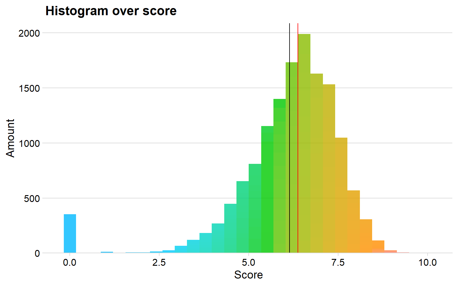
Black Line is the mean, Red line is the median
We can see that the median score seems to be around seven. I use the median since it is more consistent against the outliners, for example there are many animes that haven’t gotten a score, that is why the mean line is lower than the median.
Animes made over the years
Is anime on the rise or is it declining? To investigate this, we can look if how many animes that are realsed each year and see if there is an up- or downward curve.
I will use the package dygraphs in order to create the line plot. This allows me to create an interactive plot which the user can change the timeline in the bottom.
animeyear <- anime %>%
  group_by(year) %>%
  count(title) %>%
  summarise(sumtitle = sum(n)) %>%
  drop_na()

animeyear$year <- ymd(animeyear$year, truncated = 2L) #lubriate to convert into year


library(xts)
animeyear <- xts(animeyear, order.by = animeyear$year) #must do this to use dygraph


dygraph(animeyear) %>% dyRangeSelector(dateWindow = c("1960-01-01", "2019-01-01")) %>% dyOptions(drawPoints = TRUE, pointSize = 2)
We can clearly see and upward curve, however, the curve seems to stop at the year 2014. It looks like around 800 animes each year is produced at maximum.
We can observe that the anime boom seems to start after year 2000, since there are much more increase after that period until year 2014.
Conclusion is that anime is on the rise, but it seems like it is at the top if you only consider how much that is produced each year.
The top producing studios
There are several studios in our dataset. Some studios only produce anime movies, such as Studio Ghibli. Let us sort out the top 15 the studios that have produced the most anime titles over the years.
top15studio <- anime %>%
  count(studio) %>%
  filter(studio != "") %>%
  top_n(15) %>%
  arrange(n, studio) %>%
  mutate(studio = factor(studio, levels = unique(studio)))

topid  <- anime %>%    #Create a new dataframe that only contains information from the top 15 makers
  filter(studio %in% top15studio$studio ) %>%
  mutate(studio = factor(studio, levels = levels(top15studio$studio)))


p1 <- ggplot(data = top15studio, aes(x = reorder(studio, n), y = n)) + geom_col(fill = "#049cd8", alpha = 0.7)+ coord_flip() + theme_minimal_vgrid() +  labs(title = "Top 15 studios",x = "Studio", y = "Total anime titles made") + scale_y_continuous(expand = expand_scale(mult = c(0, 0.05))) + geom_text(aes(y = n, label = n), hjust = 1.5, colour = "black") +
  theme(legend.position = 'none') + theme(
    legend.position = "bottom",
    legend.justification = "left",
    legend.direction = "horizontal",
    legend.box = "horizontal", legend.background = element_blank()) + panel_border()


p2 <- topid %>%
  count(year, studio) %>%
  ggplot(aes( x = year, y = studio , fill = n)) + geom_tile()  + theme_minimal_vgrid()  + scale_fill_viridis(breaks = c(5, 10, 15, 20, 25, 30), labels = c(5, 10, 15, 20, 25, 30)) + theme(axis.text.y=element_blank(),
        axis.ticks.y=element_blank(),axis.text=element_text(size= 9)) + labs(title = "Anime made each year", x = "Year", y = "") + panel_border()


topid$studio <- factor(topid$studio ,levels = c(levels(fct_infreq(topid$studio))))


p3 <- ggplot(data = topid, aes(x = studio, y = score, fill = studio)) + geom_jitter( alpha = 0.2, aes(color = topid$studio)) + geom_boxplot() + geom_hline(yintercept=median(topid$score), color="red") + theme_minimal_hgrid() + theme(legend.position = 'none') + theme(axis.text.x=element_text(angle=50,hjust=1, size = 9)) + ylim(c(0,10))+
  labs(title= "Studios and their score", x = "Studio", "Anime Score")


(p1 + p2) / p3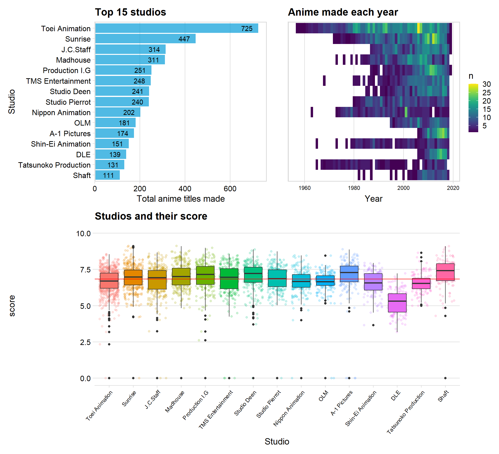
We can see that the studios Toei and Sunrise are the two studios that have produced the greatest number of anime titles. The right sided graph gives us an indication of how many animes the studios produce each year and how long each studio have been active.
We can see that both Toei and Sunrise have been active in the anime industry for a long time, which can help to explain why they have produced the most titles.
The boxplot shows us each studio and their score for every title. All studios are about the same mean and median score, but the studio DLE seems to have the lowest score overall. This might be because they seem relatively new (which we can see in the “year” graph) and might therefore have mass produced titles, and some of those titles may have been rushed.
Mean score for the top 15 studios across the years
Let us use the top 15 studios from earlier and watch their mean score from the year 1990 to 2018. Maybe we can see if there exist any pattern or if they are closely related.
mean_ratings <- anime %>% group_by(studio, year) %>%
  mutate(avg_rate = mean(score), thisYear = n()) %>%
  filter(studio != "", year > 1989)

##

mean_ratings$year <- ymd(mean_ratings$year, truncated = 2L)


##Recreate economist graph
  ggplot(data = mean_ratings, aes(x = year, y = avg_rate)) +
  geom_smooth(method = "lm",
              color = "gray30",
              se = FALSE,
              size = 0.5,
              alpha = 0.4,
              linetype = 2) +
  geom_smooth(aes(weight = avg_rate),
              color = "orange",
              method = "lm",
              size = 1,
              se = FALSE,
              alpha =0.4,
              linetype = 1
              ) +
  geom_point(aes(size = thisYear),
             alpha = 0.06,
             color = "gray30") +
  geom_point(data= mean_ratings,
            aes(x = year,
                y = avg_rate,
                size = thisYear),
                alpha =0.06,
            show.legend = FALSE) +
  labs(x = "\nDate",
       y = "Average score",
       color = "Show",
       title = "Average Anime score for top 15 studios",
       subtitle = "",
       caption = "") +
  scale_size_continuous(range = c(1,12)) +
  scale_color_viridis(option = "A",
                      discrete = TRUE,
                      begin = 0.3, end = 0.7) +
  scale_x_date(breaks = seq.Date(ymd("1990-01-01"),ymd("2018-01-01"), by = "year"),
               labels = as.character(seq(1990, 2018, by = 1))) +
  scale_y_continuous(limits = c(4,10)) +
  theme_minimal() + ylim(c(4,9))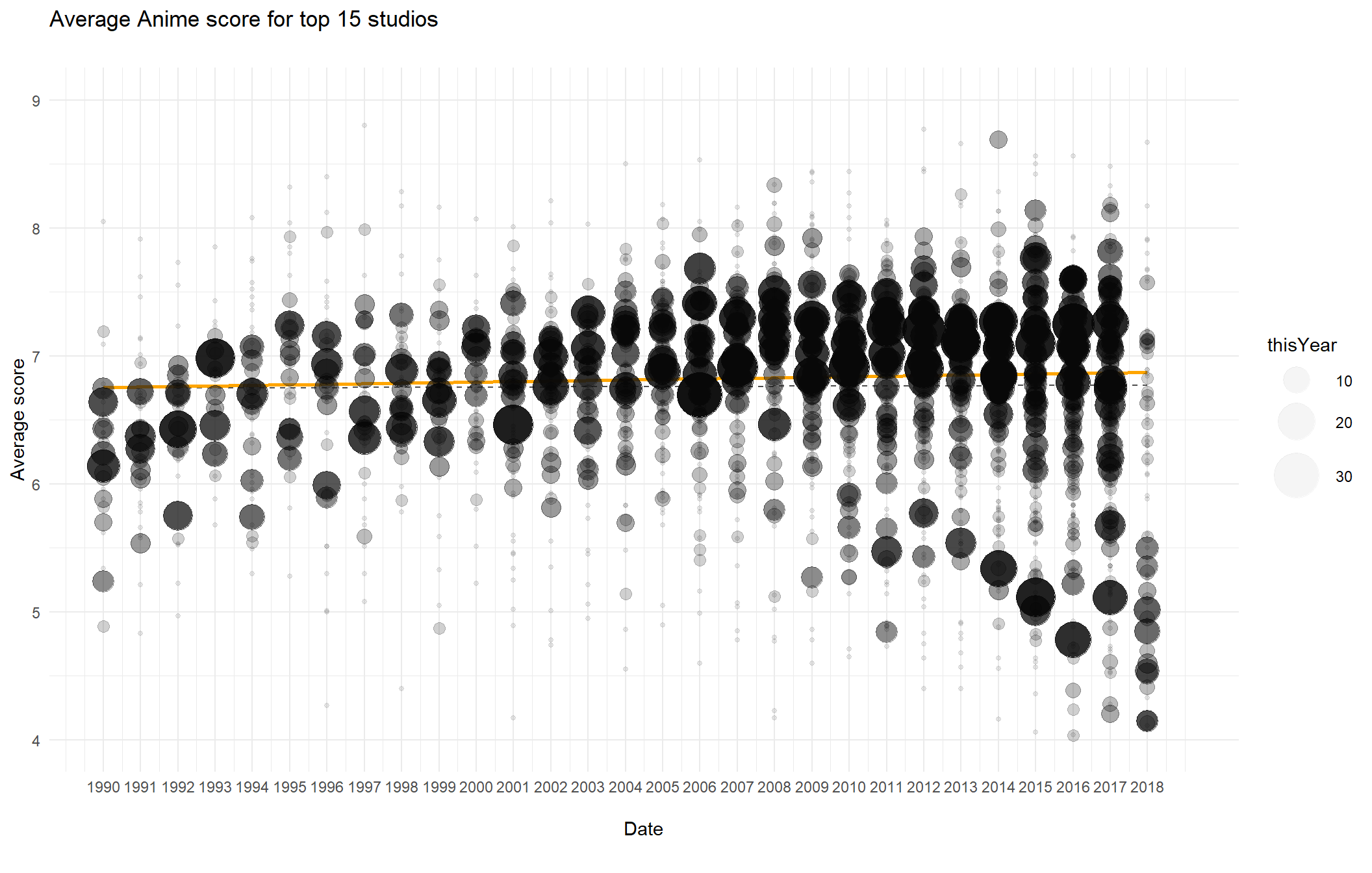
The size of each point indicates how many animes the studio produced that year. The studios seems to get a lower mean score in the recent years, and the gap between different studios widens.
Exploration of the ratings
Most animes have a rating assigned to them, such as “For all ages” or “Violence” and so on. It is interesting to know which of these ratings that are most produced, and if the user score for each rating is about the same.
anime$rating <- factor(anime$rating,levels = c(levels(fct_infreq(anime$rating)))) #easy way to set levels to the most frueqent rating

p1 <- anime %>%
  count(rating) %>%
  ggplot(aes(x = reorder(rating, -n), y = n, fill = rating)) + geom_col(alpha = 0.8, color = "black") + theme_minimal_hgrid() + labs(title = "Number of rating", y = "Amount", x = "") + scale_y_continuous(expand = expand_scale(mult = c(0, 0.05))) + geom_text(aes(y = , label = n), vjust = 1.3, colour = "black", size = 4)+ theme(legend.position = 'none') + theme(axis.text.x=element_text(angle=50,hjust=1, size = 9))


p2 <- ggplot(data = anime, aes(x = rating, y = score, fill = rating)) + geom_boxplot(alpha = 0.8) + theme_minimal_hgrid() + theme(legend.position = 'none') + labs(title = "Rating and the score", y = "Score", x = "") + theme(axis.text.x=element_text(angle=50,hjust=1, size = 9)) + geom_hline(yintercept=median(anime$score), color="red")


p3 <- ggplot(data = anime, aes(x = score, y = rating, fill = rating)) +
  stat_density_ridges( scale = 3, rel_min_height = 0.01, alpha = 0.7) +
  scale_x_continuous(expand = c(0.01, 0)) +
  scale_y_discrete(expand = c(0.01, 0)) +
  theme_ridges(font_size = 10, grid = TRUE) + theme(legend.position = 'none')+ ylab("") + xlab("Sales")


(p1 + p2) / p3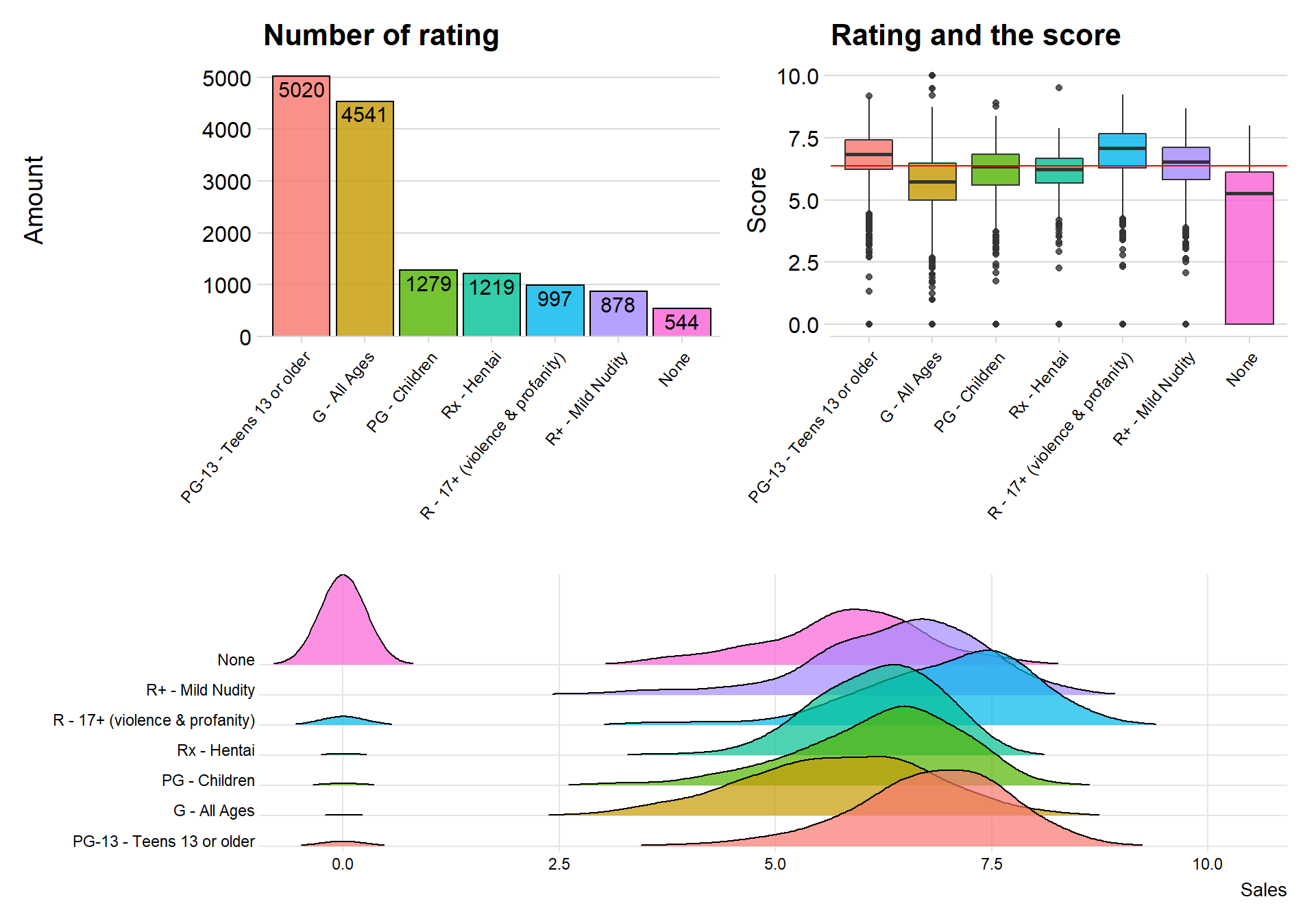
We can see that there is a total of six different ratings, where Teens 13 or older is the most produced anime. In the bottom is the ratings Mild nudity and None
The ratings with best scores seem to be PG-13- Teens or older and 17-violence
Ratings and score across the years
I wanted to try a new visualization plot, instead of doing a boxplot or a lineplot across the years I will create a new kind of plot with inspiration from boxplot.
I will see if the score for each rating have changed much between 1980 and 2010.
anime %>%
  filter(year %in% c(1980, 1985, 1990, 1995, 2005, 2010)) %>%
  ggplot(aes(x = factor(year), y = score, fill = rating)) +
  geom_econodist(
    median_point_size = 1.2,
    tenth_col = "#b07aa1",
    ninetieth_col = "#591a4f",
    show.legend = FALSE
  ) +
  ggthemes::scale_fill_tableau(name = NULL) +
  coord_flip() +
  labs(
    x = "Year", title = "Rating & Score across the years", y = NULL,
    caption = ""
  ) +
  facet_wrap(~rating, nrow = 4) +
  theme_ipsum_rc() -> gmgg

grid.newpage()
gmgg %>%
  add_econodist_legend(
    econodist_legend_grob(
      tenth_col = "#b07aa1",
      ninetieth_col = "#591a4f",
    ),
    below = "axis-b-1-4",
    just = "right"
  ) %>%
  grid.draw()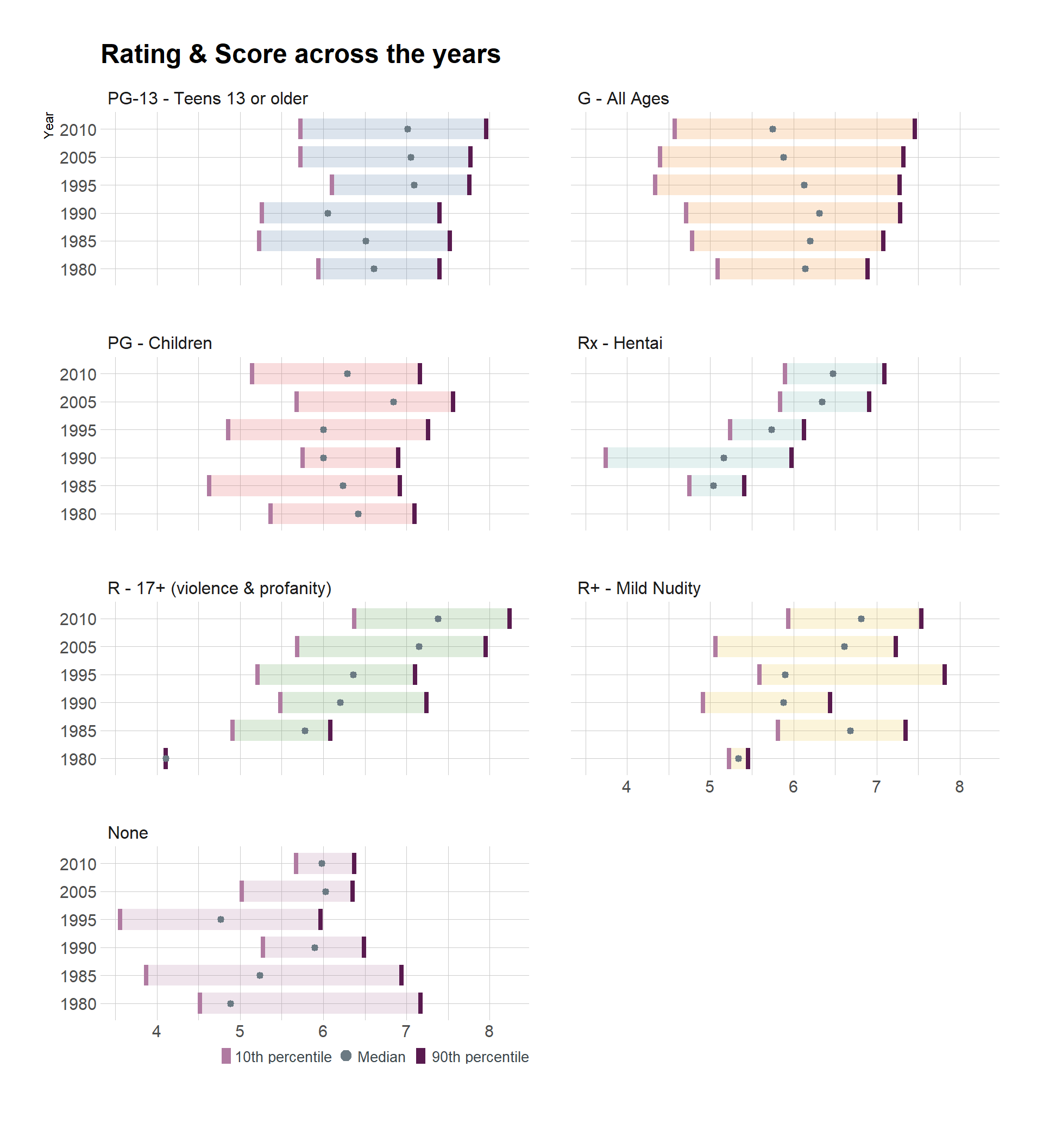
I first notice that the rating None was very spread out during the two first time periods but is much more condes in the last time period.
I also notice that the rating Rx-Hentai have had an increase in score for every time period if you look at the median.
The rating G-All ages have on the other side decreased over time.
Scores in the decades
TV-series, movies and anime are often a product of their specific time-period. It might therefore be interesting to see if there is a decade that stands out, of if they are all the same, of if every next decade have higher scores because more people watch and the quality of the anime is getting better.
anime$decade <- floor(anime$year / 10) * 10


decade <- anime %>%
select(score, decade) %>%
filter(decade > 1960, decade != "")

decade$decade <- as.factor(decade$decade )


ggplot(data = decade, aes(x = score, fill = decade)) + geom_density(alpha = 0.5) + gghighlight()+ facet_wrap(decade~.)+ theme(legend.position = 'none') 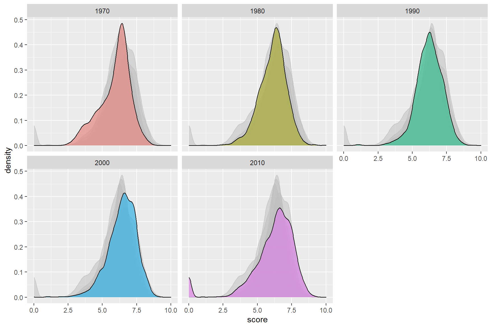
The scores seem to be about the same over each decade. I think there is a small tendency for the decade 2010 to have higher scores when observing the plot. So maybe it wasn’t better in the good old times (at least concerning anime)
Source for the anime
Movies and tv-series are often based on something else, so is the case with anime also. Anime is related to Japanese manga, it is therefore no surprise if many animes are based on manga. Let us investigate what type of mediums animes are often based on.
anime$source <- factor(anime$source,levels = c(levels(fct_infreq(anime$source))))

dsource <- anime %>%
  count(source) %>%  #filter out the rows that dont have any names
  top_n(5) %>%
  arrange(n, source) %>%
  mutate(source = factor(source, levels = unique(source)))

topsource <- anime %>%
  filter(source %in% dsource$source) %>%
  mutate(source = factor(source, levels = levels(dsource$source)))

p1 <-  topsource %>%
  count(source) %>%
  ggplot(aes(x = reorder(source,-n), y = n, fill = source)) + geom_col(colour = "black", show.legend = FALSE, alpha = 0.8) + theme(legend.position = 'none') + theme_minimal_hgrid() + scale_y_continuous(expand = expand_scale(mult = c(0, 0.05))) + geom_text(aes(y = , label = n), vjust = 1.3, colour = "black", size = 4)+ theme(legend.position = 'none') + theme(axis.text.x=element_text(angle=50,hjust=1, size = 9)) + labs(title = "The source for the anime", x = "Source", y = "")

p2 <- ggplot(data = topsource, aes(x = source, y = score, fill = source)) + theme_minimal_hgrid() +  geom_jitter( alpha = 0.1, aes(color = topsource$source)) + geom_boxplot() + theme(legend.position = 'none') + labs(title = "Source and thier score", x = "Source", y = "")


p3 <-ggplot(data = topsource, aes(x = score, y = source, fill = source)) +
  stat_density_ridges( scale = 3, rel_min_height = 0.01, alpha = 0.7) +
  scale_x_continuous(expand = c(0.01, 0)) +
  scale_y_discrete(expand = c(0.01, 0)) +
  theme_ridges(font_size = 13, grid = TRUE) + theme(legend.position = 'none')+ ylab("") + xlab("Scores")

(p1 + p2) / p3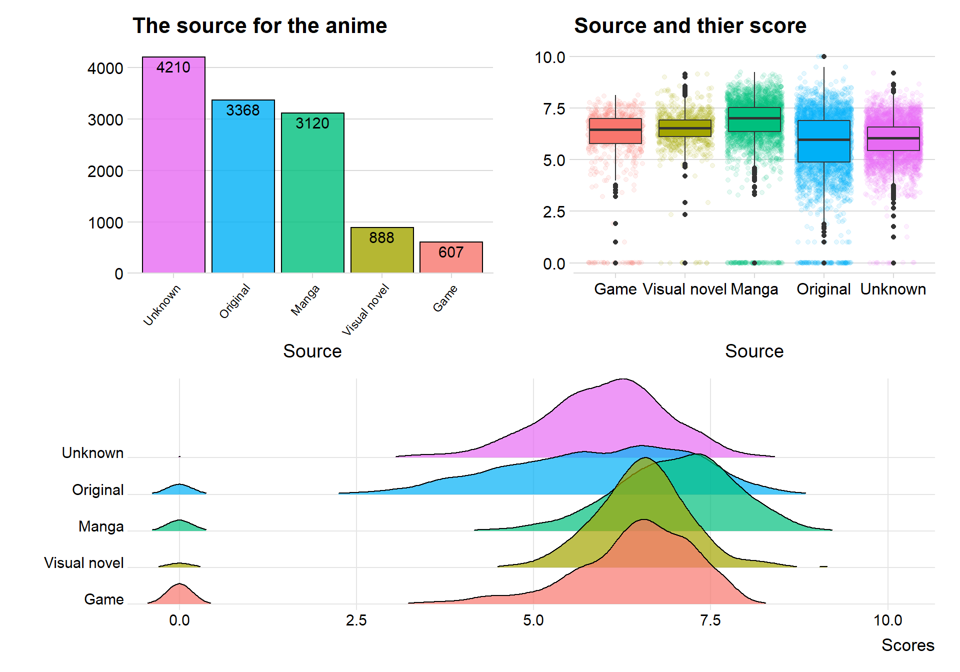
The top five sources for creating an anime is Unknown, Original, Manga, Visual Novel and Game. It is a shame that almost a third of our data has an unknown source. There are many more original animes that I would have believed beforehand.
When comparing the sources with the scores we can see that animes based on manga have relative better scores. The worst source seems to be the original, maybe it is hard to write new anime and the viewers can tell that the dialog and story is lacking.
High popularity means high score?
Each anime has a popularity rank from MyAnimeList, where rank 1 means highest popularity. Let’s therefore investigate if there is a relationship between the popularity of anime and their score. Here I use the new package ggpointdensity in order to overcome over plotting.
ggplot(data = anime, mapping = aes(x = score, y = popularity)) +
  geom_pointdensity() +
  scale_color_viridis(option = "C") + scale_y_reverse() + labs(title = "Relation between score and popularity", x = "Score", y = "Popularity") + theme_minimal_grid()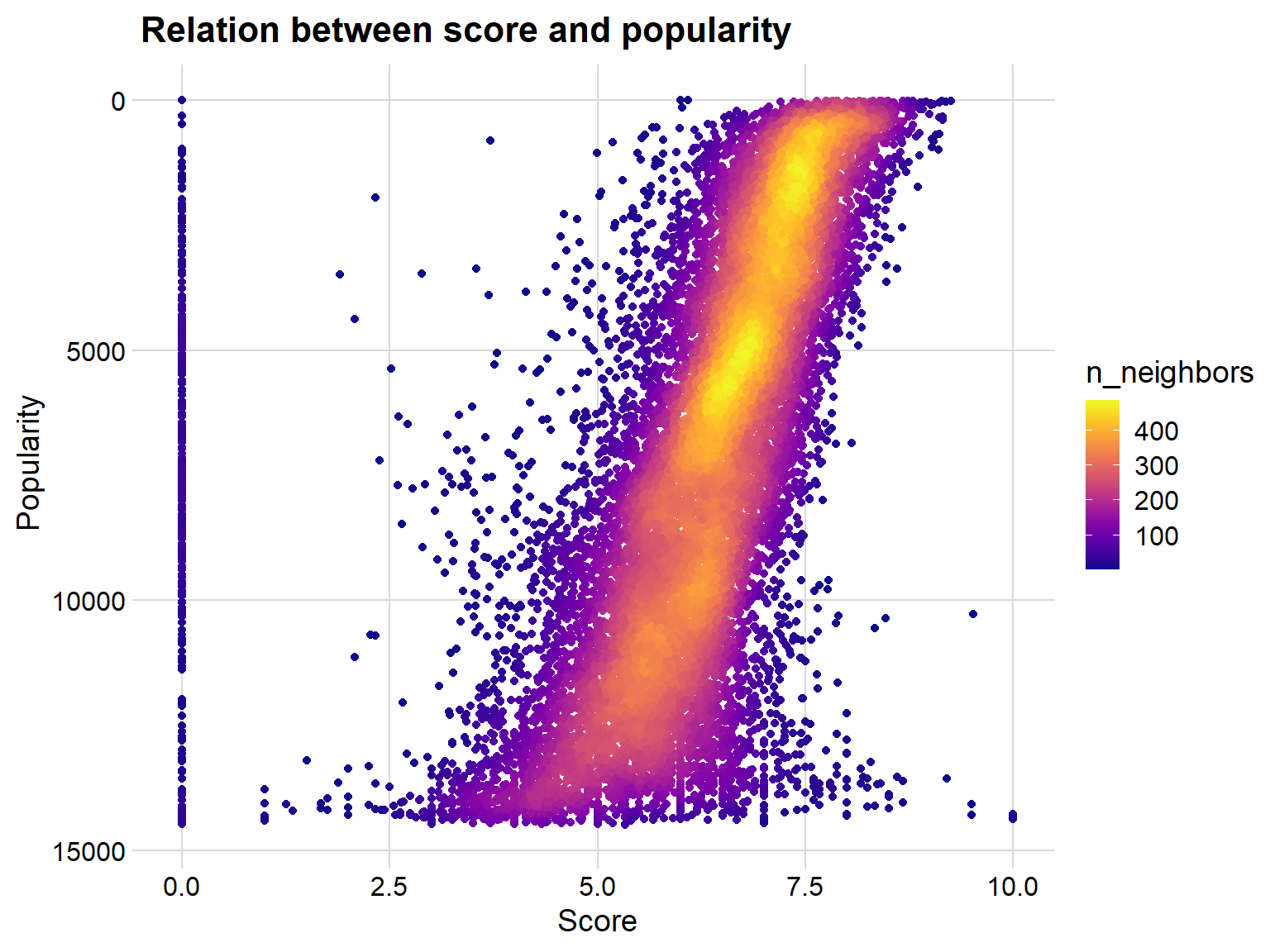
We can see that there is indeed a relation between score and popularity. Of course, is it very spread over, but higher popularity generally means better score.
There are some observations that are very low on the popularity list but have high scores, I suspect that this is unpopular animes that only a few people have giving a score to.
Network analysis between studios
library(widgetframe)

netdf <- anime %>%
  group_by(licensor, studio) %>%
  count() %>%
  filter( n>5, licensor != "", studio != "")


ts<- simpleNetwork(netdf , zoom = F)


frameWidget(ts, height = 400, width = '95%')
Count the most popular genres
Each anime has genres assigned to them, for example adventure, drama and school can be genres for one anime. An anime can have multiple genres assigned to them. I will split up every string that contains the genres and count every single one, this way we can see the most popular genres for anime.
genre <- str_extract_all(anime$genre, boundary("word"))
genre <-data.frame(words = unlist(genre))


genre <- genre %>%
  group_by(words) %>%
  count() %>%
  filter(n > 2280)

ggplot(data = genre, aes(x = reorder(words,-n), y = n)) + geom_col(fill = "#049cd8", color = "black", alpha = 0.7) + theme_minimal_hgrid() + scale_y_continuous(expand = expand_scale(mult = c(0, 0.05))) + geom_text(aes(y = , label = n), vjust = 1.3, colour = "black", size = 4) + labs(title = "Most popular genres", x = "Genre", y = "Amount")
## Warning: `expand_scale()` is deprecated; use `expansion()` instead.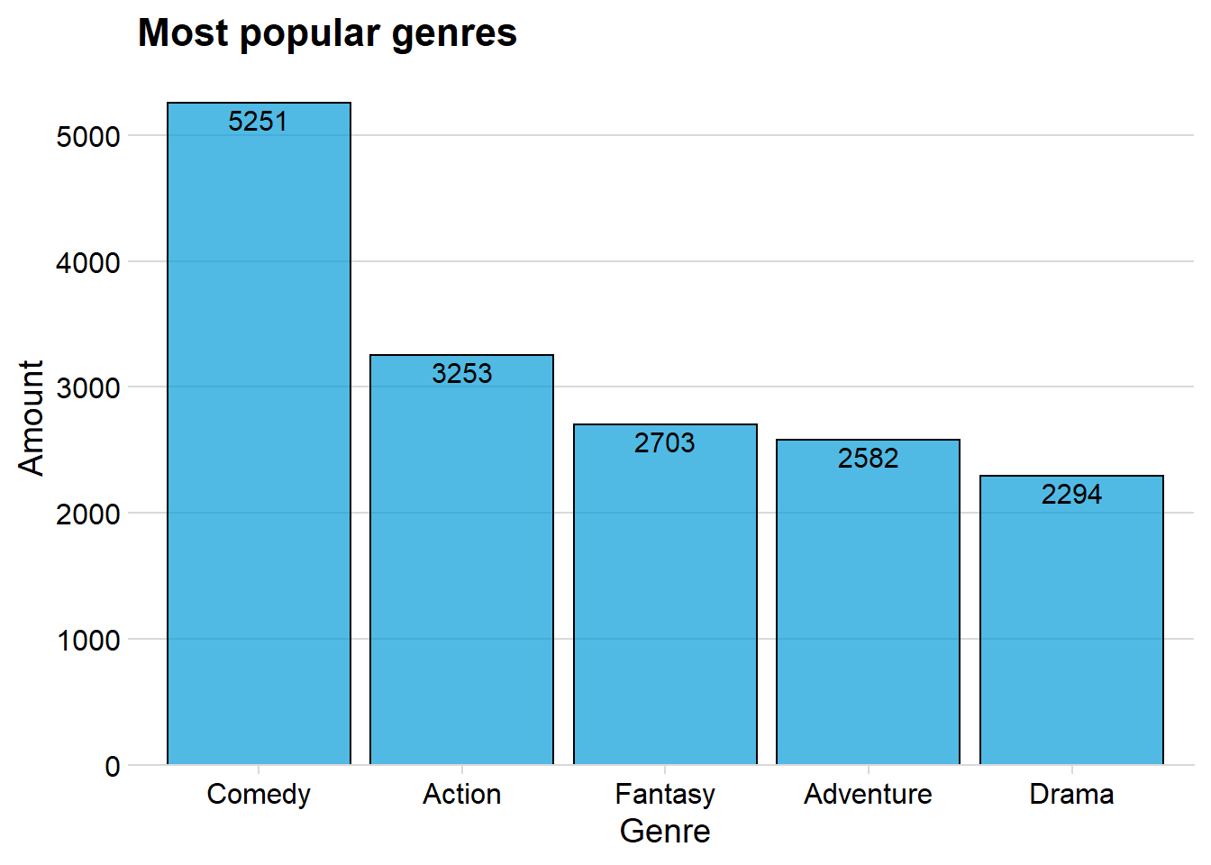
The above plot shows that Comedy, Action, Fantasy, Adventure and Drama are the five most produced genres
Correlation and similarity to the genres
Let us now investigate if there is any correlation between the genres and if we can see a pattern.
Here I use a plot made possible by the corrr package, instead of just showing a regular correlation plot.
library(corrr)
library(tidytext)

tidy_anime <- readr::read_csv("https://raw.githubusercontent.com/rfordatascience/tidytuesday/master/data/2019/2019-04-23/tidy_anime.csv")

########


df_network <- tidy_anime %>%
  dplyr::select(name, genre) %>%
  distinct()

#df_network <- df_network[,-1]  #ta bort denna om id inte kommer med automatistk

#df_network <- df_network %>%  # ta även  bort denna då
  #distinct()


df_network <- df_network %>%
  mutate(flag = rep(1, nrow(df_network))) %>%
  spread(genre, flag) %>%
  select(-name, -"<NA>")


df_network[is.na(df_network)] <-0

df_network %>%
  correlate() %>%
  network_plot(min_cor = 0, colors = c("red", "white", "green"), legend = FALSE)+
  labs(title = "Anime genre combinations",
       subtitle = "Network plot of genres from MyAnimeList",
       caption = "Made by Per Granberg",
       color = "white") +
  theme_dark(base_size = 20, base_family = "Lato") +
  theme(axis.text = element_blank(),
        axis.ticks = element_blank(),
        axis.title = element_blank(),
        panel.grid = element_blank(),
        plot.background = element_rect(fill = "#7f7f7f"),
        plot.title = element_text(face = "bold"),
        text = element_text(color = "white"))+
  guides(color = FALSE)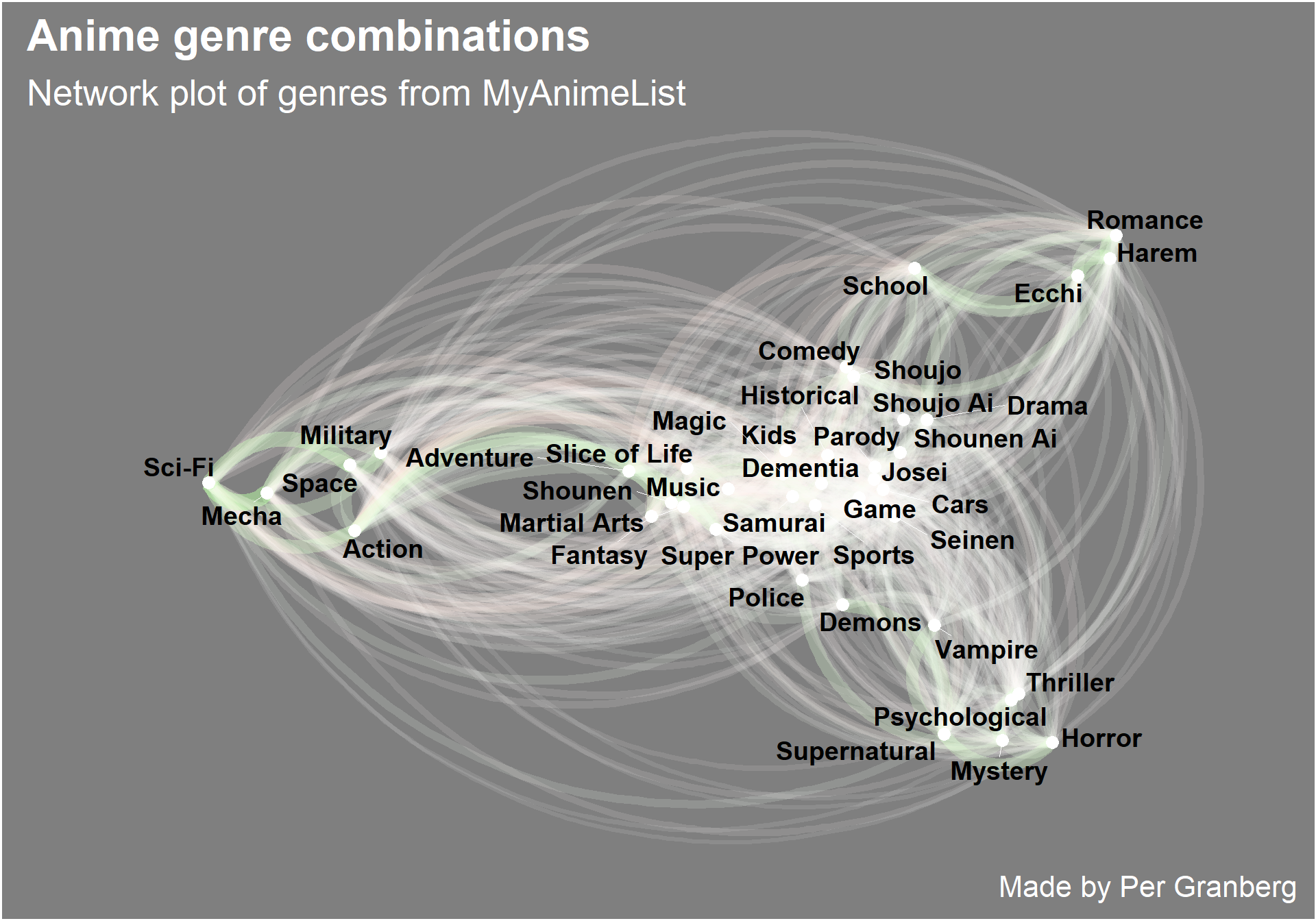
The green lines indicate a positive correlation while the red lines is a negative relation. White lines indicate that there is not a strong relation.
We can see that many of the genres are uncorrelated. But we can also see that the genres group together, for example Thriller, Horror, Mystery, Supernatural and Psychological all group together in the right bottom corner, This means that they often are seen together.
Relation between anime and scored by
The data tell us the average score for each anime, but it also tells us how many users that have scored the anime. The question I therefore have is: Can we see any relationship between score and how many people that has scored?
ggplot(data = anime, aes(x = anime$scored_by, y = score)) + geom_pointdensity() + scale_color_viridis(option = "C")+
  facet_zoom(xlim = c(0, 250000), ylim = c(6,10)) + geom_smooth() + labs(title = "Relation between score and scored by", x = "Scored by", y = "Score")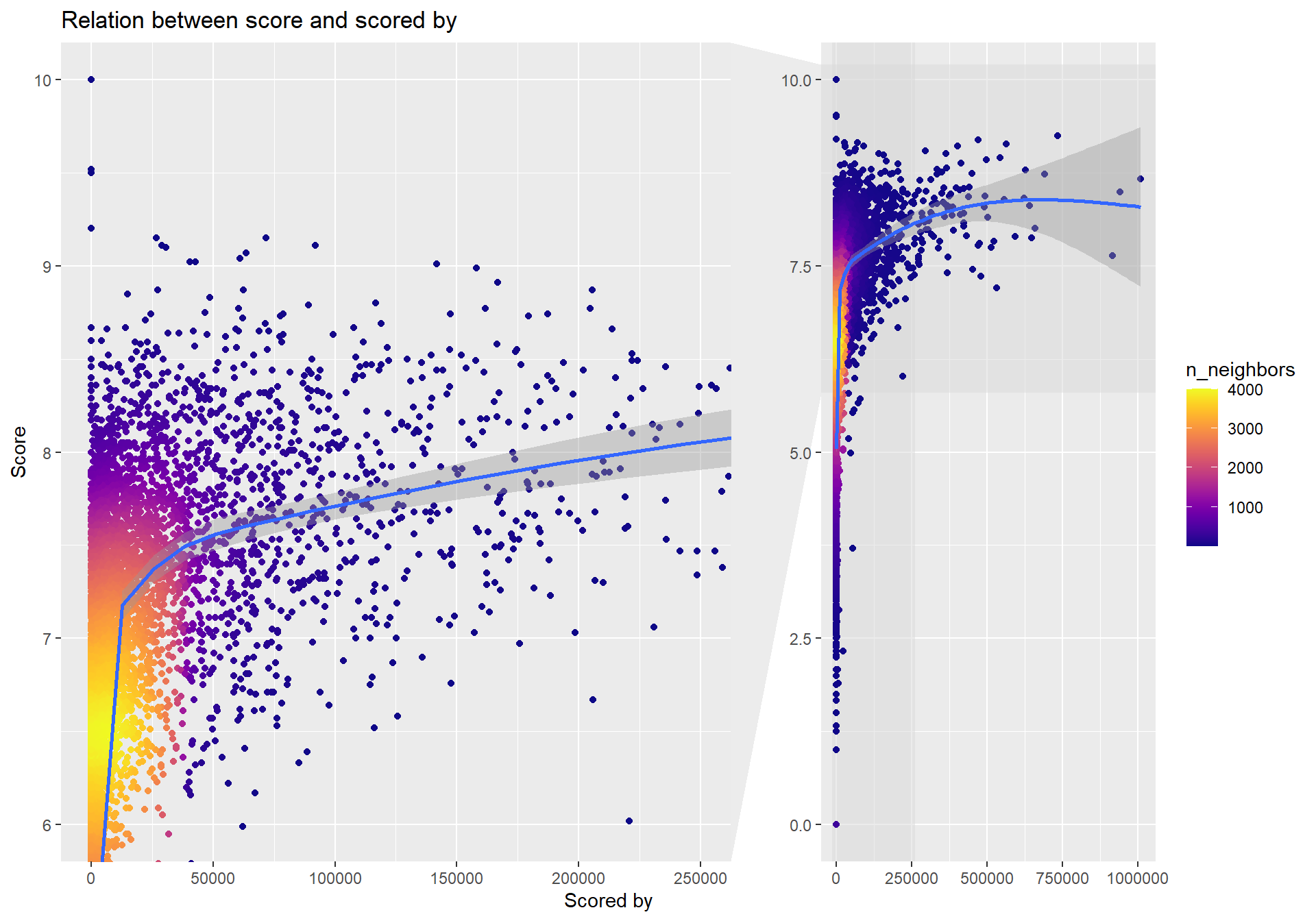
We can indeed witness that there seems to be connection between the anime score and how many users that have scored the anime.
There also seems to be a lot of animes that haven’t been scored by many users.
Studios and their produced animes
The best way to showcase the top studios and each of their animes is by using the circlepackeR and make a interactive plot that you, the reader, can click on to investigate more.
library(circlepackeR) #devtools::install_github("jeromefroe/circlepackeR")
library(data.tree)
library(treemap)


top25 <- topid %>%
  group_by(studio) %>%
  top_n(10, score)


top25$pathString <- paste("studio",
                            top25$studio,
                            top25$title,
                            sep = "/")
population <- as.Node(top25)

circlepackeR(population, size = "favorites", color_min = "hsl(56,80%,80%)",
             color_max = "hsl(341,30%,40%)")
The plot above is interactive, so I suggest that you click on some studio to see the top favorite animes is for that studio. The size of the circle indicates how much total favorites the studio has. The studio Madhouse is the largest, which means that that studio has most favorite scores.
Mean score across years
Let’s see how the mean score for each year have changes over time and how many members there are.
anime%>%
  group_by(year) %>%
  summarise(sumyear = mean(score), summemb = mean(members)) %>%
  filter(year != 2019) %>%
  ggplot(aes(x = year, y = sumyear)) + geom_point(aes(size = summemb), alpha = 0.5)  +
  geom_label(aes(x = 2006, y = 5.6, label = "MAL\nwent online"),
             hjust = 0,
             vjust = 0.5,
             colour = "#FAAB18",
             fill = "white",
             label.size = NA,
             family="Helvetica",
             size = 3)  +
  geom_curve(aes(x = 2006, y = 5.5, xend = 2006, yend = 6.3),
             colour = "#FF0000",
             size=0.5,
             curvature = -0.2,
             arrow = arrow(length = unit(0.03, "npc"))) + labs(title = "Mean score over the years", x = "Year", y = "Mean score")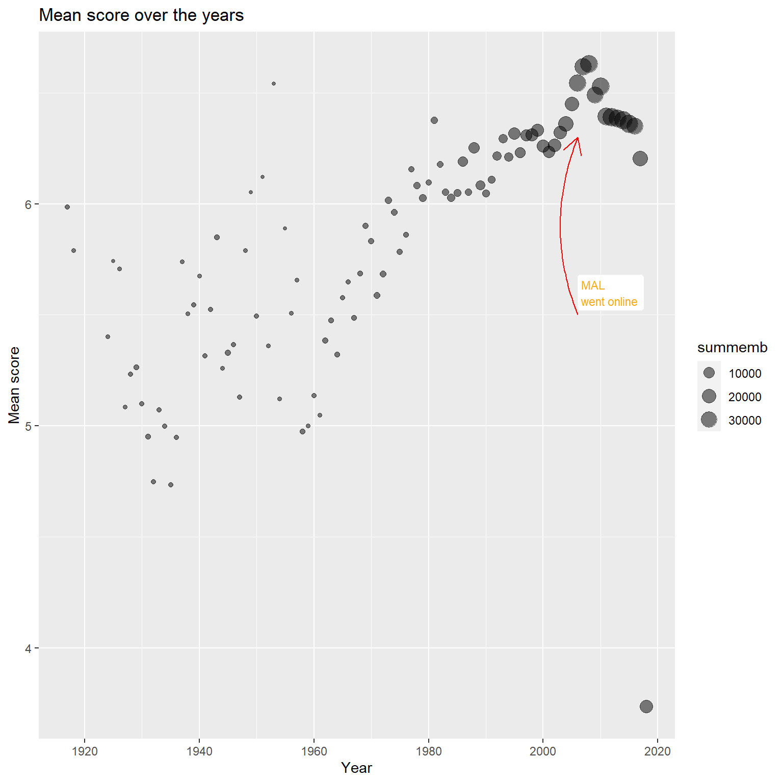
We can clearly see that the mean score has a huge variance for the first years, it becomes steady and predictable around 1970. The peak of the mean score seems to be about 2008, since then it has decreased for every year thereafter.
Mean score for the type
The data have information considering if the anime is made for tv, or movie or music and more. It would therefore be interesting to compare the mean score of each type and see if there exist any difference. I wanted to use error plots since it reminded me of the course “Variance analysis” from university.
animetype <- anime %>%
  group_by(type) %>%
  summarise(n = n(),
            mean = mean(score),
            sd = sd(score),
            se = sd/sqrt(n),
            ci = qt(0.975, df = n-1) * sd / sqrt(n)) %>%
  filter(type != "Unknown")


ggplot(animetype,
       aes(x = type,
           y = mean,
           group = 1)) +
  geom_point(size = 3) +
  geom_line() +
  geom_errorbar(aes(ymin = mean - se,
                    ymax = mean + se),
                width = .1) + labs(title = "Mean score for Type", x = "Type", y = "Score") + theme_minimal_hgrid()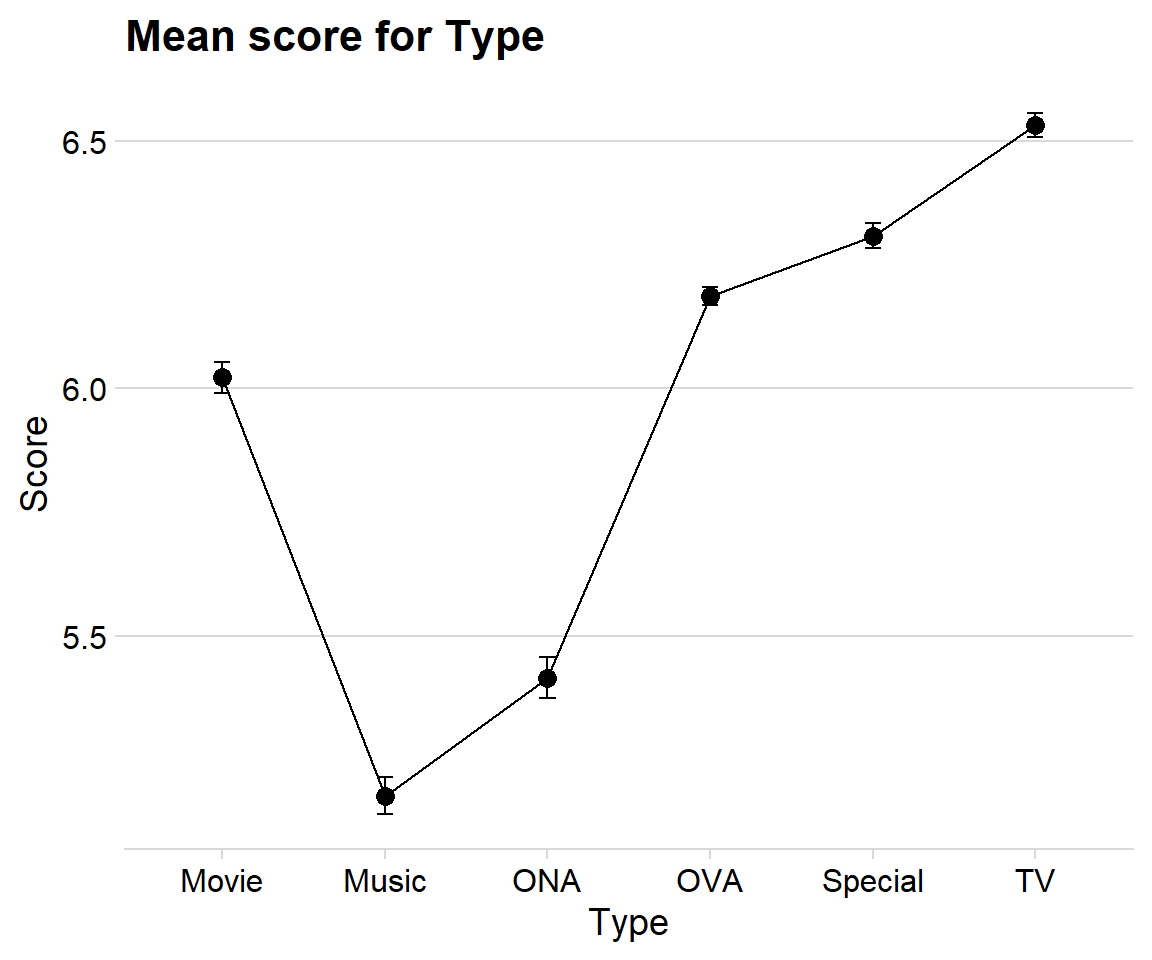
The plot tells me that Music has the overall lowest mean score between the types. I am little surprised that movies have such a low score, but maybe that is because movie adaptations are often rushed and not as good as the “real” material.
TV-anime have the highest score, which is no surprise since that is the most common channel to the viewers.
Treemap over the type and source
A treemap is a good way to visualize the structure of two categorical variables. Here I will focus on the type and source, is there any pattern in the data?
anime %>%
  group_by(type, source) %>%
  count() %>%
  ungroup() %>%
  ggplot(aes(area = n, fill =type,label = type, subgroup = source))+
  geom_treemap() +
  geom_treemap_subgroup_border() +
  geom_treemap_subgroup_text(place = "centre", grow = T, alpha = 0.5, colour = "black", fontface = "italic", min.size = 0)+
  geom_treemap_text(colour = "white", place = "topleft", reflow = T)+
  theme(legend.position = "null") +
  ggtitle("Relation between tje type and source")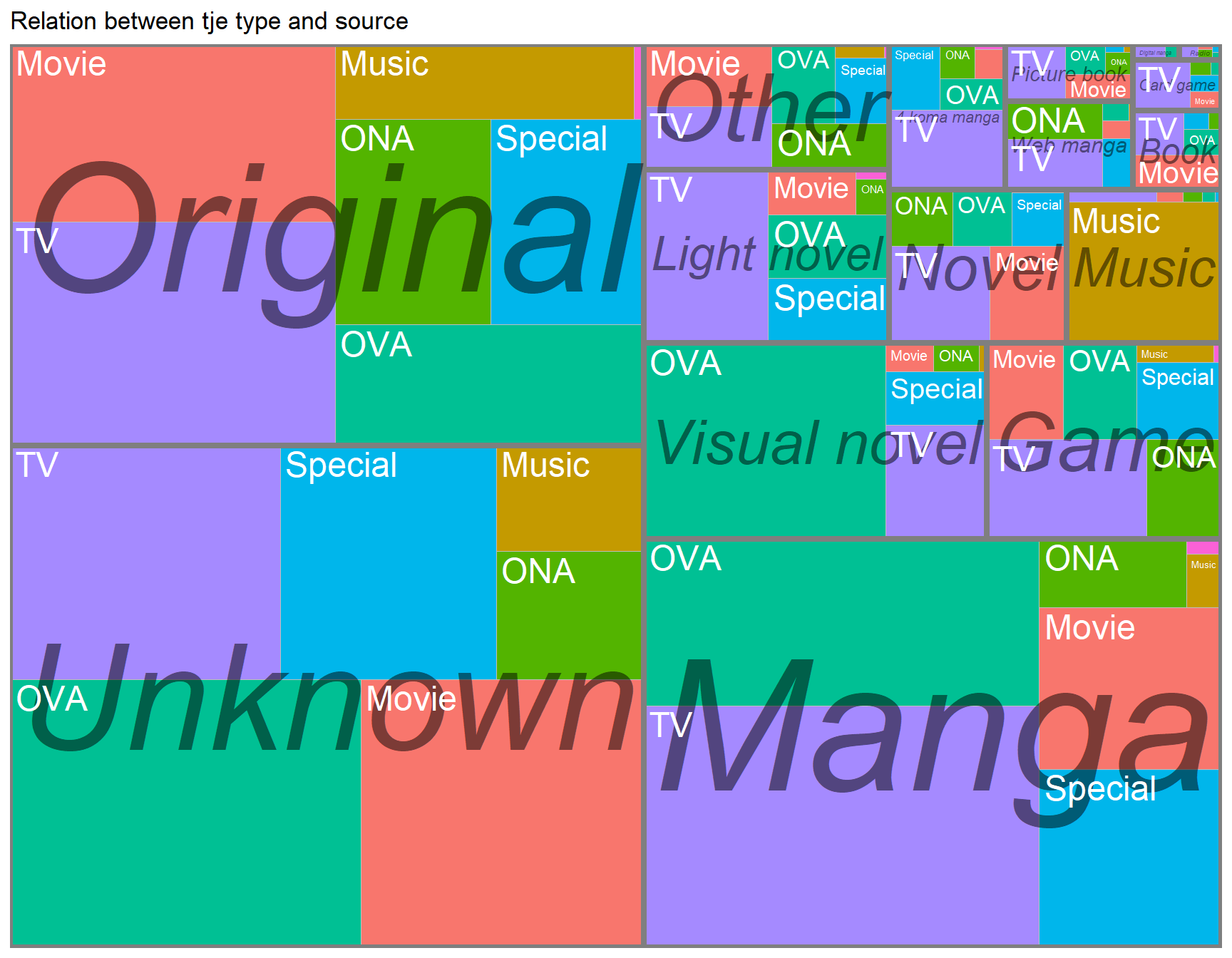
The treemap plot show us that when the source is Unknown so is the type most often OVA. The types TV, Movie and Special are almost the same ratio. The most interesting findings is that Manga is most often used on TV or OVA and not on Movies.
Heatmap over top 15 studios
A heatmap is a powerful visualization tool in order to create a big overview of some variables connection to other variables. Here I will use the package superheat which makes it easy to construct a good looking heatmap with a dendrogram.
The superheat package also group variables that are similar to each other, making it easier to get a understanding of the data.
numanime <- select_if(topid, is.numeric)

numanime$studio <- topid$studio

numanime <- numanime[,-1]


newdata <- numanime %>%
  drop_na() %>%
  group_by(studio) %>%
  summarise_all(mean)


newdata2 <- newdata

newdata <- newdata[,-1]

row.names(newdata) <- newdata2$studio  #g?r att studion  blir row names
superheat(newdata,
scale = TRUE,
left.label.size = 0.15, #adjust the label around the text
bottom.label.size = 0.11,
left.label.text.size=3.2, #adjust the text
bottom.label.text.size=3.2,
#bottom.label.text.angle = 45,
left.label.text.alignment = "left",
pretty.order.rows = TRUE,
pretty.order.cols = TRUE,
row.dendrogram = TRUE,
grid.hline.col = "white",
grid.vline.col = "white",
)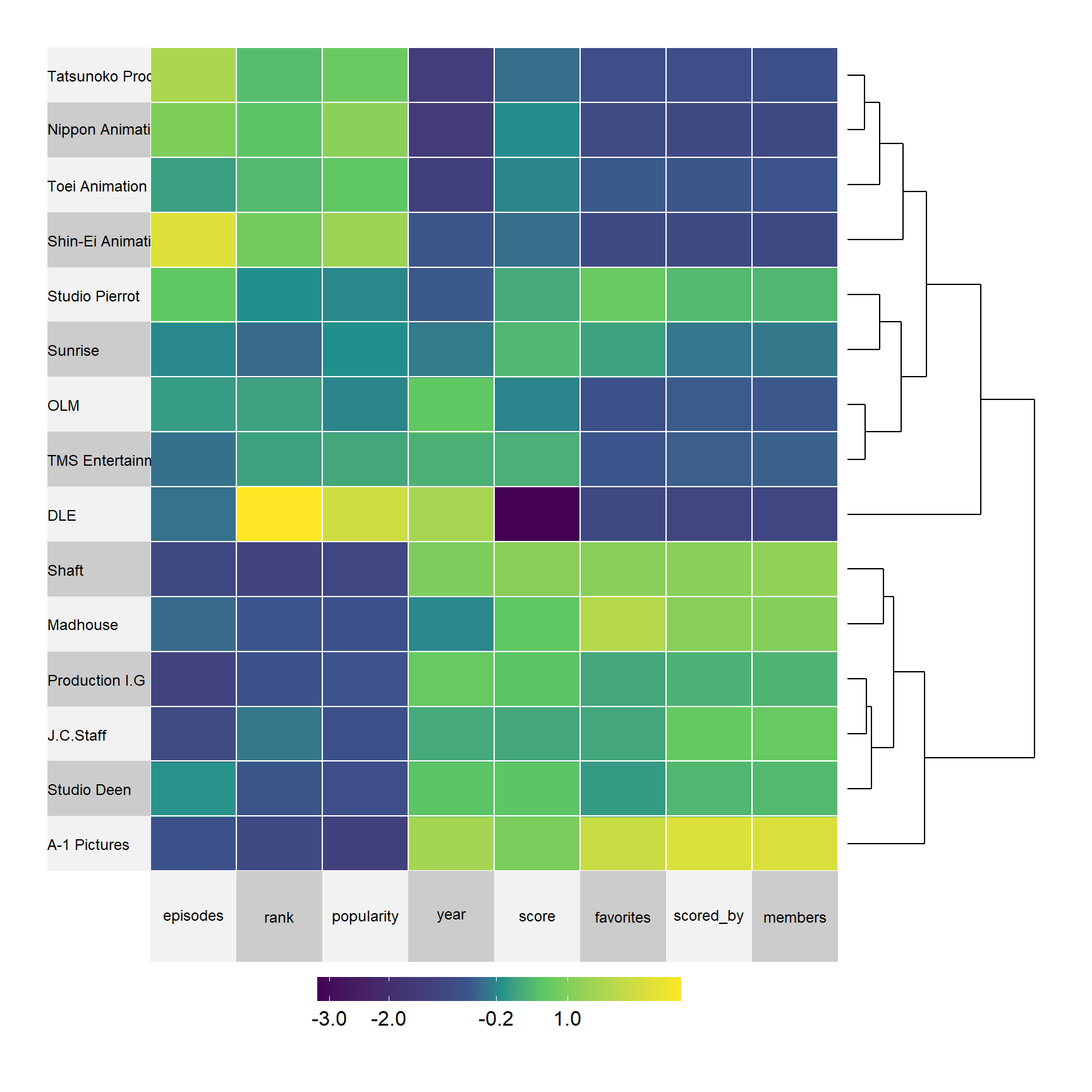
The plot scales all the numerical variables such as episodes, rank, popularity and so on. The plot arranges the studios on the y-axel according to similarity, for example, the first four studios have high values on episodes, rank and popularity, indicating that those studios have been active for a long time and produced many animes. However, they also have lower values on the variables score, favorites, scored_by and members.
The six last studios have low values on the first three variables but high values on the five last, indiciating that they haven’t made as much animes butea ach anime is scored relatively high and are loved by the members compared to the other studios.
Sentiment analysis
I will use sentiment analysis in order to get insight of what positive or negative words are being used in order to describe the story of each anime.
I will perform the analysis of the most popular and different ratings.
tidy_anime  <-tidy_anime  %>%
  group_by(animeID) %>%
  slice(1:1)


nrc_joy <- get_sentiments("bing")


test <-tidy_anime %>%
    unnest_tokens(word, synopsis) %>%    # split words
    anti_join(stop_words) %>%    # take out "a", "an", "the", etc.
    count(word, sort = TRUE)%>% # count occurrences
  drop_na()


test <- merge(test, tidy_anime, by = "animeID")

# to plot negative/positve counts over the year
test$year <- stringr::str_extract(test$premiered , "\\d{4}")
test$year <- as.integer(test$year)


test1 <- test%>%
  select(word, rating) %>%
  group_by(word, rating) %>%
  count()

ratingsent <- merge(test1,nrc_joy, by = "word" )
p1 <- ratingsent %>%
filter(rating == "G - All Ages") %>%
arrange(desc(n)) %>%
group_by(sentiment) %>% slice(1:15) %>%
ggplot(aes(x = reorder(word, n), y = n, fill = sentiment)) +
geom_col(show.legend = FALSE, alpha = 0.8, color = "black") +
labs(title ="G - All Ages",y = "",
x = NULL) +
coord_flip() + theme_minimal_vgrid() + panel_border() + scale_y_continuous(expand = expand_scale(mult = c(0, 0.05))) + facet_wrap(~ sentiment, scales = "free_y")
p2 <- ratingsent %>%
filter(rating == "R - 17+ (violence & profanity)") %>%
arrange(desc(n)) %>%
group_by(sentiment) %>% slice(1:15) %>%
ggplot(aes(x = reorder(word, n), y = n, fill = sentiment)) +
geom_col(show.legend = FALSE, alpha = 0.8, color = "black") +
labs(title ="R+17 violence",y = "",
x = NULL) +
coord_flip() + theme_minimal_vgrid() + panel_border() + scale_y_continuous(expand = expand_scale(mult = c(0, 0.05))) + facet_wrap(~ sentiment, scales = "free_y")
p3 <- ratingsent %>%
filter(rating == "PG - Children") %>%
arrange(desc(n)) %>%
group_by(sentiment) %>% slice(1:15) %>%
ggplot(aes(x = reorder(word, n), y = n, fill = sentiment)) +
geom_col(show.legend = FALSE, alpha = 0.8, color = "black") +
labs(title ="Children",y = "",
x = NULL) +
coord_flip() + theme_minimal_vgrid() + panel_border() + scale_y_continuous(expand = expand_scale(mult = c(0, 0.05))) + facet_wrap(~ sentiment, scales = "free_y")
p4 <- ratingsent %>%
filter(rating == "R+ - Mild Nudity") %>%
arrange(desc(n)) %>%
group_by(sentiment) %>% slice(1:15) %>%
ggplot(aes(x = reorder(word, n), y = n, fill = sentiment)) +
geom_col(show.legend = FALSE, alpha = 0.8, color = "black") +
labs(title ="R+ - Mild Nudity",y = "",
x = NULL) +
coord_flip() + theme_minimal_vgrid() + panel_border() + scale_y_continuous(expand = expand_scale(mult = c(0, 0.05))) + facet_wrap(~ sentiment, scales = "free_y")
(p1 + p2)/ (p3+p4)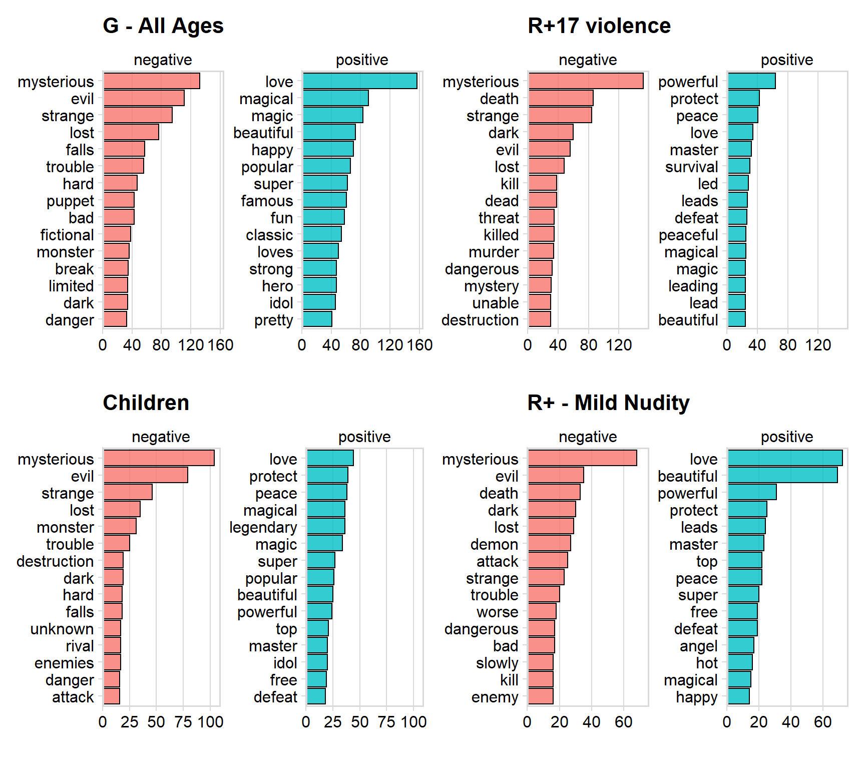
We can see that the are several words that occurs in all the ratings. Mysterious, evil and death seems to be the most negative used words across the ratings.
love, protect and peace are some of the most positive words used.
Sentimental analysis over the years
Let us now investigate if the ratio between negative and positive words have changed over the years. This will answer if animes was described more positively in the earlier years.
# sentimental over the years

test2 <- test%>%
  select(word, year) %>%
  drop_na() %>%
  group_by(word, year) %>%
  count()

yearsent <- merge(test2,nrc_joy, by = "word" )

year_grp <- yearsent %>%
  group_by(year, sentiment) %>%
  filter(year > 1969) %>%
  count()

p1 <- ggplot(data = year_grp, aes(x = year, y = n, color = sentiment)) + geom_line() + geom_point() + theme_minimal_hgrid() + labs(title = "Time serie of total negative/positive words", x = "Year", y = "Total amount")


p2 <- ggplot(data = year_grp, aes(x = year, y = n, fill = sentiment)) + geom_area( position='fill', alpha = 0.8) + theme_minimal_hgrid() + labs(title = "Ratio of negative and positive words", y = "%", x = "Year") + scale_y_continuous(expand = c(0, 0), label = percent)

p1/p2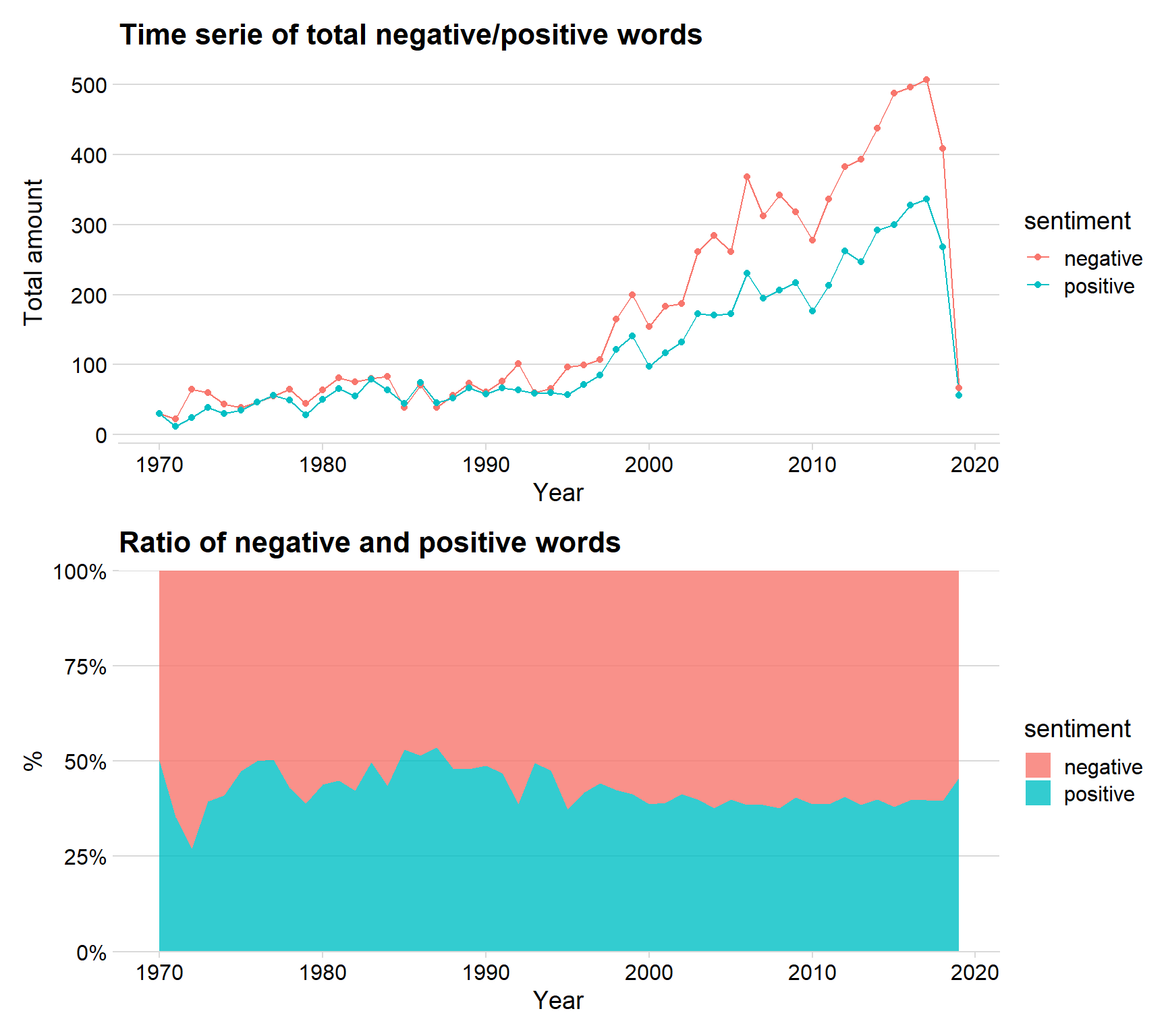
We can see that the ratio between negative and positive words have been almost the same across all years, however, there seems to be a little more positive words used between 1980 to 1990, because after the year 2000 is the ratio around 60 % negative words.
Investigate users from MyAnimeList
As mentioned before, MyAnimeList is a website where users can select their favorite anime and put a score on each anime. The website also let user give information such as gender, age and location. Let’s therefore begin to investigate the users of the website. We start by looking at how many persons there are of each gender.
I have information on around 110 000 people.
users <- read.csv("C:/Users/GTSA - Infinity/Desktop/R analyser/usersfiltered.csv")

users$gender <- factor(users$gender,levels = c(levels(fct_infreq(users$gender))))

p1 <- users %>%
  group_by(gender) %>%
  count() %>%
  ggplot(aes(x = reorder(gender, - n), y = n, fill = gender)) + geom_col( color = "black", alpha = 0.7) + theme_minimal_hgrid() + scale_y_continuous(expand = expand_scale(mult = c(0, 0.05))) + geom_text(aes(y = , label = n), vjust = 1.3, colour = "black", size = 4) + labs(title = "Gender profiles", x = "Gender", y = "Total")


p2 <- users %>%
  ggplot(aes(x = gender, y = user_days_spent_watching, fill = gender)) +  geom_violin(alpha = 0.2) +geom_boxplot(alpha = 0.7) + ylim(c(0,250)) + labs(title = "Gender and days spent wathich anime", x = "Gender", y = "Days watching anime")+ theme_minimal_hgrid()

p1 / p2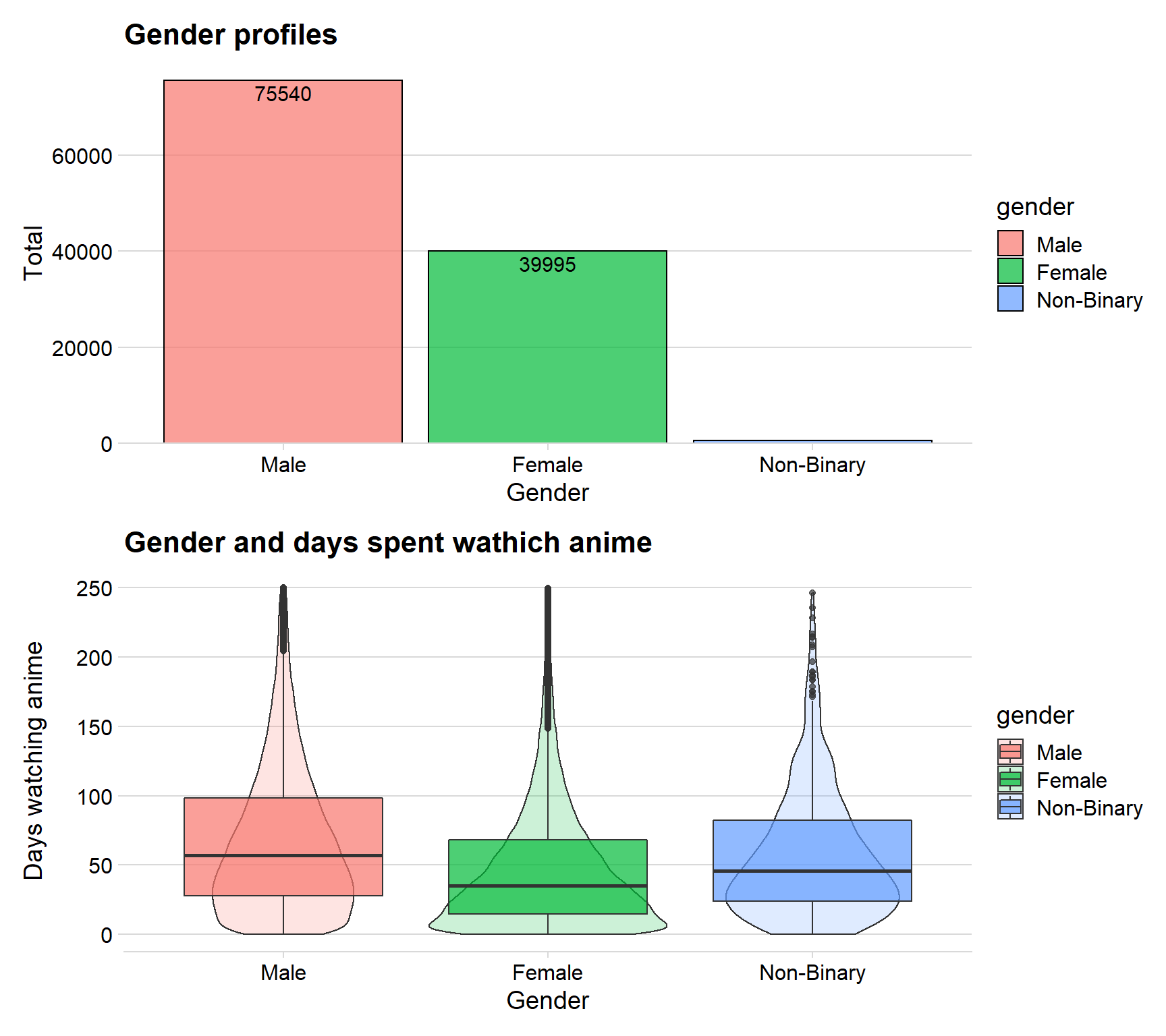
The first plot shows that there are 75 540 Males, 39 995 Females and a small number of nonbinary people registered. This is only a cleaned dataset I am using, in reality is there a lot more users but I haven’t performed the analysis on that dataset since it is too big with a lot of missing values.
The second graphs have days spent watching anime on the y-axel. We can see that the mean for Males are around 55 days which is the highest of the genders. Females seems to have a mean of around 40 days. I therefore create a hypothesis that males watch more anime that females.
I combined the boxplot with a density plot in order to get a feeling for the distribution.
Age distribution
Let’s use a histogram of males and females to see the age distribution. First, I need to recode the users age since the data only have information on the users birthdate and not the actual age.
users$birth_date <- stringr::str_extract(users$birth_date , "\\d{4}")  #extracting the year the user is born
users$birth_date  <- as.integer(users$birth_date)

users$age <- 2019 - users$birth_date # calculate the age

a_mean <- users %>%
  group_by(gender) %>%
  filter(gender == "Female" | gender == "Male") %>%
  dplyr::summarize(mean_val = mean(age))


users %>%
  filter(age > 9, age < 65, gender == "Female" | gender == "Male") %>%
  ggplot(aes(x = age, fill = gender)) + geom_histogram(bins = 40,color = "black")+
  gghighlight()+ theme(legend.position = 'none') + facet_grid(gender ~ .,
             scales = "free_y") + scale_y_continuous(expand = expand_scale(mult = c(0, 0.05)))  + theme_pubclean()+ panel_border() + scale_x_continuous(breaks = seq(0, 100, 5)) + geom_vline(data= a_mean, aes(xintercept=mean_val),
             col = "black",
             linetype = "dashed")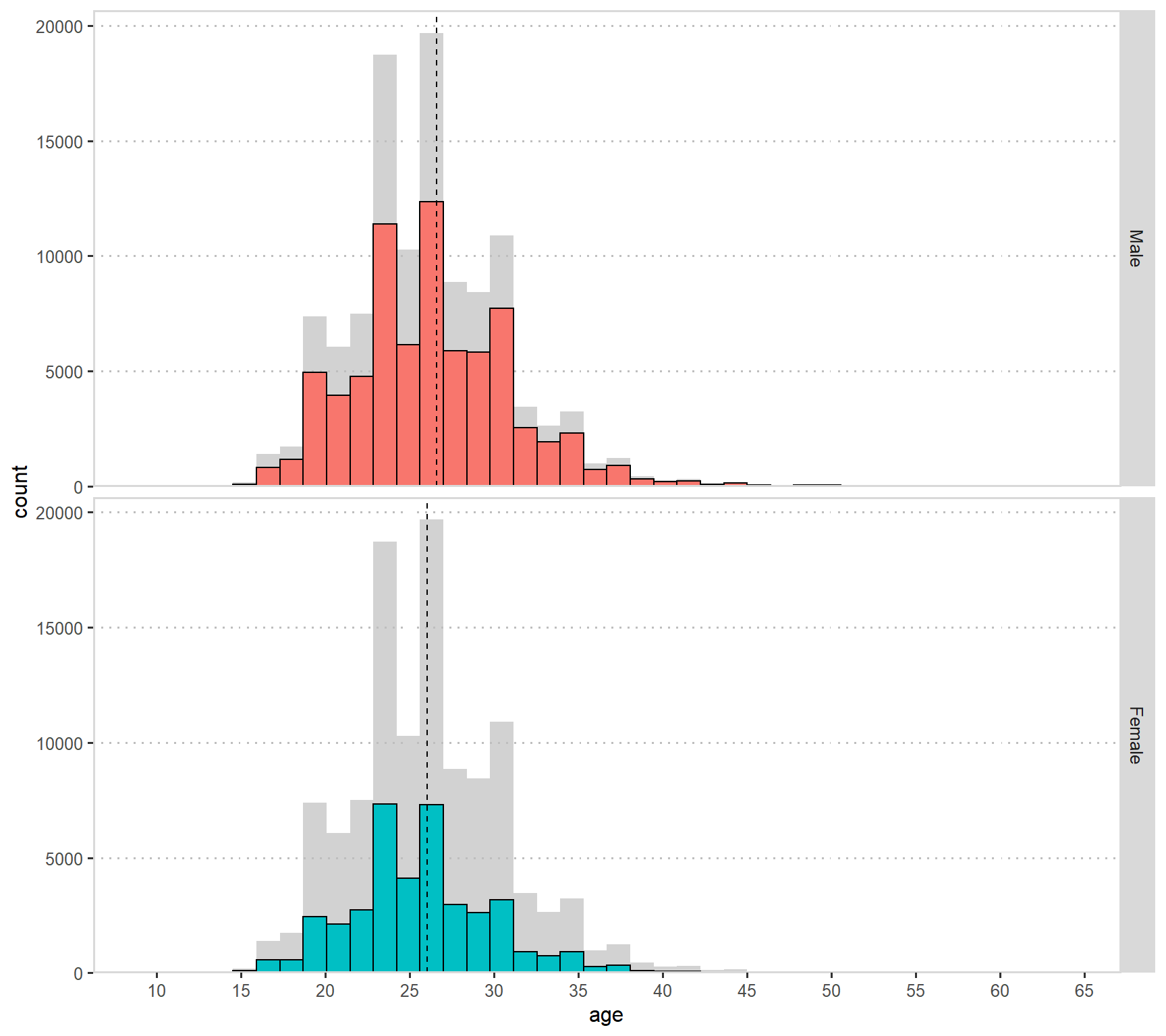
The dashed line indicates the mean age for females or males. We can see that the mean age is a little higher for males, this is due to the fact that there are nearly no females over the age of 40 while there are some males in that age.
I therefore conclude that there are more males with high age than females, and that there are a few old females in our dataset.
Age into groups
I wondered if the mean score users give increases/decreases or stay the same with older age. I therefore made eight groups with and age band of five years to investigate this hypothesis.
agedata <- users %>%
  filter(age > 9, age < 65)

agedata$age_grp <- ifelse((agedata$age>=10 | agedata$age<=19), '10-19',agedata$age_grp)
agedata$age_grp <- ifelse((agedata$age>=10 & agedata$age<=19), '10-19',agedata$age_grp)
agedata$age_grp <- ifelse((agedata$age>20 & agedata$age<=24) , '20-24',agedata$age_grp)
agedata$age_grp <- ifelse((agedata$age>25 & agedata$age<=29) , '25-29',agedata$age_grp)
agedata$age_grp <- ifelse((agedata$age>30 & agedata$age<=34) , '30-34',agedata$age_grp)
agedata$age_grp <- ifelse((agedata$age>35 & agedata$age<=39) , '35-39',agedata$age_grp)
agedata$age_grp <- ifelse((agedata$age>40 & agedata$age<=46) , '40-46',agedata$age_grp)
agedata$age_grp <- ifelse((agedata$age>55) , '47+',agedata$age_grp)
agedata$age_grp <-as.factor(agedata$age_grp)


ggplot(data = agedata, aes( x = age_grp, y = agedata$stats_mean_score, fill = age_grp)) +geom_violin(width=1.1, size=0.2, draw_quantiles =  0.5, alpha = 0.85) +
    scale_fill_viridis(discrete=TRUE) +
    theme_minimal_hgrid() +
    theme(
      legend.position="none"
) +ylim(c(4,10)) + labs(title = "Age group and mean score", x ="Age groups", y = "Mean Score") + theme(legend.position = 'none') 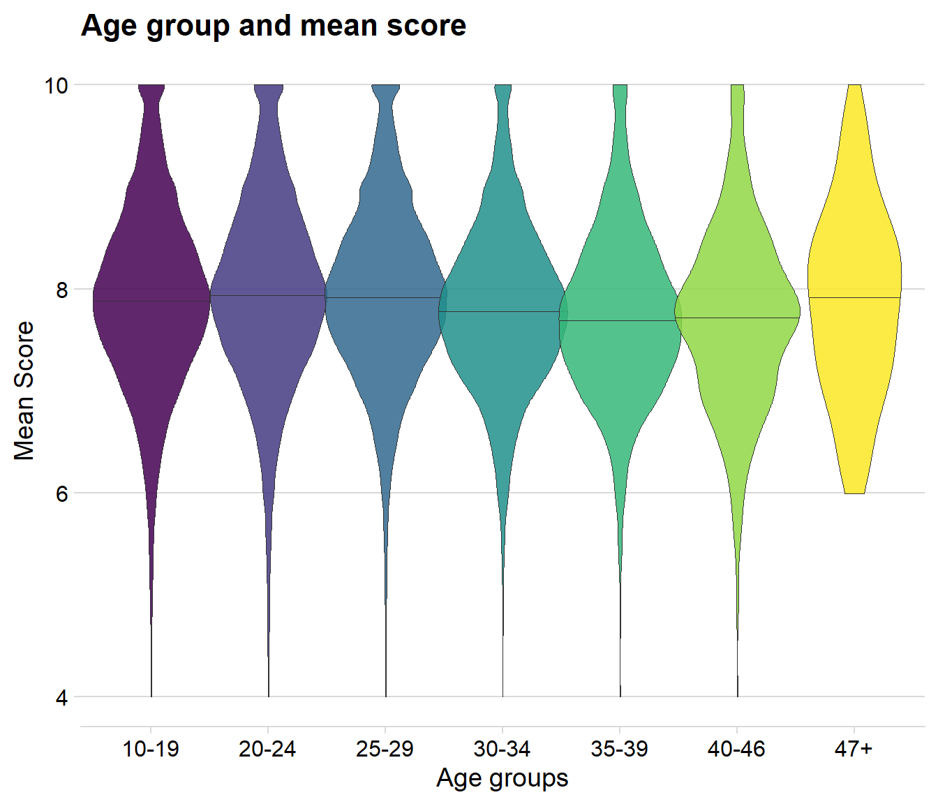
There is almost no difference at all between the age groups. One thing I could see is that the mean score does indeed seems to get a little bit lower during the age between 30 to 46, however, the change is so small that it is hard to believe that it would be statistically significant.
Time series of new users
The dataset has information of what day a user joined MyAnimeList, lets therefore create a calendar heatmap where the color indicates how many new users that joined for each day during the last three and a half year .
users$join_date <- as_date(users$join_date )

creation <- users %>%     #select every day for 2017 and 2018 and count how many new members it got for each day
  select(join_date) %>%
  filter(join_date > "2014-12-31") %>%
  group_by(join_date) %>%
  count()


creation %>%
  ggplot_calendar_heatmap('join_date','n',monthBorderSize = 1.5,monthBorderColour = "black")+
  scale_fill_viridis(option = "D")+   #change the option to change the color
  theme_minimal()+
  facet_wrap(~Year, ncol = 1,strip.position = "right")+
  theme(panel.spacing = unit(4, "lines"),
        panel.grid.minor = element_blank(),
        legend.position = "bottom")+
  labs(y='',
       fill="Daily joined members",
       title = "",
       subtitle = "",
caption = "") 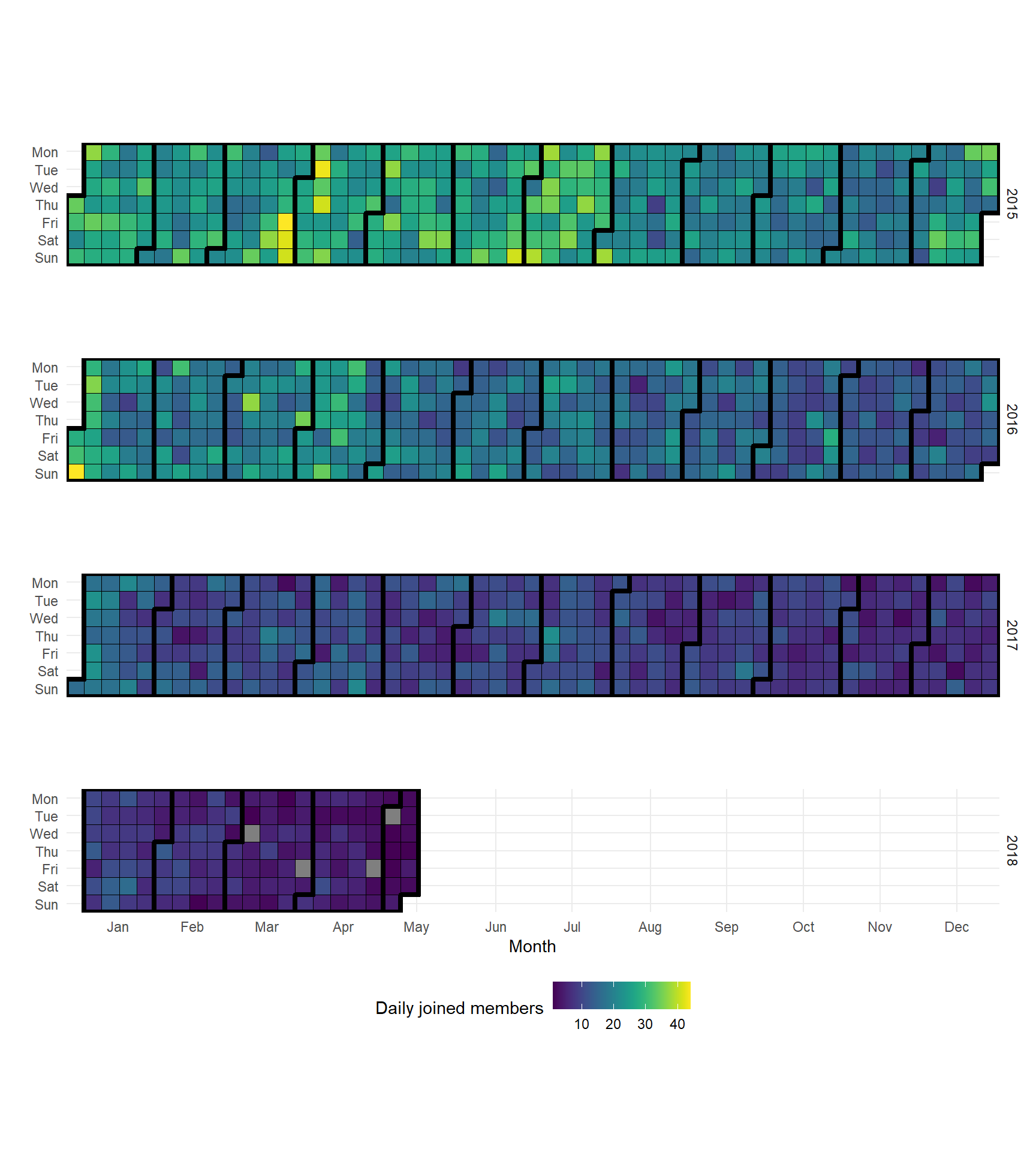
The above plot shows us that new members seems to decrease over time. There are even four days in the last year where no one joined MyAnimeList.
Further analysis of new members
Since the calendar heatmap suggest that there are not as many new users, lets investigate that hypothesis further with another graphs.
users$last_online <- as_date(users$last_online)
agedata$last_online <- as_date(agedata$last_online)
#using the base function diffttime in order to calculate the days between joined and last online
agedata$diff_in_days<- difftime(agedata$last_online ,agedata$join_date , units = c("days"))

days <- agedata %>%
  filter(diff_in_days > 0, gender != "Non-Binary")


p1<- ggplot(data = creation, aes(x = join_date, y =n)) + geom_line() + geom_smooth() + theme_minimal_hgrid()+ labs(title = "New members per day from 2015", x = "Join Date", y = "New members")


#users$birth_date <- stringr::str_extract(users$birth_date , "\\d{4}")
#users$birth_date  <- as.integer(users$birth_date)

days$year <- as.integer(stringr::str_extract(days$join_date , "\\d{4}"))

days$year <- as.integer(days$year)

p2 <- days %>%
  group_by(year) %>%
  count() %>%
  ggplot(aes(x = year, y = n)) + geom_col(fill = "#049cd8", alpha = 0.8, color = "black") + theme_minimal_hgrid() + labs(title = "New members each year", y = "new members", x = "Year") + scale_y_continuous(expand = expand_scale(mult = c(0, 0.05))) + geom_text(aes(y = , label = n), vjust = 1.3, colour = "black", size = 4)+ theme(legend.position = 'none') + theme(axis.text.x=element_text(angle=50,hjust=1, size = 9))

p1/p2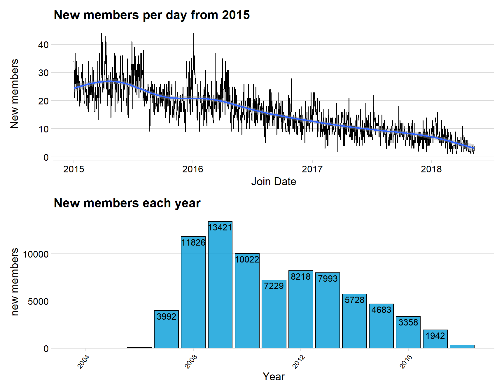
Both above graphs clearly indicate that there are fewer new members on MyAnimeList for each year, this would indicate a problem for the website if there are few people joining.
Difference between joined and last online
The data have information on when the user joined the website, but it also shows when the user was last active and haven’t logged in for a long time. It is therefore interesting to see how long people are active on the website.
I use the age groups defined earlier and gender for male and female in order to get more insight of difference of the active members.
ggplot(data = days, aes(x = diff_in_days, y = age_grp, fill = gender)) +
  stat_density_ridges( scale = 3, rel_min_height = 0.01, alpha = 0.5) +
  scale_x_continuous(expand = c(0.01, 0)) +
  scale_y_discrete(expand = c(0.01, 0)) +
  theme_ridges(font_size = 10, grid = TRUE) + ylab("") + xlab("Days")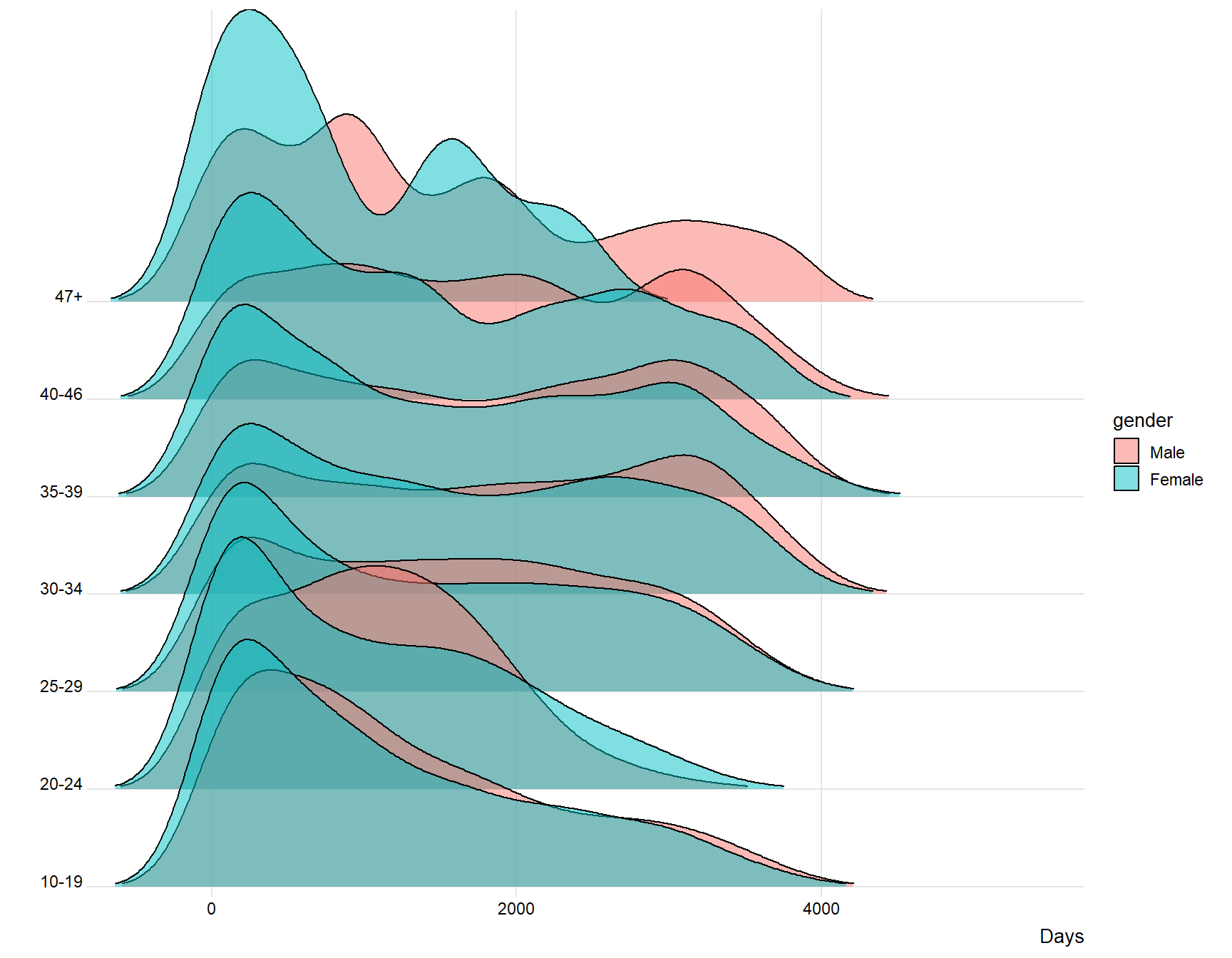
The plot above indicates for me that younger people spend less days, meaning that the time difference between joining and last active is lower for younger users compared to older users. The plot also indicates that females log of earlier than males. Younger people and females seem therefore to be the users that are the first to “log of” from the website.
Using gganimate on the same plot
I will now use the package gganimate but animate it on the years, so we will see the time between joining and logging of for each year.
ggplot(data = days, aes(x = diff_in_days, y = age_grp, fill = gender)) +
  stat_density_ridges( scale = 3, rel_min_height = 0.01, alpha = 0.5) +
  scale_x_continuous(expand = c(0.01, 0)) +
  scale_y_discrete(expand = c(0.01, 0)) +
  theme_ridges(font_size = 10, grid = TRUE) + ylab("") + xlab("Sales")+
  labs(title ='Year: {frame_time}')+
transition_time(year) 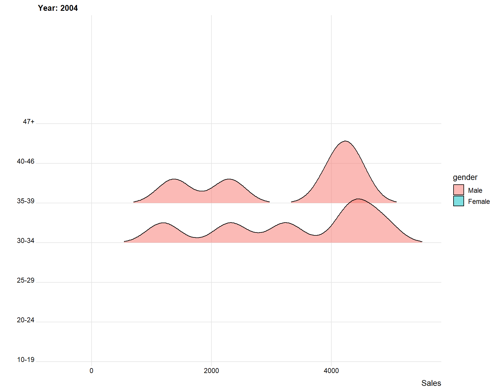
We can see that the difference shrinks for every year, this is because there is not as much time for people to log of. However, it is still clear that younger people and females or those that log of earlier.
Animate the best Animes for each year
The gganimate package is fun and fantastic to use when creating animated graphs. Let’s use this power and create a graph that shows the top 10 animes with highest scores for every year from 1990 till 2019.
topscores <- anime %>%
filter(year > 1989) %>%
arrange(desc(score)) %>%
group_by(year) %>% slice(1:10)


topscores  <- topscores  %>%
  select(year, title, score) %>%
  mutate(rank = rank(desc(score), ties.method = 'first')) #automatic rank per year, fantastic and I love it!


topscores$value <- 10

p <- topscores  %>%
ggplot(aes(x = value, y = rank, colour = title)) + geom_text(aes(label = title, ), check_overlap = T, show.legend = F, size = 4, hjust = 1) + xlim(c(4,10.1)) + theme_void() + labs(title ='Best animes for the year: {frame_time}') + transition_time(year)

animate(p, duration = 110, width = 800, height = 600)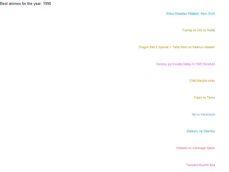
We can see a lot of different titles over the years. Some titles are connected, for example Detective Conan are on the above graph many times, that is because it is a long-time running TV-series and manga, and many movies have been released.
Word cloud over synopsis
A word cloud is a nice (but not the best) visualization tool to use in order to create a better understanding of the most occurred words. Let’s therefore use it on the synopsis for each anime and see what words that are most common.
tidy_anime <- tidy_anime[,-1]   #remove the id column


word <-   tidy_anime %>%
    unnest_tokens(word,synopsis) %>%    # split words
    anti_join(stop_words) %>%    # take out "a", "an", "the", etc.
    count(word, sort = TRUE)    # count occurrences


word$char <-nchar( word$word)

word <-  word %>%
 filter( char > 2, n > 70, n < 5000)


wordcloud2((data =  word), size = 0.7)
The words that I notice are the following:
School.
Friends.
Mother, Father, Brother, Parents, Children.
Girl and Girls
Japanese
Animated
Prince and Princess
There are a lot of different words, not as many words dedicated to anime as I would have suspected. However, school, friends and family are often themes in anime series.
This is the end of the analysis What I have learned is the following:
Anime making have been active for a long time
The most popular anime genres are Comedy, Action, Fantasy, Adventure and Drama
The website MyAnimeList doesn’t get as many new users as it has in the past
TV-anime has overall the best score between the different types
Males are more pruned to be older and be longer active on MyAnimeList
Thank you for reading,
Kind regards Per Granberg