Classifying bank customers with Log, Net and Tree
Classifying customers that open a term deposit
This data analysis will be a little different than the previous in that sense that I will now focus a little more on statistical modelling. The data in this post comes from UCI
The dataset comes from a real bank marketing campaign where the bank tried to tell the customers to open a term deposit.
I will use the package caret in order to perform the following models:
- Logistic Classification
- Neural Network
- Classification Tree
Caret is a great package because it makes so many aspects of data science simple, for example data splitting, model tuning, model comparison and changing model.
library(inspectdf)
library(caret)
library(tidyverse)
library(psych)
library(doParallel) #for parallel processing
library(cowplot)
library(ggalluvial)
library(ggridges)
library(patchwork)
library(viridis)
library(gghighlight)
library(ggpubr)
library(scales)
library(gganimate)
library(nnet)
library(pROC)
library(NeuralNetTools)
library(rpart.plot)
library(rpart)
library(skimr)

bank <- read.csv("C:/Users/GTSA - Infinity/Desktop/R analyser/bank-additional-full.csv", sep=";")
This is the first time I use the function skim in order to view the data, I usually use str() or glimpse()
skim(bank)| Name | bank |
| Number of rows | 41188 |
| Number of columns | 21 |
| _______________________ | |
| Column type frequency: | |
| factor | 11 |
| numeric | 10 |
| ________________________ | |
| Group variables | None |
Variable type: factor
| skim_variable | n_missing | complete_rate | ordered | n_unique | top_counts |
|---|---|---|---|---|---|
| job | 0 | 1 | FALSE | 12 | adm: 10422, blu: 9254, tec: 6743, ser: 3969 |
| marital | 0 | 1 | FALSE | 4 | mar: 24928, sin: 11568, div: 4612, unk: 80 |
| education | 0 | 1 | FALSE | 8 | uni: 12168, hig: 9515, bas: 6045, pro: 5243 |
| default | 0 | 1 | FALSE | 3 | no: 32588, unk: 8597, yes: 3 |
| housing | 0 | 1 | FALSE | 3 | yes: 21576, no: 18622, unk: 990 |
| loan | 0 | 1 | FALSE | 3 | no: 33950, yes: 6248, unk: 990 |
| contact | 0 | 1 | FALSE | 2 | cel: 26144, tel: 15044 |
| month | 0 | 1 | FALSE | 10 | may: 13769, jul: 7174, aug: 6178, jun: 5318 |
| day_of_week | 0 | 1 | FALSE | 5 | thu: 8623, mon: 8514, wed: 8134, tue: 8090 |
| poutcome | 0 | 1 | FALSE | 3 | non: 35563, fai: 4252, suc: 1373 |
| y | 0 | 1 | FALSE | 2 | no: 36548, yes: 4640 |
Variable type: numeric
| skim_variable | n_missing | complete_rate | mean | sd | p0 | p25 | p50 | p75 | p100 | hist |
|---|---|---|---|---|---|---|---|---|---|---|
| age | 0 | 1 | 40.02 | 10.42 | 17.00 | 32.00 | 38.00 | 47.00 | 98.00 | ▅▇▃▁▁ |
| duration | 0 | 1 | 258.29 | 259.28 | 0.00 | 102.00 | 180.00 | 319.00 | 4918.00 | ▇▁▁▁▁ |
| campaign | 0 | 1 | 2.57 | 2.77 | 1.00 | 1.00 | 2.00 | 3.00 | 56.00 | ▇▁▁▁▁ |
| pdays | 0 | 1 | 962.48 | 186.91 | 0.00 | 999.00 | 999.00 | 999.00 | 999.00 | ▁▁▁▁▇ |
| previous | 0 | 1 | 0.17 | 0.49 | 0.00 | 0.00 | 0.00 | 0.00 | 7.00 | ▇▁▁▁▁ |
| emp.var.rate | 0 | 1 | 0.08 | 1.57 | -3.40 | -1.80 | 1.10 | 1.40 | 1.40 | ▁▃▁▁▇ |
| cons.price.idx | 0 | 1 | 93.58 | 0.58 | 92.20 | 93.08 | 93.75 | 93.99 | 94.77 | ▁▆▃▇▂ |
| cons.conf.idx | 0 | 1 | -40.50 | 4.63 | -50.80 | -42.70 | -41.80 | -36.40 | -26.90 | ▅▇▁▇▁ |
| euribor3m | 0 | 1 | 3.62 | 1.73 | 0.63 | 1.34 | 4.86 | 4.96 | 5.04 | ▅▁▁▁▇ |
| nr.employed | 0 | 1 | 5167.04 | 72.25 | 4963.60 | 5099.10 | 5191.00 | 5228.10 | 5228.10 | ▁▁▃▁▇ |
We can see the data consist of 21 variables and 41 188 observations, or customers as we also can call it. There is no missing value in this dataset. A good thing about the skim function is that it creates histograms of the numerical variables.
Now I will use the package psych in order to create scatterplots and correlation of all the variables. The dataframe is to big (21 variables) so I won’t be able to plot every variable at the same time. I will therefore only split the 10 first variables and then I will also look at the 10 last variables. The response variable which we have the most interest in will be in both graphs so we can see how it correlates with the others.
bankfirst <- bank[,1:10]

bankfirst$y.yes <- bank[,21]

pairs.panels(bankfirst)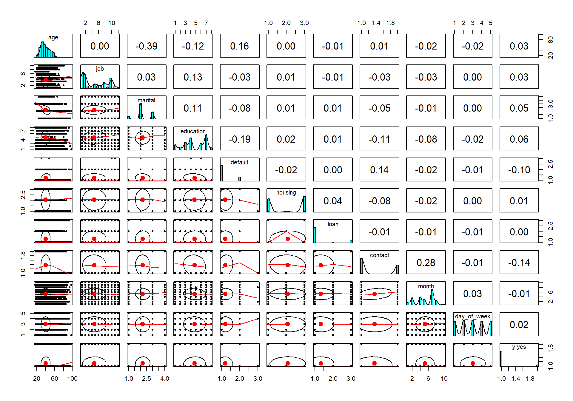
The last row in the graph is the response variable. As we can see so is there not any strong correlations at all regarding the response variable. Let us therefore investigate the rest of the variables and hope that they contain some sort of information that we can help to use when classifying.
banksecond <- bank[,11:21]

pairs.panels(banksecond)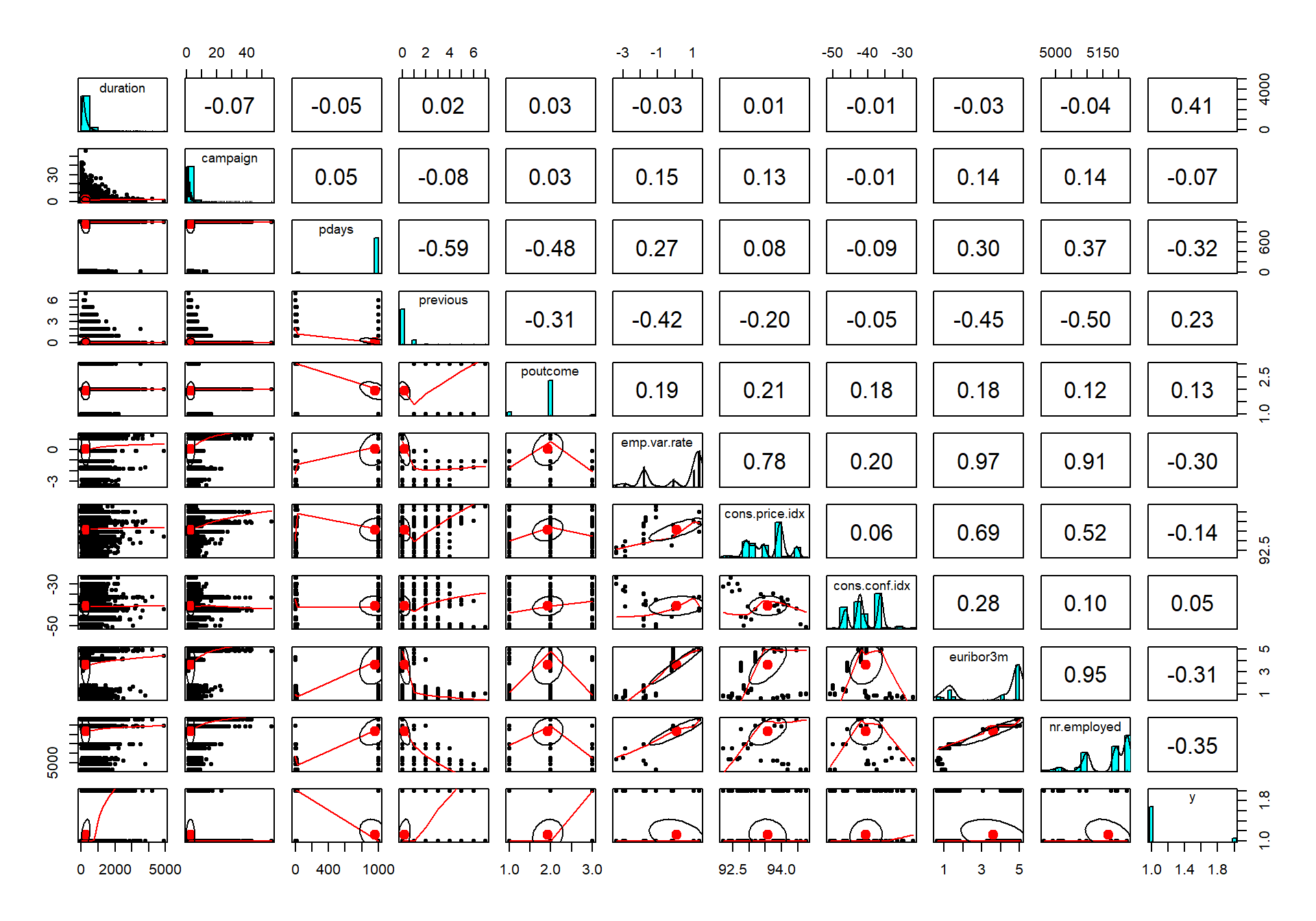
The last row is the response variable. Now we can see that there is a lite more action going on regarding the correlation, for example, the first-row duration (measures the duration of the call the bank has with the customer in seconds) has the strongest correlation of all variables.
We can also see that there are some other variables that have a correlation around 0.20 to 0.30.
Explore only the categorical variables with inspectdf
Here I will use the package inspectdf for the first time in order to show the frequency of all the categorical levels in our bank dataset.
bankcat <- bank %>%
  inspect_cat()


bankcat %>% show_plot()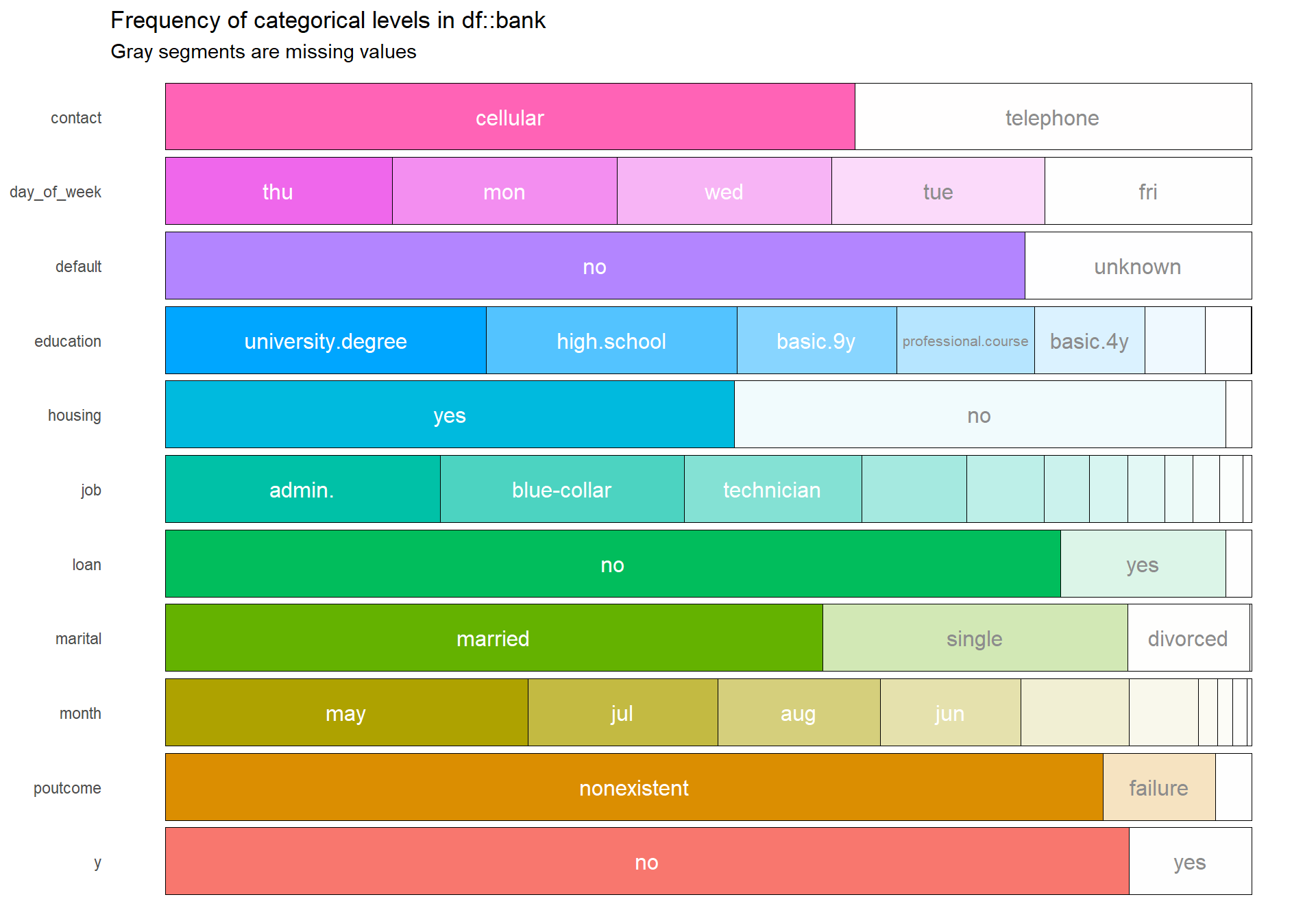
The plot above shows that some factors have multiple and even small levels which create problems since we know from the correlation plot that many variables don’t have much information concerning our response variable. The many levels will only add more computational time when conduction our models and will also make the summary of logistic model messy.
Looking at the top correlations
Here I still use the package inspectdf but now I use a function that shows the strongest correlation of all variables first.
inspect_cor(bank) %>% show_plot()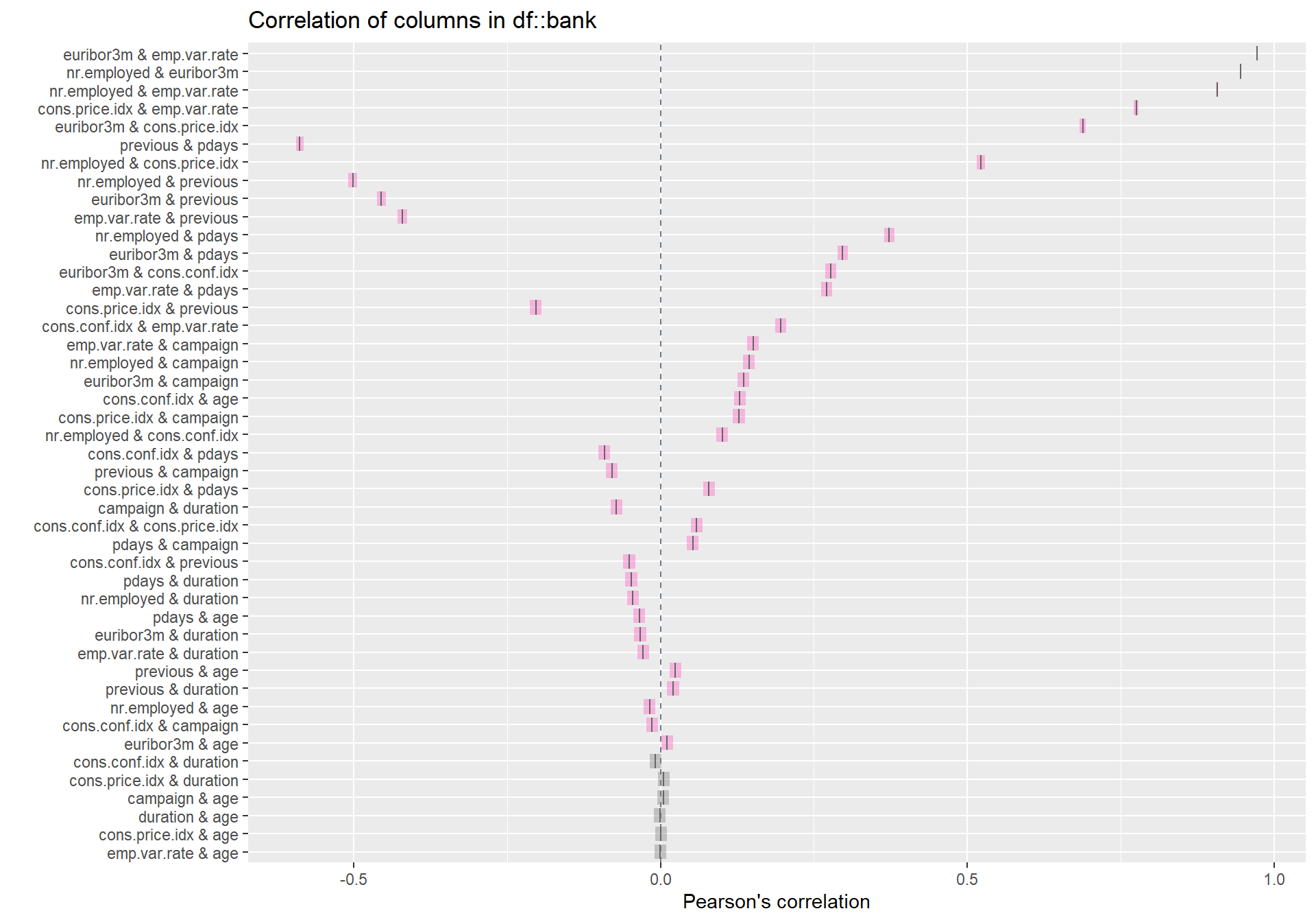
We can clearly see from the plot above that the strongest correlation amongst all the variables are between euribor3m & emp.var.rate.
Term Deposit
Now I will start to focus more on some variables, the first one being Term deposit.
bank %>%
  group_by(y)%>%
  count() %>%
  ggplot(aes(x = y, y = n, fill = y)) + geom_col(color = "black", alpha = 0.7) + theme_minimal_hgrid() + scale_y_continuous(expand = expand_scale(mult = c(0, 0.05))) + geom_text(aes(y = , label = n), vjust = 1.3, colour = "black", size = 4) + labs(title = "", x = "Term Deposit", y = "NUmber of cases")
## Warning: `expand_scale()` is deprecated; use `expansion()` instead.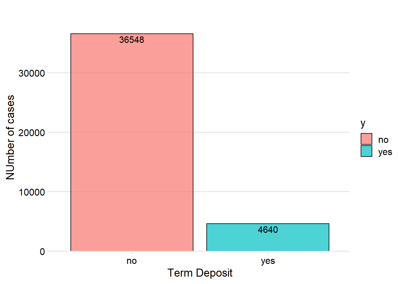
From the 41 188 customers only 4 640 wanted to open a term deposit, the rest of the customers said no. This distribution creates a problem for our classifier since the data is therefore very imbalanced, meaning that there are almost 90 % of “No” customers compared to around 10 % of “Yes” customers.
The classifier model will in that case want to classify many predictions as “No” since it will then yield a high accuracy. In order to counter this, I can use different resampling methods such as oversampling, undersampling, ROSE or SMOTE.
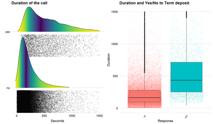
Duration of the call
We could see from the correlation plot that duration has the highest correlation with Term deposit. Let us therefore investigate this further with some graphs.
 p1 <- ggplot(data = bank, aes(x = duration, y = y, fill = 0.5 - abs(0.5-..ecdf..))) + stat_density_ridges( rel_min_height = 0.01, geom = "density_ridges_gradient", calc_ecdf = TRUE, jittered_points = TRUE, position = "raincloud",
    alpha = 0.08, scale = 0.9) +
  scale_x_continuous(expand = c(0.01, 0)) +
  scale_y_discrete(expand = c(0.01, 0))+
  scale_fill_viridis(name = "Tail probability", direction = -1) + theme(legend.position = "none") + ylab("")  + theme_minimal_hgrid() + theme(
        legend.position="none") + labs(title = "Duration of the call", x = "Seconds") + xlim(c(-20,1500))


 p2 <- ggplot(data = bank, aes(x = y, y = duration, fill = y)) + geom_jitter( alpha = 0.05, aes(color = y)) + geom_boxplot() + theme_minimal_hgrid() + theme(legend.position = 'none') + theme(axis.text.x=element_text(angle=50,hjust=1, size = 9))+
  labs(title= "Duration and Yes/No to Term deposit", x = "Response", y = "Duration") + ylim(c(0,1500))

 p1 + p2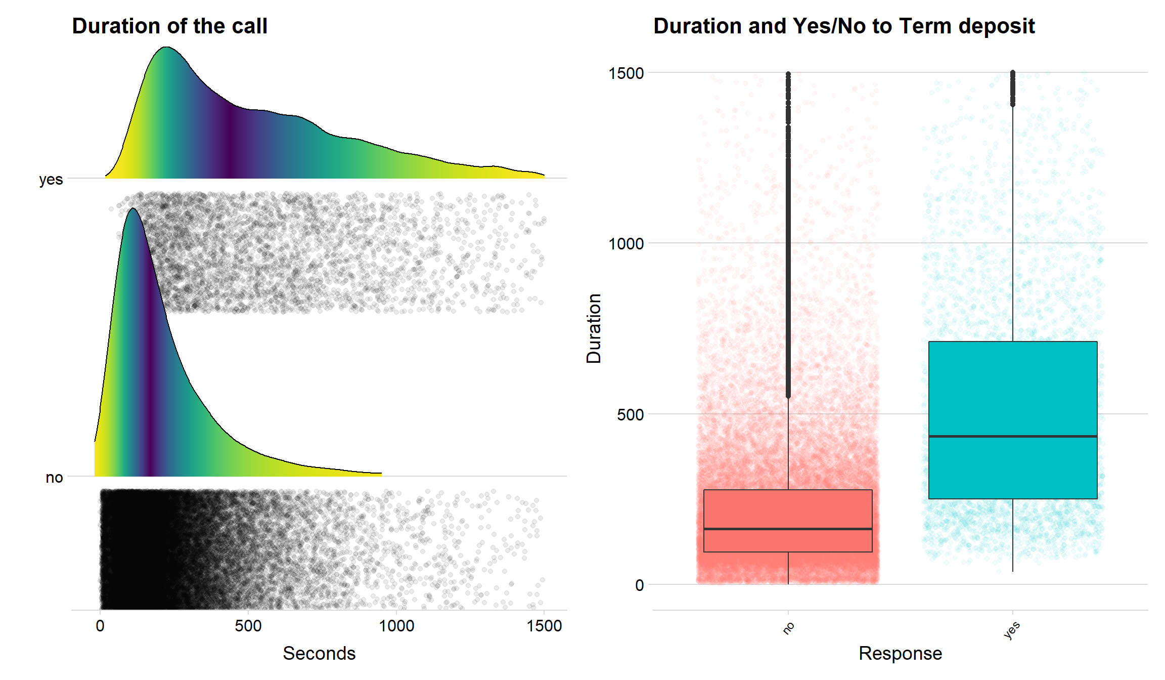
The two plots above clearly indicate that duration is a variable that can be used when predicting customers that opens a term deposit. Both the density lines the boxplots show that customers that say yes often has a longer call with the bank.
The age distribution
Let’s take a deeper look at the age distribution amongst our customers.
ggplot(data = bank, aes(x = age, fill = y)) + geom_histogram(bins = 40, color = "black")+
  gghighlight()+ theme(legend.position = 'none') + facet_grid(y ~ .,
             scales = "free_y") + scale_y_continuous(expand = expand_scale(mult = c(0, 0.05)))  + theme_pubclean()+ panel_border() + scale_x_continuous(breaks = seq(0, 100, 5)) + geom_vline(xintercept = c(30, 60),
             col = "red",
             linetype = "dashed")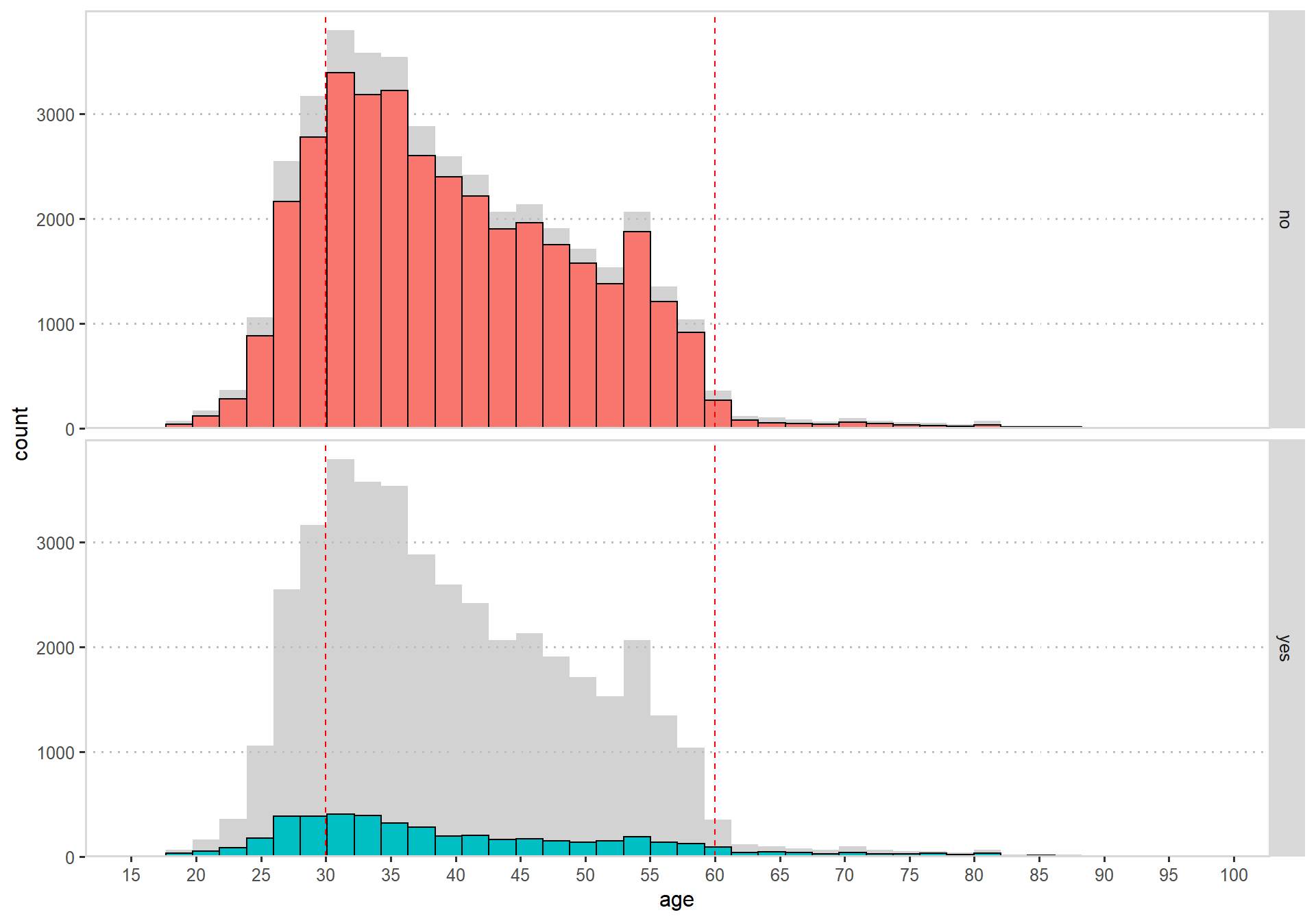
There are almost no customers that are above 60 or below 25 years old, I would therefore say that our customers are mostly middle aged with a slight skew on the younger side.
The bad thing is that there doesn’t seem to add any value considering term deposit, I can’t see any clear pattern that would tell me something.
Cell phone or by home telephone
The bank had two options when calling the customers, calling to their cell phone or by their telephone.
p1<- bank %>%
group_by(contact, y) %>%
count() %>%
ggplot(aes(x = contact, y = n,fill = y)) + geom_col(color = "black", alpha = 0.8,  position = "dodge") + theme_minimal_hgrid() + scale_y_continuous(expand = expand_scale(mult = c(0, 0.05))) + labs(title = "Contact by telephone or cellphone", x = "Contanct by", y = "Observations")+ theme(legend.position = 'none')

p2 <- bank %>%
group_by(contact, y) %>%
count() %>%
ggplot(aes(x = contact, y = n,fill = y)) + geom_col(color = "black", alpha = 0.8,  position='fill') + theme_minimal_hgrid() + scale_y_continuous(expand = expand_scale(mult = c(0, 0.05))) + labs(title = "Contact by telephone or cellphone", x = "Contanct by", y = "Observations")+ scale_y_continuous(expand = c(0, 0), label = percent)

p1 + p2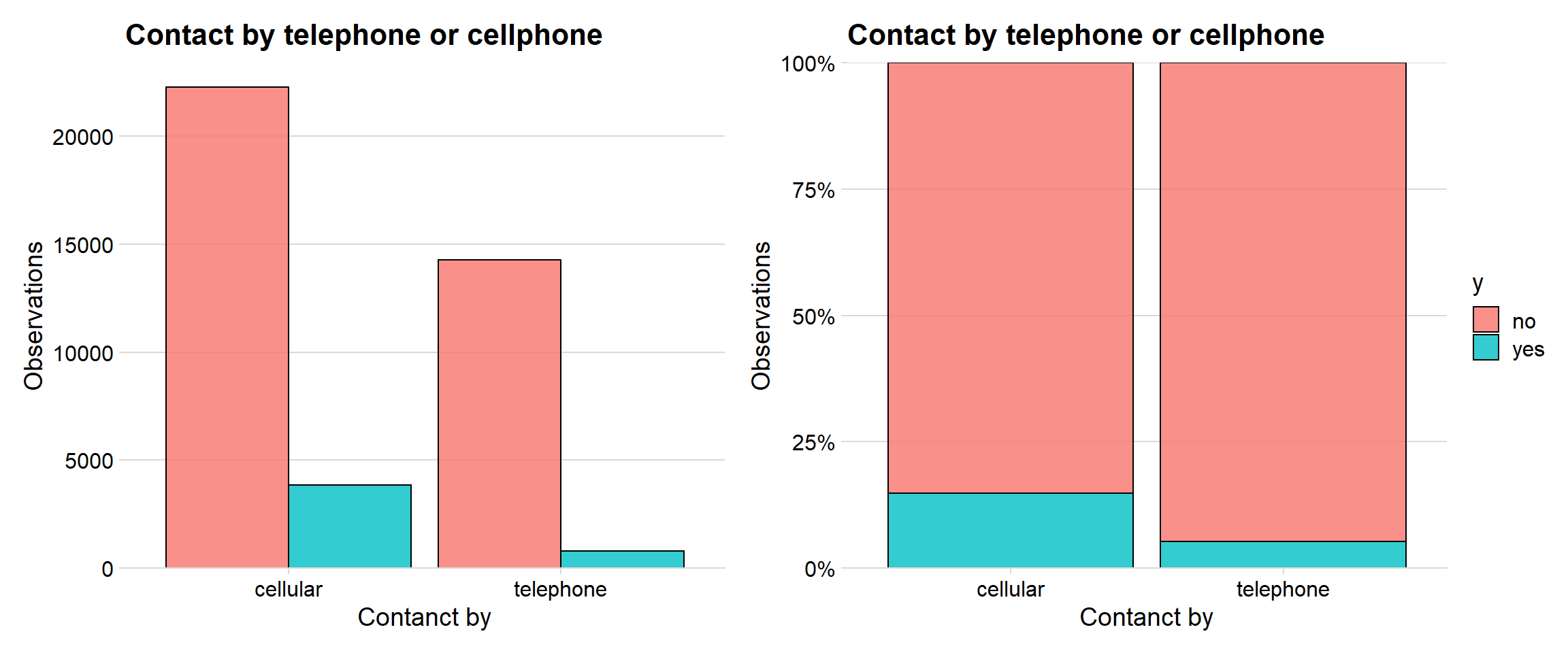
The bank called the customers most often on their cell phone. The right graph indicates that around 15 % of the customers that got called on their cell phone opened a term deposit, while it was only around 5 % when they were called on the telephone.
Job and term deposit
The Job variable is one of the factors that contaied a lot of levels and didn’t have much information concerning term deposit.
bank %>%
group_by(job, y) %>%
count() %>%
ggplot(aes(x = reorder(job, n), y = n,fill = y)) + geom_col(color = "black", alpha = 0.8) + theme_minimal_vgrid() + scale_y_continuous(expand = expand_scale(mult = c(0, 0.05))) + labs(title = "Job and accepting", x = " ", y = "Amount") + coord_flip()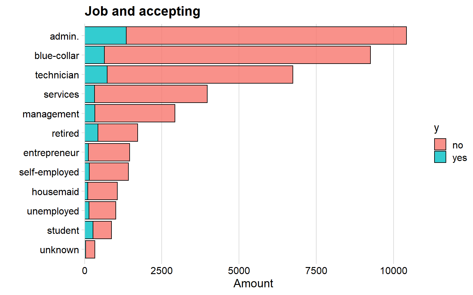
The job administrator is the most common among the banks customers and next is blue-collar. There is not so much information in the graph so let’s move on.
gganimate job, age and term deposit.
Let’s combined the variables age, job and term deposit and create an animated graph using gganimate.
p  <- ggplot(data = bank, aes(x = age, fill = y)) + geom_density(alpha = 0.8)+ theme_minimal_hgrid() + scale_y_continuous(expand = expand_scale(mult = c(0, 0.05))) + transition_states(job, transition_length = 3, state_length = 1) + labs(title = "{closest_state}") +
  enter_fade() +
  exit_shrink() +
  ease_aes('sine-in-out')


animate(p, 20, nframes = 300, fps = 30, type = "cairo")
We can see that some jobs are much more common when the age is young or old. However, the graph is good looking but don’t add any information.
Creating and Alluvium diagram
I wanted to use the alluvium plot in order to investigate how the customers “flow” in some of the factors.
#väljer ut variablerna och räknar dem
testing <- bank %>%
  count(y, loan, contact, marital) %>%
  drop_na()


testing %>%
  mutate( Loan = fct_rev(as.factor(loan)),
          Contact = fct_rev(as.factor(contact)),
          Marital = fct_rev(as.factor(marital)),
          Accepted = fct_rev(as.factor(y))) %>%
  ggplot(aes(y = n, axis1 = marital, axis2 = loan, axis3 = contact, axis4 = y)) +
  geom_alluvium(aes(fill = y), aes.bind=TRUE, width = 1/12) +
  geom_stratum(width = 1/4, fill = "white", color = "black", size = 0.8) +
  geom_text(stat = "stratum", label.strata = TRUE) +
  scale_x_discrete(limits = c("Martial status", "Loan", "Contact", "Term Deposit"),
                   expand = c(.05, .05)) +
  labs(y = "Cases") +
  theme_minimal() +
  theme(legend.position = "none") +
  ggtitle("Alluvium diagram over the bank")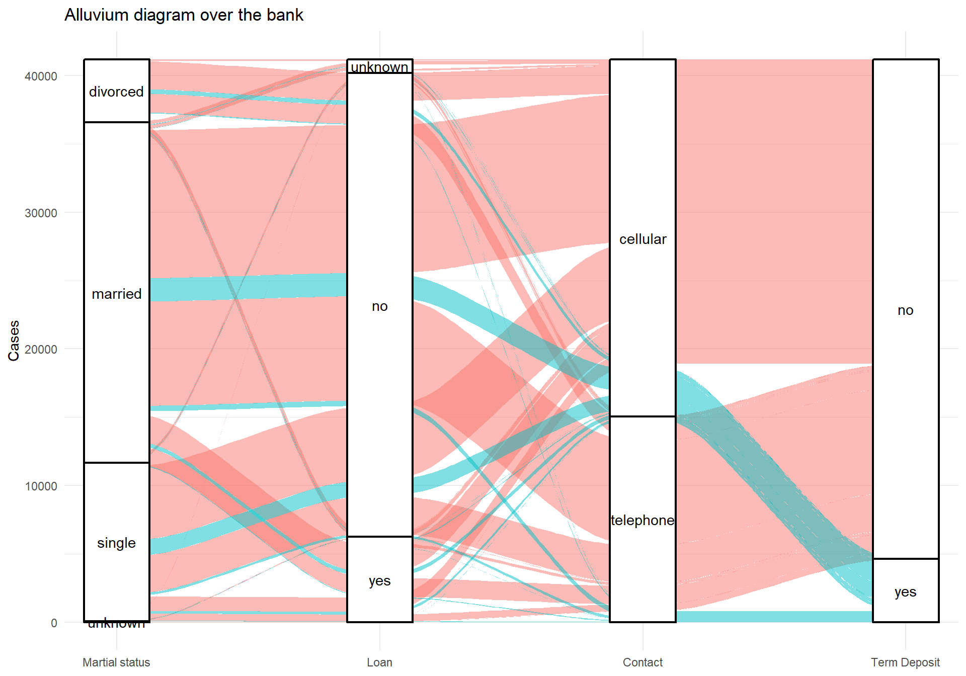
The variables in the alluvial plot are Martial Status, Loan, Contact and Term Deposit. Again, there isn’t any clear pattern in the above plot, I just wanted to make it.
Model preparation
Now I will begin my classification journey. I will be using caret and that package only allows numerical values, so I must create dummy variables of all the factors. I use the function dummyVars in caret that creates the dummy variables.
dmy <- dummyVars(" ~ .", data = bank,fullRank = T)   #Caret automatic fixes the dummy variables
train_transformed <- data.frame(predict(dmy, newdata = bank))

train_transformed$y.yes <- as.factor(train_transformed$y.yes)  # do the response variable as factor again.
The problem with transforming all the factors to dummy variables is that the data frame now consists of 54 columns. In order to lower the number of columns (because many variables doesn’t contain much information at all regarding term deposit).
I will therefore use a function in caret that ranks the best variables in the data frame.
Feature Selection
Feature Selection means that we look at each of the variables performance and how much they add to the mix. It works like backwards selection. The code is out commented because it takes a very very long time.
#Feature selection using rfe in caret
#control <- rfeControl(functions = rfFuncs,
                  # method = "repeatedcv",
                  # repeats = 3,
                  # verbose = FALSE)
#outcomeName<-'y.yes'
#predictors<-names(trainSet)[!names(trainSet) %in% outcomeName]
#Loan_Pred_Profile <- rfe(trainSet[,predictors], trainSet[,outcomeName],
                      #rfeControl = control)


# plot(Loan_Pred_Profile, type=c("g", "o"))
Selecting only the best predictors
The 15 best predictors given by the above function is seen below. I create a new data frame with only these 15 predictors and the response variable.
fewdata <- train_transformed %>% select("duration", "euribor3m", "pdays", "poutcome.success", "month.oct", "contact.telephone", "emp.var.rate", "age", "cons.conf.idx", "month.mar", "cons.price.idx", "day_of_week.wed", "poutcome.nonexistent", "campaign", "day_of_week.thu", "y.yes")Splitting the data
Now I will use the createDataPartition function from caret that splits the data frame into training and test set. The function makes sure that the proportion of the response variable stays the same.
set.seed(123)
trainIndex <- createDataPartition(fewdata$y.yes, p = .75, list = FALSE)
trainData1 <- fewdata[trainIndex,]
testData1 <- fewdata[-trainIndex,]


p1 <- trainData1 %>%
  group_by(y.yes)%>%
  count() %>%
  ggplot(aes(x = y.yes, y = n, fill = y.yes)) + geom_col(color = "black", alpha = 0.7) + theme_minimal_hgrid() + scale_y_continuous(expand = expand_scale(mult = c(0, 0.05))) + geom_text(aes(y = , label = n), vjust = 1.3, colour = "black", size = 4) + labs(title = "Train data", x = "Term Deposit", y = "Number of cases") + theme(legend.position = "none")

p2 <- testData1 %>%
  group_by(y.yes)%>%
  count() %>%
  ggplot(aes(x = y.yes, y = n, fill = y.yes)) + geom_col(color = "black", alpha = 0.7) + theme_minimal_hgrid() + scale_y_continuous(expand = expand_scale(mult = c(0, 0.05))) + geom_text(aes(y = , label = n), vjust = 1.3, colour = "black", size = 4) + labs(title = "Test data", x = "Term Deposit", y = " ")


p1 + p2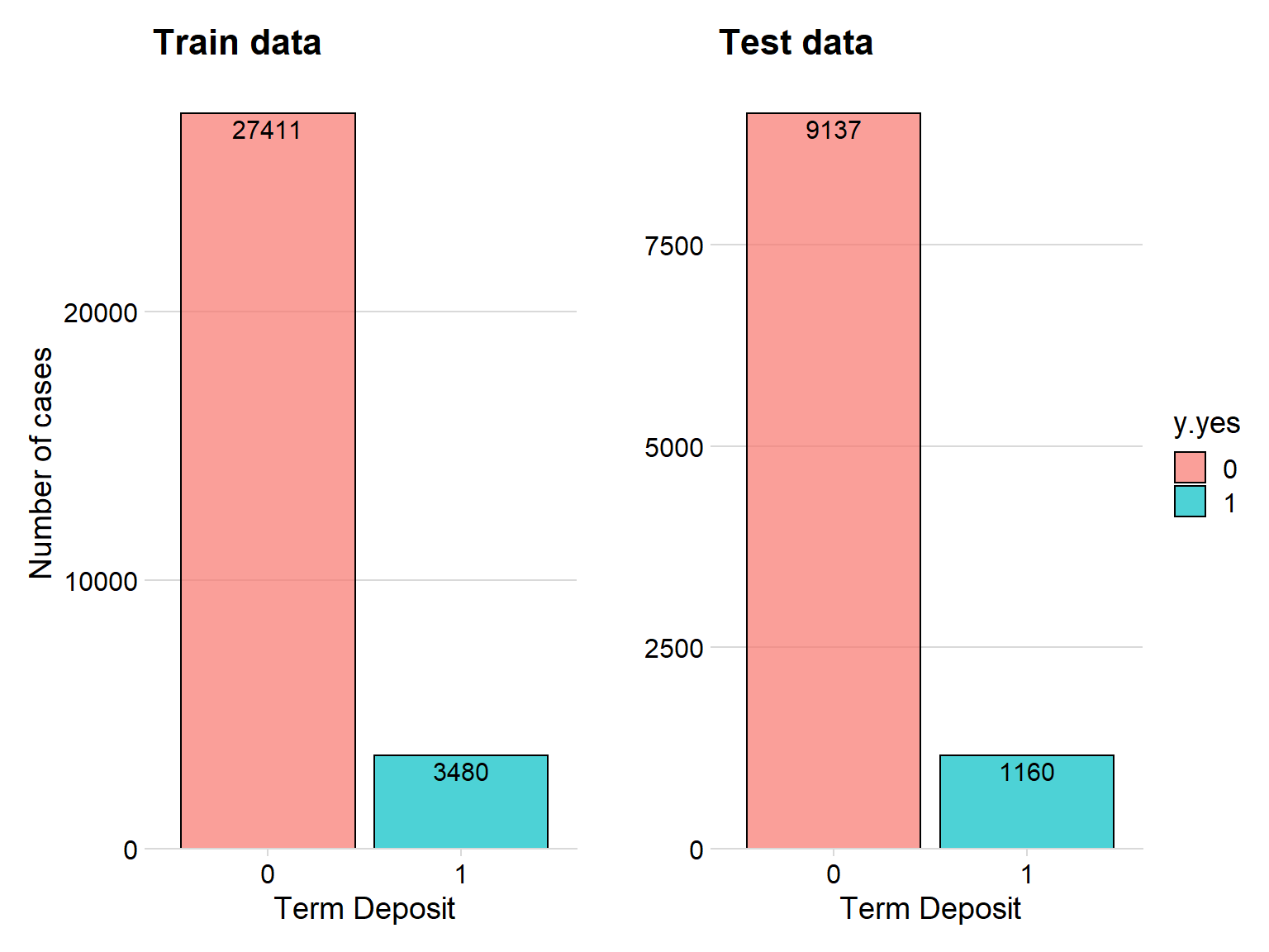
The plot above shows that the proportion of the response variable stays the same in our training and testing set thanks to the caret function createDataPartition.
Order the right levels
I want the level “Yes” to be the positive level when conduction the confusion matrix, I will therefore change the levels and attribute of the term deposit variable. Because now it is 0 for No and 1 for Yes.
testData1$y.yes   <- ifelse(testData1$y.yes == 1, "Yes","No")
testData1$y.yes <- as.factor(testData1$y.yes )

trainData1 $y.yes   <- ifelse(trainData1$y.yes == 1, "Yes","No")
trainData1 $y.yes <- as.factor(trainData1$y.yes )

trainData1$y.yes<- factor(trainData1$y.yes, levels = c("Yes", "No"))

testData1$y.yes<- factor(testData1$y.yes, levels = c("Yes", "No"))
Creating the trainControl in caret
Caret allows me to create a trainControl to use when constructing the classification model. Here I tell caret to use repeated 10-fold cross validation that repeats 5 times. Here I also tell caret to use the resampling method SMOTE in order to account for the imbalanced data considering term deposit.
ctrl <- trainControl(method="repeatedcv",   # 10fold cross validation
                     repeats=5,         # do 5 repititions of cv
                     summaryFunction=twoClassSummary,   # Use AUC to pick the best model
                     classProbs=TRUE,
                     savePredictions = "final",
                     sampling = "smote")
Logistic Classification
Here I create the logistic classification, again, the model is commented because it takes a long time. So I did the model on my computer and saved it, therefore I simply uploaded the model in this website.
#cl <- makePSOCKcluster(5)   #for parallel processing
#registerDoParallel(cl)


#log_model <- train(y.yes ~.,
              #   data = trainData1,
              #   method = "glm",
              #   family = "binomial",
              #   preProc = c("center", "scale"),
              #   metric = "Sens",
              #   tuneLength=5,
              #   trControl = ctrl)


# stopCluster(cl)   ##  <--When you are done

# saveRDS(log_model, "./log_model.rds")  # <--saving the model

# I have already performed this analysis and it would take to long to do it again in order to upload this script to the website, so I will simply upload the model sinceI have saved it.


log_model <- readRDS("C:/Users/GTSA - Infinity/Desktop/R analyser/log_model.rds")
Predict the test data
Here I will simply predict on the testdata. I won’t waste time showing summary of the model and so on in this website, this is only a quick example and not ment to be the best possibly approach.
predict <- predict(object= log_model, testData1, type='prob')
ho <- pROC::roc(ifelse(testData1[,"y.yes"] == "Yes", 1, 0), predict[[2]])

plot.roc(ho)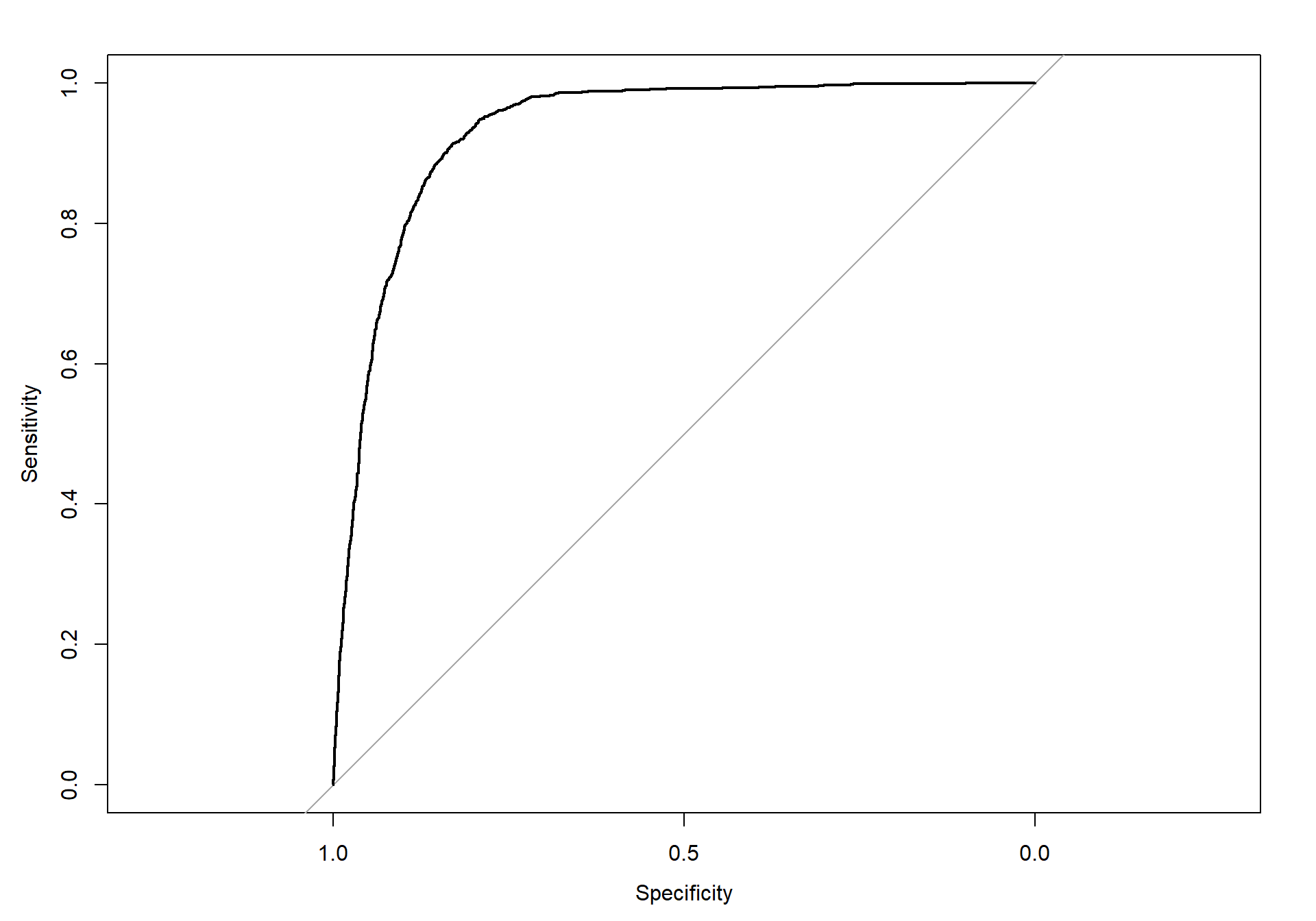
The above plot shows the predicted ROC curve. We can see that the curve is performing well.
Area under the curve
ho$auc## Area under the curve: 0.9324Here we can see that the AUC is almost 1, which is what we want.
Variable importance for Logistic
Let’s create a plot that show what variables that is the most important variables for the Logistic Model.
plot(varImp(object= log_model),main="Logistic model - Variable Importance")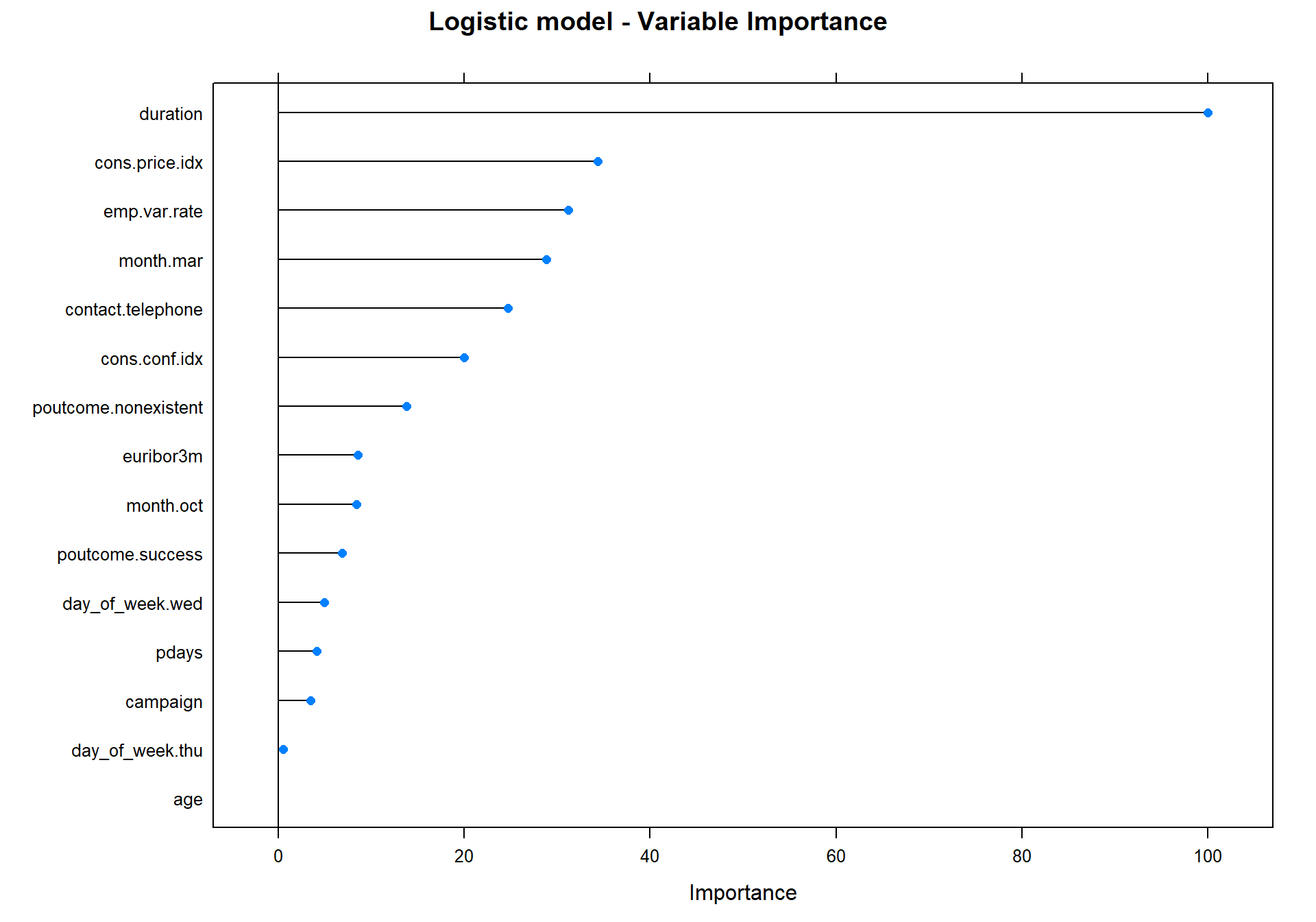
We can see that the most important variable is duration.
Draw confusion matrix function
I want to create a function that draw the confusion matrix from caret. Below is the function that i named draw_confusion_matrix.
draw_confusion_matrix <- function(cm) {

  layout(matrix(c(1,1,2)))
  par(mar=c(2,2,2,2))
  plot(c(100, 345), c(300, 450), type = "n", xlab="", ylab="", xaxt='n', yaxt='n')
  title('Confusion Matrix', cex.main=2)

  # create the matrix
  rect(150, 430, 240, 370, col='green')
  text(195, 435, 'Yes', cex=1.2)
  rect(250, 430, 340, 370, col='red')
  text(295, 435, 'No', cex=1.2)
  text(125, 370, 'Predicted', cex=1.3, srt=90, font=2)
  text(245, 450, 'Actual', cex=1.3, font=2)
  rect(150, 305, 240, 365, col='red')
  rect(250, 305, 340, 365, col='green')
  text(140, 400, 'Yes', cex=1.2, srt=90)
  text(140, 335, 'No', cex=1.2, srt=90)

  # add in the cm results
  res <- as.numeric(cm$table)
  text(195, 400, res[1], cex=1.6, font=2, col='black')
  text(195, 335, res[2], cex=1.6, font=2, col='black')
  text(295, 400, res[3], cex=1.6, font=2, col='black')
  text(295, 335, res[4], cex=1.6, font=2, col='black')

  # add in the specifics
  plot(c(100, 0), c(100, 0), type = "n", xlab="", ylab="", main = "DETAILS", xaxt='n', yaxt='n')
  text(10, 85, names(cm$byClass[1]), cex=1.2, font=2)
  text(10, 70, round(as.numeric(cm$byClass[1]), 3), cex=1.2)
  text(30, 85, names(cm$byClass[2]), cex=1.2, font=2)
  text(30, 70, round(as.numeric(cm$byClass[2]), 3), cex=1.2)
  text(50, 85, names(cm$byClass[5]), cex=1.2, font=2)
  text(50, 70, round(as.numeric(cm$byClass[5]), 3), cex=1.2)
  text(70, 85, names(cm$byClass[6]), cex=1.2, font=2)
  text(70, 70, round(as.numeric(cm$byClass[6]), 3), cex=1.2)
  text(90, 85, names(cm$byClass[7]), cex=1.2, font=2)
  text(90, 70, round(as.numeric(cm$byClass[7]), 3), cex=1.2)

  # add in the accuracy information
  text(30, 35, names(cm$overall[1]), cex=1.5, font=2)
  text(30, 20, round(as.numeric(cm$overall[1]), 3), cex=1.4)
  text(70, 35, names(cm$overall[2]), cex=1.5, font=2)
  text(70, 20, round(as.numeric(cm$overall[2]), 3), cex=1.4)
}
Here I use the above function to draw the confusion matrix for the Logistic Model.
predictions2<-predict.train(object=log_model, testData1,type="raw")


cm <- confusionMatrix(predictions2, testData1$y.yes, positive = "Yes")

draw_confusion_matrix(cm) #using the draw cm function
We can see that 946 was predictet Yes and was true, however, 214 was classified as NO while they in fact was Yes.
Neural Network
Now I will do the same thing but with a neural network.
# cl <- makePSOCKcluster(5)
# registerDoParallel(cl)


#nnet_model <- train(y.yes ~.,
               #  data = trainData1,
               #  method = "nnet",
               #  preProc = c("center", "scale"),
               #  metric = "Sens",
               #  tuneLength=5,
               #  trControl = ctrl)

## When you are done:
#stopCluster(cl)


nnet_model <- readRDS("C:/Users/GTSA - Infinity/Desktop/R analyser/nnet_model.rds")
plotnet(nnet_model$finalModel, y_names = "Term deposit")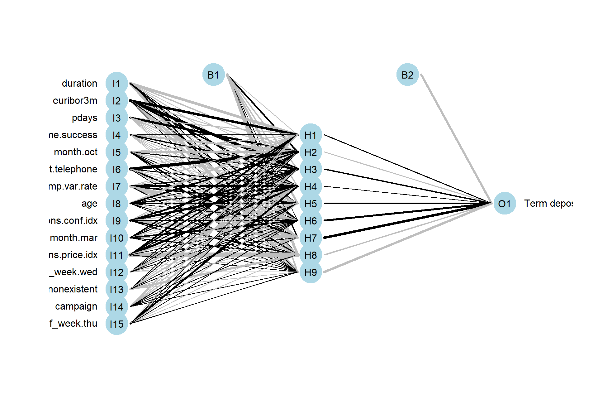
plot(varImp(object=nnet_model),main="NNET - Variable Importance")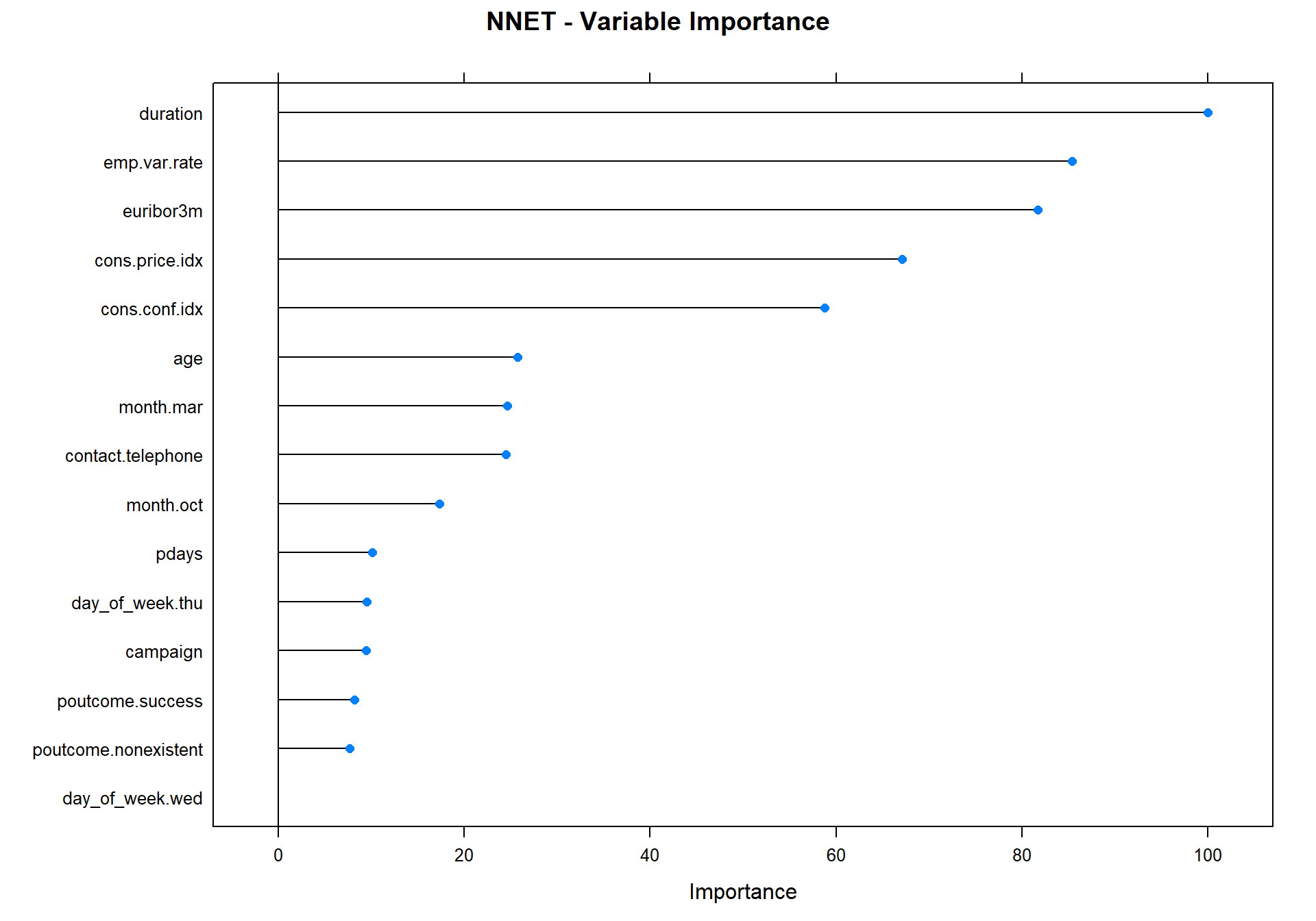
predictions2<-predict.train(object=nnet_model, testData1,type="raw")
cm <- confusionMatrix(predictions2, testData1$y.yes, positive = "Yes")
draw_confusion_matrix(cm) #using the draw cm function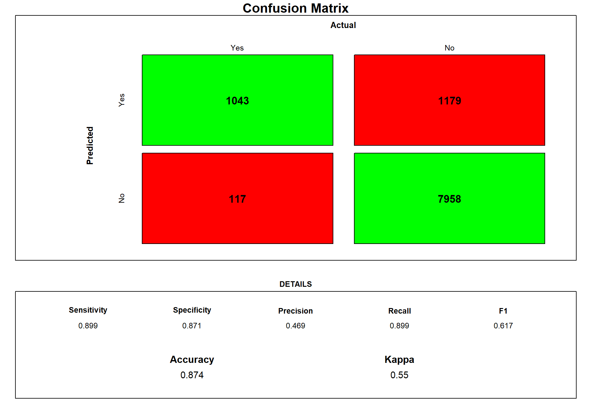
We can see that the network is a little bit better than the Logistic Model concerning predicting our yes.
Classification Tree
Now I create a classification tree.
#rpart_model <- train(y.yes ~.,
   #                data = trainData1,
   #                method = "rpart",
   #                preProc = c("center", "scale"),
   #                metric = "ROC",
   #                tuneLength=5,
   #                trControl = ctrl)

## When you are done:
#stopCluster(cl)


rpart_model <- readRDS("C:/Users/GTSA - Infinity/Desktop/R analyser/rpart_model.rds")

rpart.plot(rpart_model$finalModel)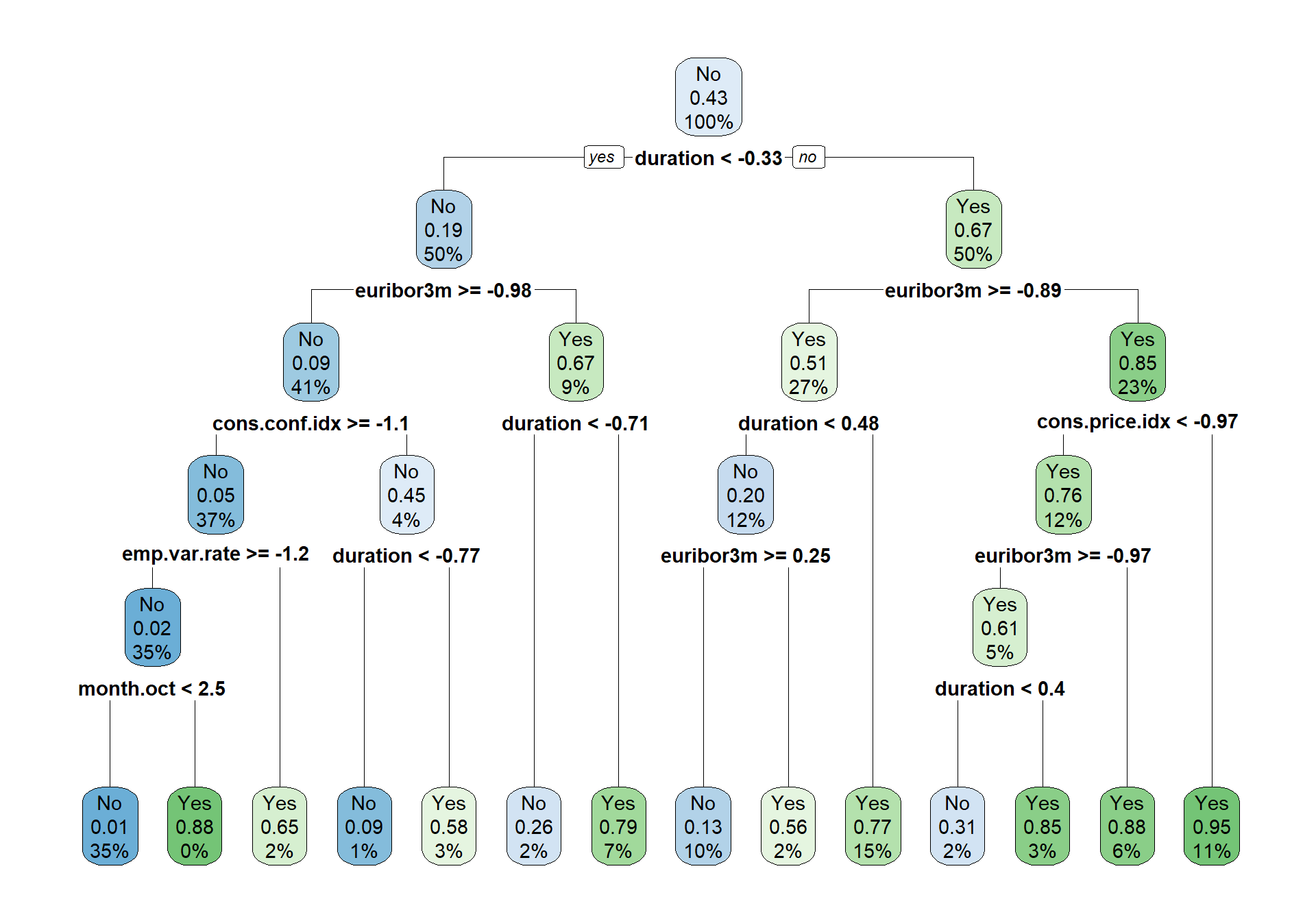
We can see from the tree plot above that the only variable used in the tree is duration, mont.oct, emp.var.rate, cons.conf.idx and euribor3m.
predictions2<-predict.train(object=rpart_model, testData1,type="raw")
cm <- confusionMatrix(predictions2, testData1$y.yes, positive = "Yes")
draw_confusion_matrix(cm) #using the draw cm function
We can see that the classification tree predicts the most true positive, but it predicts to many so many predictions are in fact No.
Comparing the models
I will use a plot that shows the sensitivity and ROC for each model during the cross-validation in caret.
rValues <- resamples(list(rpart_model, nnet_model, log_model))

bwplot(rValues,metric=c("Sens", "ROC"),ylab =c( "Tree", "Net", "Logistic")) 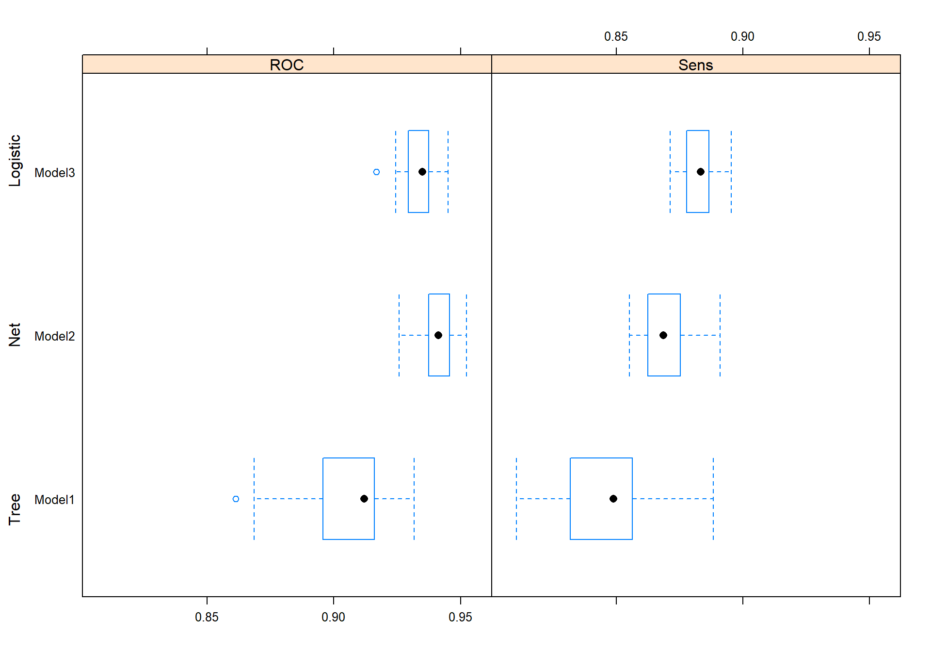
We can see that the Logistic classification model has the best sensitivity in the caret cross-validation. However, the network predicted the best on the test data. I would still use the logistic classification in production because it gives a lot more valuable information of the variables and how the model thinks and is also much faster than the network.
That’s all I had to say. This was a short post just showing some classification method. There is a lot more I could have done better, for example transforming some variable to factor and so on. But this is just a small test.