Web scraping Lund University student papers - ongoing project

Web scraping Lund University for the student papers.
Lund University has this website: Student Papers. I used R with packages such as Rvest to gather the data and Rselium to loop trough some of the webpages. I had to first collect the ID of every student paper and then create two loops for downloading the data. The first loop downloaded a dataframe that consist of data such as Author Names, Faculty, Department, title of the paper, Language, Year it was pubslihed and so on.
The second loop downloaded information such as how many times the paper has been downloaded, by which country and so on.
I will post all the code of the actual web scraping; however, it is quite messy at the moment so it will take some time.
This post will just focus on some of the results. This is just a start and is not at all near finished, there is still a lot more plots I need to make!
I haven’t been writing much text or insights regarding the plots since this is just a prototype.
#if (!knitr::is_latex_output()) {
#  knitr::opts_chunk$set(dpi = 300, dev.args = list(type = "cairo"))
#}
library(plotly)
library(ggplot2)
library(tidyverse)
library(scales)
library(psych)
library(ggforce)
library(ggalt)
library(patchwork)
library(GGally)
library(ggridges)
library(gganimate)
library(naniar) #check for missing values
library(dplyr)
library(scales)
library(data.table)
library(viridis)
library(ggpubr)
library(ggalluvial)
library(Hmisc)
library(reshape2) #Melt function
library(tibble)
library(ggiraphExtra)
library(treemapify)
library(ggExtra)
library(gghighlight)
library(ggfortify)
library(arules)
library(rayshader)
library(forcats)
library(caret)
library(forcats)
library(ggstance)
library(stringi)
library(gmodels)
library(CGPfunctions) #For slophe graph
library(tm)
library(SnowballC)
library(wordcloud)
library(RColorBrewer)
library(lubridate)
library(arules)
library(ggTimeSeries)
library(ggeconodist) #install by devtools::install_github("hrbrmstr/ggeconodist")
library(hrbrthemes)
library(superheat)
library(d3heatmap)
library(cowplot)
library(viridis)
library(ggpointdensity)
library(dygraphs)
library(wordcloud2)
library(tidytext)
library(Cairo)
library(networkD3)
library(tidyverse)
library(widgetframe)
library(igraph)
library(ggrepel)
library(ggraph)
library(hrbrthemes)
library(extrafont)
library(textdata)Load the data
dataclean <-  read.csv("C:/Users/GTSA - Infinity/Desktop/R analyser/nyadataclean.csv", comment.char="#")

dataclean$numauthors <- as.character(dataclean$numauthors)

dataclean$Abstract <- as.character(dataclean$Abstract)
Number of thesis across the years
One of the first question that we can deduce from the data is; are the amount of student papers rising, declining or on the same level for every year? The students at Swedish University schools as increased for several years, so it would be expected that the papers are also increasing.
#dataclean$Year <- as_date(dataclean$Year)

library(extrafont)
loadfonts(device = "win")

dataclean %>%
  group_by(Year) %>%
  count() %>%
  ggplot(aes(x = Year, y = n)) + geom_line(size = 0.5, color = "#0072B2") +
  geom_point(color = "white", fill = "#0072B2", shape = 21, size = 2) +
  theme_minimal_grid() + labs(title = "Number of published student papers for each year", x = "Year", y = "Published papers") + xlim(c(1990,2018)) +  theme(text=element_text(size=16,  family="Garamond", color="#9c6114"))+
 theme(plot.title=element_text(size=17,
                                    #face="bold",
                                    family="Garamond",
                                    color="#9c6114",
                                    #hjust=0.5,
lineheight=1.2)) 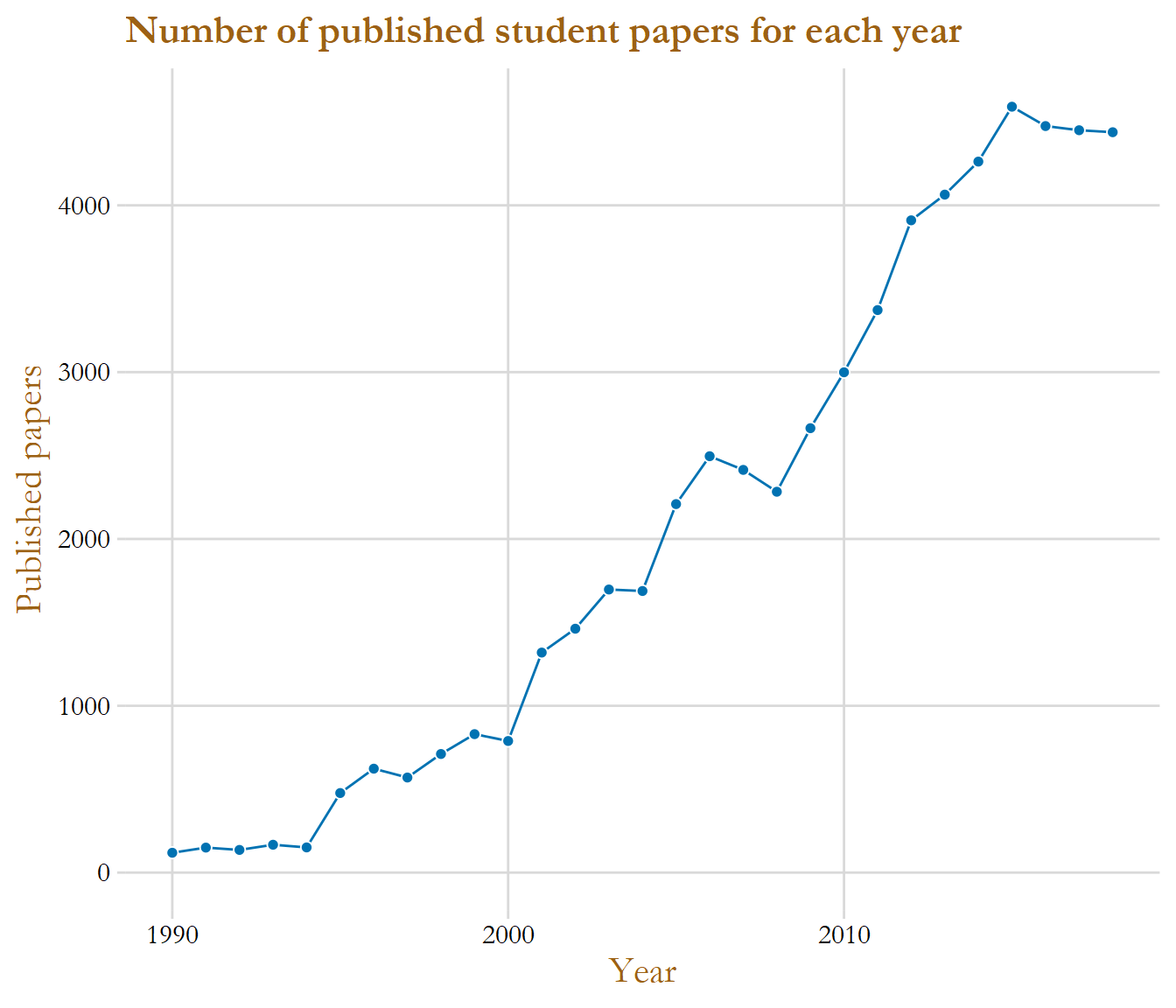
The graph above give the insight that the number of student papers have increased for almost every year, the sharpest rise started around the year 2008 and lasted to 2015. The yearly amount of papers seems to have been stabilized in the recent years with around 4 500 papers published.
dataclean$Department <- as.character(dataclean$Department)


#This show top 9
dataclean %>%
  group_by(Faculties) %>%
  filter(!is.na(Faculties)) %>%
  summarise(total_count = n()) %>%
  ggplot(aes(x = reorder(Faculties, -total_count), y = total_count)) + geom_col(color = "black", fill = "#049cd8", alpha = 0.8) + theme_minimal_hgrid() +  labs(title = "Student Papers made in Faculties",x = " ", y = "Total papers made") + scale_y_continuous(expand = expand_scale(mult = c(0, 0.05))) + geom_text(aes(y = total_count, label = total_count), vjust = 1.4, colour = "black")+  theme(text=element_text(size=18,  family="Garamond"))+
 theme(plot.title=element_text(size=17,
                                    #face="bold",
                                    family="Garamond",
                                    color="#9c6114",
                                    #hjust=0.5,
                                    lineheight=1.2))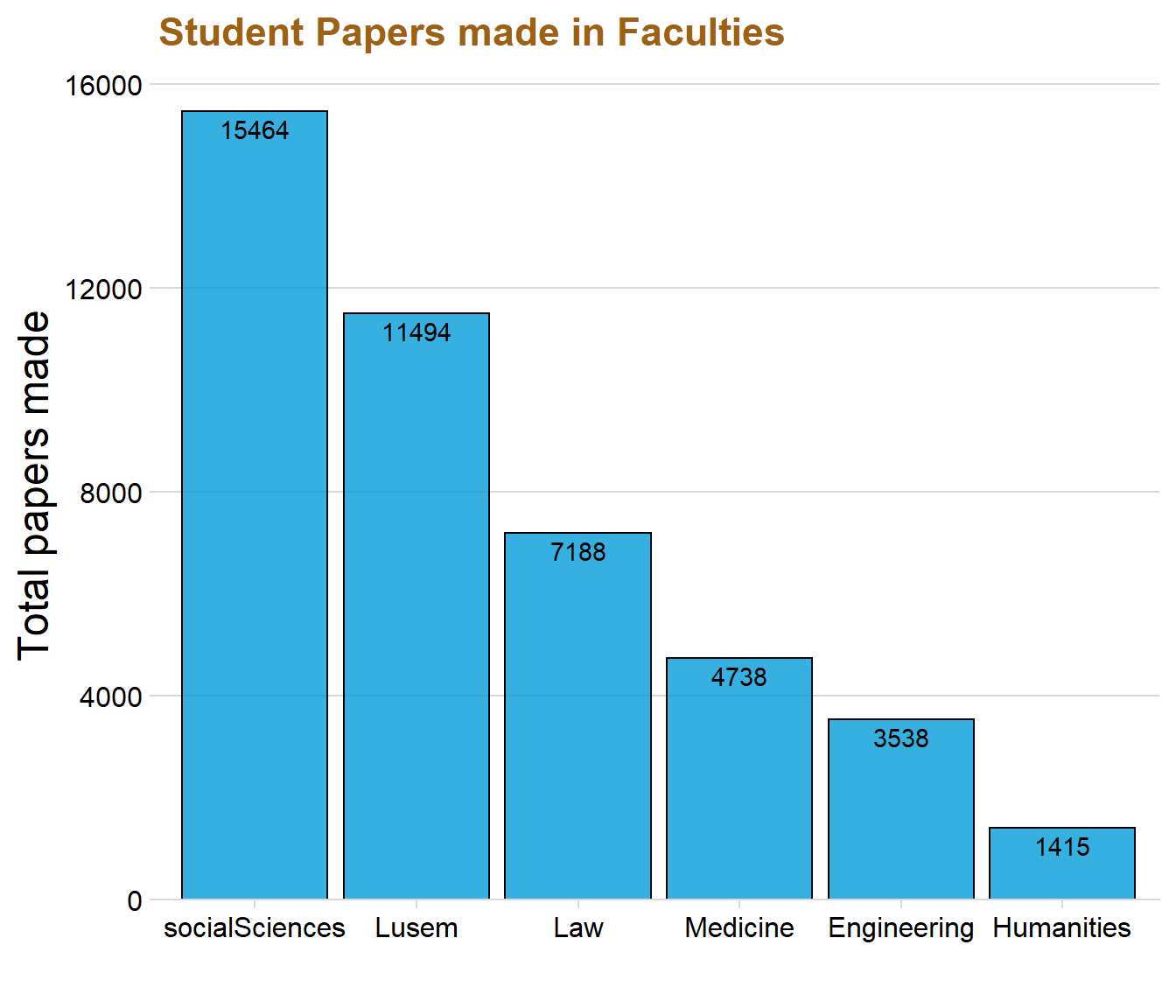
We can tell from the graph that Social Science and Lusem are the two faculties that have produced the most student papers. The faculties Engineering and Humanities are instead at the bottom, producing around 5 000 student papers in total. The variable “Course” creates a little bit of insight to why Social Sciences and Lusem might be the best producing faculties concerning the amount of papers. These two faculties are namely also the ones that have most courses.
# This only show the top 3
dataclean %>%
filter(str_detect(dataclean$Type, "Master|Bachelor")) %>%
group_by(Type) %>%
summarise(total_count = n()) %>%
ggplot(aes(x = reorder(Type, -total_count), y = total_count)) + geom_col(fill = "#049cd8", alpha = 0.7, color = "black")+ scale_y_continuous(expand = expand_scale(mult = c(0, 0.05))) + theme_minimal_hgrid() +  labs(title = "Amount of papers made in each Degree type",x = "", y = "") + geom_text(aes(y = total_count, label = total_count), vjust = 1.4, colour = "black") + theme(text=element_text(size=16,  family="Garamond"))+
 theme(plot.title=element_text(size=17,
                                    #face="bold",
                                    family="Garamond",
                                    color="#9c6114",
                                    #hjust=0.5,
                                    lineheight=1.2))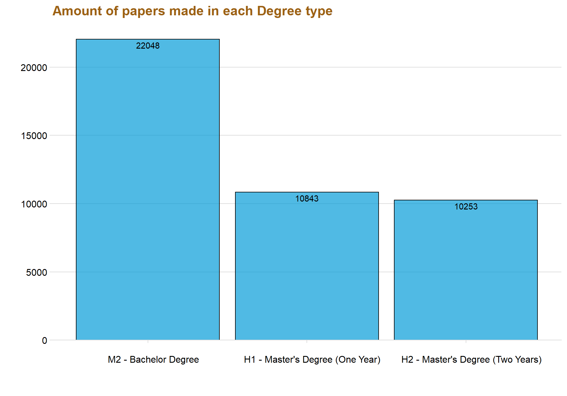
gg_miss_upset(dataclean)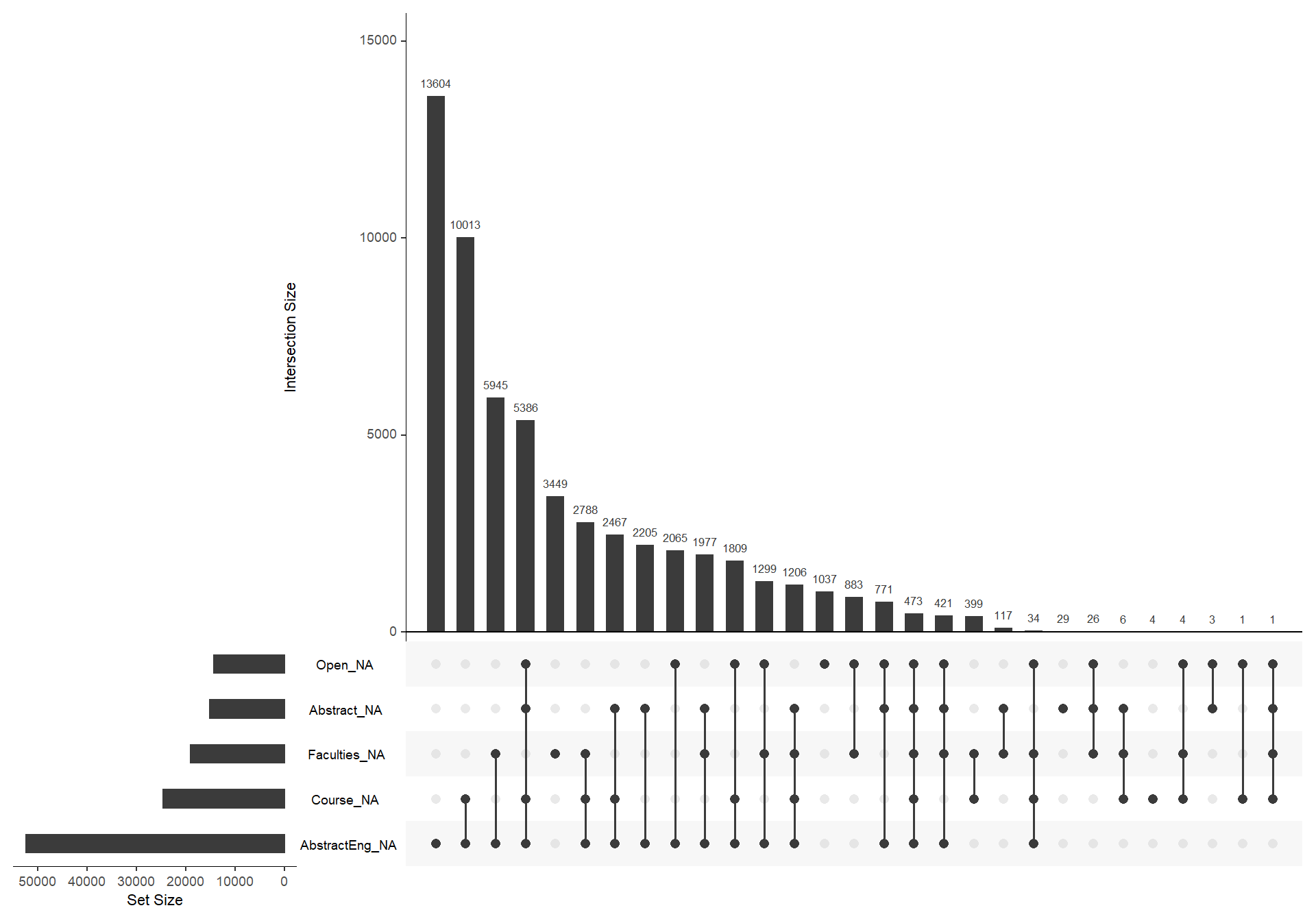
vis_miss(dataclean, warn_large_data = FALSE)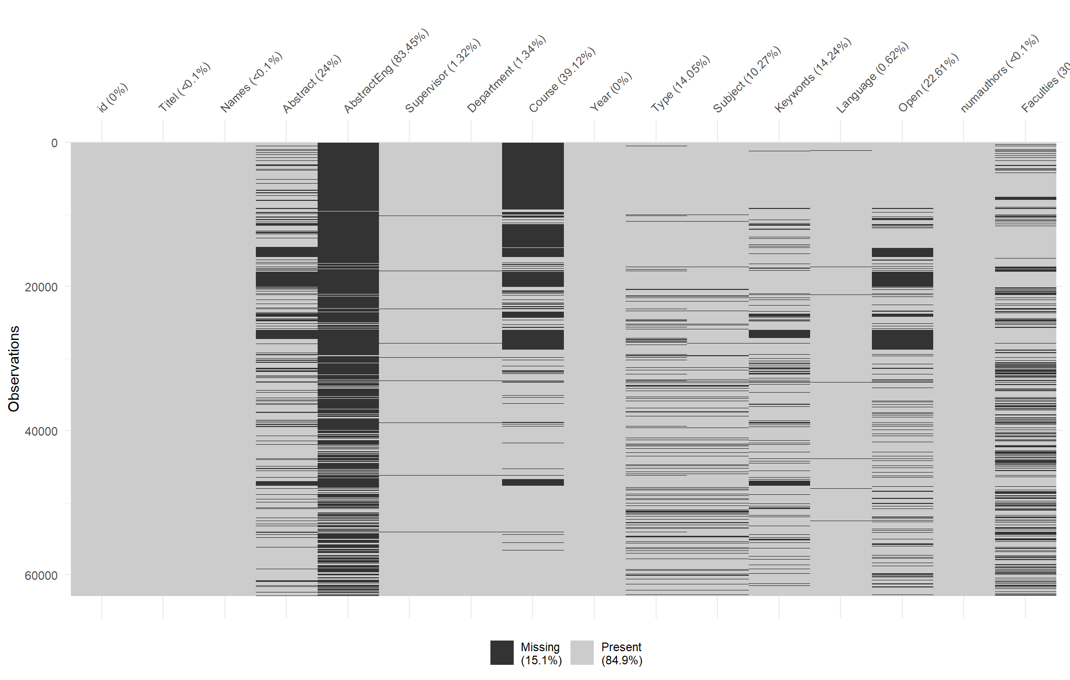
Here we can see that a total of 14 percent of our observations are missing. The variable “AbstractEng” have the highest score of missing observations with 84 percent, indicating that most students that write in Swedish doesn’t add an English abstract.
The graph is ordered by year, meaning that the newest papers are at the top and the older papers are below. Age is clearly a factor when viewing the missing observations of the variable “Course”, we can see that there are not many observations at the upper half of the graph (newer papers) but almost every observation on the lower half (older papers) are missing.
dataclean %>%
  group_by(Type) %>%
  filter(!is.na(Type)) %>%
  summarise(total_count = n()) %>%
  top_n(9) %>%
  ggplot(aes(x = reorder(Type, total_count), y = total_count)) + geom_col(fill = "#049cd8", alpha = 0.7, color = "black") + coord_flip() + theme_minimal_vgrid() +  labs(title = "All Degree types",x = "", y = "Amount of papers") + geom_text(aes(y = total_count, label = total_count), hjust = -.0, colour = "black") + theme(text=element_text(size=16,  family="Garamond"))+
 theme(plot.title=element_text(size=17,
                                    #face="bold",
                                    family="Garamond",
                                    color="#9c6114",
                                    #hjust=0.5,
                                    lineheight=1.2))+ scale_y_continuous(expand = expand_scale(mult = c(0, 0.05)))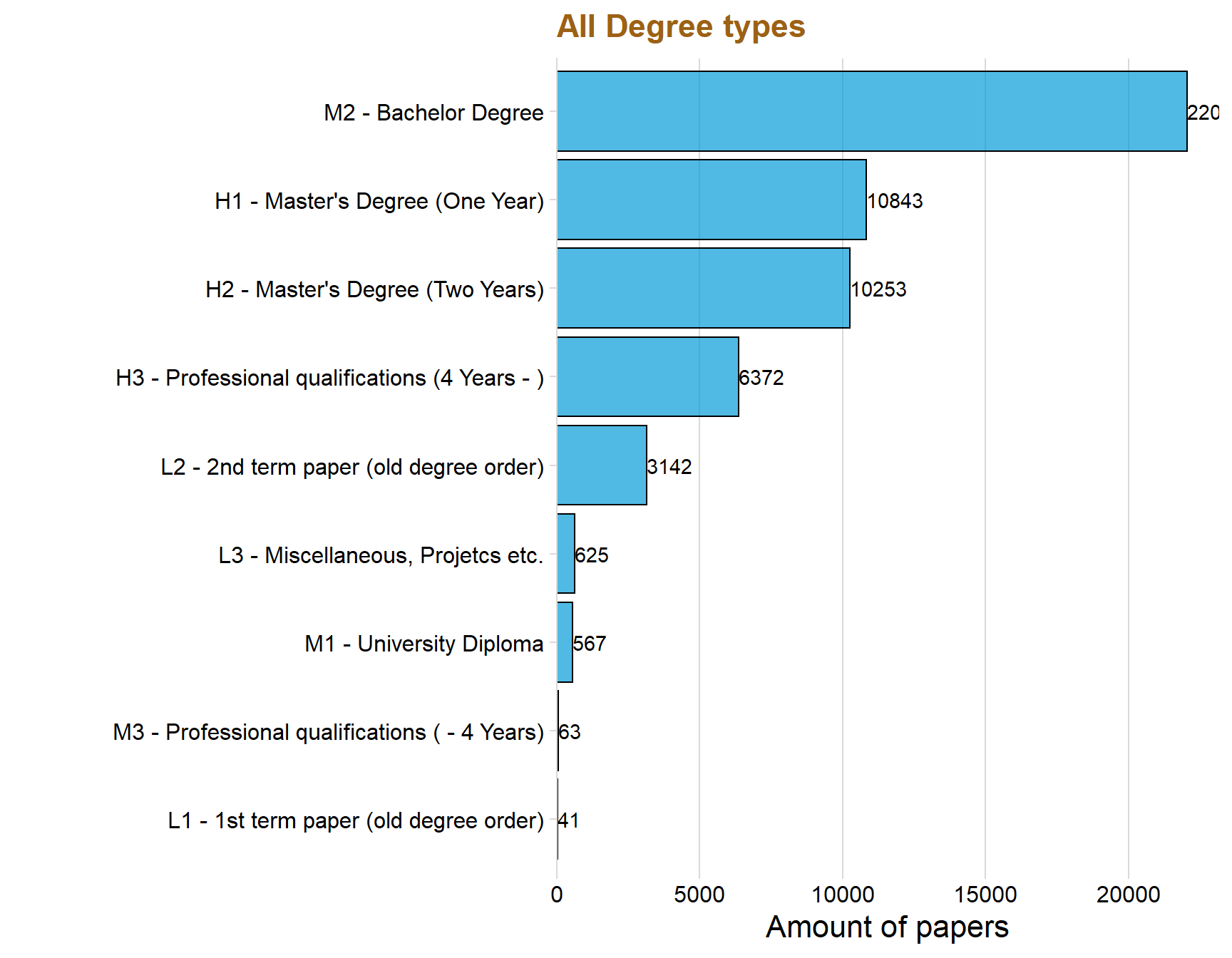
Type of paper across the years
The variable “Type” consists of data that tells if the paper is at a bachelor, master (one year) or master (two years) level. The data have more Types but this thesis will only focus on the three mentioned above since they are the most common.
p1 <- dataclean %>%
  filter(str_detect(dataclean$Type, "Master|Bachelor")) %>%
  group_by(Type, Year) %>%
  count() %>%
  ggplot(aes(x = Year, y = n, color = Type, fill = Type)) +  geom_line(size = 0.5) +
  geom_point( color = "white", shape = 21, size = 2) +
  theme_minimal_grid()  + labs(title = "Paper type over the years", y = "", c = "Year") + xlim(c(1990,2018))+ theme(text=element_text(size=12,  family="Garamond"))+
 theme(plot.title=element_text(size=17,
                                    #face="bold",
                                    family="Garamond",
                                    color="#9c6114",
                                    #hjust=0.5,
                                    lineheight=1.2)) + theme(
    legend.position = "bottom",
    legend.justification = "left",
    legend.direction = "horizontal",
    legend.box = "horizontal", legend.background = element_blank(),axis.text=element_text(size= 9))


p2 <- dataclean %>%
  filter(str_detect(dataclean$Type, "Master|Bachelor")) %>%
  group_by(Type, Year) %>%
  count() %>%
  ggplot(aes(x = Year, y = n, fill = Type)) + geom_area( position='fill', alpha = 0.8) + scale_y_continuous(expand = c(0, 0), label = percent)+theme_minimal_hgrid() +  theme(
    legend.position = "bottom",
    legend.justification = "left",
    legend.direction = "horizontal",
    legend.box = "horizontal", legend.background = element_blank(),axis.text=element_text(size= 9)) + labs(title = "Change in typer over the years", x = "Year", y = "Type in %")+ xlim(c(1990,2018)) + theme(text=element_text(size=16,  family="Garamond"))+
 theme(plot.title=element_text(size=17,
                                    #face="bold",
                                    family="Garamond",
                                    color="#9c6114",
                                    #hjust=0.5,
                                    lineheight=1.2))


p1 / p2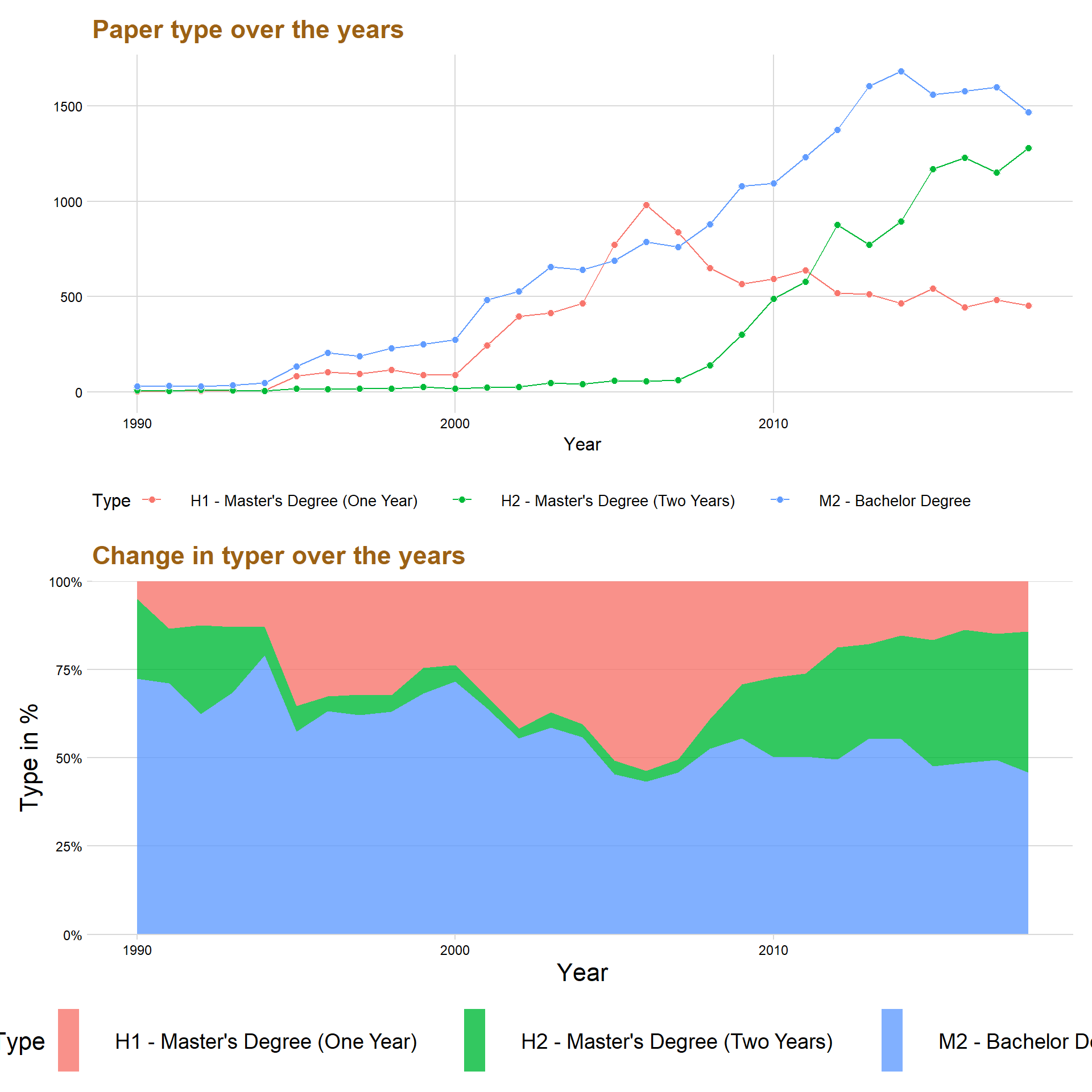
The first graph above shows that papers made in the bachelor level is most common, except for three years from 2005 to 2008 where the most common paper was master’s degree (One Year).
One of the most interesting things to notice in the graph is that Master’s Degree (Two Years) started to get momentum around the year 2008 and have increased ever since. On the other hand, Master’s Degree (One Year) decreased for every year after the year 2006 and became even lower than Master’s Degree (Two Year) in the year 2011.
Below is a percentage graph that visualize more effectively the allocation of the paper type’s across the years.
The percentage plot indicates that in the year 2018 that almost 50 percent of all the papers published are a Bachelor’s Degree, while around 30 percent are Master’s Degree (Two Year) and roughly around 20 percent are Master’s Degree (One Year).
The percentage plot also gives a better understanding concerning the changes in time concerning the rise of Master’s Degree (Two Year).
dataclean %>%
  group_by(Subject) %>%
  filter(!is.na(Type)) %>%
  summarise(total_count = n()) %>%
  top_n(15) %>%
  ggplot(aes(x = reorder(Subject, total_count), y = total_count)) + geom_col(fill = "#049cd8", alpha = 0.7, color = "black") + coord_flip() + theme_minimal_vgrid() +  labs(title = "Top 15  Departments",x = "", y = "Total levels made") + scale_y_continuous(expand = expand_scale(mult = c(0, 0.05))) + geom_text(aes(y = total_count, label = total_count), hjust = -.0, colour = "black", size = 2.5)+ theme(text=element_text(size=16,  family="Garamond"))+
 theme(plot.title=element_text(size=17,
                                    #face="bold",
                                    family="Garamond",
                                    color="#9c6114",
                                    #hjust=0.5,
                                    lineheight=1.2))
dataclean$Type <- as.character(dataclean$Type)

langyear <- dataclean %>%
  filter(str_detect(dataclean$Type, "Master|Bachelor")) %>%
  group_by(Language, Year, Type) %>%
  filter(!is.na(Language), Language == "Swedish"| Language == "English", Year > 1989) %>%
  count()
## Warning: Factor `Language` contains implicit NA, consider using
## `forcats::fct_explicit_na`Analyzing Language
The data consists of a total of five languages, Swedish, English, Danish, French, German and Spanish. This thesis will only focus on Swedish and English because the rest had a very few observations and would only distort the visualizations and insights.
Let’s first answer the question, how has the use of Swedish and English changed over time?
dataclean %>%
  group_by(Language) %>%
  filter(!is.na(Language)) %>%
  summarise(total_count = n()) %>%
  top_n(6) %>%
  ggplot(aes(x = reorder(Language, total_count), y = total_count)) + geom_col(fill = "#049cd8", alpha = 0.7) + coord_flip() + theme_minimal_vgrid() +  labs(title = "Language used in papers",x = "", y = "Total papers made") + scale_y_continuous(expand = expand_scale(mult = c(0, 0.05))) + geom_text(aes(y = total_count, label = total_count), hjust = -.0, colour = "black", size = 2.5)+ theme(text=element_text(size=16,  family="Garamond"))+
 theme(plot.title=element_text(size=17,
                                    #face="bold",
                                    family="Garamond",
                                    color="#9c6114",
                                    #hjust=0.5,
                                    lineheight=1.2))
dataclean %>%
  group_by(Language, Year) %>%
  filter(!is.na(Language), Language == "Swedish"| Language == "English", Year > 1989, Year < 2019) %>%
  count() %>%
   ggplot(aes(x = Year, y = n, fill = Language, color = Language)) + geom_area( position='fill', alpha = 0.8) + scale_y_continuous(expand = c(0, 0), label = percent)+theme_minimal_hgrid() +  theme(
    legend.position = "bottom",
    legend.justification = "left",
    legend.direction = "horizontal",
    legend.box = "horizontal", legend.background = element_blank(),axis.text=element_text(size= 9)) + labs(title = "Change in Language over the years", x = "", y = "Language in %")+ theme(text=element_text(size=16,  family="Garamond"))+
 theme(plot.title=element_text(size=17,
                                    #face="bold",
                                    family="Garamond",
                                    color="#9c6114",
                                    #hjust=0.5,
                                    lineheight=1.2))
dataclean %>%
  group_by(Language, Year) %>%
  filter(!is.na(Language), Language == "Swedish"| Language == "English") %>%
  count() %>%
   ggplot(aes(x = Year, y = n, fill = Language, color = Language)) +geom_line(size = 0.7) +
  geom_point( color = "white", shape = 21, size = 2.2) +
  theme_minimal_grid()  + labs(title = "Swedish and English papers over the years", y = "", c = "Year") + xlim(c(1990,2018))+ theme(text=element_text(size=15,  family="Garamond"))+
  theme(plot.title=element_text(size=17,
                                #face="bold",
                                family="Garamond",
                                color="#9c6114",
                                #hjust=0.5,
                                lineheight=1.2)) + theme(
                                  legend.position = "bottom",
                                  legend.justification = "left",
                                  legend.direction = "horizontal",
                                  legend.box = "horizontal", legend.background = element_blank(),axis.text=element_text(size= 15)) + scale_fill_brewer(palette = "Set2") + scale_color_brewer(palette = "Set2")
The graph displays that Swedish was the most common used language until the year 2008 where it almost was the same amount as English. However, the use of Swedish in student papers has slightly decreased over the last five year while English has instead increased. This might be because universities are becoming more international and writing in English can be better for the future workplace.
Language and the type of degree
langyear %>%
  group_by(Language, Type) %>%
  summarise(sumtype = sum(n)) %>%
  ggplot(aes(x = reorder(Type, -sumtype), y = sumtype, fill = Language, color = Language)) + geom_col(position = "dodge", color = "black", alpha = 0.8) + theme_minimal_hgrid() + scale_y_continuous(expand = expand_scale(mult = c(0, 0.05))) + geom_text(aes(y = , label = sumtype ), vjust = 1.3, colour = "black", size = 4, position = position_dodge(width = 1)) + labs(title = "Total amount in Language for Type", x = "", y = "")  + theme(text=element_text(size=16,  family="Garamond"))+
 theme(plot.title=element_text(size=26,
                                    #face="bold",
                                    family="Garamond",
                                    color="#9c6114",
                                    #hjust=0.5,
                                    lineheight=1.2)) + scale_fill_brewer(palette = "Set3")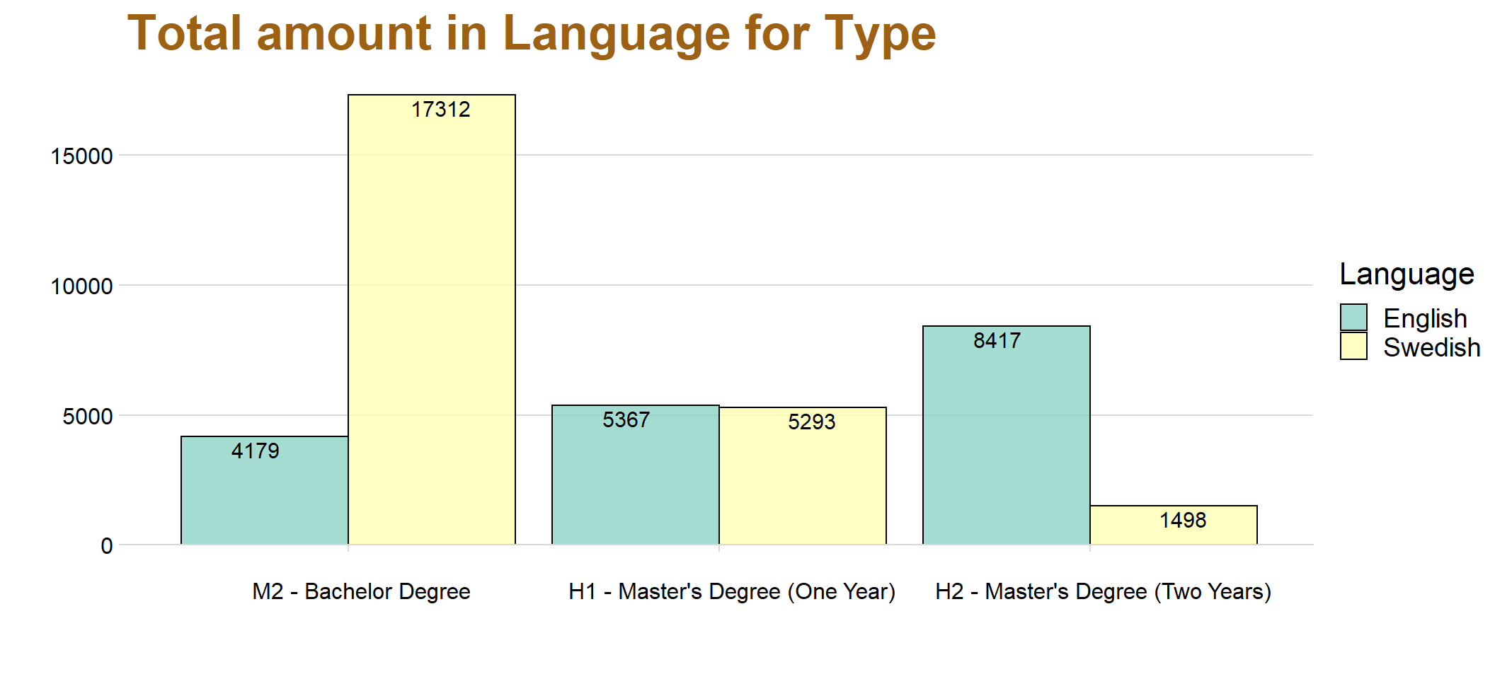
It’s clear that Swedish is most commonly used at the Bachelor Degree and English is most common instead in Master’s Degree (Two Years).
The result is not surprising since with higher and more advanced courses are students expected to perform better, and one aspect of this is often to have courses in English
langyear %>%
  ggplot(aes(x = Year, y = n, color = Language)) + geom_line() + geom_point() + facet_wrap(Type~.) +  labs(title = "Facet wrap over Degree ", y = "")+xlim(c(1990, 2018)) + theme(text=element_text(size=16,  family="Garamond"))+
 theme(plot.title=element_text(size=17,
                                    #face="bold",
                                    family="Garamond",
                                    color="#9c6114",
                                    #hjust=0.5,
                                    lineheight=1.2))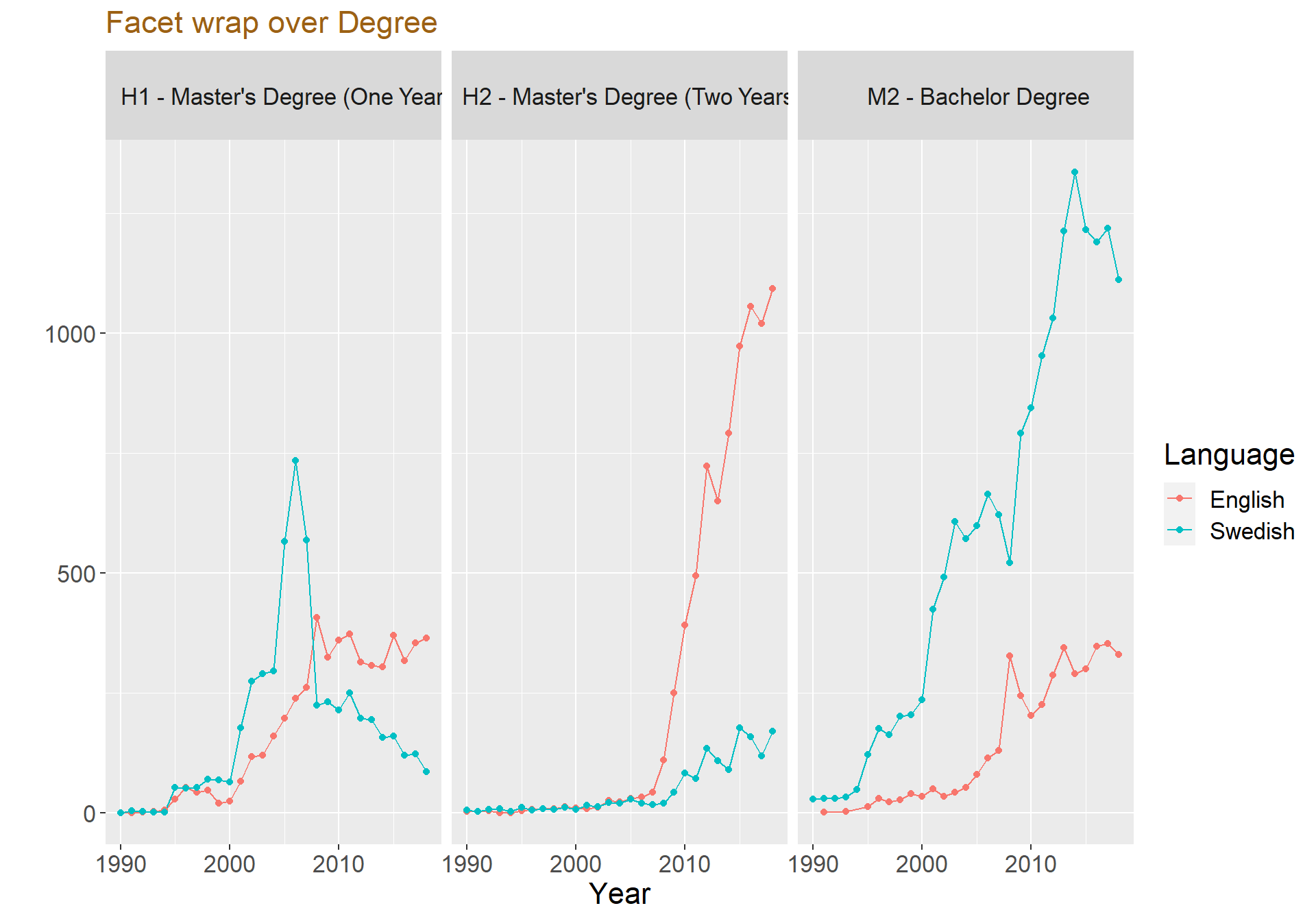
langyear %>%
ggplot(aes(x = Year, y = n, fill = Language, color = Language)) + geom_area( position='fill', alpha = 0.8) + scale_y_continuous(expand = c(0, 0), label = percent)  + theme_minimal_hgrid() +  theme(
    legend.position = "bottom",
    legend.justification = "left",
    legend.direction = "horizontal",
    legend.box = "horizontal", legend.background = element_blank(),axis.text=element_text(size= 9)) + labs(title = "Change in Language with percentage plot", x = "", y = "Difficulty in %") + facet_wrap(.~ Type ) + panel_border() + xlim(c(1995,2018))+ theme(text=element_text(size=16,  family="Garamond"))+
 theme(plot.title=element_text(size=17,
                                    #face="bold",
                                    family="Garamond",
                                    color="#9c6114",
                                    #hjust=0.5,
                                    lineheight=1.2))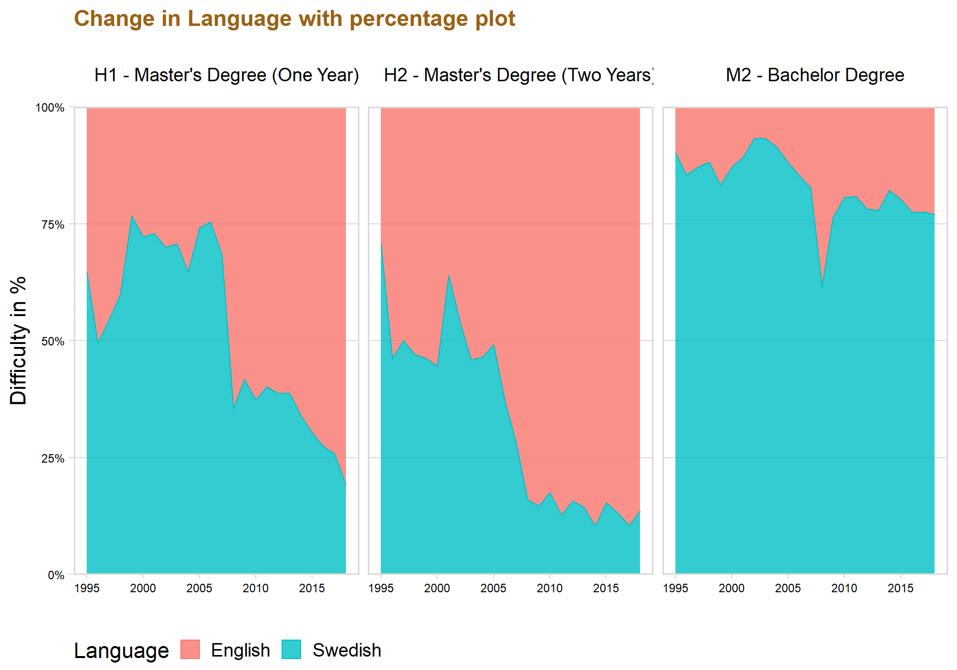
Treemap over something
top15 <- dataclean %>%
  group_by(Department) %>%
  filter(!is.na(Department)) %>%
  summarise(n = n()) %>%
  top_n(15)


top15 <- dataclean %>%     #Now a dataframe with only 15 most departments
  filter(Department %in% top15$Department)

test <- dataclean%>%
  group_by(Faculties, Type) %>%
  count()


test$Type <- as.character(test$Type)

test <- dataclean %>%
  filter(str_detect(dataclean$Type, "Master|Bachelor"))


test <- test %>%
  group_by(Faculties, Type) %>%
  count()

test <- drop_na(test)


ggplot(data = test, aes(area = n, fill = Faculties,label = Faculties, subgroup = Type))+
  geom_treemap() +
  geom_treemap_subgroup_border() +
  geom_treemap_subgroup_text(place = "centre", grow = T, alpha = 0.5, colour = "black", fontface = "italic", min.size = 0)+
  geom_treemap_text(colour = "white", place = "topleft", reflow = T)+
  theme(legend.position = "null") +
  labs(title = "Relation between Faculties and the Paper Type")+ theme(text=element_text(size=16,  family="Garamond"))+
 theme(plot.title=element_text(size=20,
                                    #face="bold",
                                    family="Garamond",
                                    color="#9c6114",
                                    #hjust=0.5,
                                    lineheight=1.2))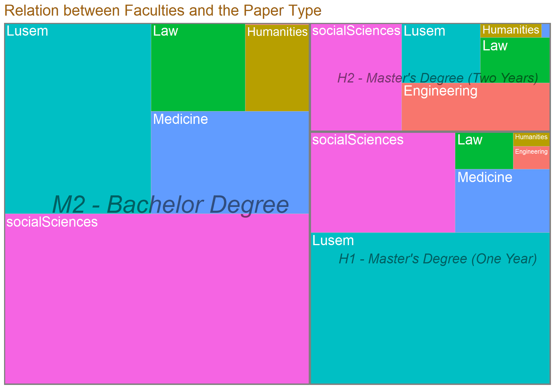
ggplot(data = test, aes(x = Type, y = n, fill = Faculties)) + geom_col(position = "dodge")+ labs(title = "Testing using bars instead of above tree")+ theme(text=element_text(size=16,  family="Garamond"))+
 theme(plot.title=element_text(size=17,
                                    #face="bold",
                                    family="Garamond",
                                    color="#9c6114",
                                    #hjust=0.5,
                                    lineheight=1.2))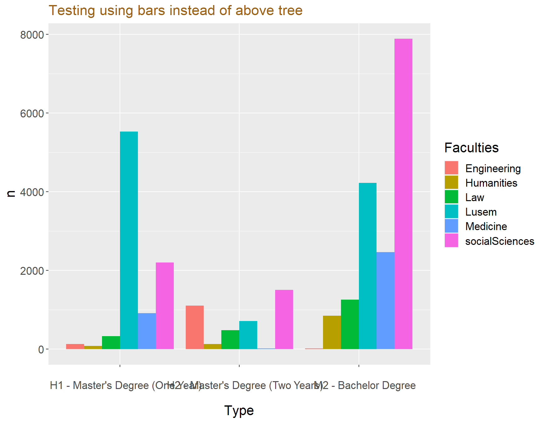
Network graph over Department and Supervisor
top15$Department <- as.factor(top15$Department)

nettest <- top15 %>%
  group_by(Department, Supervisor) %>%
  count() %>%
  group_by(Department) %>%
  top_n(10,n)


ts <- simpleNetwork(nettest,
              zoom = T)

frameWidget(ts, height = 400, width = '95%')
The network is interactive so play with it a little so see the must active supervisors for the top 15 departments!
Testing using alluvial diagram
#v?ljer ut variablerna och r?knar dem
testing <- top15 %>%
  count(Department, Type, Subject) %>%
  drop_na() %>%
  filter(n>1)


testing %>%
  mutate( Department = fct_rev(as.factor(Department)),
          Type = fct_rev(as.factor(Type)),
          Subject = fct_rev(as.factor(Subject))) %>%
  ggplot(aes(y = n, axis1 = Department, axis2 = Type, axis3 = Subject)) +
  geom_alluvium(aes(fill = Department), aes.bind=TRUE, width = 1/12) +
  geom_stratum(width = 1/4, fill = "white", color = "black") +
  geom_text(stat = "stratum", label.strata = TRUE) +
  scale_x_discrete(limits = c("Origin", "Carrier", "Destination"),
                   expand = c(.05, .05)) +
  labs(y = "Cases") +
  theme_minimal() +
  theme(legend.position = "none") +
  ggtitle("NYC flights volume for top destinations and airlines")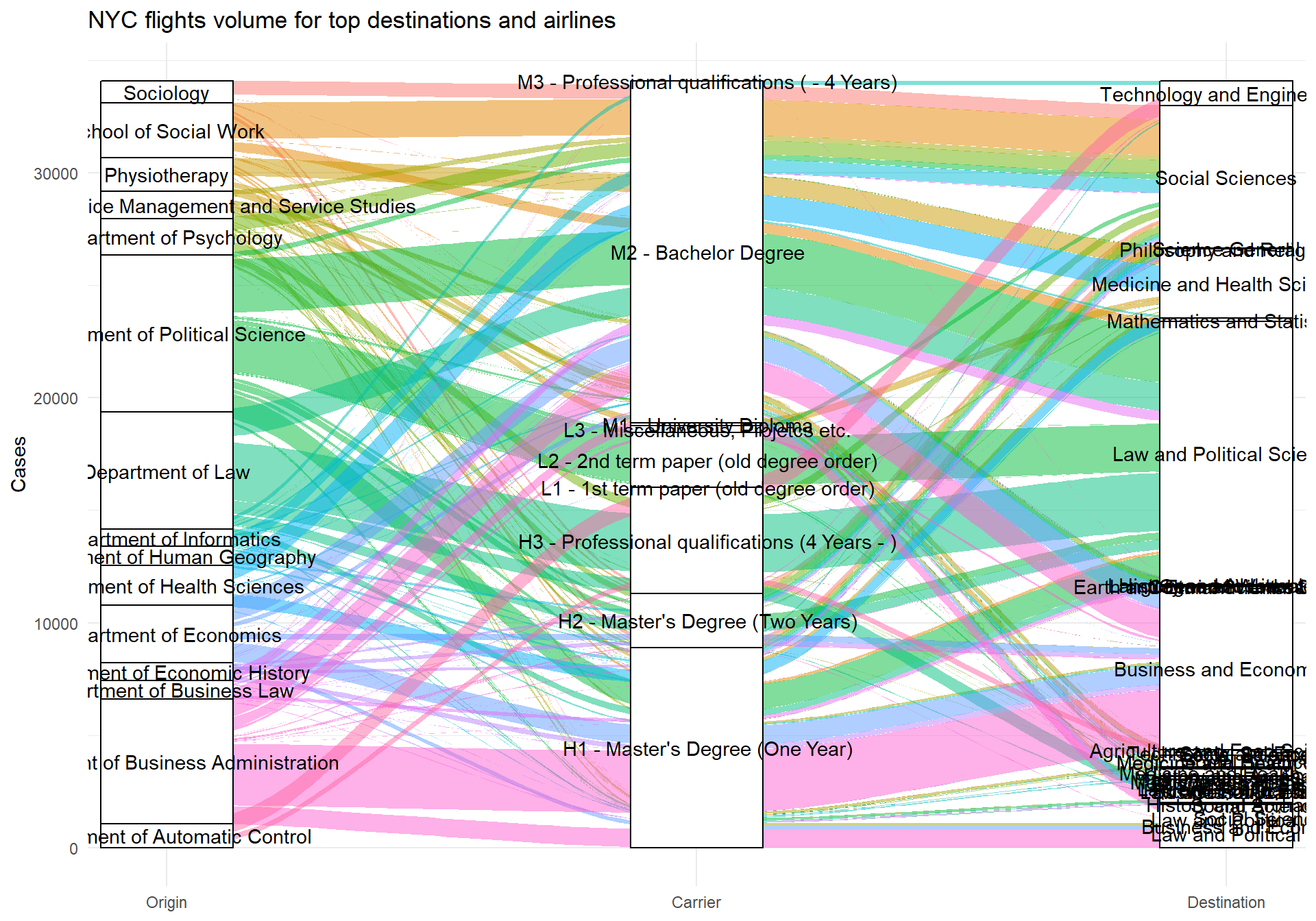
As we can see there are a lot of variables so I will clean that up later, this is just a test.
Wordcloud
dataclean$Keywords <- as.character(dataclean$Keywords)

hej <- dataclean %>%
    unnest_tokens(word, Keywords) %>%    # split words
    anti_join(stop_words) %>%    # take out "a", "an", "the", etc.
    count(word, sort = TRUE)%>% # count occurrences
  drop_na() %>%
  top_n(200)


wordcloud2((data = hej), size = 0.7)
Some of the biggest word in the plot are: Management, Social, Enterprises, Företagsledning, Law and Theory. This indicates that the most common words belong to the economic and social studies, which makes sense considering that the faculties Social Science and Lusem produced the most student papers.
Sentimental analysis av keywords och titlar
dataclean$Titel <- as.character(dataclean$Titel)


nrc_joy <- get_sentiments("afinn")
nrc_joy <- get_sentiments("bing")

hej4 <- dataclean %>%
    unnest_tokens(word, Keywords) %>%    # split words
    anti_join(stop_words) %>%    # take out "a", "an", "the", etc.
    count(word, sort = TRUE)%>% # count occurrences
  drop_na()
## Joining, by = "word"hi <- merge(hej4,nrc_joy, by = "word" )Testar g?ra det p? abstract
nrc_joy <- get_sentiments("bing")

hej5 <- dataclean %>%
    unnest_tokens(word, Abstract) %>%    # split words
    anti_join(stop_words) %>%    # take out "a", "an", "the", etc.
    count(word, sort = TRUE)%>% # count occurrences
  drop_na()
## Joining, by = "word"hi2 <- merge(hej5,nrc_joy, by = "word" )p1 <- hi %>%
arrange(desc(n)) %>%
group_by(sentiment) %>% slice(1:10) %>%
ggplot(aes(x = reorder(word, n), y = n, fill = sentiment)) +
geom_col(show.legend = FALSE, alpha = 0.8, color = "black") +
facet_wrap(~sentiment, scales = "free_y") +
labs(title ="Sentimental analysis over Keywords",y = "Contribution to sentiment",
x = NULL) +
coord_flip() + theme_minimal_vgrid() + panel_border() + scale_y_continuous(expand = expand_scale(mult = c(0, 0.05))) + theme(text=element_text(size=16, family="Garamond"))+
theme(plot.title=element_text(size=20,
#face="bold",
family="Garamond",
color="#9c6114",
#hjust=0.5,
lineheight=1.2))
p2 <- hi2 %>%
arrange(desc(n)) %>%
group_by(sentiment) %>% slice(1:10) %>%
ggplot(aes(x = reorder(word, n), y = n, fill = sentiment)) +
geom_col(show.legend = FALSE, alpha = 0.8, color = "black") +
facet_wrap(~sentiment, scales = "free_y") +
labs(title ="Sentimental over Abstracts", y = "Contribution to sentiment",
x = NULL) +
coord_flip() + theme_minimal_vgrid() + panel_border() + scale_y_continuous(expand = expand_scale(mult = c(0, 0.05)))+
theme(text=element_text(size=16, family="Garamond"))+
theme(plot.title=element_text(size=20,
#face="bold",
family="Garamond",
color="#9c6114",
#hjust=0.5,
lineheight=1.2))
p1 / p2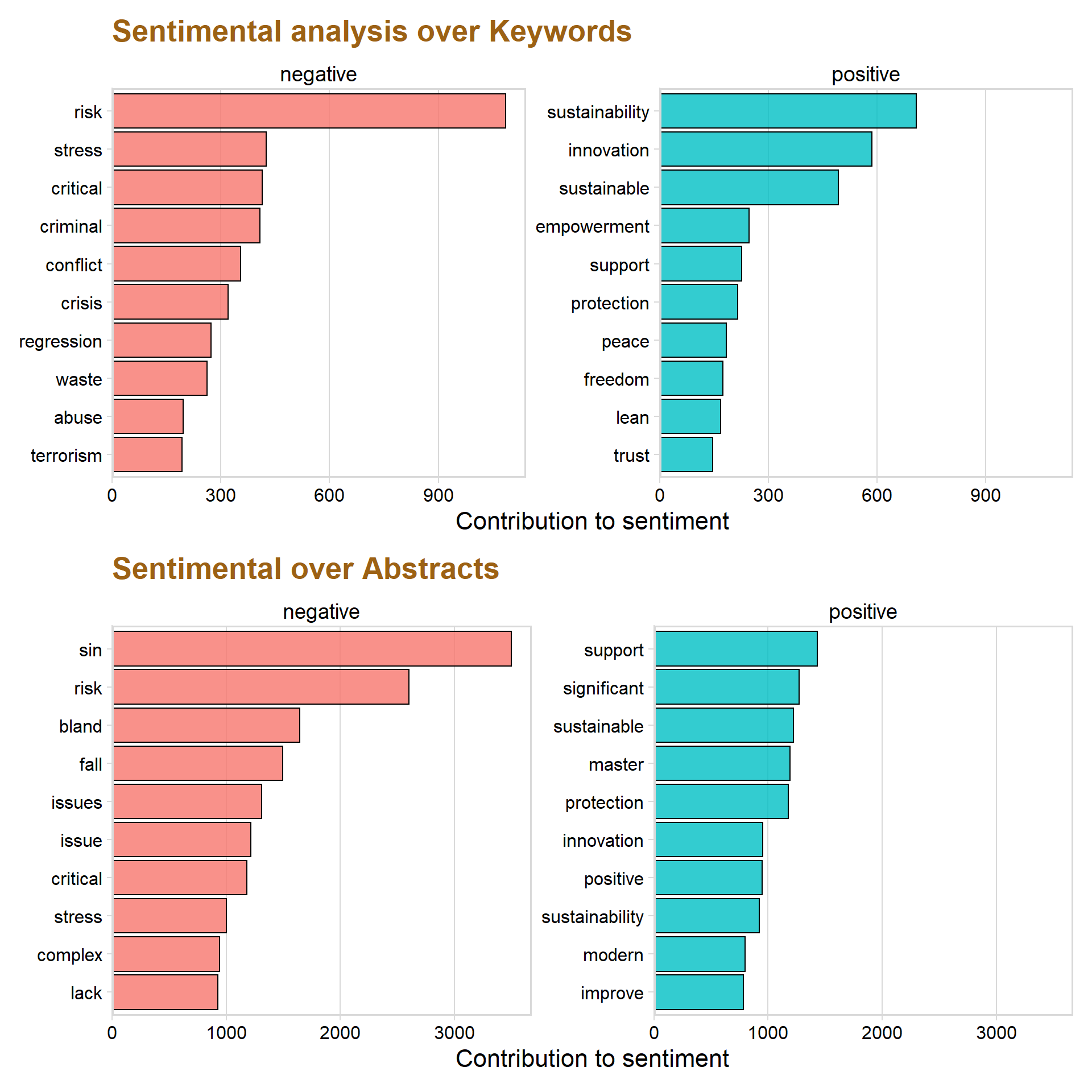
The graph above show the ten most frequent positive and negative Keywords that was able to match the words from the database.
The most common negative words are risk, stress, critical and criminal. However, the word regression is classified as negative but there is a high chance that it simply is describing the statistical model “regression” and is therefore not a true negative word in that context.
Sustainability, innovation, sustainable and empowerment are the most occurred positive Keywords.
Focus on number of authors
dataclean %>%
  count(numauthors) %>%
  drop_na() %>%
  ggplot(aes(x = reorder( numauthors, -n), y = n )) + geom_col() + labs(title = "Number of authors")+ theme(text=element_text(size=16,  family="Garamond"))+
 theme(plot.title=element_text(size=20,
                                    #face="bold",
                                    family="Garamond",
                                    color="#9c6114",
                                    #hjust=0.5,
                                    lineheight=1.2))
## Warning in grid.Call(C_textBounds, as.graphicsAnnot(x$label), x$x, x$y, : font
## family not found in Windows font database
## Warning in grid.Call(C_textBounds, as.graphicsAnnot(x$label), x$x, x$y, : font
## family not found in Windows font database
## Warning in grid.Call(C_textBounds, as.graphicsAnnot(x$label), x$x, x$y, : font
## family not found in Windows font database
## Warning in grid.Call(C_textBounds, as.graphicsAnnot(x$label), x$x, x$y, : font
## family not found in Windows font database
## Warning in grid.Call(C_textBounds, as.graphicsAnnot(x$label), x$x, x$y, : font
## family not found in Windows font database
## Warning in grid.Call(C_textBounds, as.graphicsAnnot(x$label), x$x, x$y, : font
## family not found in Windows font database
## Warning in grid.Call(C_textBounds, as.graphicsAnnot(x$label), x$x, x$y, : font
## family not found in Windows font database
## Warning in grid.Call(C_textBounds, as.graphicsAnnot(x$label), x$x, x$y, : font
## family not found in Windows font database
## Warning in grid.Call(C_textBounds, as.graphicsAnnot(x$label), x$x, x$y, : font
## family not found in Windows font database
## Warning in grid.Call(C_textBounds, as.graphicsAnnot(x$label), x$x, x$y, : font
## family not found in Windows font database## Warning in grid.Call.graphics(C_text, as.graphicsAnnot(x$label), x$x, x$y, :
## font family not found in Windows font database## Warning in grid.Call(C_textBounds, as.graphicsAnnot(x$label), x$x, x$y, : font
## family not found in Windows font database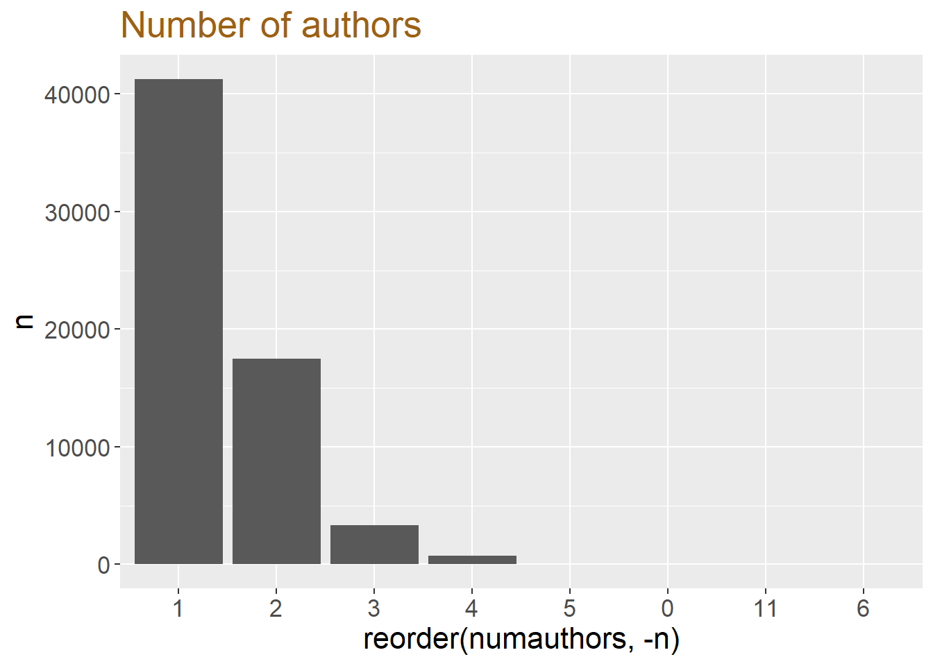
dataclean$numauthors <- as.factor(dataclean$numauthors)


dataclean %>%
  group_by(Faculties, numauthors) %>%
  count() %>%
  drop_na()%>%
  filter(numauthors != "5", numauthors != "6", numauthors != "0") %>%
  ggplot(aes(x = Faculties, y = n, fill = numauthors)) + geom_col( position='fill', color = "black", alpha = 0.9) + scale_y_continuous(expand = c(0, 0), label = percent)  + theme_minimal_vgrid() +  theme(
    legend.position = "bottom",
    legend.justification = "left",
    legend.direction = "horizontal",
    legend.box = "horizontal",axis.text=element_text(size= 9)) + labs(title = "Number of authors in the Faculties", x = "", y = " %")+ theme(text=element_text(size=16,  family="Garamond"))+
 theme(plot.title=element_text(size=20,
                                    #face="bold",
                                    family="Garamond",
                                    color="#9c6114",
                                    #hjust=0.5,
                                    lineheight=1.2))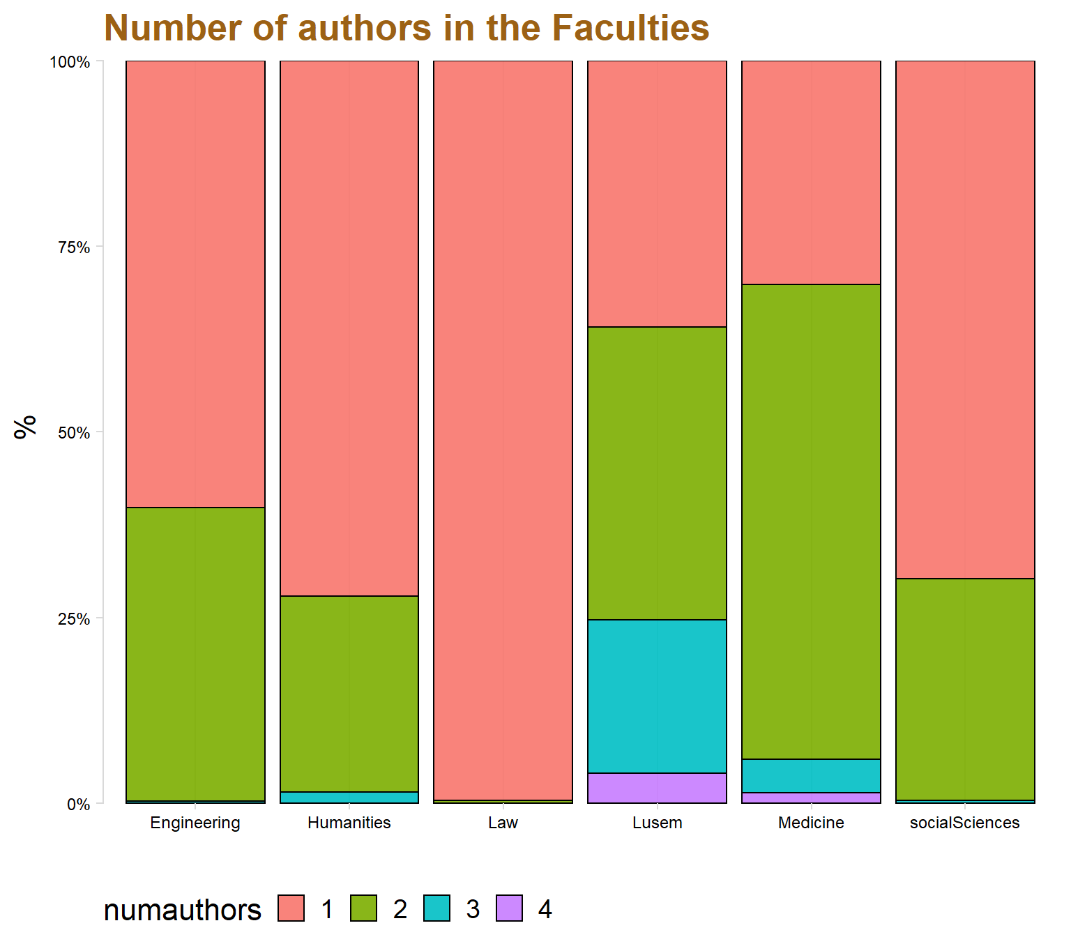
dataclean %>%
  group_by(Year, numauthors) %>%
  count() %>%
  filter(numauthors == "1" | numauthors == "2") %>%   #filter out only two or one author
  ggplot(aes(x = Year, y = n, fill = numauthors, color = numauthors)) + geom_area( position='fill', alpha = 0.8) + scale_y_continuous(expand = c(0, 0), label = percent)  + theme_minimal_hgrid() +  theme(
    legend.position = "bottom",
    legend.justification = "left",
    legend.direction = "horizontal",
    legend.box = "horizontal", legend.background = element_blank(),axis.text=element_text(size= 9)) + labs(title = "Change in number of authors", x = "", y = "Difficulty in %") + xlim(c(1990, 2018))+theme(text=element_text(size=16,  family="Garamond"))+
 theme(plot.title=element_text(size=20,
                                    #face="bold",
                                    family="Garamond",
                                    color="#9c6114",
                                    #hjust=0.5,
                                    lineheight=1.2))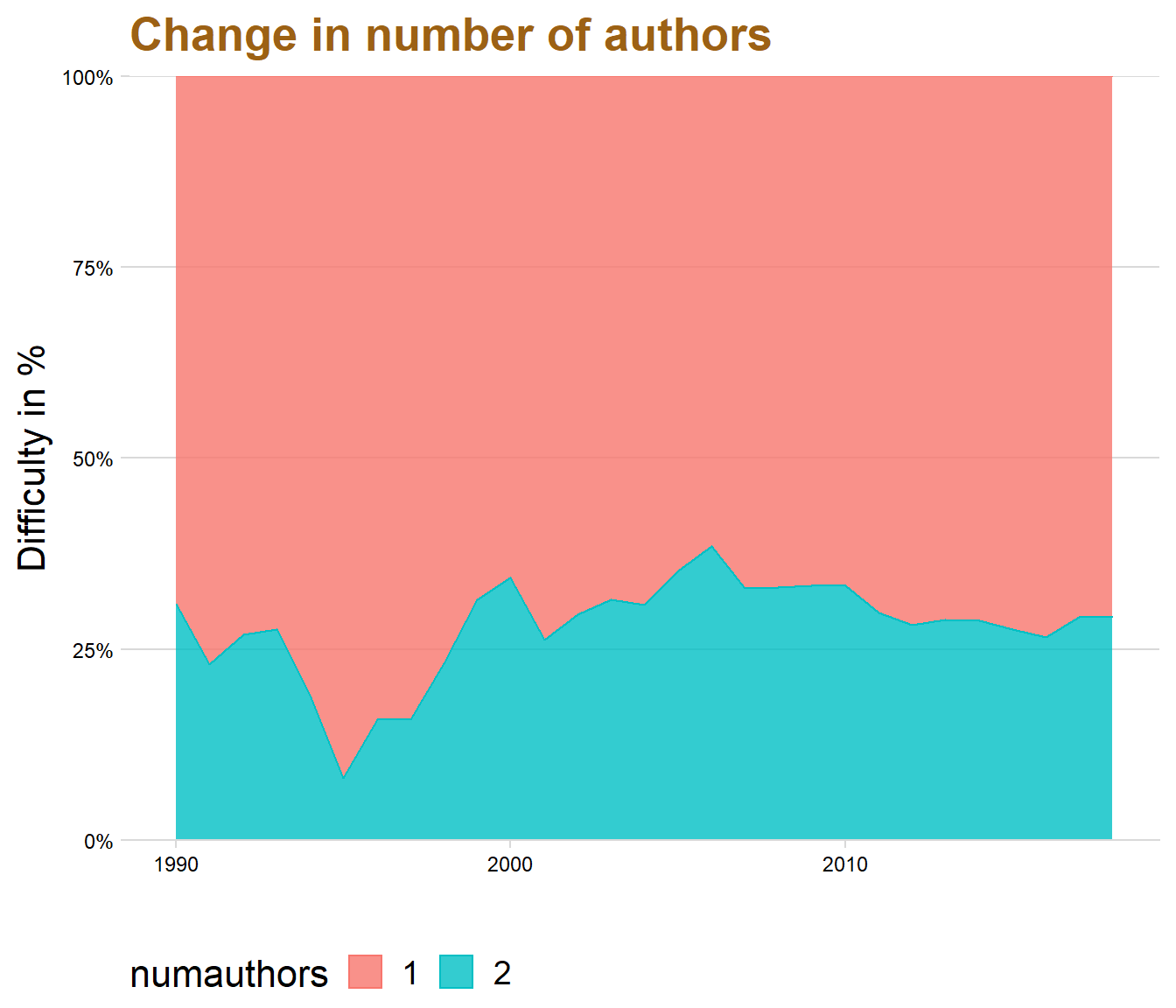
newtop15 <- top15 %>%
  filter(Department == "School of Social Work" | Department == "Department of Business Administration" | Department == "Department of Health Sciences" | Department == "Department of Economics"| Department == "Department of Psychology" | Department == "Department of Informatics")
dataclean %>%
group_by(Faculties, Year, numauthors) %>%
count() %>%
filter(numauthors == "1" | numauthors == "2"| numauthors == "3", Year > 1999) %>% #filter out only two or one author
drop_na()%>%
ggplot(aes(x = Year, y = n, fill = numauthors, color = numauthors)) + geom_area( position='fill', alpha = 0.8) + scale_y_continuous(expand = c(0, 0), label = percent) + theme_minimal_hgrid() + theme(
legend.position = "bottom",
legend.justification = "left",
legend.direction = "horizontal",
legend.box = "horizontal", legend.background = element_blank(),axis.text=element_text(size= 9)) + labs(title = "Change in number of authors", x = "", y = "Difficulty in %") + facet_wrap(.~ Faculties ) + panel_border()+theme(text=element_text(size=16, family="Garamond"))+
theme(plot.title=element_text(size=20,
#face="bold",
family="Garamond",
color="#9c6114",
#hjust=0.5,
lineheight=1.2))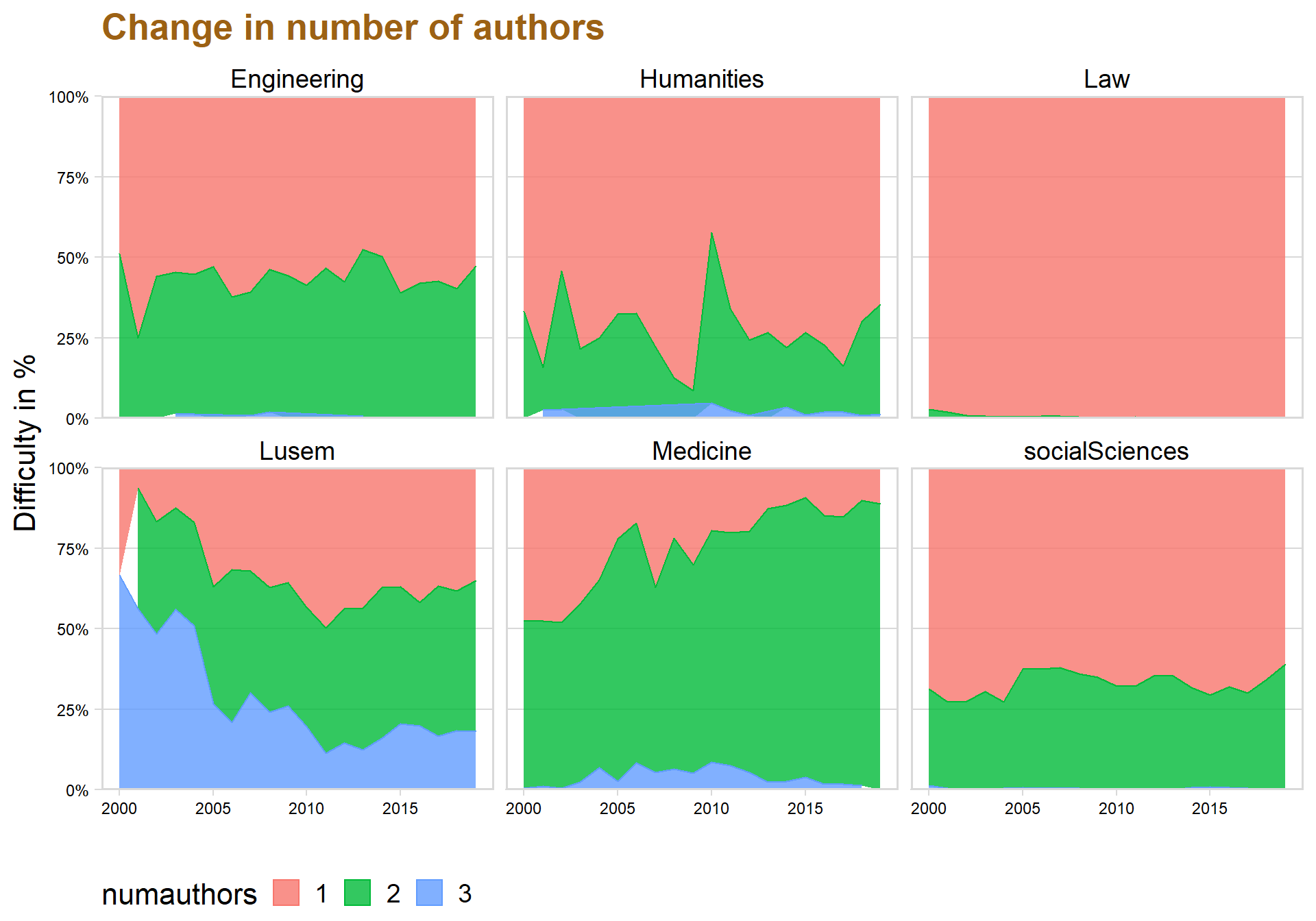
datastat <- read.csv("C:/Users/GTSA - Infinity/Desktop/R analyser/datastatid.csv", comment.char="#")

datastat$old <- 2019-datastat$Year

datastat$avgYear <- datastat$totalDown / datastat$old
vis_miss(datastat, warn_large_data = FALSE)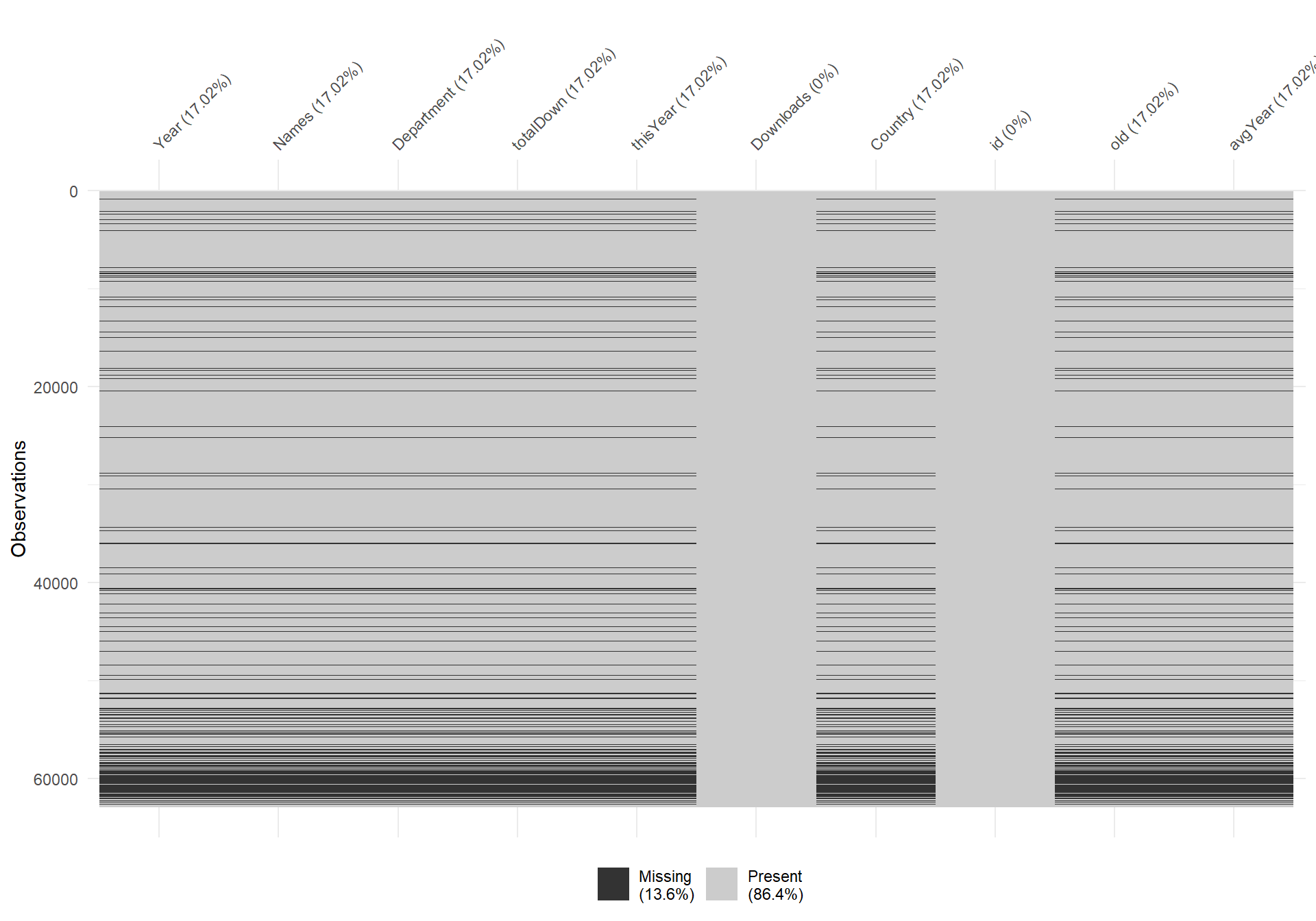
datastat <- datastat %>%
  drop_na()
Analyzing downloads of the papers
The student papers that are available to read online also contains data regarding how many times the paper have been downloaded, what country that downloaded the paper and history of downloaded for the previously 12 months.
Let’s start by examining the distribution of downloads by creating a histogram.
ggplot(data = datastat, aes(x = totalDown)) + geom_histogram(color = "black", fill = "#049cd8",alpha = 0.8, bins = 50) + theme_minimal_hgrid() + scale_y_continuous(expand = expand_scale(mult = c(0, 0.05))) + theme(legend.position = 'none') + scale_fill_discrete(h = c(240, 10), c = 120, l = 70) + labs(title = "Histogram over total downloads", x = "Downloads", y = "") + geom_vline(xintercept=mean(datastat$totalDown), color="red", linetype="dashed")+ xlim(c(0,2000))+geom_vline(xintercept=median(datastat$totalDown), color="red", linetype="dashed")+ ggplot2::annotate("text", x = 600, y =4300, label = "Mean", size = 5)+ggplot2::annotate("text", x = 160, y =4300, label = "Median", size = 5)+theme(text=element_text(size=16,  family="Garamond"))+
 theme(plot.title=element_text(size=20,
                                    #face="bold",
                                    family="Garamond",
                                    color="#9c6114",
                                    #hjust=0.5,
                                    lineheight=1.2))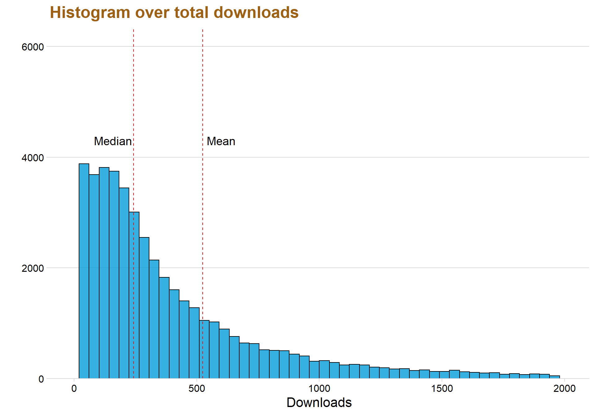
The first thing to notice is the large difference between the median and mean line. The mean is more affected by outliners in the data which explains why the mean line is larger, since the downloads have a long tail with many outliners.
ggplot(data = datastat, aes(x = thisYear)) +  geom_histogram(color = "black", fill = "#049cd8",alpha = 0.8, bins = 50) + theme_minimal_hgrid() + scale_y_continuous(expand = expand_scale(mult = c(0, 0.05))) + theme(legend.position = 'none') + scale_fill_discrete(h = c(240, 10), c = 120, l = 70) + labs(title = "Histogram over downloaded this year", x = "Downloaded this Year", y = "") + geom_vline(xintercept=mean(datastat$thisYear), color="red",linetype="dashed")+ xlim(c(0,500)) + geom_vline(xintercept=median(datastat$thisYear), color="black", linetype="dashed") + theme(text=element_text(size=16,  family="Garamond"))+
 theme(plot.title=element_text(size=20,
                                    #face="bold",
                                    family="Garamond",
                                    color="#9c6114",
                                    #hjust=0.5,
                                    lineheight=1.2))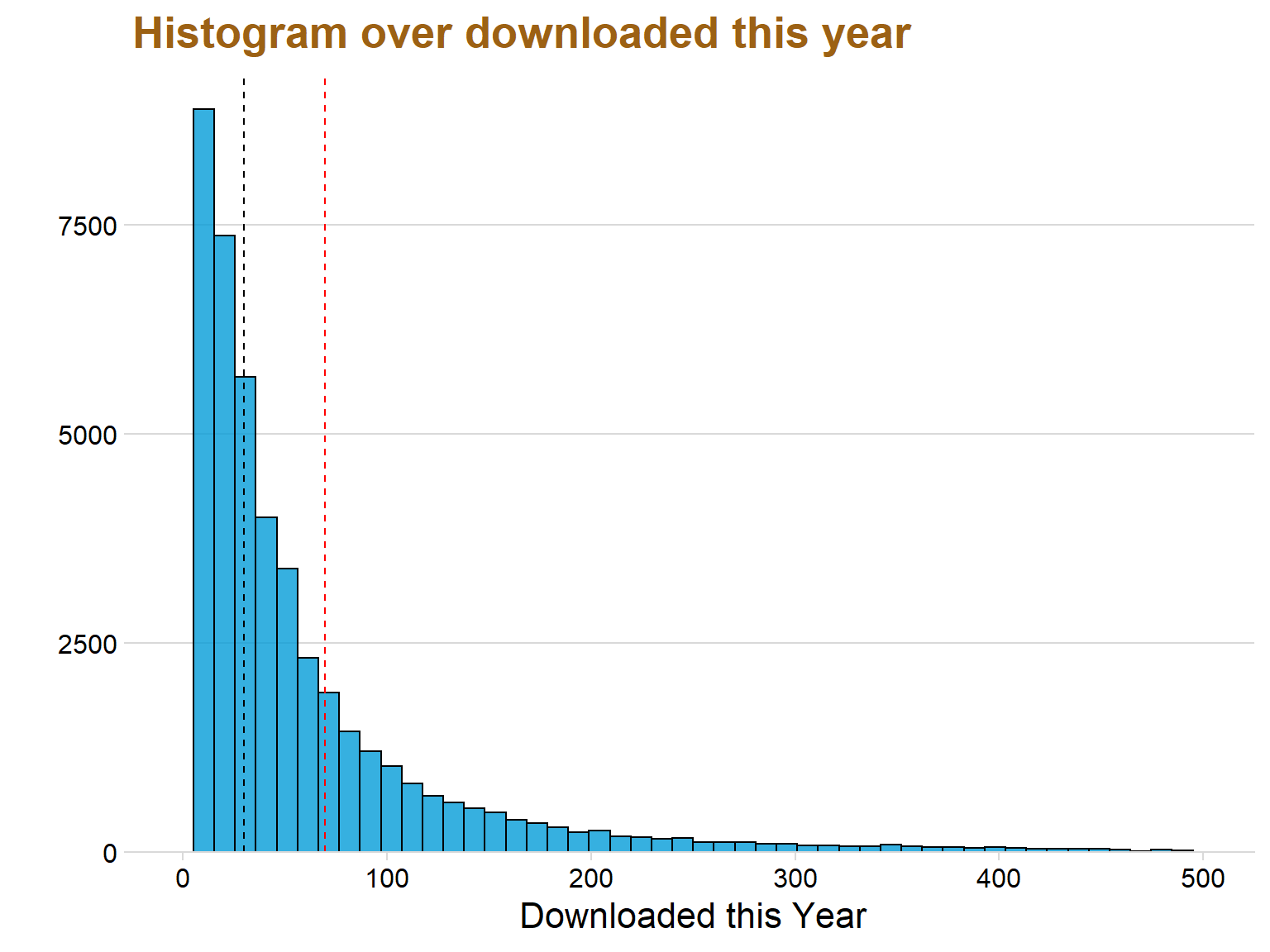
ggplot(data = datastat, aes(x = avgYear)) +  geom_histogram(color = "black", fill = "#049cd8",alpha = 0.8, bins = 50)+ theme_minimal_hgrid() + scale_y_continuous(expand = expand_scale(mult = c(0, 0.05))) + theme(legend.position = 'none') + scale_fill_discrete(h = c(240, 10), c = 120, l = 70) + labs(title = "Histogram over average downloads", x = "Average downloads", y = "") + xlim(c(0,500)) + geom_vline(xintercept=median(datastat$avgYear), color="red",linetype="dashed")+theme(text=element_text(size=16,  family="Garamond"))+
 theme(plot.title=element_text(size=20,
                                    #face="bold",
                                    family="Garamond",
                                    color="#9c6114",
                                    #hjust=0.5,
                                    lineheight=1.2))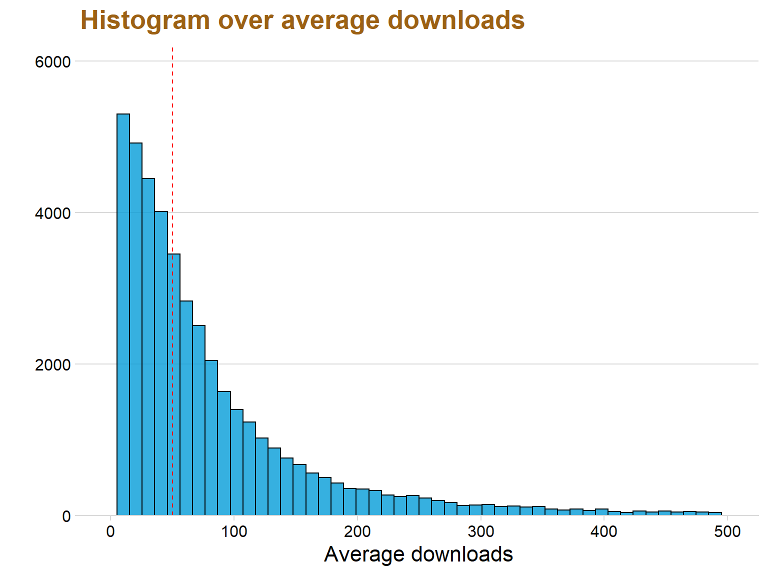
Skapar Lusem data saken
datastat$Department <- as.character(datastat$Department)

lusem <- dataclean %>%
  filter(str_detect(dataclean$Department, "Department of Economics|Department of Business Administration|Department of Informatics|Department of Business Law|Department of Economic History|Department of Statistics"))

lusem$Faculties <- "Lusem"


faqdata <- read.csv("C:/Users/GTSA - Infinity/Desktop/R analyser/faqdata.csv", comment.char="#")
reallusem <- lusem %>%
group_by(Department) %>%
count()%>%
filter(n > 50)
lusem <- datastat %>% #Now a dataframe with only 15 most departments
filter(Department %in% reallusem$Department)testar <- faqdata %>%
filter(old > 0)
ggplot(data = testar, aes(x = avgYear, y = Faculties, fill = 0.5 - abs(0.5-..ecdf..))) + stat_density_ridges( rel_min_height = 0.01, geom = "density_ridges_gradient", calc_ecdf = TRUE, jittered_points = TRUE, position = "raincloud",
alpha = 0.08, scale = 0.9) +
scale_x_continuous(expand = c(0.01, 0)) +
scale_y_discrete(expand = c(0.01, 0))+
scale_fill_viridis(name = "Tail probability", direction = -1) + theme(legend.position = "none") + ylab("") + theme_minimal_hgrid() + theme(
legend.position="none") + labs(title = "Total downloads for Faculties", x = "Likes") + xlim(c(-15,300))+theme(text=element_text(size=16, family="Garamond"))+
theme(plot.title=element_text(size=20,
#face="bold",
family="Garamond",
color="#9c6114",
#hjust=0.5,
lineheight=1.2))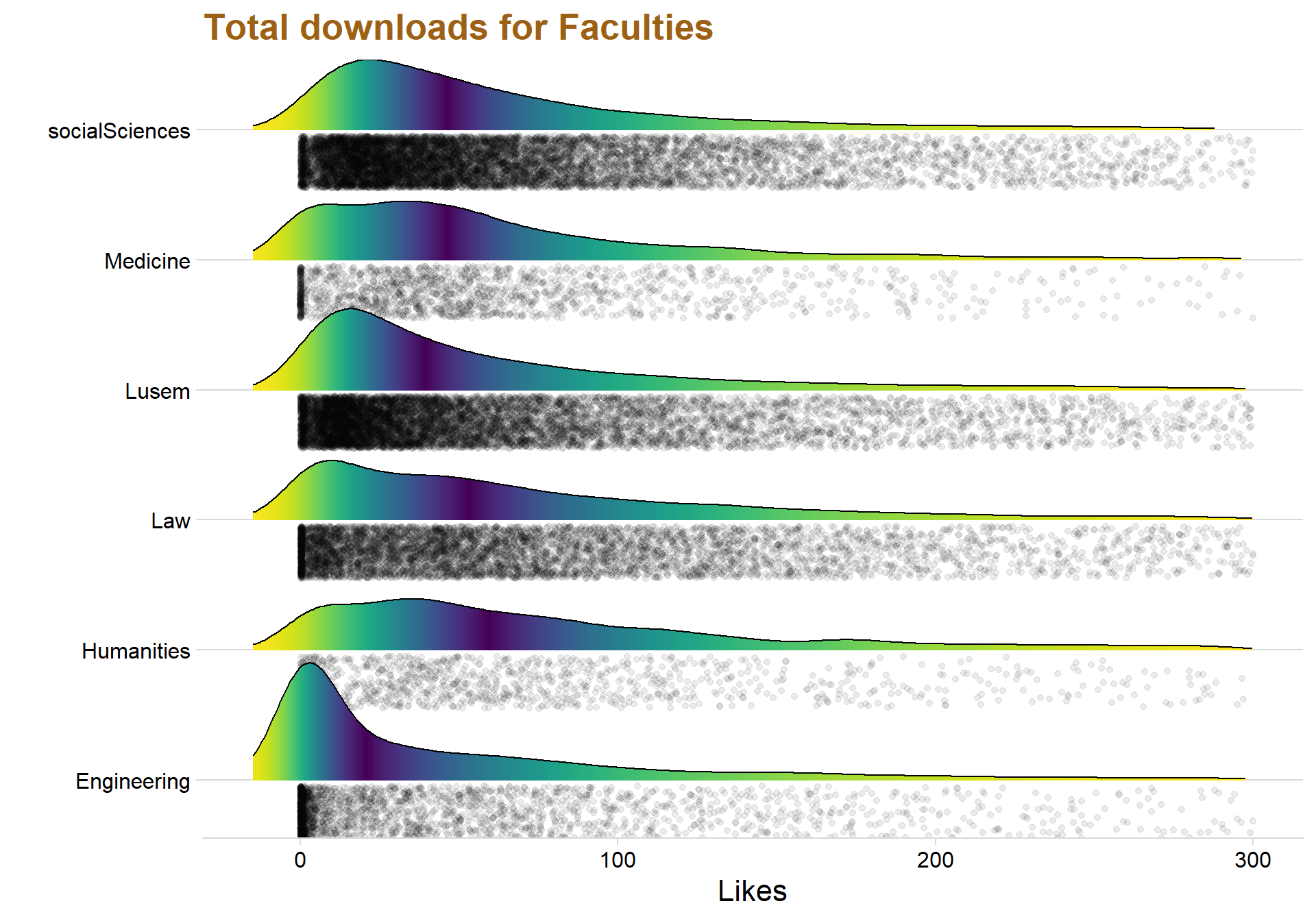
ggplot(data = testar, aes(y = avgYear, x = Faculties, fill = Faculties))  + ylim(c(0,500)) + geom_jitter(aes(color = Faculties), alpha = 0.05)+ geom_boxplot() + labs(title = "Faculties and boxplot over the average score", x = "", y = "Average Score")+ theme_minimal_hgrid() + theme(legend.position = "none") +theme(text=element_text(size=16,  family="Garamond"))+
 theme(plot.title=element_text(size=20,
                                    #face="bold",
                                    family="Garamond",
                                    color="#9c6114",
                                    #hjust=0.5,
                                    lineheight=1.2))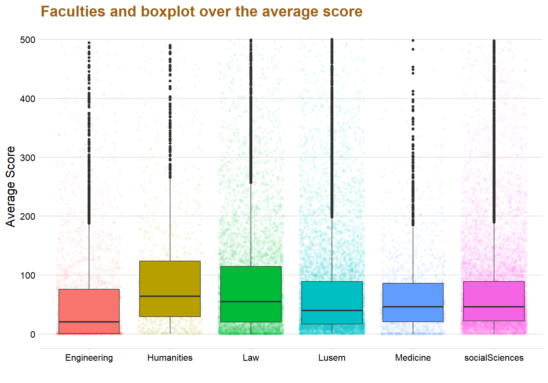
testar %>%
  group_by(Faculties)%>%
  summarise(medel = mean(avgYear))
## # A tibble: 6 x 2
## Faculties medel
## <fct> <dbl>
## 1 Engineering 91.7
## 2 Humanities 208.
## 3 Law 102.
## 4 Lusem 98.6
## 5 Medicine 80.9
## 6 socialSciences 81.9ggplot(data = lusem, aes(x = totalDown, y = Department, fill = Department)) +
stat_density_ridges( scale = 3, rel_min_height = 0.01, alpha = 0.7, jittered_points = TRUE, position = "raincloud",
alpha = 0.1, scale = 0.9) +
scale_x_continuous(expand = c(0.01, 0)) +
scale_y_discrete(expand = c(0.01, 0)) +
theme_ridges(font_size = 10, grid = TRUE) + theme(legend.position = 'none')+ ylab("") + xlab("Sales") + theme(axis.title.y=element_blank(),
axis.text.y=element_blank(),
axis.ticks.y=element_blank(),
legend.position="none") + labs(title = "Total downloads for Faculties", x = "Likes") + xlim(c(-180,1000)) +theme(text=element_text(size=16, family="Garamond"))+
theme(plot.title=element_text(size=20,
#face="bold",
family="Garamond",
color="#9c6114",
#hjust=0.5,
lineheight=1.2))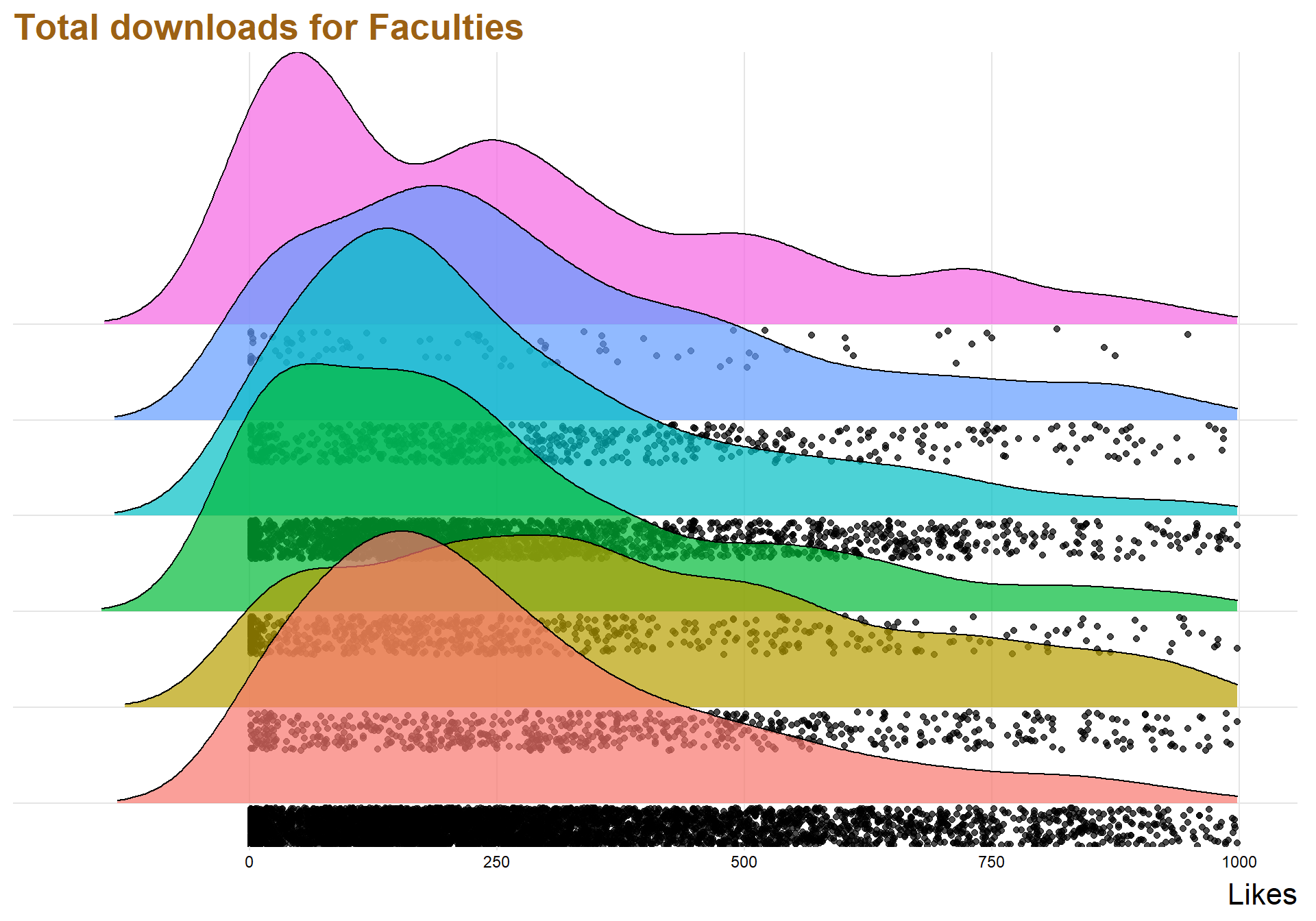
ggplot(lusem, aes(x = `totalDown`, y = `Department`, fill = ..x..)) +
  geom_density_ridges_gradient(scale = 3, rel_min_height = 0.01) +
  scale_fill_viridis(name = "Temp. [F]", option = "C") +
  labs(title = 'Temperatures in Lincoln NE in 2016')+
  scale_x_continuous(expand = c(0.01, 0)) +
  scale_y_discrete(expand = c(0.01, 0)) +
  theme_ridges(font_size = 10, grid = TRUE) + theme(legend.position = 'none')+ ylab("") + xlab("Sales")  + theme(axis.title.y=element_blank(),
        axis.text.y=element_blank(),
        axis.ticks.y=element_blank(),
        legend.position="none") + labs(title = "Total downloads for Faculties", x = "Likes") + xlim(c(-180,1000))+ theme(text=element_text(size=16,  family="Garamond"))+
 theme(plot.title=element_text(size=20,
                                    #face="bold",
                                    family="Garamond",
                                    color="#9c6114",
                                    #hjust=0.5,
                                    lineheight=1.2))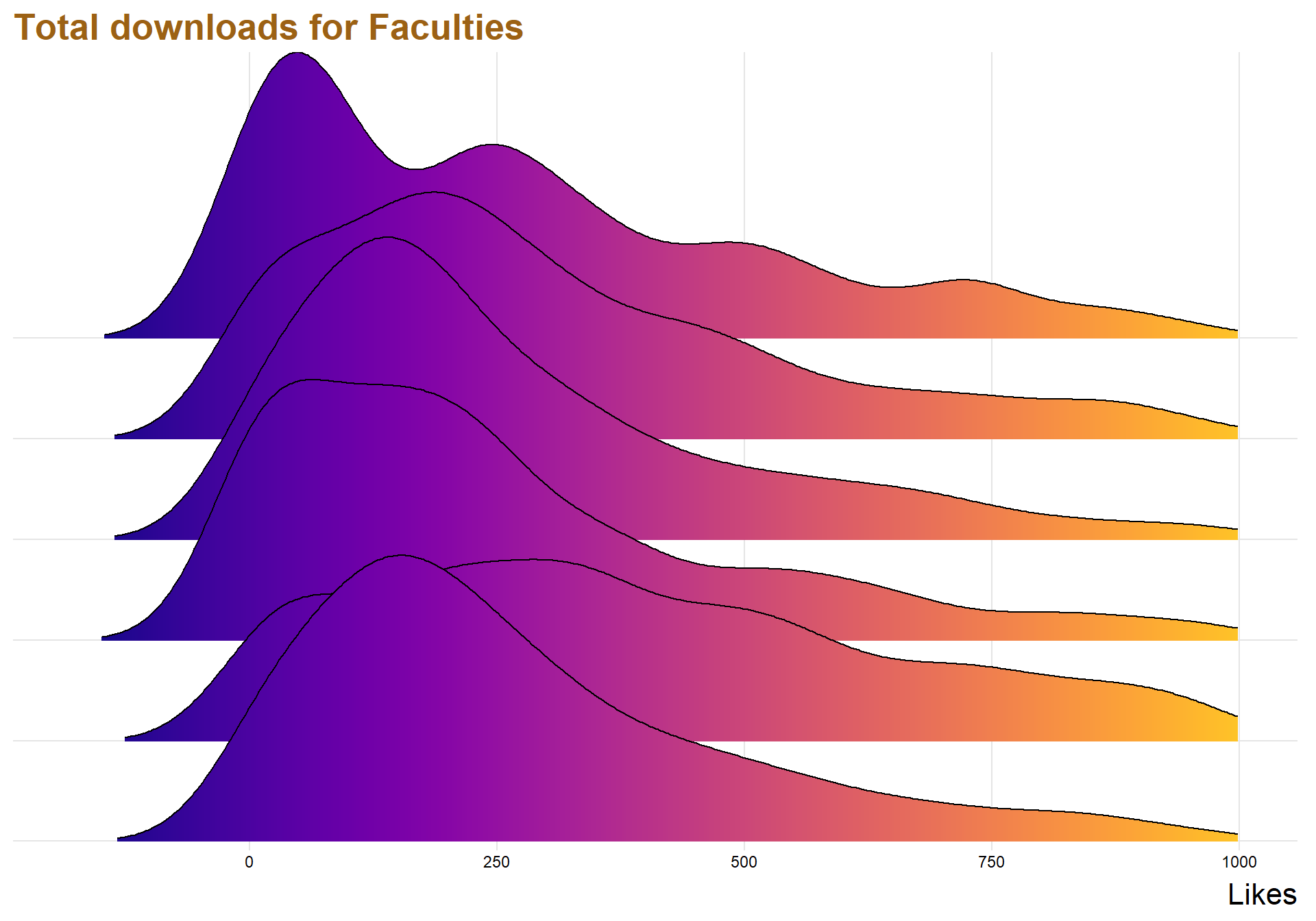
top10per <- lusem %>%
  filter(totalDown > quantile(totalDown , .965))
Testar g?ra den p? min data
#lusem$Year <- ymd(lusem$Year, truncated = 2L)
#str(lusem)
library(tidyverse);library(viridis);library(lubridate);library(ggthemes)


##Recreate economist graph
  ggplot(data = top10per, aes(x = Year, y = totalDown)) +
  geom_smooth(method = "lm",
              color = "gray30",
              se = FALSE,
              size = 0.5,
              alpha = 0.4,
              linetype = 2) +
  geom_smooth(aes(weight = totalDown),
              color = "orange",
              method = "lm",
              size = 1,
              se = FALSE,
              alpha =0.4,
              linetype = 1
              ) +
  geom_point(aes(size = thisYear),
             alpha = 0.15,
              show.legend = FALSE,
             color = "gray30") +
  geom_point(data= top10per,
            aes(x = Year,
                y = totalDown,
                size = thisYear),
                alpha =0.15,
            show.legend = FALSE)  +
  labs(x = "\nDate",
       y = "Average download",
       color = "Show",
       title = "Top three percent papers in downloads",
       subtitle = "",
       caption = "") +
  scale_size_continuous(range = c(1,12)) +
  scale_color_viridis(option = "A",
                      discrete = TRUE,
                      begin = 0.3, end = 0.7) +
  theme_minimal() +
  theme(
    text = element_text(family = "Roboto"),
    plot.background = element_rect(fill = "gray95"),
    plot.title = element_text(size = 25, face = "bold"),
    plot.subtitle = element_text(size = 12),
    plot.caption = element_text(size = 12),
    panel.grid.minor = element_blank(),
    panel.grid.major = element_line(size = 0.1,linetype = 2,color = "gray80"),
    axis.title.x = element_text(size = 13, face = "bold"),
    axis.title.y = element_text(size = 13, face = "bold"),
    axis.text.y = element_text(size = 12),
    axis.text.x = element_text(size = 12, angle = 45),
    legend.position = "top"
  ) + ylim(c(0,20000))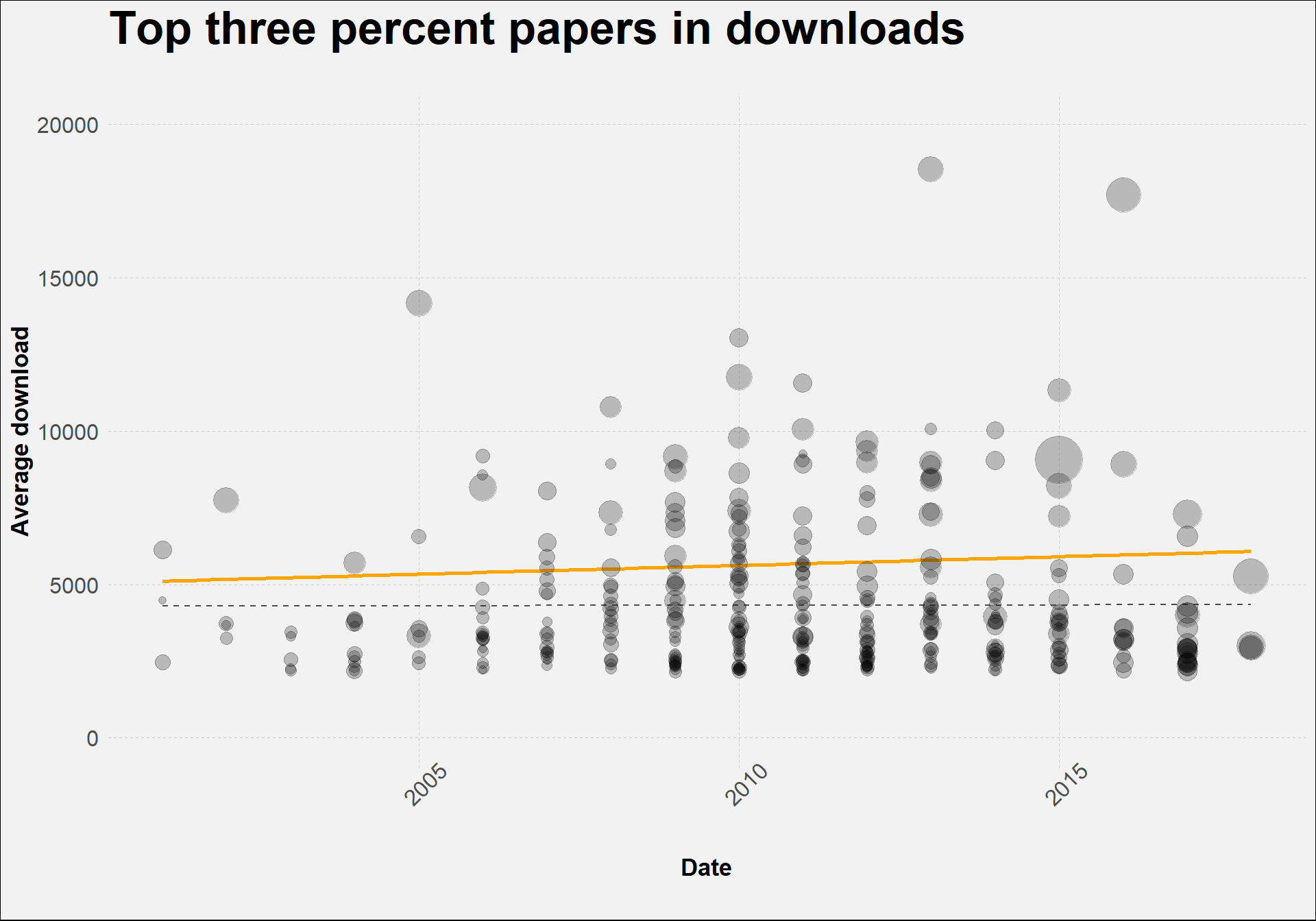
Creating a gender variable
The raw data scraped from the LUP website contains only the names of the authors. However, by extracting the first name of each author it’s possible to use the R-package Genderzied to determine if the name is associated with females or males. The package is not perfect so when it doesn’t know the gender of a name it will return a missing value, which is better than random guessing because then it is at least possible to sort out the missing values.
allgender <- read.csv("C:/Users/GTSA - Infinity/Desktop/R analyser/allgender.csv", comment.char="#")


dataclean %>%
  group_by(Language, Year) %>%
  filter(!is.na(Language), Language == "Swedish"| Language == "English") %>%
  count() %>%
   ggplot(aes(x = Year, y = n, fill = Language, color = Language)) +geom_line(size = 0.7) +
  geom_point( color = "white", shape = 21, size = 2.2) +
  theme_minimal_grid()  + labs(title = "Swedish and English papers over the years", y = "", c = "Year") + xlim(c(1990,2018))+ theme(text=element_text(size=15,  family="Garamond"))+
  theme(plot.title=element_text(size=17,
                                #face="bold",
                                family="Garamond",
                                color="#9c6114",
                                #hjust=0.5,
                                lineheight=1.2)) + theme(
                                  legend.position = "bottom",
                                  legend.justification = "left",
                                  legend.direction = "horizontal",
                                  legend.box = "horizontal", legend.background = element_blank(),axis.text=element_text(size= 15))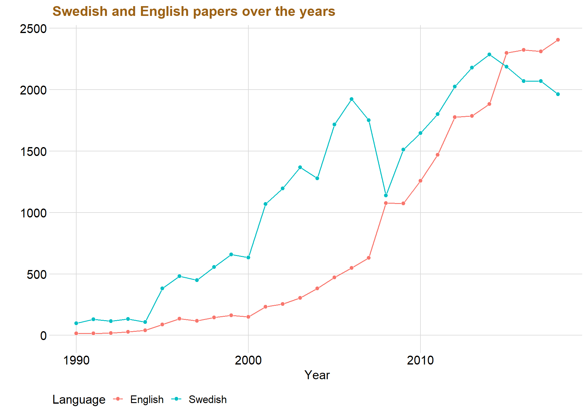
allgender %>%
  group_by(Gender, Year) %>%
  count %>%
  drop_na() %>%
  ggplot(aes(x = Year, y = n, color = Gender, fill = Gender)) +geom_line(size = 0.7) +
  geom_point( color = "white", shape = 21, size = 2.2) + theme_minimal_grid()+ xlim(c(1990,2018)) + labs(title = "Male and Female authors over the years", x = "Years", y="")+ theme(text=element_text(size=15,  family="Garamond"))+
  theme(plot.title=element_text(size=17,
                                #face="bold",
                                family="Garamond",
                                color="#9c6114",
                                #hjust=0.5,
                                lineheight=1.2)) + theme(
                                  legend.position = "bottom",
                                  legend.justification = "left",
                                  legend.direction = "horizontal",
                                  legend.box = "horizontal", legend.background = element_blank(),axis.text=element_text(size= 15))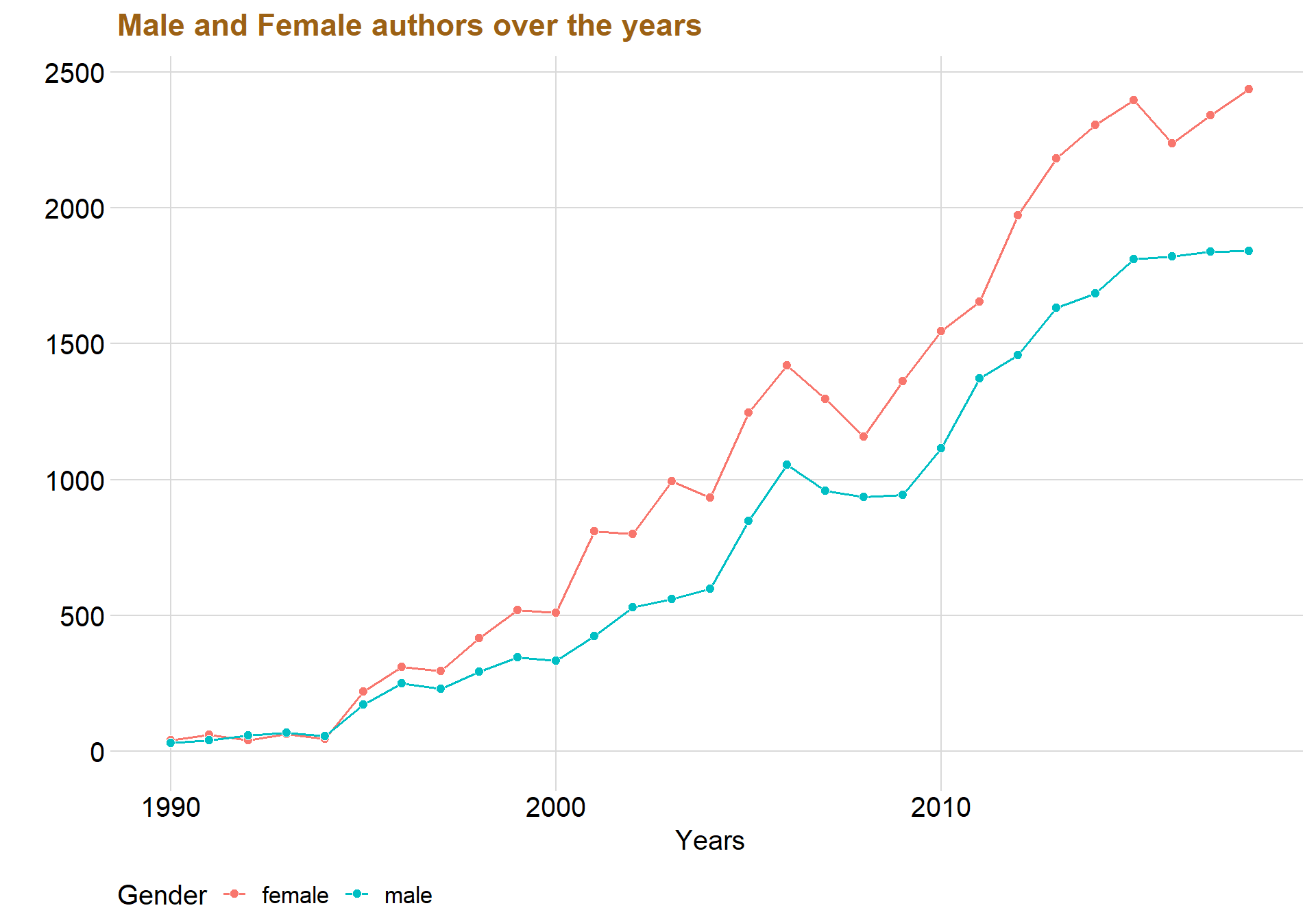
The redline that represent females are always above the blueline that represents males, indicating that there indeed seems to be more females than males in the universities.
datastatid <- read.csv("C:/Users/GTSA - Infinity/Desktop/R analyser/datastatid.csv", comment.char="#")

datagender2 <- read.csv("C:/Users/GTSA - Infinity/Desktop/R analyser/datagender2.csv", comment.char="#")
datagender <- read.csv("C:/Users/GTSA - Infinity/Desktop/R analyser/datagender.csv", comment.char="#")
meltgender <- melt(datagender2 , id.vars=c('id'),var='Gender')
allgender2 <- meltgender[,-2]
names(allgender2)[2] <- "Gender"
allgender2 <- rbind(datagender, allgender2)
allgender2$Gendernum <- ifelse(allgender2$Gender == "female", 1,0) #G?r att kvinnan f?r 1 och mannen 0
allgender2 <- merge(allgender2, dataclean, by = "id")testar <- allgender2 %>%
group_by(Faculties, Gender) %>%
count() %>%
drop_na() %>%
spread(Gender, n) %>% #using the tidyr function spread whitch make the Gender rows into columns, very nice!
mutate(Gdiff = female - male,
Gdiff_per = as.integer(Gdiff / male * 100)) # Handy names for specific colors
male_color <- "blue"
female_color <- "red"
dumbbell_color <- "#b2b2b2"
sidebar_color <- "#efefe3"
library(ggrepel)
# Nudge top row
label_vjust <- -1.4
# Plot it!
ggplot() +
geom_segment(
data = testar,
aes(
y = fct_reorder(Faculties, Gdiff_per), #denna best?mmer att h?gsta kvinna v?rdet ska vara f?rst i
yend = Faculties,
x = 0,
xend = max(female) * 1.04
),
color = dumbbell_color,
size = 0.15
) +
geom_dumbbell(
data = testar,
aes(y = Faculties, x = female, xend = male),
size = 1.8,
color = dumbbell_color,
colour_x = female_color,
colour_xend = male_color,
dot_guide = FALSE
) +
geom_text(
data = filter(testar, Faculties == "Medicine"),
aes(x = female, y = Faculties, label = "Women"),
color = female_color,
size = 3,
vjust = label_vjust,
fontface = "bold"
) +
geom_text(
data = filter(testar, Faculties == "Medicine"),
aes(x = male, y = Faculties, label = "Men"),
color = male_color,
size = 3,
vjust = label_vjust,
fontface = "bold"
) +
# Difference column
geom_rect(
data = testar,
aes(
xmin = max(female) * 1.07,
xmax = max(female) * 1.2,
ymin = -Inf,
ymax = Inf
),
fill = sidebar_color
) +
geom_text(
data = testar,
aes(
label = paste0(Gdiff_per, "%"),
y = Faculties,
x = max(female) * 1.13
),
fontface = "bold",
size = 3
) +
geom_text(
data = filter(testar, Faculties == "Medicine"),
aes(
x = max(female) * 2.41,
y = Faculties,
label = "Diff"
),
color = "#7a7d7e",
size = 3,
vjust = label_vjust,
fontface = "bold"
) +
scale_x_continuous() +
labs(
y = NULL,
title = "",
subtitle = "",
caption = ""
) +
theme_bw() +
theme(
panel.grid.major = element_blank(),
panel.grid.minor = element_blank(),
panel.border = element_blank(),
axis.title.x = element_blank(),
axis.ticks.y = element_blank(),
plot.title = element_text(face = "bold"),
plot.caption = element_text(size = 8, color = "gray60", vjust = -1)
) + geom_text(data=testar, aes(x=female, y=Faculties, label=female),
color="#9fb059", size=2.75, vjust=2.5, family="Calibri", check_overlap = TRUE) +
geom_text(data=testar, color="#edae52", size=2.75, vjust=2.5, family="Calibri",
aes(x=male, y=Faculties, label=male, check_overlap = TRUE)) + labs(title ="Difference in gender in the Faculties")+ theme(text=element_text(size=15, family="Garamond"))+
theme(plot.title=element_text(size=17,
#face="bold",
family="Garamond",
color="#9c6114",
#hjust=0.5,
lineheight=1.2)) + theme(
legend.position = "bottom",
legend.justification = "left",
legend.direction = "horizontal",
legend.box = "horizontal", legend.background = element_blank(),axis.text=element_text(size= 15))
Gender analysis
meltgender <- meltgender[,-2]

meltgender$Gendernum <- ifelse(meltgender$value == "female", 1,0)


mixed <- meltgender %>%
  group_by(id) %>%
  summarise(sumgender = sum(Gendernum)) %>%
  drop_na()
mixed <- mixed %>%
mutate(Gendermix = case_when(sumgender == 0 ~"All Males",
sumgender == 1 ~ "Mixed Genders",
sumgender == 2 ~ "All females"))
mixed <- merge(mixed, dataclean, by = "id")p1 <- mixed %>%
group_by(Gendermix) %>%
count() %>%
ggplot(aes(x = Gendermix, y = n, fill = Gendermix)) + geom_col( color = "black", alpha = 0.8) + theme_minimal_hgrid() + scale_y_continuous(expand = expand_scale(mult = c(0, 0.05))) + geom_text(aes(y = , label = n), vjust = 1.3, colour = "black", size = 4) + labs(title = "", x = "Gender", y = "Amount")
p2 <- mixed %>%
group_by(Year, Gendermix) %>%
summarise(count = n()) %>%
ggplot(aes(x = Year, y = count, color = Gendermix)) + geom_line() + theme_minimal_hgrid() + labs(title = "", x = "Year", y = "Amount") + xlim(c(1990, 2018)) + geom_point() + panel_border()
p1 / p2
genderdown <- merge(mixed, datastat, by = "id")ggplot(data = genderdown, aes(x = Gendermix, y = genderdown$avgYear)) + geom_boxplot() + ylim(c(0,200))## Warning: Use of `genderdown$avgYear` is discouraged. Use `avgYear` instead.## Warning: Removed 1234 rows containing non-finite values (stat_boxplot).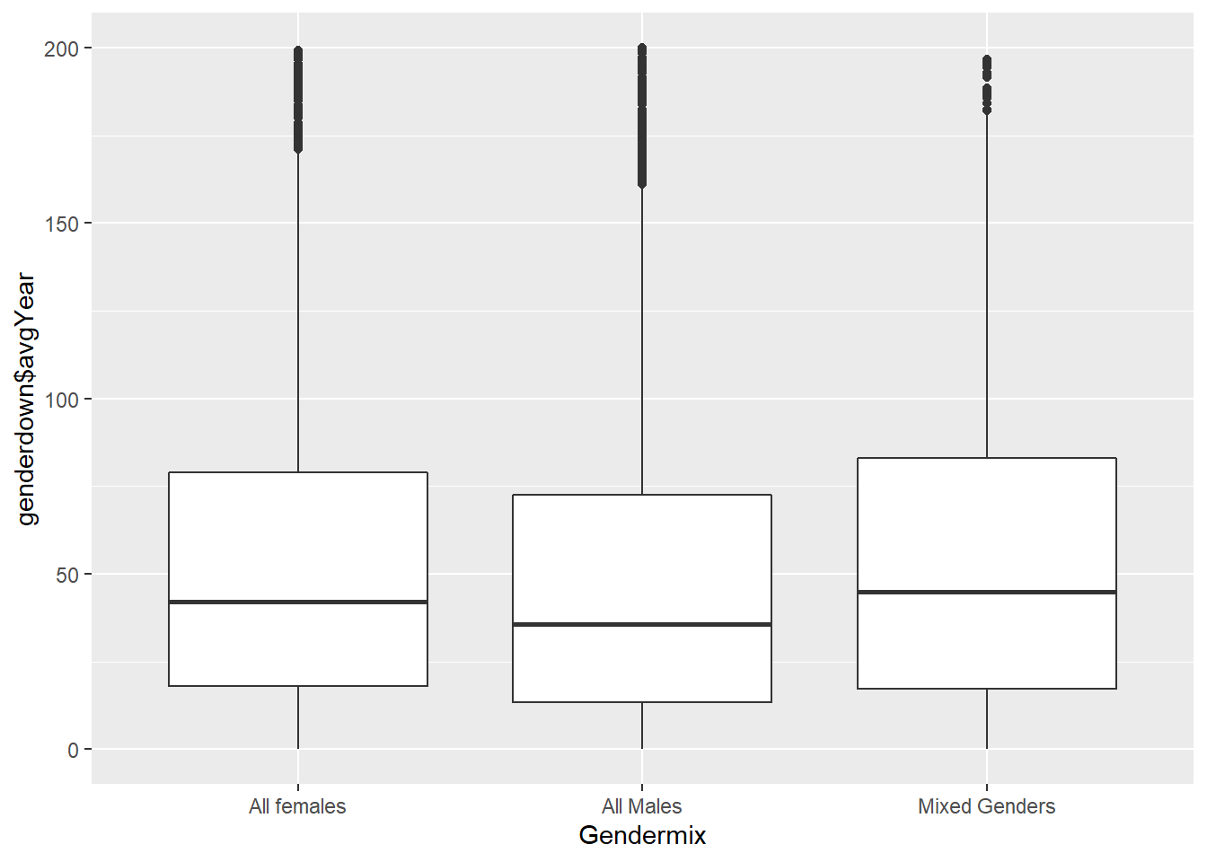
Skapar resten av fakulteterna
Medicine <- dataclean %>%
  filter(str_detect(dataclean$Department, "Division of Occupational and Environmental Medicine, Lund University|Logopedics, Phoniatrics and Audiology|Occupational Therapy and Occupational Science|Department of Health Sciences|Physiotherapy|Division of Occupational and Environmental Medicine, Lund University|MD Programme"))


Medicine$Faculties <- "Medicine"
Engineering <- datastat %>%
filter(str_detect(datastat$Department, "Department of Chemical Engineering|Civil Engineering - Architecture (BSc)| Chemical Engineering (M.Sc.Eng.)|Division of Water Resources Engineering|Department of Automatic Control|Production Management|Department of Energy Sciences|Packaging Logistics|Product Development|Environmental and Energy Systems Studies|Mechanics|Division of Risk Management and Societal Safety|Division of Structural Engingeering --- Civil Engineering (M.Sc.Eng.)|Engineering Logistics"))
Engineering$Faculties <- "Engineering"Law <- dataclean %>%
filter(str_detect(dataclean$Department, "Department of Law"))
Law$Faculties <- "Law"socialSciences <- dataclean %>%
filter(str_detect(dataclean$Department, "Department of Human Geography|Master of Science in Development Studies --- Graduate School --- Department of Sociology|Department of Psychology|Sociology|School of Social Work|Department of Gender Studies|Education|Department of Political Science|Graduate School"))
socialSciences$Faculties <- "socialSciences"Humanities <- dataclean %>%
filter(str_detect(dataclean$Department, "French Studies|General Linguistics|English Studies|Spanish Studies|Italian Studies|Greek (Modern Greek)s|Educational Sciences --- English Studies|Media and Communication Studies"))
Humanities$Faculties <- "Humanities"
#faqdata <- rbind(faqdata,socialSciences)
#faqdata <- faqdata %>%
# select(id, Faculties)
#alldata <- merge(dataclean, faqdata, by = "id", all = TRUE)
#alldata <- merge(datastat, faqdata, by = "id")ggplot(data = datastatid, aes( x = totalDown, y = datastatid$thisYear)) + facet_zoom(xlim = c(0, 1000), ylim = c(0,3000)) + geom_pointdensity(adjust = 8) +
scale_color_viridis(option = "C")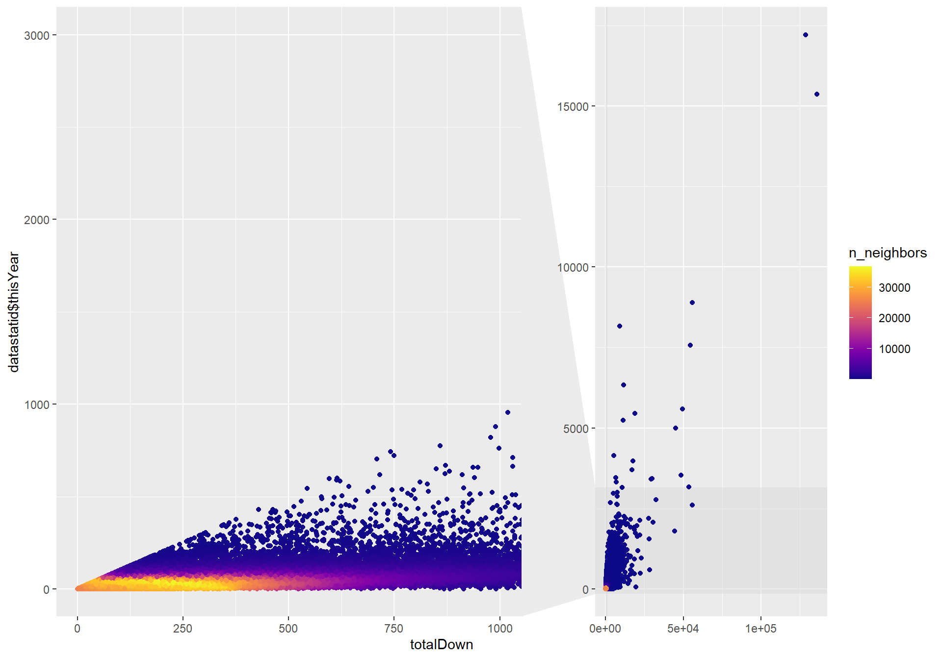
datastat$Old <- 2019 - datastat$Year

datastat$avgYear <- datastat$totalDown / datastat$Old
datastat%>%
filter(Year > 1999) %>%
ggplot(aes( x = avgYear, y = thisYear)) + geom_pointdensity(adjust = 350) +
scale_color_viridis(option = "C") + xlim(c(0,1000)) + ylim(c(0,1000))## Warning: Removed 2606 rows containing non-finite values (stat_pointdensity).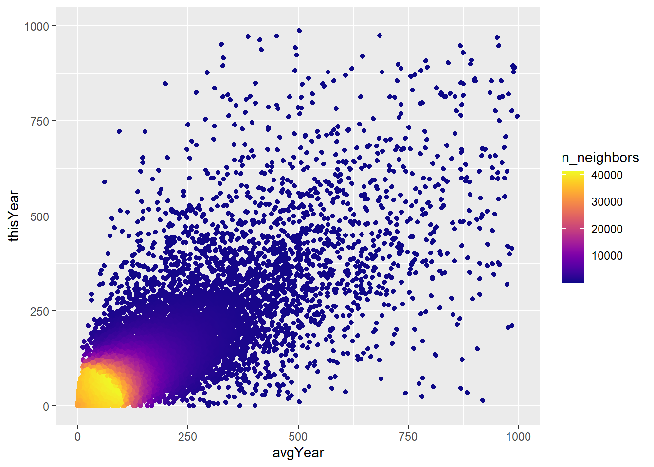
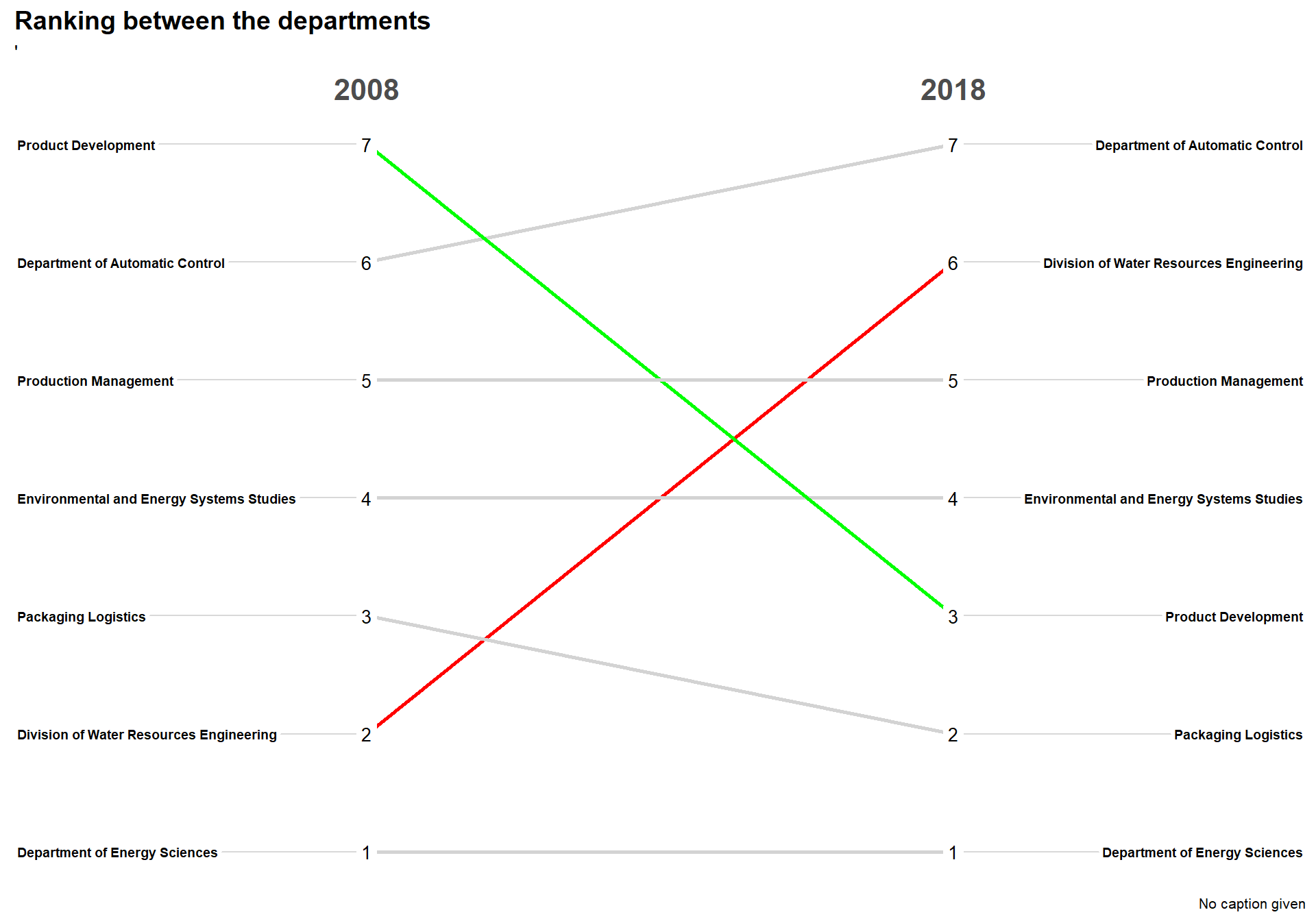
Testar g?ra slopegraph
slopetest <- Engineering %>%
  filter(Year == 2008| Year == 2018) %>%
  group_by(Department, Year) %>%
  summarise(mediandown = median(totalDown)) %>%
  mutate(numb = n()) %>%
  filter(numb == 2)


slopetest <- slopetest[,-4]  #var tvungen att r?kna ut att det fanns samma department p? b?da ?ren
slopetest <- slopetest %>%
arrange(Year, mediandown) %>%
group_by(Year) %>%
mutate(rank = rank(desc(mediandown), ties.method = "first"))%>% #First time using rank in dplyr :D
ungroup()
slopetest$Year <- as.character(slopetest$Year)#This code calculate and gives red or black depedning on the difference is +-4
colorvect <- slopetest %>% group_by(Department) %>%
summarise(difference = diff(rank)) %>%
mutate(whatcolor = case_when(
difference >= 4 ~ "red",
difference <= -4 ~ "green",
TRUE ~ "light gray"
)) %>%
dplyr::select(Department, whatcolor) %>% #another package uses select so must specify that I want to use dplyrs function
tibble::deframe()newggslopegraph(dataframe = slopetest,
Times = Year,
Measurement = rank,
Grouping = Department,
#ReverseYAxis = TRUE, #Cant use this, that is why 15 is first
DataTextSize = 3.5,
YTextSize = 2.5,
XTextSize = 16,
DataLabelPadding = .2,
Title = "Ranking between the departments",
SubTitle = "'",
LineColor = colorvect
)
#gl?m inte att l?gga till colorvect fr?n mario maker s? att det blir bra f?rglibrary(ggeconodist) #install by devtools::install_github("hrbrmstr/ggeconodist")
Engineering$Year <- as.character(Engineering$Year)
testar2 <- Engineering %>%
filter(Year == 1999)
test15 <- datastat%>% #Now a dataframe with only 15 most departments
filter(Department %in% testar2$Department)
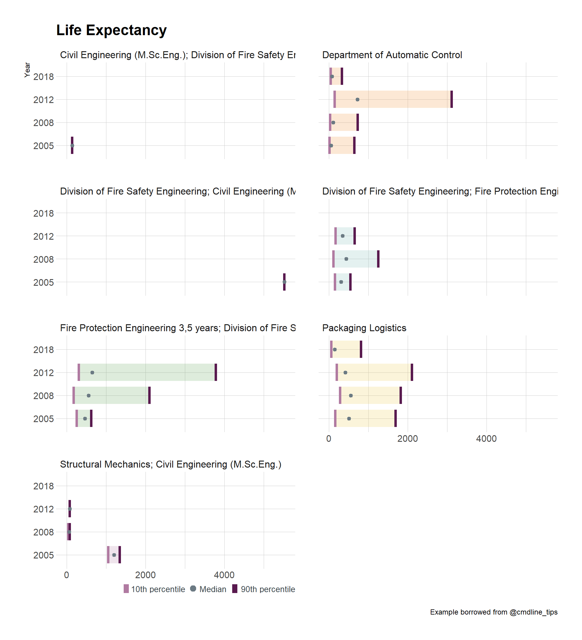
test15$Year <- as.integer(test15$Year)test15 %>%
filter(Year %in% c(2005,2008,2012,2018)) %>%
ggplot(aes(x = factor(Year), y = totalDown, fill = Department)) +
geom_econodist(
median_point_size = 1.2,
tenth_col = "#b07aa1",
ninetieth_col = "#591a4f",
show.legend = FALSE
) +
ggthemes::scale_fill_tableau(name = NULL) +
coord_flip() +
labs(
x = "Year", title = "Life Expectancy", y = NULL,
caption = "Example borrowed from @cmdline_tips"
) +
facet_wrap(~Department, nrow = 4) +
theme_ipsum_rc() -> gmgg
grid.newpage()
gmgg %>%
add_econodist_legend(
econodist_legend_grob(
tenth_col = "#b07aa1",
ninetieth_col = "#591a4f",
),
below = "axis-b-1-4",
just = "right"
) %>%
grid.draw()