Who Plays and Makes Levels in the Nintendo Game Mario Maker?
It’sss aaaa Mee Mariooo analysis
Welcome! And a big thank you for viewing this post! This analysis is all about our favorite plumber Super Mario and the fantastic makers and players that have played the game Mario Maker.
But let me first explain what the game Mario Maker is all about. Mario Maker combines the best of traditional Mario games and human creativity, because players are given tools to create their own Mario levels and the other players can play those levels. The players become therefore the Mario makers, which has yielded a huge variety of funny and smart levels.
This post will first focus on the makers, for example: who creates the most levels? What time is the levels created? Which game style or difficulty is often created? Is there any creation patterns in the data?
But first load the unlimited power in R that is the packages. One of the reasons why I love R is because of the wide variety of packages that can do almost anything imaginable. I will try and highlight some of the packages that are less known in this analysis.
This analysis is written in Rmarkdown, if you want to learn more about rmarkdown you can click on this link: Pimp Rmarkdown, which is created by the very talented Yan Holtz, he has also has made The r graph gallery.
Loading and looking at the data
Load unlimited power
As stated above, all the different packages is one of the best things with R. Some of the new packages I use and want to highlight is the ggpointdensity, pathwork, ggTimeseries (makes it easy with calender heatmap) and cowplot from which I use many of my themes.
library(plotly)
library(ggplot2)
library(tidyverse)
library(ggforce)
library(patchwork)
library(ggridges)
library(scales)
library(data.table)
library(viridis)
library(highcharter)   #create the wordmap
library(cowplot)
library(forcats)
library(lubridate)   #perfect for creating and managing dates
library(countrycode)
library(igraph)
library(ggTimeSeries)  #For creating the calender heatmap
library(wordcloud2)
library(ggpointdensity)    #awesome to use when there is overplotting!
library(DT)  #create tables of the data
library(tidytext)
library(widgetframe)
library(igraph)
library(ggrepel)
library(ggraph)
library(networkD3)
Loading the data
There are many datafiles and some of them are big, I therefore use the fread function from data.table which makes it faster to read data, can’t waste time when we must rescue Princess Peach!
clears <- fread("C:/Users/GTSA - Infinity/Desktop/R analyser/clears.csv")
coursemeta <- fread("C:/Users/GTSA - Infinity/Desktop/R analyser/course-meta.csv")
courses <- fread("C:/Users/GTSA - Infinity/Desktop/R analyser/courses.csv")
likes <- fread("C:/Users/GTSA - Infinity/Desktop/R analyser/likes.csv")
players <- fread("C:/Users/GTSA - Infinity/Desktop/R analyser/players.csv")
plays <- fread("C:/Users/GTSA - Infinity/Desktop/R analyser/plays.csv")
#records <- fread("C:/Users/GTSA - Infinity/Desktop/R analyser/smmnet/records.csv")
Creativity Hearos
Let us begin this analysis by focusing on the players that create levels, I will call these players for makers from now on.
Who builds the levels
The game is named Mario Maker, therefore it feels natural to first investigate the top makers in the game, meaning the players that have created most levels! My code will group every Maker and count how many levels they have made, the top 15 creators is then chosen by the top_n code and will forever be immortalized in my graph.
 p1 <- courses %>%
  group_by(maker) %>%
  summarise(total_count = n()) %>%
  top_n(15) %>%
  filter(maker != "") %>%  #filtering out none named
  ggplot(aes(x = reorder(maker, total_count), y = total_count)) + geom_col(fill = "#049cd8", alpha = 0.7) + coord_flip() + theme_minimal_vgrid() +  labs(title = "Top 15  Mario makers",x = "Dedicated makers", y = "Total levels made") + scale_y_continuous(expand = expand_scale(mult = c(0, 0.05))) + geom_text(aes(y = total_count, label = total_count), hjust = 1.5, colour = "black") + draw_image(
  "https://www.mariowiki.com/images/thumb/a/a2/Builder_Mario_Run.png/1200px-Builder_Mario_Run.png",x = -4, y = 75.5, width = 16, height = 20
) + draw_image(
  "http://www.pngall.com/wp-content/uploads/2/Mario-PNG-Transparent-HD-Photo.png",x = -5.8, y = 75.5, width = 15, height = 20
)


#Using the blue Mario color taken from this website https://www.schemecolor.com/super-mario-colors.php


top15makers <- courses %>%    #Filter out the top 15 makers
  count(maker) %>%
  top_n(15) %>%
  filter(maker != "") %>%
  arrange(n, maker) %>%
  mutate(maker = factor(maker, levels = unique(maker)))


top15 <- courses %>%    #Create a new dataframe that only contains information from the top 15 makers
  filter(maker %in% top15makers$maker) %>%
  mutate(maker = factor(maker, levels = levels(top15makers$maker)))


p2 <- top15 %>%
  group_by(maker, difficulty) %>%
  count() %>%
  ggplot(aes(x = maker, y = n, fill = difficulty)) + geom_col( position='fill', color = "black", alpha = 0.9) + scale_y_continuous(expand = c(0, 0), label = percent)  + theme_minimal_vgrid() +  theme(
    legend.position = "bottom",
    legend.justification = "left",
    legend.direction = "horizontal",
    legend.box = "horizontal", legend.background = element_blank(),legend.title = element_blank(),
               legend.text = element_text(size = 7),axis.title.y=element_blank(),
        axis.text.y=element_blank(),
        axis.ticks.y=element_blank(),axis.text=element_text(size= 9)) + labs(title = "Difficulty in the making", x = "", y = "Difficulty in %") + coord_flip()

p1 + p2 + plot_layout(ncol=2,widths=c(2,1))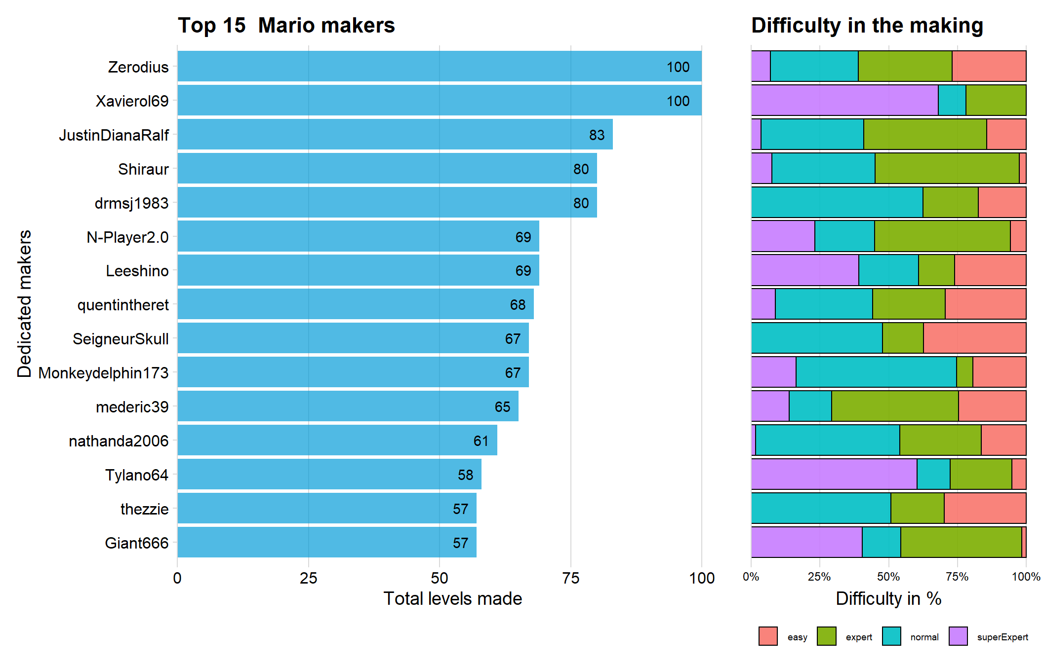
We can see that both Zerodius and Xavierol69 have made 100 levels each, which seems to be the maximum amount of levels one player can create.
One could think that one reason that the top 15 makers have made so many levels is because they are doing many easy levels (which should take less time). But as we can see from the right graph, so is not the case! Many of the makers have made few easy levels and mostly normals and expert. Xavierol69 have created around 70 % of his/her levels on the superExpert difficulty, very impressive indeed since superexpert levels often takes a lot of time!
When did they have the time?
I wondered how long time it took for the top 15 makes to make a level so I grouped each maker and date. This should show me which day they made a level (or more precise, uploaded it). I used Plotly in order to let the reader explore the graph interactively.
#using the lubriate packate to convert into date
courses$creation <- as_date(courses$creation)

likes$catch <- as_date(likes$catch)
plays$catch <- as_date(plays$catch)


#filter out the top 15

d2 <- courses %>%
  count(maker) %>%
  top_n(15) %>%
  arrange(n, maker) %>%
  mutate(maker = factor(maker, levels = unique(maker)))


top15 <- courses %>%
  filter(maker %in% d2$maker) %>%
  mutate(maker = factor(maker, levels = levels(d2$maker)))

p <- top15 %>%
  group_by( creation, maker) %>%
  summarise(count = n()) %>%
  ggplot(aes(x = creation, y = count, color = maker)) + geom_jitter(aes(size = count, alpha = 0.5)) + theme_minimal_hgrid() + labs(title = "When the top makers made the levels")

ggplotly(p)
We can see that there are some big outliners in the data. If you hover over the big first point you will see that Zerodius uploaded 94 levels on 2017-08-28 according to the data. It is interesting to notice that some makers uploaded several levels on the same day between August and October.
Otherwise it seems normal, the most makers upload one level per day and waits some days before uploading a new level.
Timeline of the making
Let’s see if there is any time trend in the creation of levels. Questions that could be asked is if there is a decline/increase of new levels, which could indicate if the game is “dying” or thriving.
courses %>%
  group_by( creation) %>%
  summarise(count = n()) %>%
  ggplot(aes(x = creation, y = count)) + geom_line() + geom_smooth() + theme_minimal_hgrid() + labs(title = "Time serie of creating levels", x = "Date", y = "")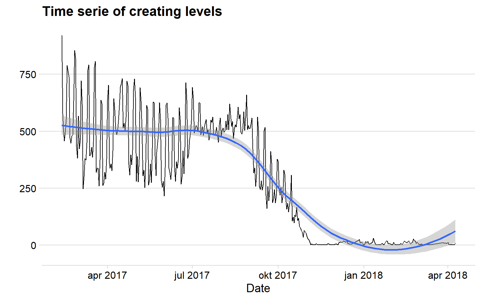
Here is something interesting again. There is a sudden drop of creations which could be linked to our earlier graph that showed us that some makers uploaded many levels on the same day between August and October. Maybe there was a patch in the game that was released between that time period.
The graph tells me that there are not many new levels uploaded, however, I belive this is more a problem with our dataset.
Calender heatmap of uploading levels
In our data is the date for when the level was uploaded to the Mario Maker game server. The date contains information of the Year, Month and day, which is all we need in order to use the awesome package ggTimeseries to create a calendar heatmap.
makerdate <- courses %>%
  count(creation)

makerdate %>%
  ggplot_calendar_heatmap('creation','n',monthBorderSize = 1.5,monthBorderColour = "black")+
  scale_fill_viridis(option = "D")+  #Change the option to exmaple: A,B,C,E,F in order to change colour
  theme_minimal()+
  facet_wrap(~Year, ncol = 1,strip.position = "right")+
  theme(panel.spacing = unit(4, "lines"),
        panel.grid.minor = element_blank(),
        legend.position = "bottom")+
  labs(y='',
       fill="Levels uploaded each day",
       title = "Calendar heatmap for level creation")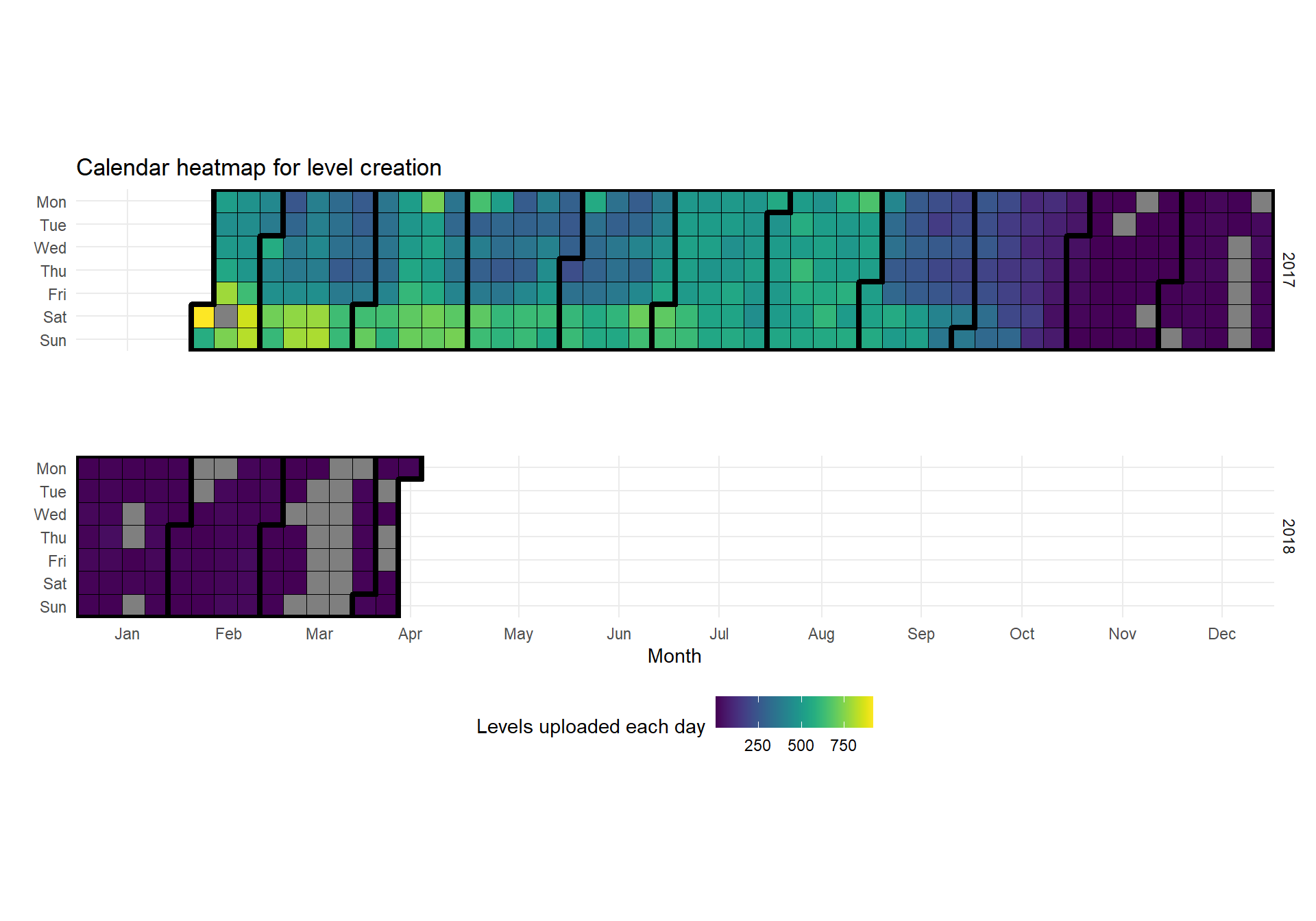
We can see that there are much more activity uploading levels the first months and then a big decline (which we also could see in the line graph). A new thing we can witness using the calendar heatmap is that Saturday and Sunday seems to be the most active days, which is no surprise since the makers are free from school or work on these days.
We can also see that there are some missing days in our data for the last five months.
Network analysis
Network analysis is a powerful tool when you want to analyze relationship between two or more things of interest. In this analysis I want to analyze if there are any relationship between players and makers.
The data consist of players that have played levels. If I merge the played levels ID with the makers ID I am able to see if there players that play many levels created by the same maker.
I use the package networkD3 that makes an interactive and according to me clear/good looking social analysis graph.
networktest <- merge(plays, courses, by = "id")  #merge the dataframe so we only have data on levels with makers


netdf <- networktest %>%
  group_by(player, maker) %>%
  count() %>%
  filter( n>45)   #Only have the players that have played over 45 times from same maker


netdf  <- netdf [,-3]

ts <- simpleNetwork(netdf ,
              zoom = T)
frameWidget(ts, height = 400, width = '95%')
The network is interactive and zoomable so spend some time to investigate it! I would like to add arrow so the players will point to the makers…..but I don’t know how to do it.
Which difficulty is most popular?
There are four different difficulty’s for a level: easy, normal, expert and super expert. The super expert levels are no joke! Check out this for example:

Give me a hundred years and I would never be able to beat it (but my thumbs would have gotten six pack from all the button pressing).
Mario Maker is fantastic since you can create Mario games in four different styles! The classic Mario style from the legendary 8 bit NES time, Super Mario Bros 3, Super Mario Word from (my favorite style) and the last style is New Super Mario Bros, which is not in pixel graphics.
I will now investigate which of the difficulty that is most created, and if the game styles is the same across each difficulty.
p1 <- courses %>%
  group_by(difficulty) %>%
  count() %>%
  ggplot( aes(x = reorder(difficulty, -n), y = n, fill = difficulty)) +
  geom_col(fill = "#049cd8", alpha = 0.7, color = "black") +theme(legend.position = 'none') +
  theme_minimal_hgrid() + labs(title = "Levels made in each difficulty", y = "Amount", x = "") +
  scale_y_continuous(expand = expand_scale(mult = c(0, 0.05))) +
  geom_text(aes(y = , label = n), vjust = 1.3, colour = "black", size = 4)


#Here I use forcats so that the plot will not be ordered by alphabetuc
courses$difficulty <- fct_relevel(courses$difficulty, c('easy', 'normal', 'expert', "superExpert"))

p2 <- courses %>%
  group_by( creation, difficulty) %>%
  summarise(count = n()) %>%
  ggplot(aes(x = creation, y = count, color = difficulty)) + geom_line(color = "#049cd8") +
  facet_grid(difficulty ~.) + theme_minimal_hgrid() + theme(legend.position = 'none') +
  panel_border() + labs(title = "Time series of levels", x = "Creation date", y = "Amount")


#Selecting colors from the super mario games
colorset = c('marioBros'='#fbd000','marioBros3'='#e52521','marioBrosU'='#43b047','marioWorld'='blue'  )


p3 <- courses %>%
  group_by(difficulty, gameStyle) %>%
  count() %>%
  ggplot(aes(x = difficulty, y = n, fill = gameStyle)) + scale_fill_manual(values=colorset) +
  geom_col( position='fill', color = "black", alpha = 0.7) + scale_y_continuous(expand = c(0, 0), label = percent)  +
  theme_minimal_hgrid() +  theme(
    legend.position = "bottom",
    legend.justification = "left",
    legend.direction = "horizontal",
    legend.box = "horizontal", legend.background = element_blank(),legend.title = element_text(size = 9),
               legend.text = element_text(size = 9)) +
  labs(title = "Game style distribution in difficulty", x = "", y = "Gamestyle in %")

(p1 / p3) - p2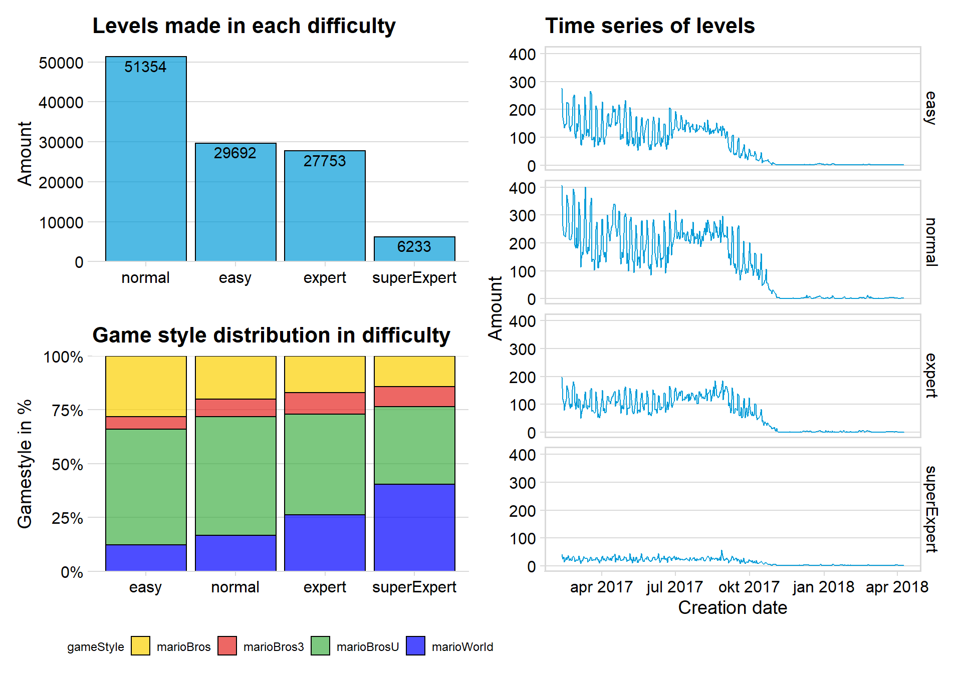
We can clearly see that the Normal difficulty is most common for Makers to create. I am not surprised that there are least of Super expert levels since they often have a complex composition.
The plot that showcase the game style in each difficulty tells me that Mario Word becomes more popular with makers that makes higher difficulty levels. My guess would be that the hard-core Mario makers played Mario Word when they were younger and took a liking to the game
The newest style New Mario Bros U is most popular at easy or normal difficulty.
Who is spreading the love?
The CSV file named likes contains levels that have received likes and the player that gave the like. Below is my analysis on this topic.
love <- likes %>%
  count(player) %>%
  arrange(desc(n)) %>%
  top_n(15)%>%
  arrange(n, player) %>%
  mutate(player= factor(player, levels = unique(player)))

top15<- courses %>%    #Filter out the top 15 makers
  count(maker) %>%
  top_n(15) %>%
  filter(maker != "") %>%
  arrange(n, maker) %>%
  mutate(maker = factor(maker, levels = unique(maker)))


top15likes <- likes %>%
  filter(player %in% love$player) %>%
  mutate(player= factor(player, levels = levels(love$player)))


ha <- top15likes %>%
  group_by(catch, player) %>%
  count()


p1 <- ggplot(data = love, aes(x = reorder(player,n), y = n)) + geom_col(fill = "#049cd8", alpha = 0.7) +
  coord_flip() + theme_minimal_vgrid() +
  labs(title = "Players that spread the most love",x = "Honorable players", y = "Total likes given") +
  scale_y_continuous(expand = expand_scale(mult = c(0, 0.05))) +
  geom_text(aes(y = n, label = n), hjust = 1.5, colour = "black")

p2 <- ggplot(data =ha, aes(x = n, y = player, fill = 0.5 - abs(0.5-..ecdf..))) + stat_density_ridges(geom = "density_ridges_gradient", calc_ecdf = TRUE, alpha = 0.8) +
  scale_x_continuous(expand = c(0.01, 0)) +
  scale_y_discrete(expand = c(0.01, 0))+
  scale_fill_viridis(name = "Tail probability", direction = -1) + theme(legend.position = "none") +
  ylab("") + xlim(c(-5, 20)) + theme_minimal_hgrid() + theme(axis.title.y=element_blank(),
        axis.text.y=element_blank(),
        axis.ticks.y=element_blank(),
        legend.position="none") + labs(title = "Likes given per day", x = "Likes")


p1 + p2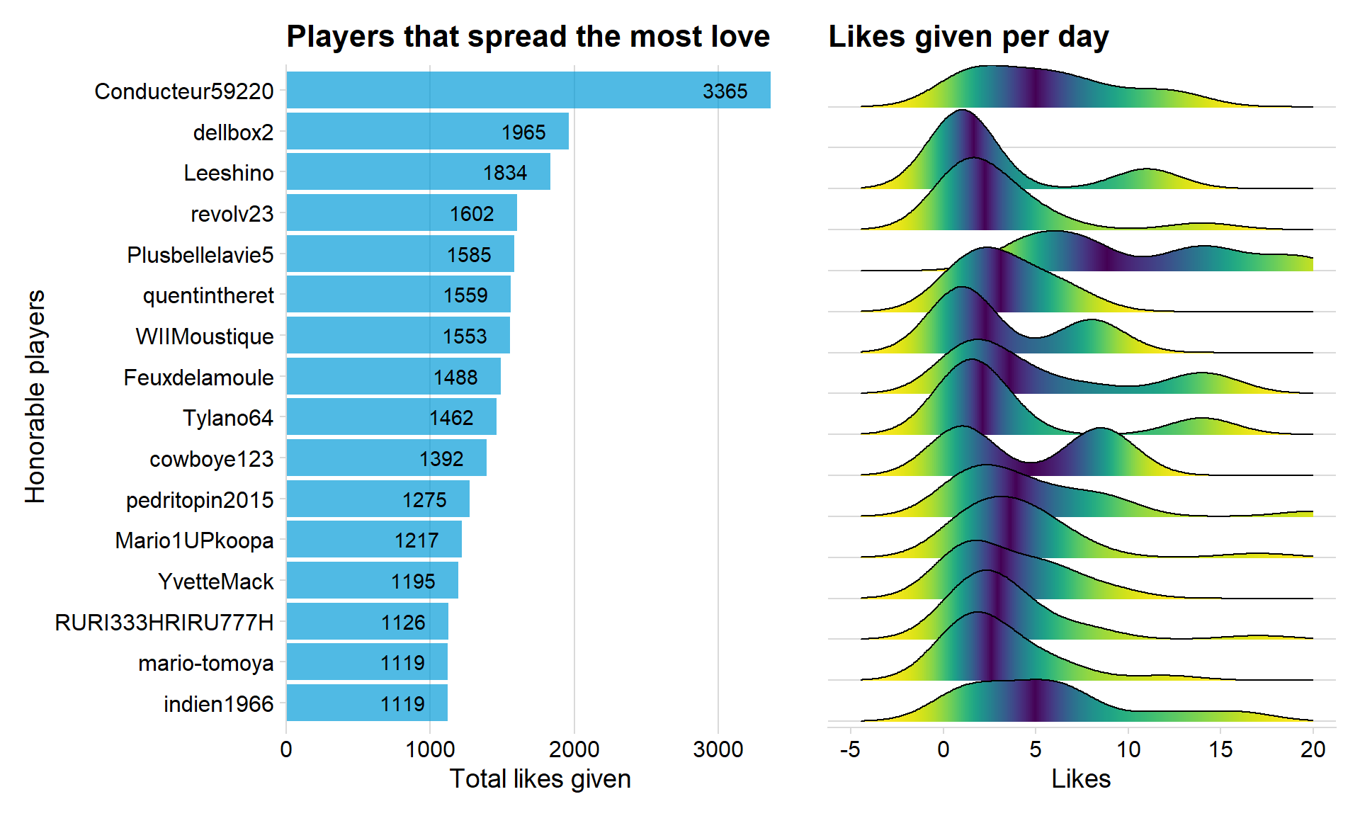
Conducteur59220 is the player that have given away 3365 likes which is the most of any player. The right sided graph indicates how many likes the players gives each day, dellbox2 can’t be seen in that graph because of the xlim function.
Likes for difficulty and game style
Let’s investigate which difficulty and game style that receives the most likes.
loveall <- merge(likes, courses, by ="id")

p1 <- loveall %>%
  group_by(gameStyle) %>%
  count() %>%
  ggplot(aes(x = reorder(gameStyle, -n), y = n, fill = gameStyle)) +
  geom_col(fill = "#049cd8", color = "black", alpha = 0.7) + theme_minimal_hgrid() +
  scale_y_continuous(expand = expand_scale(mult = c(0, 0.05))) +
  geom_text(aes(y = , label = n), vjust = 1.3, colour = "black", size = 4) +
  labs(title = "The love for Game Style", x = "Game style", y = "Amount")


p2 <- loveall %>%
  group_by(difficulty) %>%
  count() %>%
  ggplot(aes(x = reorder(difficulty,-n), y = n, fill = difficulty)) +
  geom_col(fill = "#049cd8", color = "black", alpha = 0.7) + theme_minimal_hgrid() +
  scale_y_continuous(expand = expand_scale(mult = c(0, 0.05))) +
  geom_text(aes(y = , label = n), vjust = 1.3, colour = "black", size = 4) +
  labs(title = "The love for Difficulty", x = "Difficulty", y = "Amount")


p1 / p2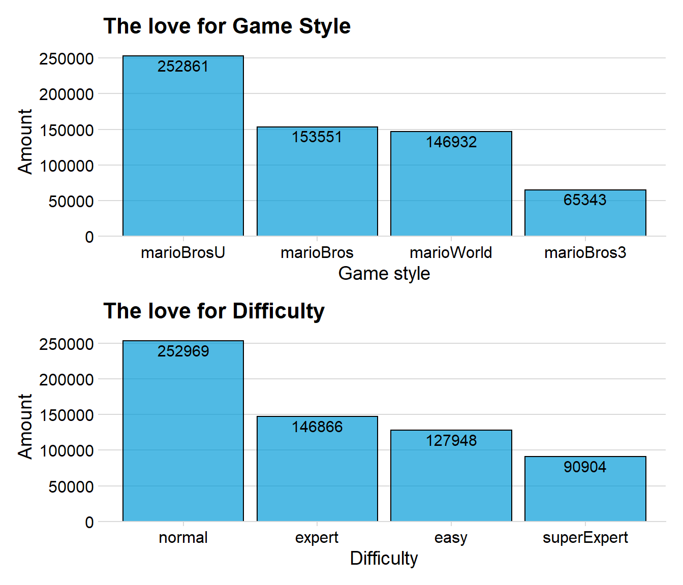
We can see that normal and expert receives the most likes. The most interesting thing to notice is that Super Expert have almost the same amount of likes as easy, but there are much more levels that are easy. This would indicate that players are more generous when giving likes to Super expert levels, maybe because the levels are more impressive.
Who is clearing the most levels?
top15players <- clears %>%
  count(player) %>%
  top_n(15) %>%
  arrange(n, player) %>%
  mutate(player = factor(player, levels = unique(player)))


p1 <- ggplot(data =top15players, aes(x = reorder(player,n), y = n)) + geom_col(fill = "#049cd8", alpha = 0.7) + coord_flip() + theme_minimal_vgrid() +
labs(title = "Top 15 players with most cleared levels",x = "Dedicated players", y = "Total cleared levels") + scale_y_continuous(expand = expand_scale(mult = c(0, 0.05))) + geom_text(aes(y = n, label = n), hjust = 1.5, colour = "black")


top15players <- clears %>%    #Create a new dataframe that only contains information from the top 15 makers
  filter(player %in% top15players$player ) %>%
  mutate(player = factor(player, levels = levels(top15players$player )))


top15players <- merge(top15players, courses, by = "id")


p2 <- top15players %>%
  group_by(player, difficulty) %>%
  count() %>%
  ggplot(aes(x = player, y = n, fill = difficulty)) + geom_col( position='fill', color = "black", alpha = 0.9) + scale_y_continuous(expand = c(0, 0), label = percent)  + theme_minimal_vgrid() +  theme(
    legend.position = "bottom",
    legend.justification = "left",
    legend.direction = "horizontal",
    legend.box = "horizontal", legend.background = element_blank(),legend.title = element_blank(),
               legend.text = element_text(size = 7),axis.title.y=element_blank(),
        axis.text.y=element_blank(),
        axis.ticks.y=element_blank(),axis.text=element_text(size= 9))+
  labs(title = "Clearing difficulty", x = "", y = "Difficulty in %") + coord_flip()

p1 + p2 + plot_layout(ncol=2,widths=c(2,1))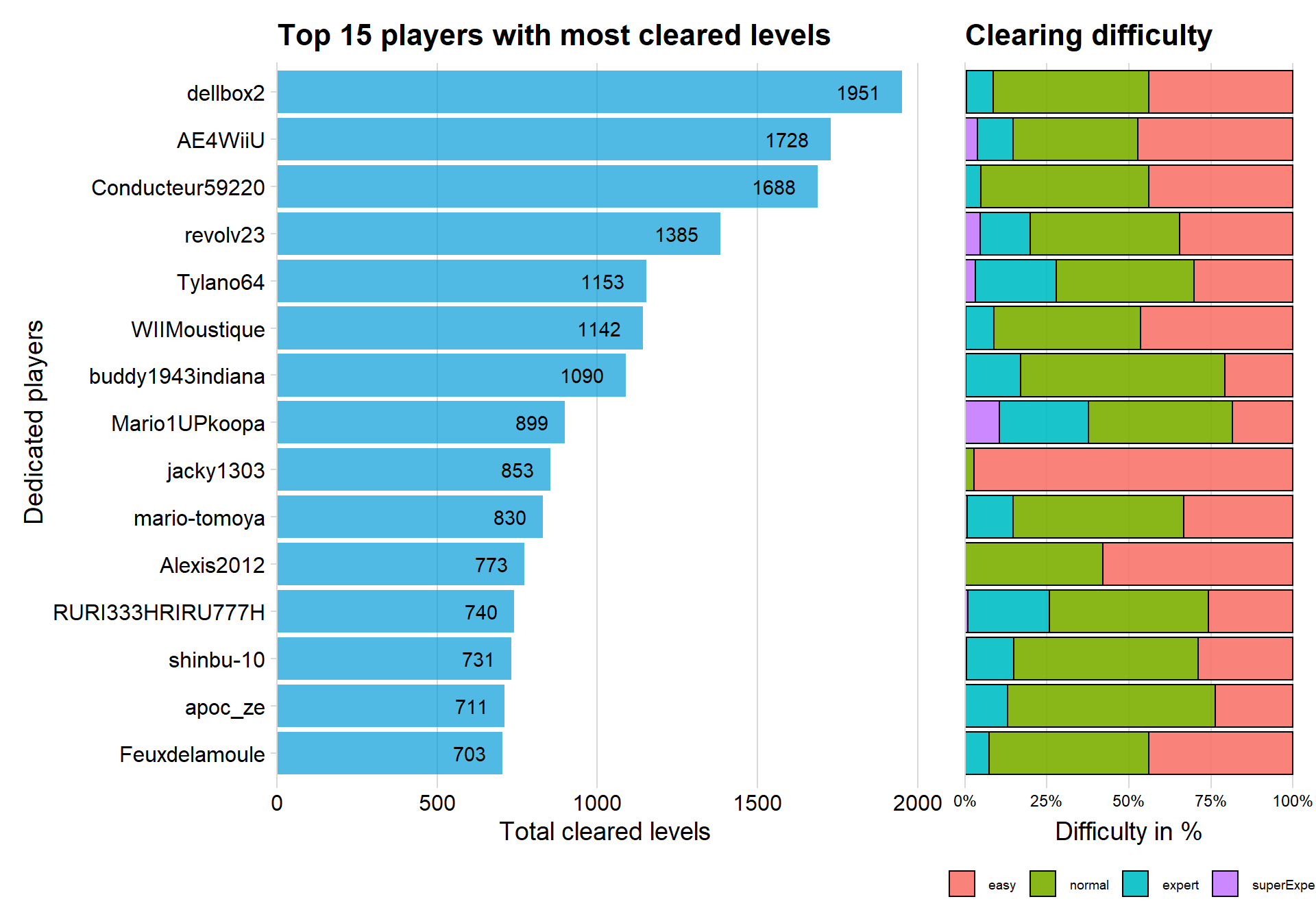
The above plot shows some similarity to the players given most likes because many of them appears on both graphs. In fact, nine of the players are the same. This would indicate that there may be a correlation between playing levels and giving likes (a correlation that sounds very reasonable)
The right sided graph shows that the top 15 players almost only play on easy or normal difficulty. Mario1UOkoopa had the highest percent of levels cleared with difficulty expert or super expert. Player **jacky1303* have almost only played easy levels.
Do people that play also give likes?
The above graphs showed us that there might be a correlation between playing many levels and giving away likes.
df<- clears %>%
count(player)
loveall <- likes %>%
count(player) %>%
arrange(desc(n))
loveplay <- merge(df, loveall, by="player")
ggplot(data = loveplay, aes(x = n.x, y = n.y)) + geom_pointdensity(adjust = 30, alpha = 0.7) + facet_zoom(xlim = c(1, 400), ylim = c(1,950)) + geom_smooth(method = "lm") + labs(titel = "Does players with more clears give more likes?", x = "Number of cleared levels", y = "Likes given") + scale_color_viridis() + labs(title = "Relation between Likes and Cleared levels", x = "Cleared Levels", y = "Likes given")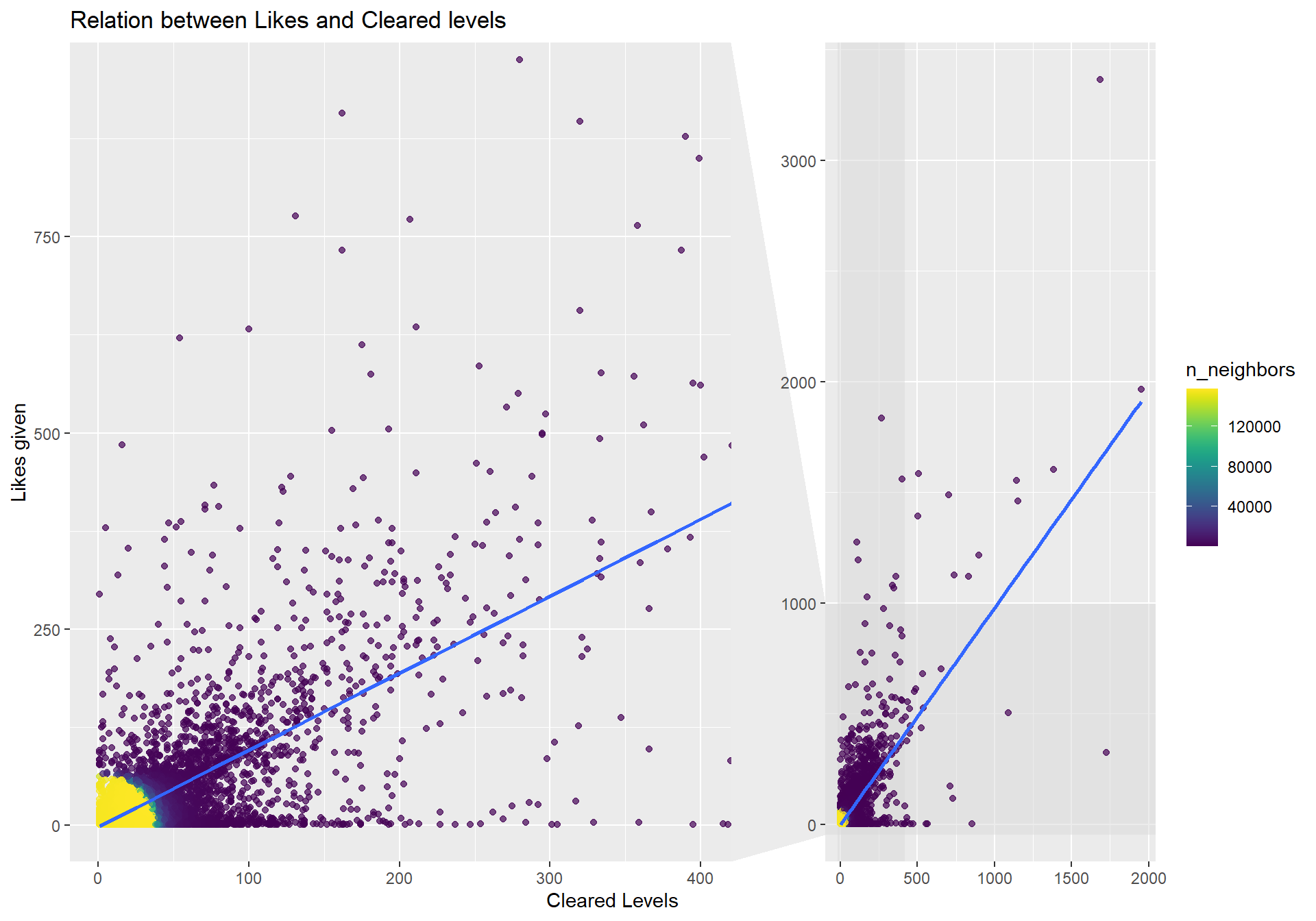 We can see that there indeed seems to be a relationship between playing and giving likes. There seems to be two different kind of players we can observe in the graph. First those players that clears many levels but almost never likes a level, on the other hand there seems to be players that has cleared few levels but liked many levels.
Calendar heatmap of cleared levels
Let’s create another calendar heatmap but using data on cleared levels instead.
clears$catch <- as_date(clears$catch)


playdate <- clears %>%
  count(catch)

playdate %>%
  ggplot_calendar_heatmap('catch','n',monthBorderSize = 1.5,monthBorderColour = "black")+
  scale_fill_viridis(option = "D", label = comma)+  #label =  comma is from scales and removes scientific notation from legend
  theme_minimal()+
  facet_wrap(~Year, ncol = 1,strip.position = "right")+
  theme(panel.spacing = unit(5, "lines"),
        #panel.grid.major = element_blank(),
        panel.grid.minor = element_blank())+
  labs(y='',
       fill="Daily active members",
title = "Calendar heatmap of the active members") 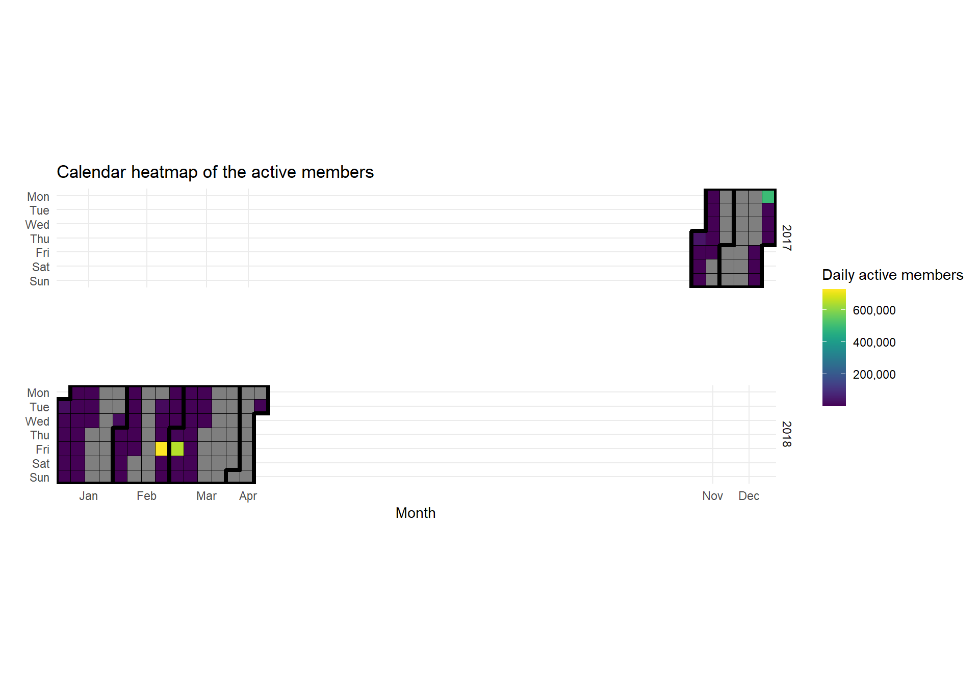
Here we can see some problem with the data. There are many days that are missing, and we only have data for around five months (we had data for 15 month on the courses dataset).
Plotting a wordmap
This is a plot that I learned by observing the very talented data viz master Head or Tails here at kaggle, more specific from this kernel: Kaggle story.
This plot is made possible thanks to the package countrycode that takes the flag column and transform it into iso3c which then can be used by highcharter.
land <- players %>%
  group_by(flag) %>%
  count() %>%
  mutate(iso3 = countrycode(flag, origin = "iso2c", destination = "iso3c"))


ts <- highchart() %>%
  hc_add_series_map(worldgeojson, land, value = 'n', joinBy = 'iso3') %>%
  hc_title(text = 'Players of the world') %>%
  hc_colorAxis(minColor = "#ffdf3f", maxColor = "#5c46ff") %>%
  hc_tooltip(useHTML = TRUE, headerFormat = "", pointFormat = "{point.flag}: {point.n} players")


frameWidget(ts, height = 350, width = '95%')
We can see that there are many countries that are not represented in our data. USA and Japan are the largest playerbase.
Clear rates and attempts
The dataset contains the clear rate for a level, where 100 means that all players have cleared the level on the first try.
meta <- merge(coursemeta, courses, by= "id")
#select the latest date for each individual id level
meta <- meta %>%
    group_by(id) %>%
    arrange(desc(catch)) %>%
    slice(1:1)


meta$difficulty<- fct_relevel(meta$difficulty, c('easy', 'normal', 'expert', "superExpert"))

p1 <- ggplot(data = meta, aes(x = difficulty, y = (clearRate)/100, fill = difficulty)) + geom_boxplot() + theme_minimal_hgrid() +  theme(legend.position = 'none') + scale_y_continuous(label = percent) +
  labs(title = "Clear rate across difficulty", x = "Difficulty", y ="Clear rate in %")


p2<- ggplot(data = meta, aes(x = log(attempts), y = difficulty, fill = difficulty)) +
  stat_density_ridges(scale = 3, rel_min_height = 0.01, alpha = 0.7) +
  scale_x_continuous(expand = c(0.01, 0)) +
  scale_y_discrete(expand = c(0.01, 0)) +
  theme_ridges(font_size = 13, grid = TRUE) + theme(legend.position = 'none') + xlab("Log attempts") + ylab("") +xlim(c(2,11))


p1 + p2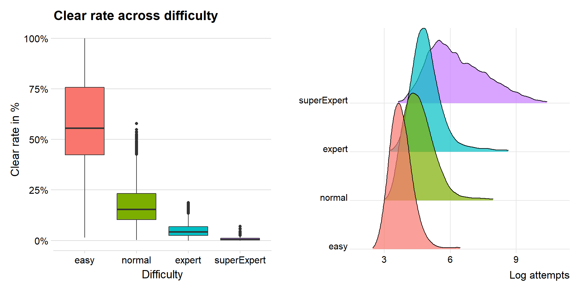
It is clear that the clear rate of levels decreases by higher difficulty. Super expert levels do live up to its name when you can see how low clear rate there is.
The Log attempts graphs show us that there are many more attempts on Super expert, this is due to the dedicated players that do everything to clear a good level. If I did not log the attempts, it would be unreadable since the difference between easy and super expert is very large.
Wordcloud of the titles
The makers must also give a title to their level when uploading it. There are often funny and very original titles. So, let’s take a quick look at a word cloud that shows the most frequent words in the titles. The word cloud is made using the package wordcloud2 which makes an interactive word cloud and you can select the shape of the cloud (which of course is a star to represent the Super Star in Mario games)
 word <-   courses %>%
    unnest_tokens(word, title) %>%    # split words
    anti_join(stop_words) %>%    # take out "a", "an", "the", etc.
    count(word, sort = TRUE)    # count occurrences


 word$char <-nchar( word$word)

 word <-  word %>%
  filter( char > 2, n > 70)


wordcloud2((data =  word), size = 0.7, shape = 'star')
The following words from the word cloud catches my attention:
Mario: he is the main character of the game.
Bowers: Marios enemy numbero uno.
Run: some levels require that you only run forward in the game.
Automatic and Automatique: The level is automatic, so you stand still and still win. Watch this example: Auto Levels
Troll: a level that is meant to trick the players, often in crazy ways, for example permanent time lock.
Classification tree for fun
A tree graph is often good to use in order to get a feel for the data and what variables that seems to be important. I also wanted to try out and showcase how good looking rpart makes the tree graph.
I therefore investigated how a tree classification tree would look like if I tried to classify the difficulty of a level, this is no serious classification, it is only done for fun, meaning to training/test data or so on.
library(rpart)
library(rpart.plot)

tree <- rpart(meta$difficulty ~ meta$stars + meta$players + meta$clears + meta$gameStyle + meta$attempts, cp = 0.02)

rpart.plot(tree, box.palette = "RdBu", shadow.col = "gray", nn = TRUE)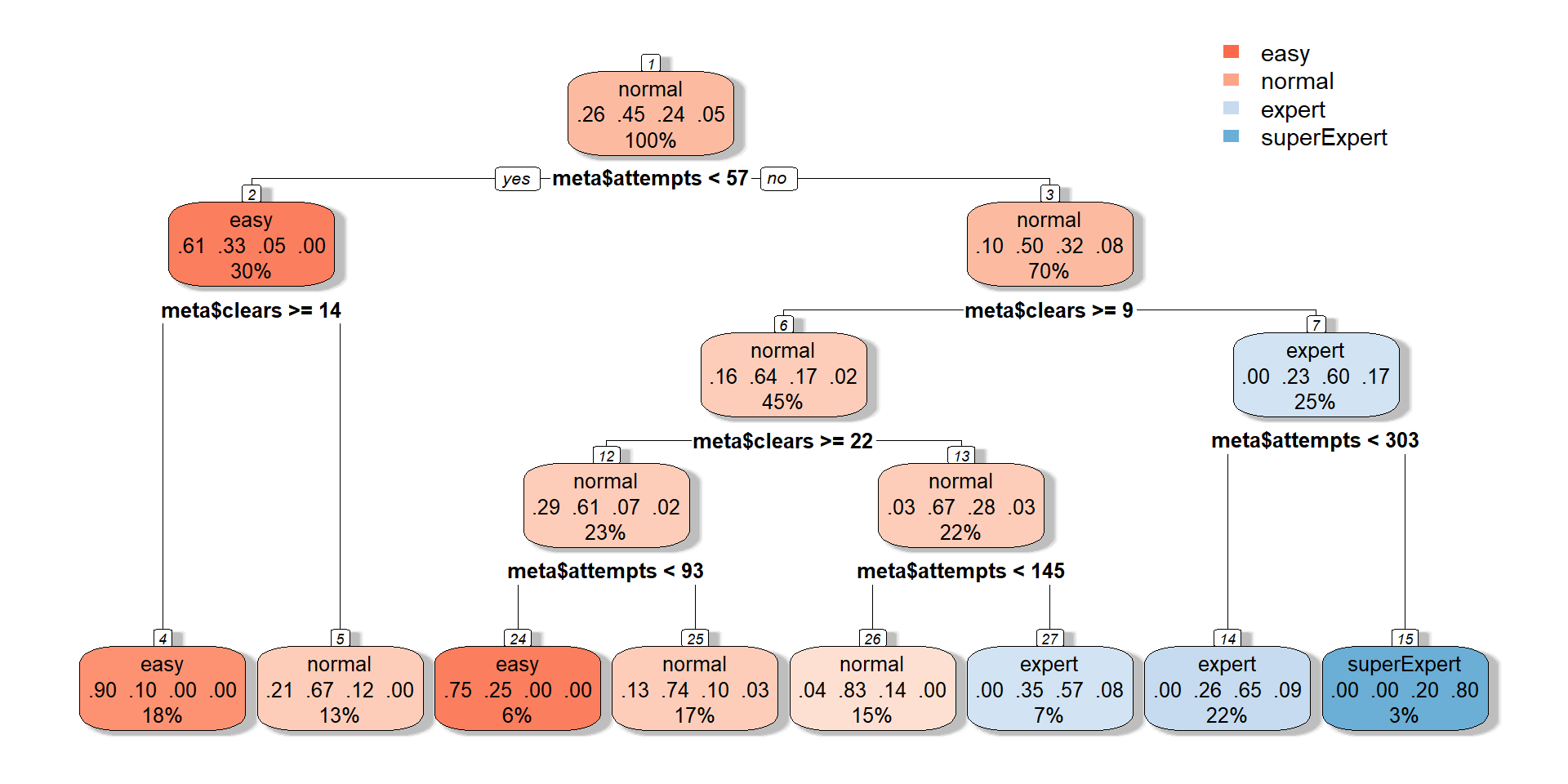
I used five variables in order to try and predict the difficulty, but only the variables “attempts” and “clears” seem to be important if we look at the tree graph. The biggest problem with this classification seems to be the Super Expert difficulty, which the tree only can predict of one node.
This is the end of my analysis. I can conclude the following:
Normal and Expert is the most popular levels, both for makers and players.
According to our dataset so is there a decline in new levels created.
The top players that cleared most levels often plays on normal or easy.
The style of Super Mario Word increases with higher difficulty.
That’s all for me for this analysis. Since I am in my Kaggle beginning journey please say if there are some mistakes or graphs I could have done better (for example the Network with arrows or the World map with more colors).
Thank you for spending time and reding my notebook!
Kind regards Per Granberg