Trends and Analysis of Suicide from WHO
Introduction
This post will explore suicides across the world for a long time period. Questions that I asked and will be answered is What country have the relative highest suicides? What Countries increases and decreases in suicide? Is there a pattern considering continent? Is age an interesting variable to study?
Suicide is a sensitive topic and I only want to explore and try to understand it more by doing this analysis.
Import the data and cleaning it
The majority of the data used in this analysis was obtained from the World Health Organisation.
Data Cleaning Notes
- 7 countries removed (<= 3 years of data total)
- 2016 data was removed (few countries had any, those that did often had data missing)
- HDI was removed due to 2/3 missing data
- Generation variable has problems, detailed in 2.11
- Continent was added to the dataset using the
countrycodepackage - Africa has very few countries providing suicide data
library(tidyverse) # general
library(ggalt) # dumbbell plots
library(countrycode) # continent
library(rworldmap) # quick country-level heat maps
library(gridExtra) # plots
library(broom) # significant trends within countries
library(patchwork)
library(highcharter)
library(cowplot)
library(scales)
library(widgetframe)
theme_set(theme_light())


# 1) Import & data cleaning

data <- read_csv("C:/Users/GTSA - Infinity/Desktop/R analyser/master.csv")

# glimpse(data) # will tidy up these variable names

# sum(is.na(data$`HDI for year`)) # remove, > 2/3 missing, not useable

# table(data$age, data$generation) # don't like this variable

data <- data %>%
  select(-c(`HDI for year`, `suicides/100k pop`)) %>%
  rename(gdp_for_year = `gdp_for_year ($)`,
         gdp_per_capita = `gdp_per_capita ($)`,
         country_year = `country-year`) %>%
  as.data.frame()


# 2) OTHER ISSUES

# a) this SHOULD give 12 rows for every county-year combination (6 age bands * 2 genders):

# data %>%
#   group_by(country_year) %>%
#   count() %>%
#   filter(n != 12) # note: there appears to be an issue with 2016 data
# not only are there few countries with data, but those that do have data are incomplete

data <- data %>%
  filter(year != 2016) %>% # I therefore exclude 2016 data
  select(-country_year)

names(data)[1] <- "country"  #rename to country

# b) excluding countries with <= 3 years of data:

minimum_years <- data %>%
  group_by(country) %>%
  dplyr::summarize(rows = n(),
            years = rows / 12) %>%
  arrange(years)

data <- data %>%
  filter(!(country %in% head(minimum_years$country, 7)))


# no other major data issues found yet


# 3) TIDYING DATAFRAME
data$age <- gsub(" years", "", data$age)
data$sex <- ifelse(data$sex == "male", "Male", "Female")


# getting continent data:
data$continent <- countrycode(sourcevar = data[, "country"],
                              origin = "country.name",
                              destination = "continent")

# Nominal factors
data_nominal <- c('country', 'sex', 'continent')
data[data_nominal] <- lapply(data[data_nominal], function(x){factor(x)})


# Making age ordinal
data$age <- factor(data$age,
                   ordered = T,
                   levels = c("5-14",
                              "15-24",
                              "25-34",
                              "35-54",
                              "55-74",
                              "75+"))

# Making generation ordinal
data$generation <- factor(data$generation,
                   ordered = T,
                   levels = c("G.I. Generation",
                              "Silent",
                              "Boomers",
                              "Generation X",
                              "Millenials",
                              "Generation Z"))

data <- as_tibble(data)


# the global rate over the time period will be useful:

global_average <- (sum(as.numeric(data$suicides_no)) / sum(as.numeric(data$population))) * 100000

# view the finalized data
glimpse(data)
## Observations: 27,492
## Variables: 10
## $ country <fct> Albania, Albania, Albania, Albania, Albania, Albania...
## $ year <dbl> 1987, 1987, 1987, 1987, 1987, 1987, 1987, 1987, 1987...
## $ sex <fct> Male, Male, Female, Male, Male, Female, Female, Fema...
## $ age <ord> 15-24, 35-54, 15-24, 75+, 25-34, 75+, 35-54, 25-34, ...
## $ suicides_no <dbl> 21, 16, 14, 1, 9, 1, 6, 4, 1, 0, 0, 0, 2, 17, 1, 14,...
## $ population <dbl> 312900, 308000, 289700, 21800, 274300, 35600, 278800...
## $ gdp_for_year <dbl> 2156624900, 2156624900, 2156624900, 2156624900, 2156...
## $ gdp_per_capita <dbl> 796, 796, 796, 796, 796, 796, 796, 796, 796, 796, 79...
## $ generation <ord> Generation X, Silent, Generation X, G.I. Generation,...
## $ continent <fct> Europe, Europe, Europe, Europe, Europe, Europe, Euro...
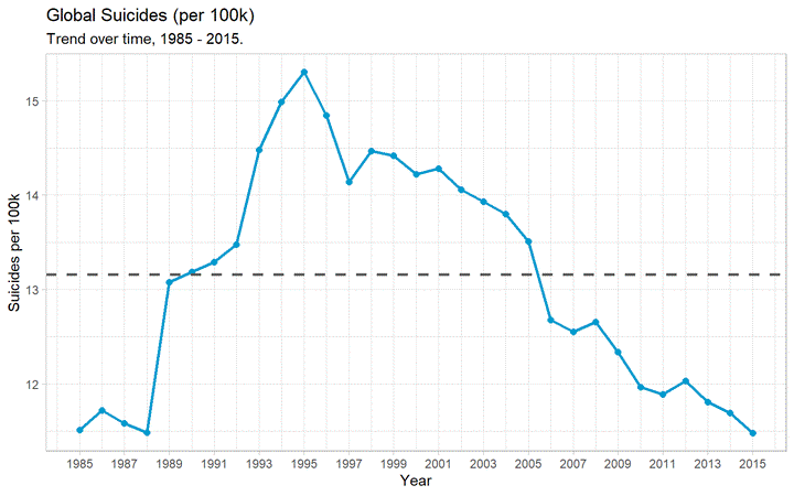
Global suicide Trend
The first question that came into my mind was to investigate if the sucide per 100k have increased or decreased over time. This is an important question because then we will know if it’s getting better or worse.
data %>%
  group_by(year) %>%
  summarize(population = sum(population),
            suicides = sum(suicides_no),
            suicides_per_100k = (suicides / population) * 100000) %>%
  ggplot(aes(x = year, y = suicides_per_100k)) +
  geom_line(col = "deepskyblue3", size = 1) +
  geom_point(col = "deepskyblue3", size = 2) +
  geom_hline(yintercept = global_average, linetype = 2, color = "grey35", size = 1) +
  labs(title = "Global Suicides (per 100k)",
       subtitle = "Trend over time, 1985 - 2015.",
       x = "Year",
       y = "Suicides per 100k") +
  scale_x_continuous(breaks = seq(1985, 2015, 2)) +
  scale_y_continuous(breaks = seq(10, 20))
The dashed line is the global average suicide rate from 1985 - 2015: (per 100k, per year).
The above plot show us the following insights:
- Peak suicide rate was 15.3 deaths per 100k in 1995
- Decreased steadily, to 11.5 per 100k in 2015 (~25% decrease)
- Rates are only now returning to their pre-90’s rates
- Limited data in the 1980’s, so it’s hard to say if rate then was truly representative of the global population
Suicide per continent
Let us now investigate the suicide trend for each continent.
continent <- data %>%
  group_by(continent) %>%
  summarize(suicide_per_100k = (sum(as.numeric(suicides_no)) / sum(as.numeric(population))) * 100000) %>%
  arrange(suicide_per_100k)


continent$continent <- factor(continent$continent, ordered = T, levels = continent$continent)

p1 <- ggplot(continent, aes(x = continent, y = suicide_per_100k, fill = continent)) +
  geom_col(alpha = 0.8) +
  labs(title = "Global Suicides (per 100k), by Continent",
  x = "Continent",
  y = "Suicides per 100k",
  fill = "Continent") + theme_minimal_hgrid() + scale_y_continuous(expand = expand_scale(mult = c(0, 0.05))) + theme(legend.position = "none", title = element_text(size = 10))+ panel_border()


continent_time <- data %>%
  group_by(year, continent) %>%
  summarize(suicide_per_100k = (sum(as.numeric(suicides_no)) / sum(as.numeric(population))) * 100000)

continent_time$continent <- factor(continent_time$continent, ordered = T, levels = continent$continent)

p2 <- ggplot(continent_time, aes(x = year, y = suicide_per_100k, col = factor(continent))) +
  facet_grid(continent ~ ., scales = "free_y") +
  geom_line() +
  geom_point() +
  labs(title = "Trends Over Time, by Continent",
       x = "Year",
       y = "Suicides per 100k",
       color = "Continent")  +
  scale_x_continuous(breaks = seq(1985, 2015, 5), minor_breaks = F)+ theme_minimal_hgrid() + panel_border()+
   theme(legend.position = "none", title = element_text(size = 10))
p1 + p2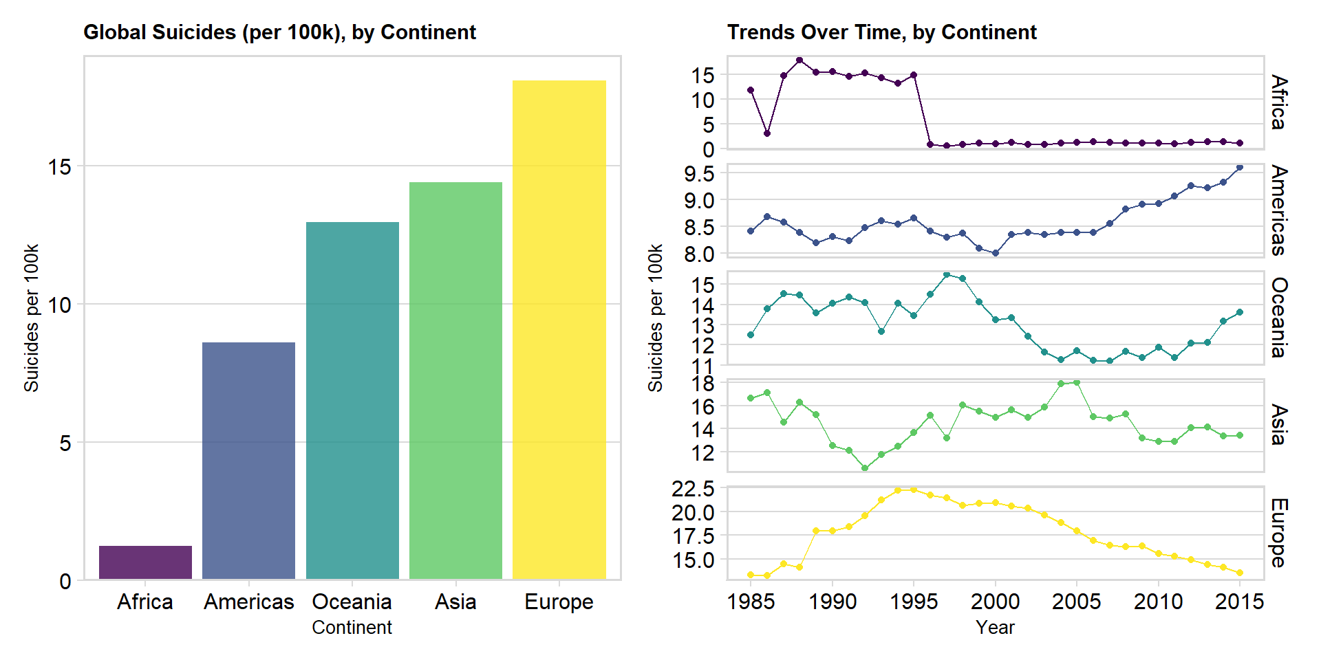
We can see that the European continent has the highest suicide rate overall but is has also steadily decreased since 1995. Europe is almost at the same rate as Asia & Oceania in year 2015. The trendline and results for Africa are due to poor data quality, only three countries in Africa have provided sufficient data.
The most concerning result is the trendline for America and Oceania, where we can see an increase in later years.
Suicide by Gender
In recent years there have been a lot of talked about increased suicide amongst men, that it can be due to loneliness, alienation, failures or pressure. Let us therefore investigate if our data also show that suicide is most common amongst males.
p1 <- data %>%
  group_by(sex) %>%
  summarize(suicide_per_100k = (sum(as.numeric(suicides_no)) / sum(as.numeric(population))) * 100000) %>%
ggplot(aes(x = sex, y = suicide_per_100k, fill = sex)) +
  geom_col(alpha = 0.8) +
  labs(title = "Global suicides (per 100k), by Sex",
       x = "Sex",
       y = "Suicides per 100k") + theme_minimal_hgrid() + scale_y_continuous(expand = expand_scale(mult = c(0, 0.05))) + theme(legend.position = "none", title = element_text(size = 10))+ panel_border()

### with time
p2 <- data %>%
  group_by(year, sex) %>%
  summarize(suicide_per_100k = (sum(as.numeric(suicides_no)) / sum(as.numeric(population))) * 100000) %>%
  ggplot(aes(x = year, y = suicide_per_100k, col = factor(sex))) +
  facet_grid(sex ~ ., scales = "free_y") +
  geom_line() +
  geom_point() +
  labs(title = "Trends Over Time, by Sex",
       x = "Year",
       y = "Suicides per 100k",
       color = "Sex") +
  scale_x_continuous(breaks = seq(1985, 2015, 5), minor_breaks = F) + theme_minimal_hgrid() + panel_border()+
   theme(legend.position = "none", title = element_text(size = 10))

p1 + p2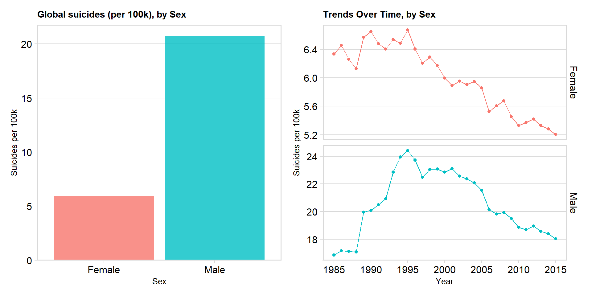
We can see that globally, the rate of suicide for men has been ~3.5x higher for men. The suicide rates for both genders peacked in 1995 and has decreased since then. The ratio between males and females has remained relatively constant since the mid 90’s. However, during the 80’s this ratio was as low as 2.7 : 1 (male : female)
## Age
Now I investigate how suicide changes with age.
p1 <- data %>%
  group_by(age) %>%
  summarize(suicide_per_100k = (sum(as.numeric(suicides_no)) / sum(as.numeric(population))) * 100000) %>%
  ggplot(aes(x = age, y = suicide_per_100k, fill = age)) +
  geom_col(alpha = 0.8) +
  labs(title = "Global suicides per 100k, by Age",
       x = "Age",
       y = "Suicides per 100k") +
  theme_minimal_hgrid() + scale_y_continuous(expand = expand_scale(mult = c(0, 0.05))) + theme(legend.position = "none", title = element_text(size = 10))+ panel_border()

### with time
p2 <- data %>%
  group_by(year, age) %>%
  summarize(suicide_per_100k = (sum(as.numeric(suicides_no)) / sum(as.numeric(population))) * 100000) %>%
  ggplot(aes(x = year, y = suicide_per_100k, col = age)) +
  facet_grid(age ~ ., scales = "free_y") +
  geom_line() +
  geom_point() +
  labs(title = "Trends Over Time, by Age",
       x = "Year",
       y = "Suicides per 100k",
       color = "Age") +
  theme(legend.position = "none") +
  scale_x_continuous(breaks = seq(1985, 2015, 5), minor_breaks = F) +
   theme(legend.position = "none", title = element_text(size = 10))


p1 +p2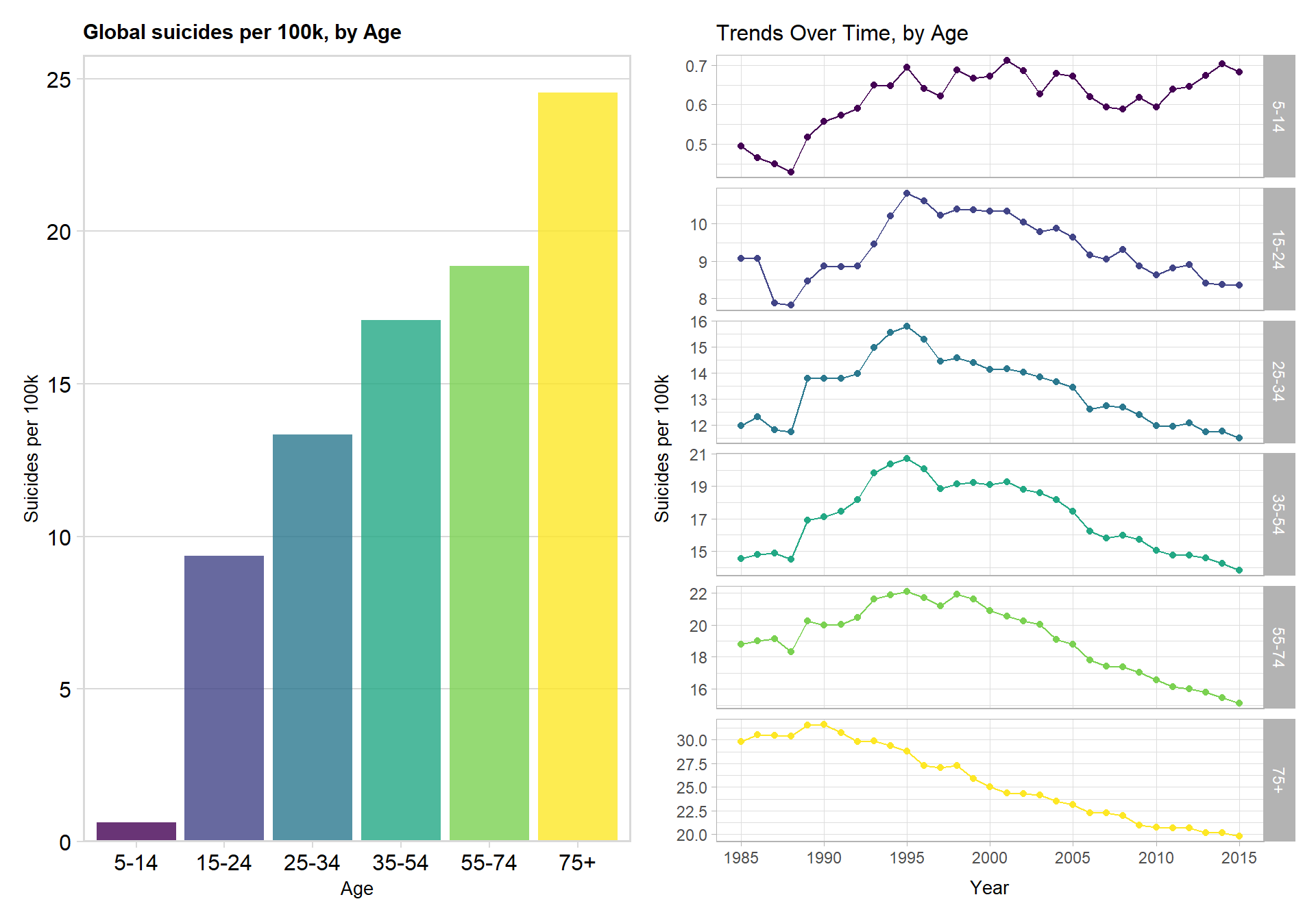
I notice that globally, the likelihood of suicide increases with age. Since 1995, suicide rate for everyone aged >= 15 has been linearly decreasing. The suicide rate of those aged 75+ has dropped by more than 50% since 1990. Suicide rate in the ‘5-14’ category remains roughly static and small (< 1 per 100k per year)
Country overall
Let us now investigate and compare the countries to each other. I will of course use suicide per 100k as the indicator, since countries with high population also have higher suicide so that won’t be comparable.
country <- data %>%
  group_by(country, continent) %>%
  summarize(n = n(),
            suicide_per_100k = (sum(as.numeric(suicides_no)) / sum(as.numeric(population))) * 100000) %>%
  arrange(desc(suicide_per_100k)) %>%
  filter(suicide_per_100k > 11)

country$country <- factor(country$country,
                          ordered = T,
                          levels = rev(country$country))

ggplot(country, aes(x = country, y = suicide_per_100k, fill = continent)) +
  geom_col(alpha = 0.8) +
  geom_hline(yintercept = global_average, linetype = 2, color = "grey35", size = 1) +
  labs(title = "Global suicides per 100k, by Country",
       x = "Country",
       y = "Suicides per 100k",
       fill = "Continent") +
  coord_flip()  +
  theme_minimal_vgrid() + scale_y_continuous(expand = expand_scale(mult = c(0, 0.05)))+
  theme(legend.position = "bottom")
## Warning: `expand_scale()` is deprecated; use `expansion()` instead.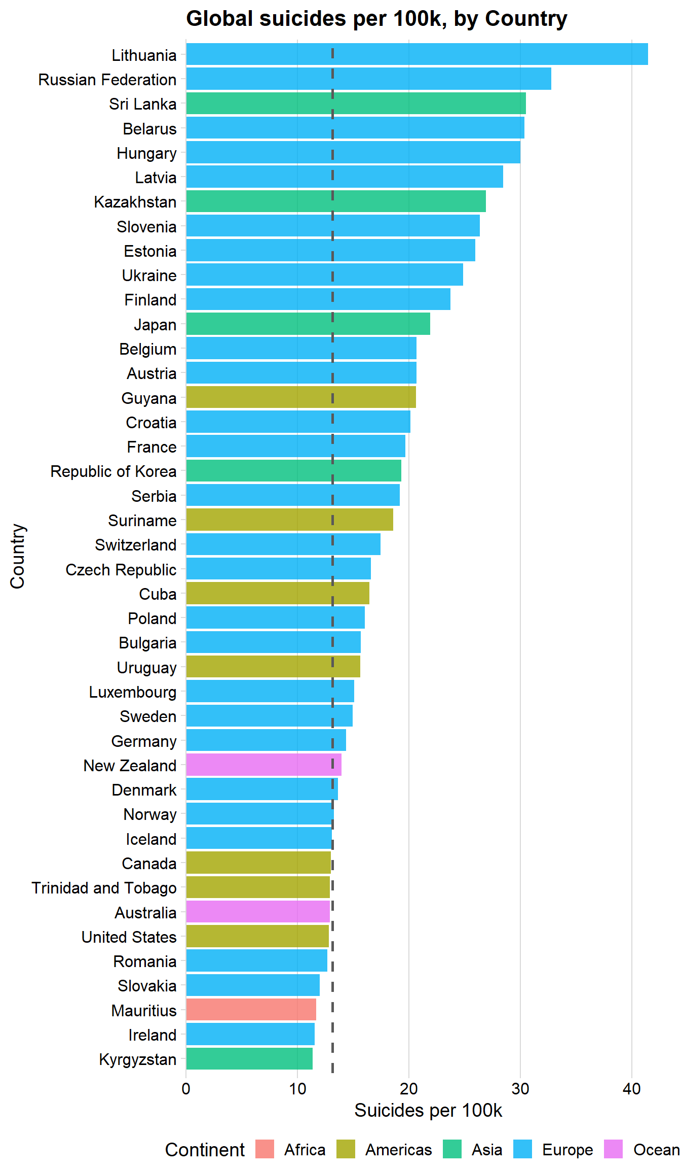
The above plot show us the following insights:
- Lithuania’s rate has been highest by a large margin: > 41 suicides per 100k (per year)
- Large overrepresentation of European countries with high rates, few with low rates
World map
Below is a interactive world map of the suicide rates between the timeframe of this analysis - note the lack of data for Africa and Asia, and bear in mind that 7 countries have been removed due to insufficient data.
country <- data %>%
  group_by(country) %>%
  summarize(suicide_per_100k = (sum(as.numeric(suicides_no)) / sum(as.numeric(population))) * 100000)

country <- country %>%
  mutate(iso3 = countrycode(country, origin = "country.name", destination = "iso3c"))


worldmap <- highchart() %>%
  hc_add_series_map(worldgeojson, country, value = 'suicide_per_100k', joinBy = 'iso3') %>%
  hc_title(text = 'Players of the world') %>%
  hc_colorAxis(minColor = "#ffdf3f", maxColor = "#5c46ff") %>%
  hc_tooltip(useHTML = TRUE, headerFormat = "", pointFormat = "{point.country}: {point.suicide_per_100k} suicides per 100k")

frameWidget(worldmap, height = 350, width = '95%')
It’s important to note that looking at figures at a global/continent level might not truly be representative of the globe/continent for these reasons.
Comparing the raw suicide rates of countries may also lead to some issues - the definition of suicide (and the reliability that a death is recorded as suicide) will likely vary between countries.
However, trends over time (within countries) are likely to be reliable. I address this next.
Linear Trends
I’m interested in how the suicide rate is changing over time within each country. Instead of visualizing all 93 countries rates across time, I fit a simple linear regression to every countries data. I extract those with a ‘year’ p-value (corrected for multiple comparisons) of < 0.05.
In other words: as time goes on, I look for countries where the suicide rate is linearly increasing or decreasing over time. These can then be rank ordered by their ‘year’ coefficient, which would be their rate of change as time goes on.
country_year <- data %>%
  group_by(country, year) %>%
  summarize(suicides = sum(suicides_no),
            population = sum(population),
            suicide_per_100k = (suicides / population) * 100000,
            gdp_per_capita = mean(gdp_per_capita))


country_year_trends <- country_year %>%
  ungroup() %>%
  nest(-country) %>% # format: country, rest of data (in list column)
  mutate(model = map(data, ~ lm(suicide_per_100k ~ year, data = .)), # for each item in 'data', fit a linear model
         tidied = map(model, tidy)) %>% # tidy each of these into dataframe format - call this list 'tidied'
  unnest(tidied)

country_year_sig_trends <- country_year_trends %>%
  filter(term == "year") %>%
  mutate(p.adjusted = p.adjust(p.value, method = "holm")) %>%
  filter(p.adjusted < .05) %>%
  arrange(estimate)

country_year_sig_trends$country <- factor(country_year_sig_trends$country,
                                          ordered = T,
                                          levels = country_year_sig_trends$country)
# plot 1
ggplot(country_year_sig_trends, aes(x=country, y=estimate, col = estimate)) +
geom_point(stat='identity', size = 4) +
geom_hline(yintercept = 0, col = "grey", size = 1) +
scale_color_gradient(low = "green", high = "red") +
geom_segment(aes(y = 0,
x = country,
yend = estimate,
xend = country), size = 1) +
labs(title="Change per year (Suicides per 100k)",
subtitle="Of countries with significant trends (p < 0.05)",
x = "Country", y = "Change Per Year (Suicides per 100k)") +
scale_y_continuous(breaks = seq(-2, 2, 0.2), limits = c(-1.5, 1.5)) +
coord_flip() + theme_minimal_vgrid()+ theme(legend.position = "none")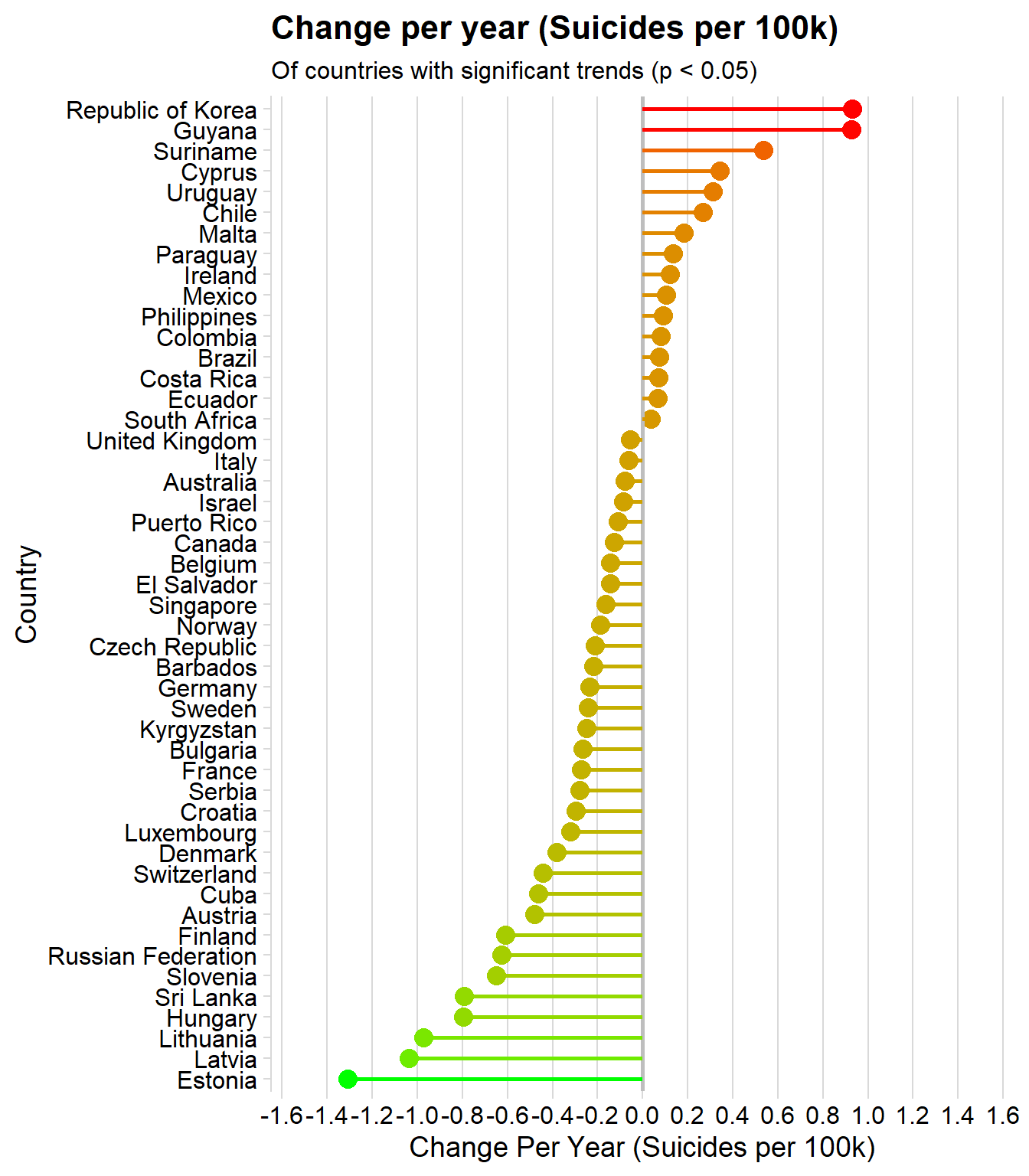
The above plot show us the following insights:
- ~1/2 of all countries suicide rates are changing linearly as time progresses
- 32 (2/3) of these 48 countries are decreasing
- Overall, this is painting a positive picture
Steepest increasing trends:
### Lets look at those countries with the steepest increasing trends

top12_increasing <- tail(country_year_sig_trends$country, 12)

country_year %>%
  filter(country %in% top12_increasing) %>%
  ggplot(aes(x = year, y = suicide_per_100k, col = country)) +
  geom_point() +
  geom_smooth(method = "lm") +
  facet_wrap(~ country) +
  theme(legend.position = "none") +
  labs(title="12 Steepest Increasing Trends",
       subtitle="Of countries with significant trends (p < 0.05)",
       x = "Year",
       y = "Suicides per 100k")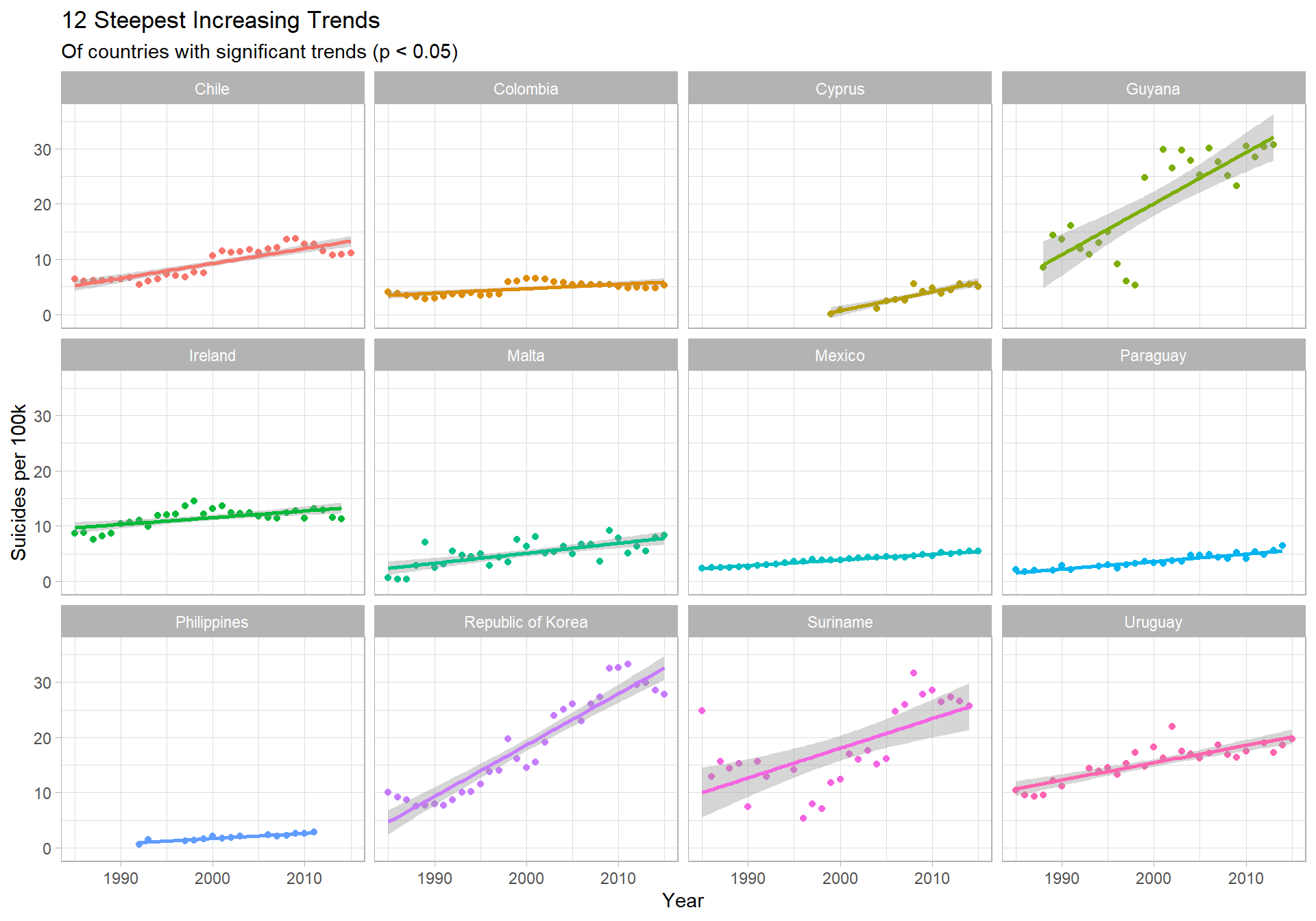
Insights
- South Korea shows the most concerning trend - an increase in suicide of 0.931 people (per 100k, per year) - the steepest increase globally
- Guyana is similar, at + 0.925 people (per 100k, per year)
- Between 1998 and 1999 (5.3 to 24.8), Guyana’s rate increased by ~365%
- The historical data for Guyana seems questionable - it’s known for very high suicide rates but the jump seems unlikely (maybe changed how they classified suicide?)
Steepest decreasing trends:
### Now those with the steepest decreasing trend

top12_decreasing <- head(country_year_sig_trends$country, 12)

country_year %>%
  filter(country %in% top12_decreasing) %>%
  ggplot(aes(x = year, y = suicide_per_100k, col = country)) +
  geom_point() +
  geom_smooth(method = "lm") +
  facet_wrap(~ country) +
  theme(legend.position = "none") +
  labs(title="12 Steepest Decreasing Trends",
       subtitle="Of countries with significant trends (p < 0.05)",
       x = "Year",
       y = "Suicides per 100k")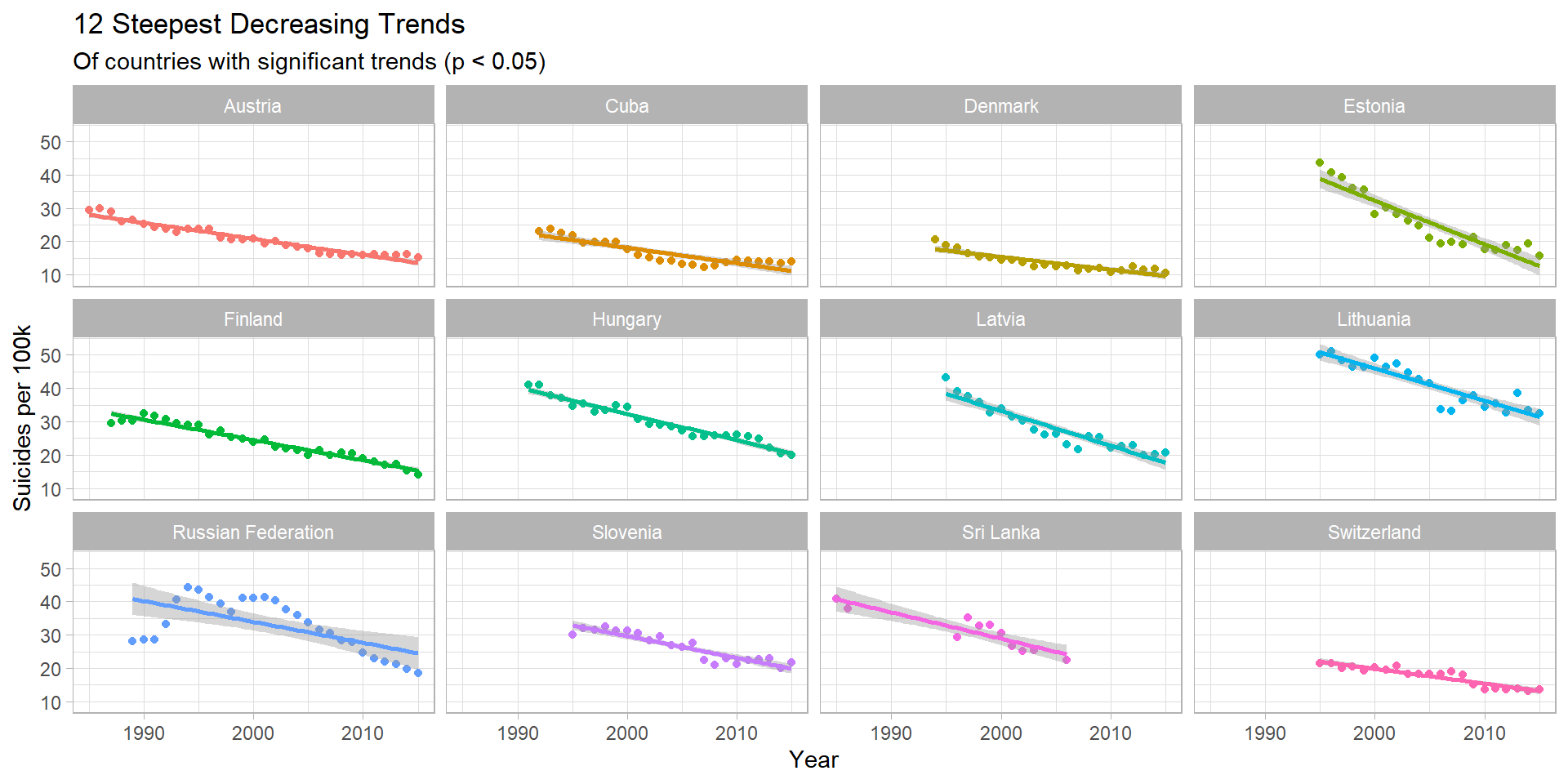
Insights
- Estonia shows the most positive trend - every year, ~1.31 less people (per 100k) commit suicide - the steepest decrease globally
- Between 1995 and 2015, this drops from 43.8 to 15.7 per 100k (per year) - a 64% decrease
- The Russian Federation trend is interesting, only beginning to drop in 2002. Since then it has decreased by ~50%.
Gender differences, by Continent
data %>%
  group_by(continent, sex) %>%
  summarize(n = n(),
            suicides = sum(as.numeric(suicides_no)),
            population = sum(as.numeric(population)),
            suicide_per_100k = (suicides / population) * 100000) %>%
  ggplot(aes(x = continent, y = suicide_per_100k, fill = sex)) +
  geom_col( position = "dodge", alpha = 0.8) +
  geom_hline(yintercept = global_average, linetype = 2, color = "grey35", size = 1) +
  labs(title = "Gender Disparity, by Continent",
   x = "Continent",
   y = "Suicides per 100k",
fill = "Sex") + theme_minimal_hgrid() + scale_y_continuous(expand = expand_scale(mult = c(0, 0.05))) 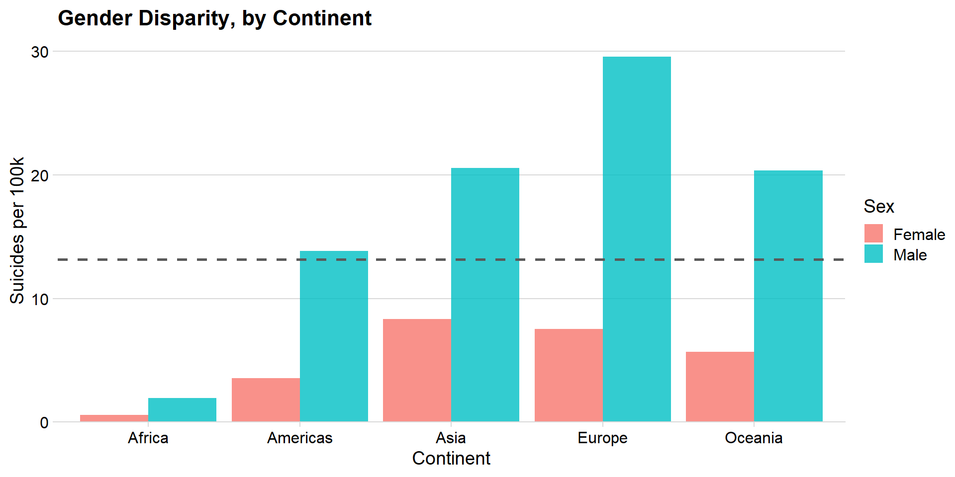
Insights
- European men were at the highest risk between 1985 - 2015, at ~ 30 suicides (per 100k, per year)
- Asia had the smallest overrepresentation of male suicide - the rate was ~2.5x as high for men
- Comparatively, Europe’s rate was ~3.9x as high for men
Gender differences, by Country
country_long <- data %>%
  group_by(country, continent) %>%
  summarize(suicide_per_100k = (sum(as.numeric(suicides_no)) / sum(as.numeric(population))) * 100000) %>%
  mutate(sex = "OVERALL")

### by country, continent, sex

sex_country_long <- data %>%
  group_by(country, continent, sex) %>%
  summarize(suicide_per_100k = (sum(as.numeric(suicides_no)) / sum(as.numeric(population))) * 100000)


sex_country_wide <- sex_country_long %>%
  spread(sex, suicide_per_100k) %>%
  arrange(Male - Female)


sex_country_wide$country <- factor(sex_country_wide$country,
                                         ordered = T,
                                         levels = sex_country_wide$country)

sex_country_long$country <- factor(sex_country_long$country,
                                   ordered = T,
                                   levels = sex_country_wide$country) # using the same order


### this graph shows us how the disparity between deaths varies across gender for every country
# it also has the overall blended death rate - generally countries with a higher death rate have a higher disparity
# this is because, if suicide is more likely in a country, the disparity between men and women is amplified

ggplot(sex_country_wide, aes(y = country, color = sex)) +
  geom_dumbbell(aes(x=Female, xend=Male), color = "grey", size = 1) +
  geom_point(data = sex_country_long, aes(x = suicide_per_100k), size = 3) +
  geom_point(data = country_long, aes(x = suicide_per_100k)) +
  geom_vline(xintercept = global_average, linetype = 2, color = "grey35", size = 1) +
  theme(axis.text.y = element_text(size = 8),
        legend.position = c(0.85, 0.2)) +
  scale_x_continuous(breaks = seq(0, 80, 10)) +
  labs(title = "Gender Disparity, by Continent & Country",
       subtitle = "Ordered by difference in deaths per 100k.",
       x = "Suicides per 100k",
       y = "Country",
       color = "Sex")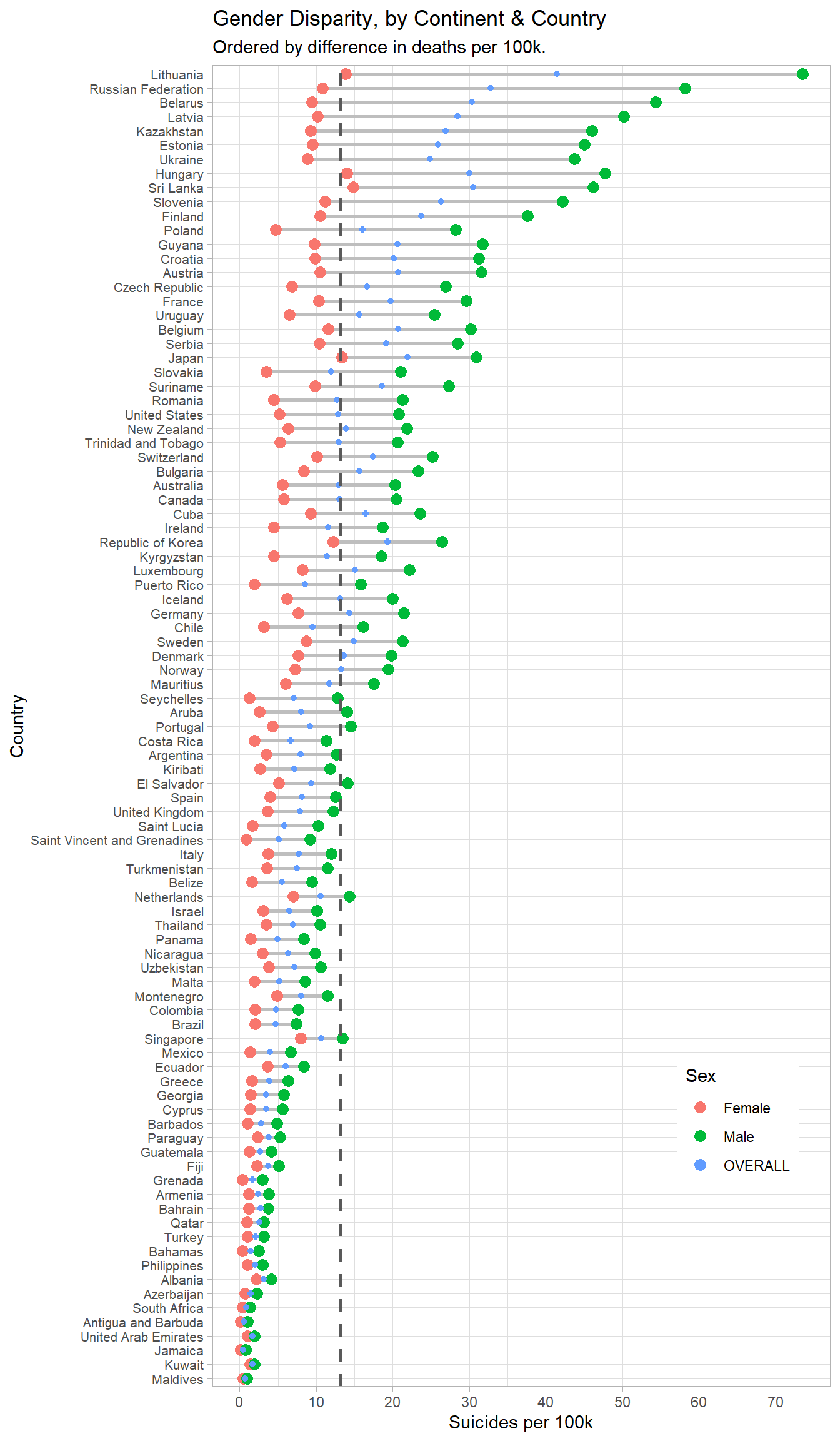
country_gender_prop <- sex_country_wide %>%
  mutate(Male_Proportion = Male / (Female + Male)) %>%
  arrange(Male_Proportion)

sex_country_long$country <- factor(sex_country_long$country,
                                   ordered = T,
                                   levels = country_gender_prop$country)

ggplot(sex_country_long, aes(y = suicide_per_100k, x = country, fill = sex)) +
  geom_bar(position = "fill", stat = "identity") +
  scale_y_continuous(labels = scales::percent) +
  labs(title = "Proportions of suicides that are Male & Female, by Country",
       x = "Country",
       y = "Suicides per 100k",
       fill = "Sex") +
  coord_flip()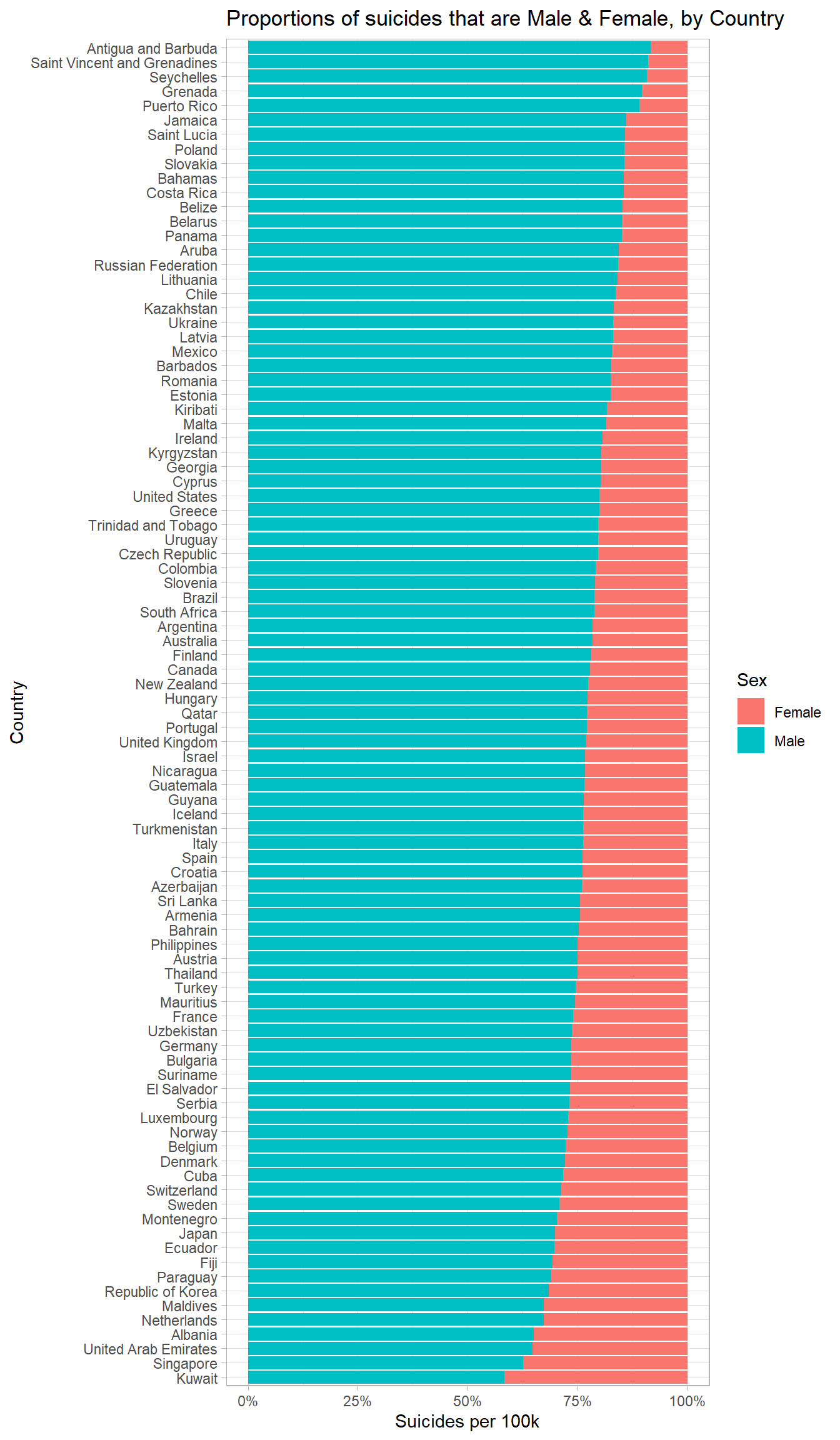
Insights
- The overrepresentation of men in suicide deaths appears to be universal, and can be observed to differing extents in every country
- Whilst women are more likely to suffer from depression and suicidal thoughts, men are more likely to die from suicide
- This is known as the gender paradox on suicidal behaviour
Age differences, by Continent
data %>%
  group_by(continent, age) %>%
  summarize(n = n(),
            suicides = sum(as.numeric(suicides_no)),
            population = sum(as.numeric(population)),
            suicide_per_100k = (suicides / population) * 100000) %>%
  ggplot(aes(x = continent, y = suicide_per_100k, fill = age)) +
  geom_col( position = "dodge", alpha = 0.8) +
  geom_hline(yintercept = global_average, linetype = 2, color = "grey35", size = 1) +
  labs(title = "Age Disparity, by Continent",
       x = "Continent",
       y = "Suicides per 100k",
       fill = "Age") + theme_minimal_hgrid() + scale_y_continuous(expand = expand_scale(mult = c(0, 0.05)))
## Warning: `expand_scale()` is deprecated; use `expansion()` instead.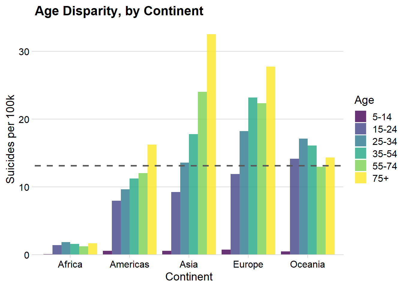
Insights
- For the Americas, Asia & Europe (which make up most of the dataset), suicide rate increases with age
- Oceania & Africa’s rates are highest for those aged 25 - 34
As a country gets richer, does it’s suicide rate decrease?
It depends on the country - for almost every country, there is a high correlation between year and gdp per capita, i.e. as time goes on, gdp per capita linearly increases.
country_year_gdp <- data %>%
  group_by(country, year) %>%
  summarize(gdp_per_capita = mean(gdp_per_capita))

country_year_gdp_corr <- country_year_gdp %>%
  ungroup() %>%
  group_by(country) %>%
  summarize(year_gdp_correlation = cor(year, gdp_per_capita))
I calculated the pearson correlations between ‘year’ and ‘GDP per capita’ within each country, then summarized the results:
The mean correlation was 0.878, indicating a very strong positive linear relationship.
This basically means that looking within a country and asking “does an increase in weath (per person) have an effect suicide rate” is pretty similar to asking “does a countries suicide rate increase as time progresses”.
This was answered earlier in (2.5.2) - it depends on the country! Some countries are increasing with time, most are decreasing.
Instead, I ask a slightly different question below.
Do richer countries have a higher rate of suicide?
Instead of looking at trends within countries, here I take every country and calculate their mean GDP (per capita) across all the years in which data is available. I then measure how this relates to the countries suicide rate across all those years.
The end result is one data point per country, intended to give a general idea of the wealth of a country and its suicide rate.
country_mean_gdp <- data %>%
  group_by(country, continent) %>%
  summarize(suicide_per_100k = (sum(as.numeric(suicides_no)) / sum(as.numeric(population))) * 100000,
            gdp_per_capita = mean(gdp_per_capita))

ggplot(country_mean_gdp, aes(x = gdp_per_capita, y = suicide_per_100k, col = continent)) +
  geom_point() +
  scale_x_continuous(labels=scales::dollar_format(prefix="$"), breaks = seq(0, 70000, 10000)) +
  labs(title = "Correlation between GDP (per capita) and Suicides per 100k",
       subtitle = "Plot containing every country",
       x = "GDP (per capita)",
       y = "Suicides per 100k",
       col = "Continent") + theme_minimal_hgrid()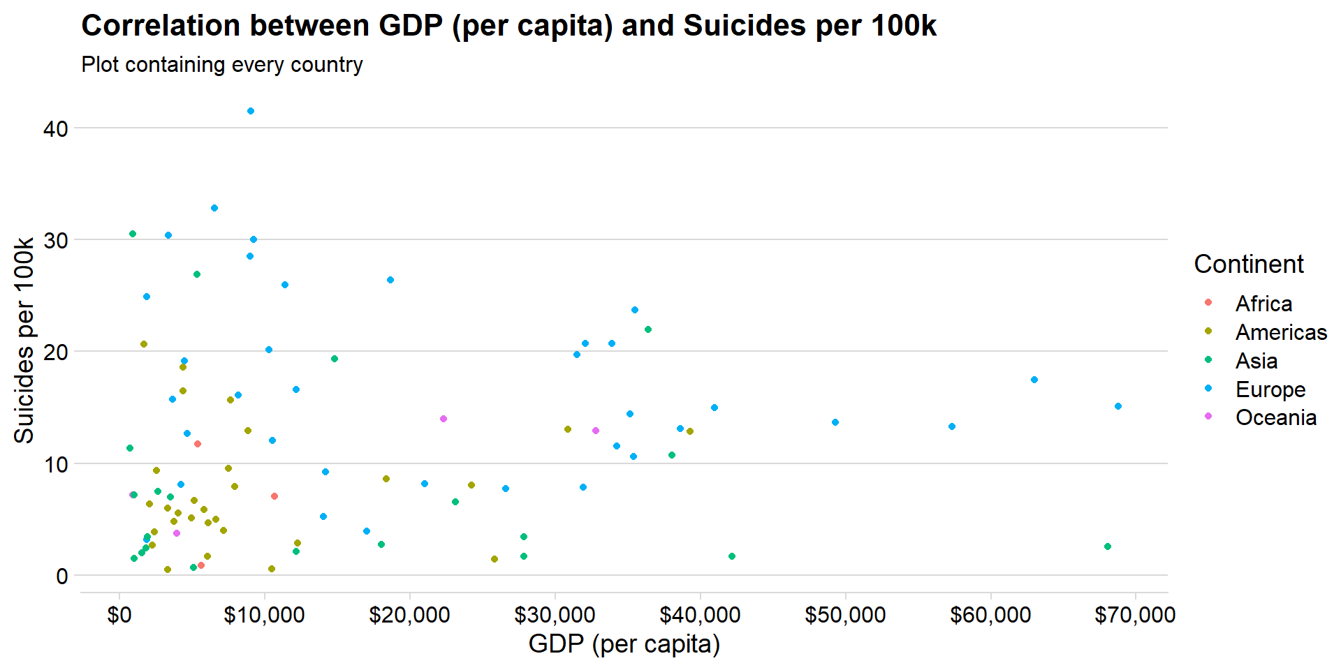
There are quite a few high leverage & residual countries that could have a significant impact on the fit of my regression line (e.g. Lithuania, top left). I’ll identify and exclude these using Cooks Distance, excluding those countries with a CooksD value of greater than 4/n.
I assess the statistics of this model (with outliers removed) below.
model1 <- lm(suicide_per_100k ~ gdp_per_capita, data = country_mean_gdp)

gdp_suicide_no_outliers <- model1 %>%
  augment() %>%
  arrange(desc(.cooksd)) %>%
  filter(.cooksd < 4/nrow(.)) %>% # removes 5/93 countries
  inner_join(country_mean_gdp, by = c("suicide_per_100k", "gdp_per_capita")) %>%
  select(country, continent, gdp_per_capita, suicide_per_100k)

model2 <- lm(suicide_per_100k ~ gdp_per_capita, data = gdp_suicide_no_outliers)

summary(model2)
##
## Call:
## lm(formula = suicide_per_100k ~ gdp_per_capita, data = gdp_suicide_no_outliers)
##
## Residuals:
## Min 1Q Median 3Q Max
## -11.769 -5.145 -1.724 3.227 20.221
##
## Coefficients:
## Estimate Std. Error t value Pr(>|t|)
## (Intercept) 8.772e+00 1.119e+00 7.839 1.12e-11 ***
## gdp_per_capita 1.115e-04 5.015e-05 2.223 0.0288 *
## ---
## Signif. codes: 0 '***' 0.001 '**' 0.01 '*' 0.05 '.' 0.1 ' ' 1
##
## Residual standard error: 7.331 on 86 degrees of freedom
## Multiple R-squared: 0.05436, Adjusted R-squared: 0.04337
## F-statistic: 4.944 on 1 and 86 DF, p-value: 0.02881The p-value of the model is 0.0288 < 0.05. This means we can reject the hypothesis that a countries GDP (per capita) has no association with it’s rate of suicide (per 100k).
The r-squared is 0.0544, so GDP (per capita) explains very little of the variance in suicide rate overall.
What does all this mean?
There is a weak but significant positive linear relationship - richer countries are associated with higher rates of suicide, but this is a weak relationship which can be seen from the graph below.
ggplot(gdp_suicide_no_outliers, aes(x = gdp_per_capita, y = suicide_per_100k, col = continent)) +
  geom_point() +
  geom_smooth(method = "lm", aes(group = 1)) +
  scale_x_continuous(labels=scales::dollar_format(prefix="$"), breaks = seq(0, 70000, 10000)) +
  labs(title = "Correlation between GDP (per capita) and Suicides per 100k",
       subtitle = "Plot with high CooksD countries removed (5/93 total)",
       x = "GDP (per capita)",
       y = "Suicides per 100k",
       col = "Continent") +
  theme(legend.position = "none")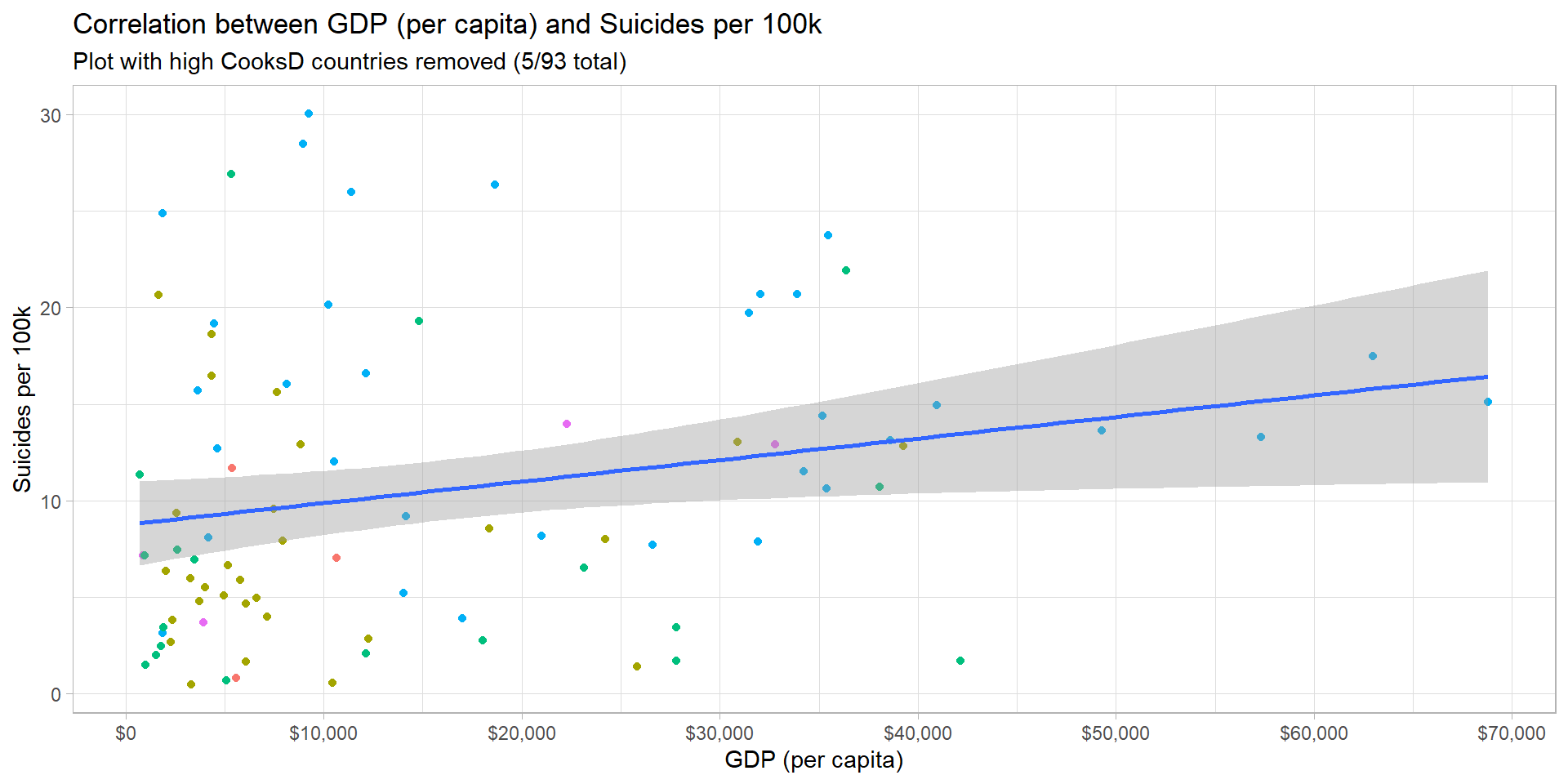
This line of best fit is represented by the equation below, where:
- Suicides = Suicides per 100k
- GDP = GDP per capita (in thousands, USD)
\[ Suicides = 8.7718 + 0.1115*GDP \]
This means that, at a country level and over the time frame of this analysis (1985 - 2015), an increase of GDP (per capita) by $8,967 was associated with 1 additional suicide, per 100k people, per year.
The reason I haven’t used the generation variable
With continuous data, if you have someones age in a given year, you have their generation. The graph below demonstrates how this works for this dataset really well, and is equivalent to the graph of age across time, shown in (2.4).
data %>%
  group_by(generation, age, year) %>%
  summarize(suicide_per_100k = (sum(as.numeric(suicides_no)) / sum(as.numeric(population))) * 100000) %>%
  ggplot(aes(x = year, y = suicide_per_100k, col = factor(generation, ordered = F))) +
  geom_point() +
  geom_line() +
  facet_grid(age ~ ., scales = "free_y") +
  scale_x_continuous(breaks = seq(1985, 2015, 5), minor_breaks = NULL) +
  labs(title = "Relationship between Generation, Age & Year",
       x = "Year",
       y = "Suicides per 100k",
       col = "Generation") +
  theme(legend.position = "bottom")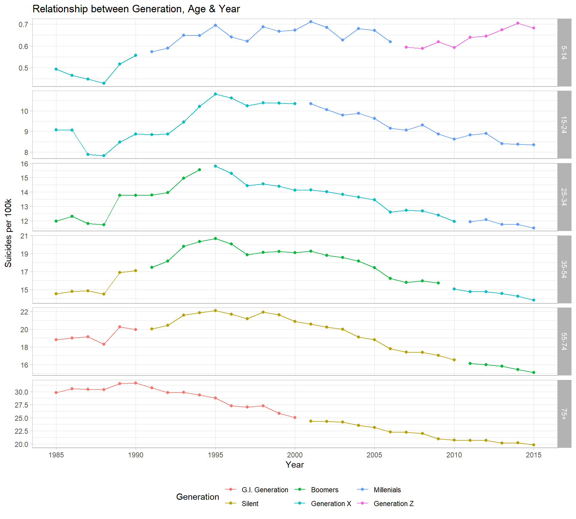
However, because of the overlap of different age categories, trying to interpret the trend of generation suicide rates over time creates problems.
Compare the rates below to the plot above - large spikes occur at the same time that different age bands begin/stop being classified as from a certain generation.
Note, for example, the supposed spike in suicide rate for G.I. generation in 1991, where those aged ‘55 - 75’ suddenly stop being classified as from this generation.
p1 <- data %>%
  group_by(generation, year) %>%
  summarize(suicide_per_100k = (sum(as.numeric(suicides_no)) / sum(as.numeric(population))) * 100000) %>%
  ggplot(aes(x = year, y = suicide_per_100k, col = factor(generation, ordered = F))) +
  geom_point() +
  geom_line() +
  facet_grid(generation ~ ., scales = "free_y") +
  scale_x_continuous(breaks = seq(1985, 2015, 5), minor_breaks = NULL) +
  labs(title = "Suicides per 100k, by Generation",
       x = "Year",
       y = "Suicides per 100k") +
  theme(legend.position = "none")

p2 <- data %>%
  group_by(generation, year) %>%
  summarize(population = sum(as.numeric(population))) %>%
  ggplot(aes(x = year, y = population / 1000000, col = factor(generation, ordered = F))) +
  geom_point() +
  geom_line() +
  facet_grid(generation ~ ., scales = "free_y") +
  scale_x_continuous(breaks = seq(1985, 2015, 5), minor_breaks = NULL) +
  labs(title = "Population, by Generation",
       x = "Year",
       y = "Population (Millions)",
       col = "Generation") +
  theme(legend.position = "none")

p1 + p2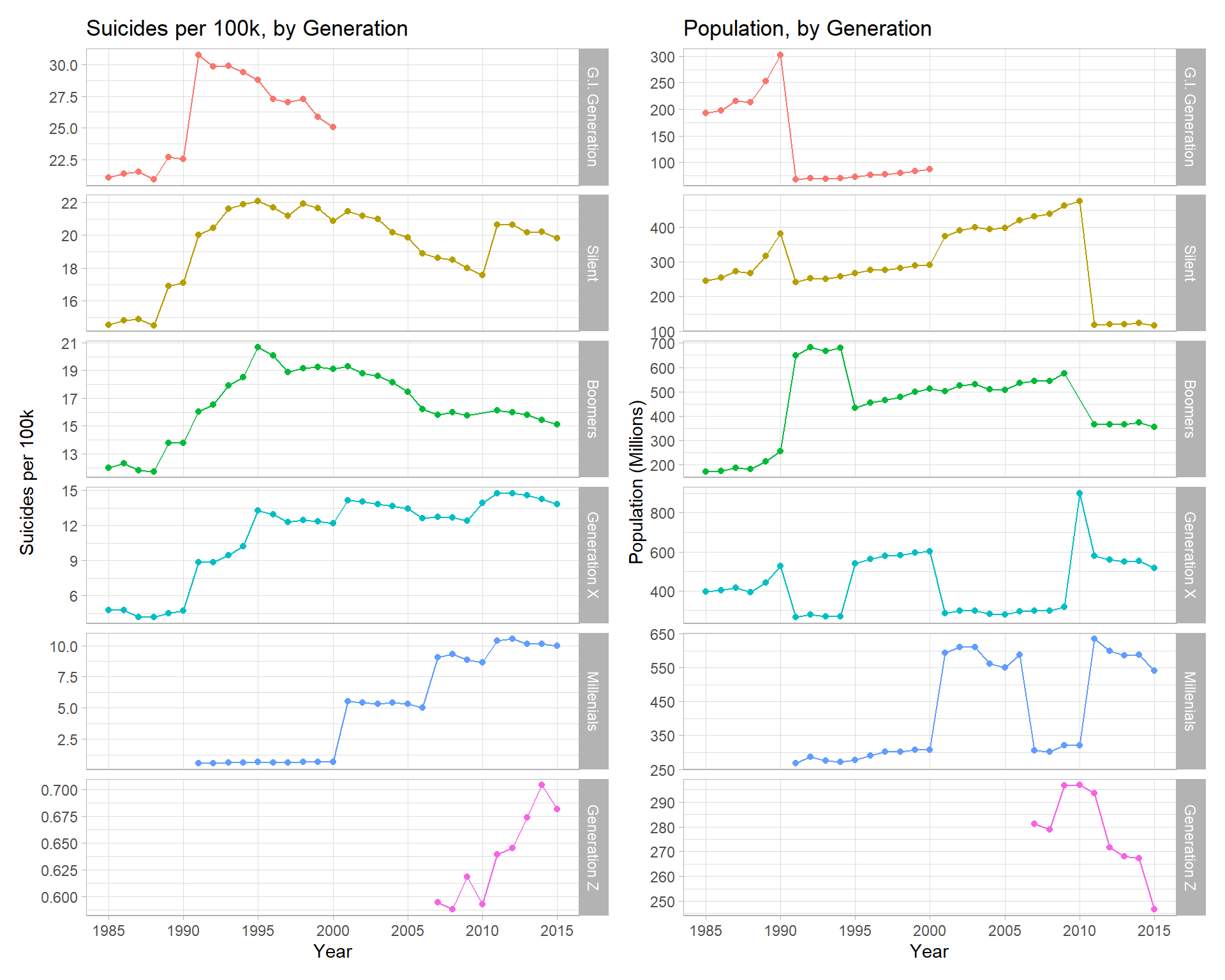
This is probably a problem with how the dataset was created - it looks like the generation variable was created after the data was summarized (by country, year, age, sex) and just appended onto the end. This shouldn’t be possible, because not everyone in a given age band & year will be of one generation.
This shows why the ‘spikes’ in generation across time are pretty meaningless and I would recommend to others not to use the variable, as it can will lead to wrong conclusions.
The 5% highest risk instances in history
I’ll filter out data from 1985 only and look at what happens in the 3 decades following.
Here i’m interested in the 5% highest risk (suicides/100k) demographics between 1986 and 2015.
I define a demographic as a year in a particular country, for some combination of sex & age. e.g. ‘United Kingdom, 2010, Female, 15 - 24’ would be a single demographic/point on the jitter plot below.
In order for a demographic to be in the top 5% for historic suicide rates, it would require a suicide rate exceeding 50.7 (per 100k) in that year.
demographic_most <- data %>%
  mutate(suicides_per_100k = suicides_no * 100000 / population) %>%
  arrange(desc(suicides_per_100k)) %>%
  filter(year != 1985) %>%
  head(n = round(nrow(.) * 5 / 100))


demographic_most$time <- ifelse(demographic_most$year <= 1995, "1986 - 1995",
                                ifelse(demographic_most$year <= 2005, "1996 - 2005",
                                       "2006 - 2015"))
p1 <- ggplot(demographic_most, aes(x = age, fill = sex)) +
geom_bar() +
labs(title = "5% Most At-Risk Instances in History",
subtitle = "Volumes by Decade, Age & Sex",
x = "Age",
y = "Number of Demographics",
fill = "Sex") +
facet_wrap(~ time) +
theme_minimal_hgrid() + scale_y_continuous(expand = expand_scale(mult = c(0, 0.05))) + panel_border()
set.seed(1)
p2 <- ggplot(demographic_most, aes(x = age, y = suicides_per_100k, col = sex)) +
geom_jitter(alpha = 0.5) +
labs(title = "5% Most At-Risk Instances in History",
subtitle = "Instances by Decade, Age, & Sex",
x = "Age",
y = "Suicides per 100k",
col = "Sex") +
facet_wrap(~ time) +
theme_minimal_hgrid() + scale_y_continuous(expand = expand_scale(mult = c(0, 0.05))) + panel_border()
p1 / p2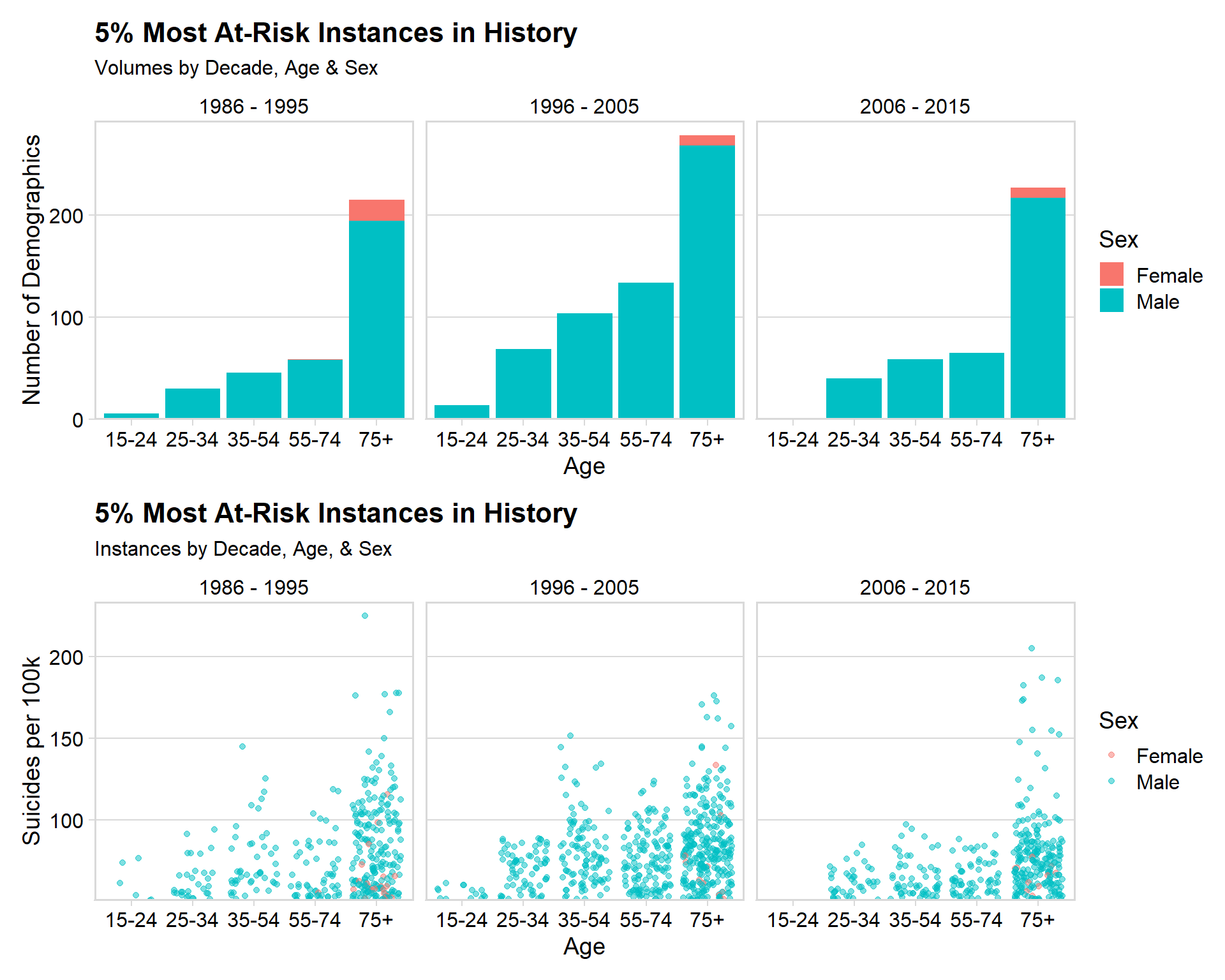
Insights
- 44.5% of these ‘high risk’ instances occurred between 1996 and 2005
- 53.5% were in the 75+ age category
- 96.9% were a male demographic
- Of the 3.1% (42 instances) that were for women, 41/42 of these were in the 75+ demographic
- The highest suicide rate for a demographic in any year is 225 (per 100k) - that’s 0.225% of the entire demographic committing suicide in 1 year
Two of the most consistently at-risk demographics seem to be men in South Korea & Hungary, which I will visualize below.
data %>%
  filter(country %in% c('Republic of Korea', 'Hungary'), sex == "Male") %>%
  group_by(country, age, year) %>%
  summarize(suicide_per_100k = (sum(as.numeric(suicides_no)) / sum(as.numeric(population))) * 100000) %>%
  ggplot(aes(x = year, y = suicide_per_100k, col = country)) +
  geom_line() +
  geom_point() +
  facet_wrap(~ age) +
  geom_hline(yintercept = min(demographic_most$suicides_per_100k)) +
  theme(legend.position = "bottom") +
  scale_y_continuous(breaks = seq(0, 220, 40)) +
  labs(title = "Male Age-Group Trends in Hungary & South Korea",
       subtitle = "Black reference line indicates where the demographic enters the 'top 5% in history'",
       x = "Year",
       y = "Suicides per 100k",
       col = "Country")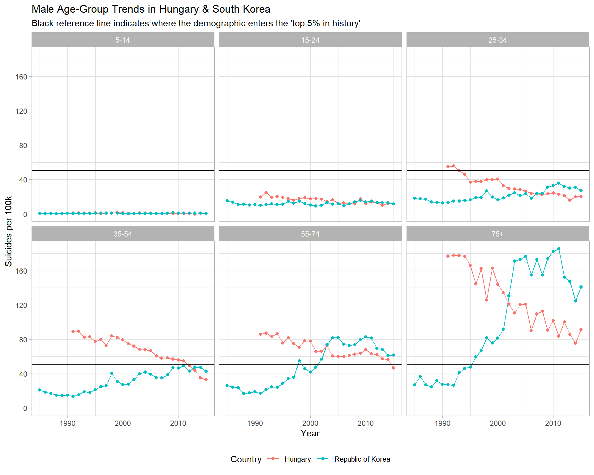
Two very different trends emerge. Hungary is obviously moving in a positive direction, whereas South Korea appears to be coming out of somewhat of a crisis.
For South Korea, mens rates in the 75+ category increased from 26.2 (per 100k) in 1992, to a peak of 185 (per 100k) in 2011 - an increase of more than 600%. Men aged 55-74 see a similar increase.
This was highlighted by my statistical analysis in (2.5.2), which identified South Korea as the steepest increasing country, and Hungary as the 4th steepest decreasing country overall.
Comparing the UK, Ireland, America, France & Denmark
I think it would be useful to compare a few countries that people might think of as similar to the UK (culturally, legally, economically).
Overall Trend
data_filtered <- data %>%
  filter(country %in% c("United Kingdom",
                        "Ireland",
                        "United States",
                        "France",
                        "Denmark"))


data_filtered %>%
  group_by(country, year) %>%
  summarize(suicide_per_100k = (sum(as.numeric(suicides_no)) / sum(as.numeric(population))) * 100000) %>%
  ggplot(aes(x = year, y = suicide_per_100k, col = country)) +
  geom_point(alpha = 0.5) +
  geom_smooth(se = F, span = 0.2) +
  scale_x_continuous(breaks = seq(1985, 2015, 5), minor_breaks = F) +
  labs(title = "UK, Ireland, US, France & Denmark",
       subtitle = "Suicides per 100k population, 1985 - 2015",
       x = "Year",
       y = "Suicides per 100k",
       col = "Country")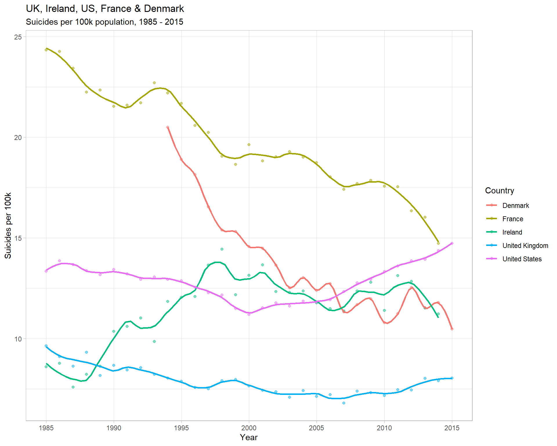
Insights
- The UK suicide rate has been consistently lowest since 1990, and has remained fairly static since ~1995
- France has historically had the highest rate, but is now roughly equal with America
- The US has the most concerning trend, linearly increasing by ~1/3 since 2000
By Sex
Male & Female Rates (over time)
data_filtered %>%
  group_by(country, sex, year) %>%
  summarize(suicide_per_100k = (sum(as.numeric(suicides_no)) / sum(as.numeric(population))) * 100000) %>%
  ggplot(aes(x = year, y = suicide_per_100k, col = country)) +
  geom_point(alpha = 0.5) +
  geom_smooth(se = F, span = 0.2) +
  scale_x_continuous(breaks = seq(1985, 2015, 5), minor_breaks = F) +
  facet_wrap(~ sex, scales = "free_y", nrow = 2) +
  labs(title = "UK, Ireland, US, France & Denmark",
       subtitle = "Suicides per 100k population, 1985 - 2015",
       x = "Year",
       y = "Suicides per 100k",
       col = "Country")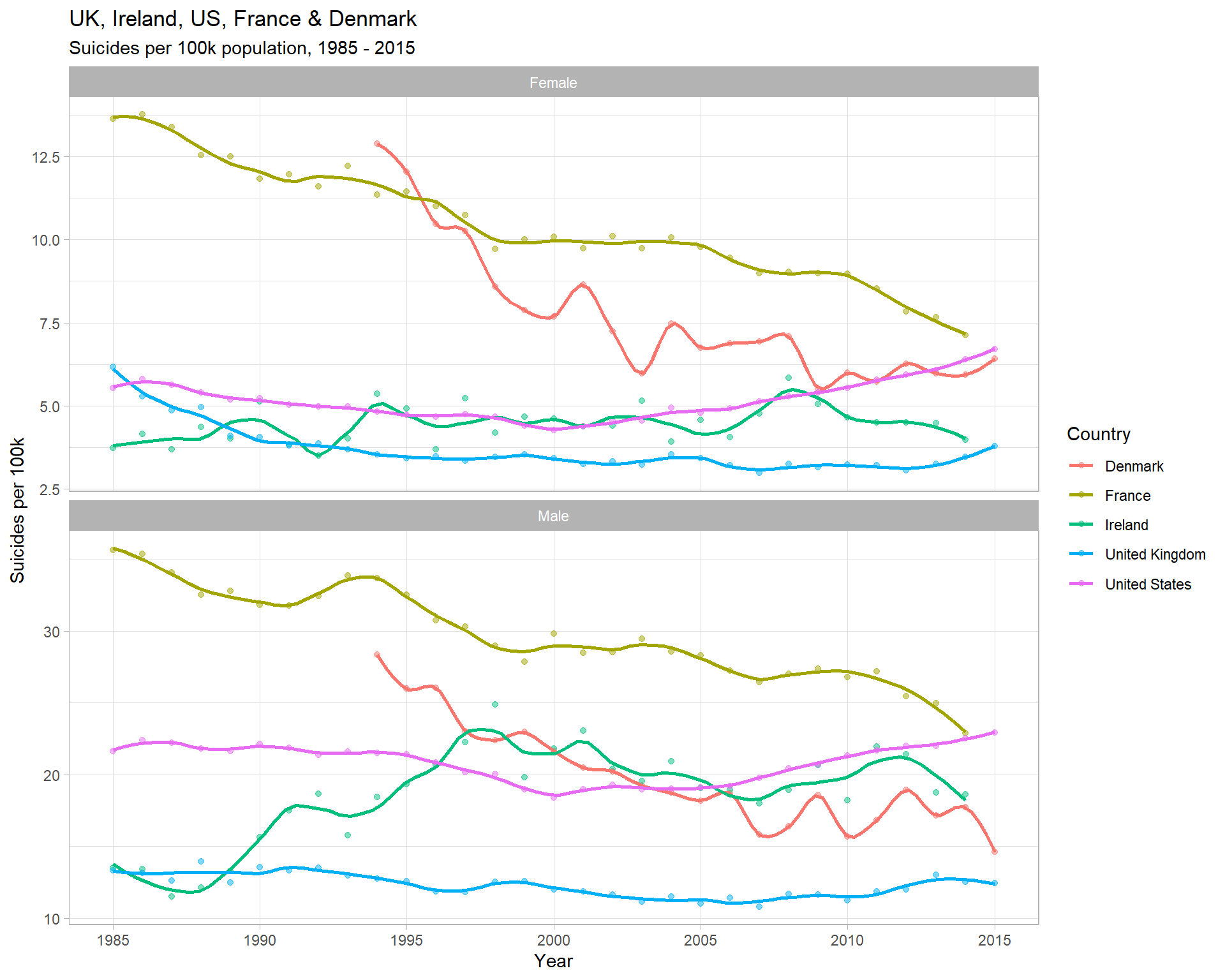
Insights
- For the UK, there’s no obvious increase in the suicide rate for men than can’t also be observed to an equal extent in women
- Again, for men and women, France has decreased to being roughly equal with the US in 2015
- The different trend lines for men & women in Ireland is unusual - in 1990, the male rate increases, but the same can’t be observed for females
2010 - 2015 Only
For the purposes of these visualisations, i’m really more interested in data from recent years (France, for example, has changed a lot), so i’ll restrict the timeframe to 2010 onwards.
Proportion of suicides that are Men
t1 <- data_filtered %>%
  filter(year >= 2010) %>%
  group_by(sex) %>%
  summarize(suicide_per_100k = (sum(as.numeric(suicides_no)) / sum(as.numeric(population))) * 100000)

global_male_proportion <- t1$suicide_per_100k[2] / sum(t1$suicide_per_100k)


t2 <- data_filtered %>%
  filter(year >= 2010, continent == "Europe") %>%
  group_by(sex) %>%
  summarize(suicide_per_100k = (sum(as.numeric(suicides_no)) / sum(as.numeric(population))) * 100000)

european_male_proportion <- t2$suicide_per_100k[2] / sum(t2$suicide_per_100k)


data_filtered %>%
  filter(year >= 2010) %>%
  group_by(country, sex) %>%
  summarize(suicide_per_100k = (sum(as.numeric(suicides_no)) / sum(as.numeric(population))) * 100000) %>%
  ggplot(aes(x = country, y = suicide_per_100k, fill = sex)) +
  geom_col(position = "fill") +
  geom_hline(yintercept = global_male_proportion) +
  geom_hline(yintercept = european_male_proportion, col = "blue") +
  scale_y_continuous(expand = c(0, 0), labels = scales::percent)+
  labs(title = "Proportion of suicides that were Male & Female",
       subtitle = "2010 - 2015 only, with reference lines for Europe (blue) & Globally (black)",
       x = "Country",
       y = "",
       fill = "Sex")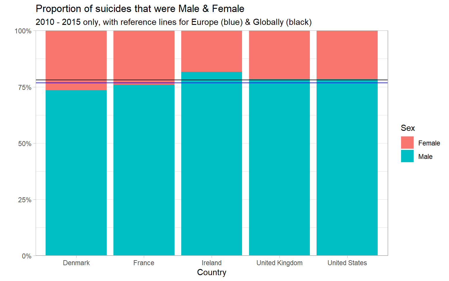
Insights
- Similar pattern as seen throughout the analysis - men make up ~ 75% of deaths by suicide
- The highest proportion is in Ireland - 81.7% male
- The lowest proportion is for Denmark - 73.5% male
Age Rates
data_filtered %>%
  filter(year >= 2010) %>%
  group_by(country, age) %>%
  summarize(suicide_per_100k = (sum(as.numeric(suicides_no)) / sum(as.numeric(population))) * 100000) %>%
  ggplot(aes(x = country, y = suicide_per_100k, fill = age)) +
  geom_col( position = "dodge", alpha = 0.8) +
  labs(title = "Age ",
       subtitle = "2010 - 2015 only",
       x = "Country",
       y = "Suicides per 100k",
       fill = "Age")+ theme_minimal_hgrid() + scale_y_continuous(expand = expand_scale(mult = c(0, 0.05)))
## Warning: `expand_scale()` is deprecated; use `expansion()` instead.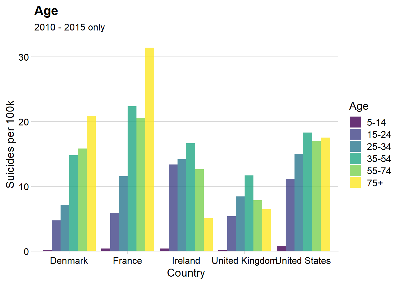
Insights
- There’s a huge difference in the ‘trend’ of suicide rates as age varies within each country
- Suicide rate increases with age for France, Denmark and the US (to a lesser extent)
- Those aged 35-54 at the highest risk in Ireland and the UK, which follow closer to a gaussian distribution
Male & Female Rates (for different age categories)
data_filtered %>%
  filter(year >= 2010) %>%
  group_by(country, sex, age) %>%
  summarize(suicide_per_100k = (sum(as.numeric(suicides_no)) / sum(as.numeric(population))) * 100000) %>%
  ggplot(aes(x = age, y = suicide_per_100k, fill = country)) +
  geom_col( position = "dodge", alpha = 0.8) +
  facet_grid( sex  ~., scales = "free_x") +
  labs(title = "Age Disparity, by Country",
       subtitle = "2010 - 2015 only",
       x = "Age",
       y = "Suicides per 100k",
       fill = "Country") +
  theme(legend.position = "bottom") + scale_y_continuous(expand = expand_scale(mult = c(0, 0.05)))
## Warning: `expand_scale()` is deprecated; use `expansion()` instead.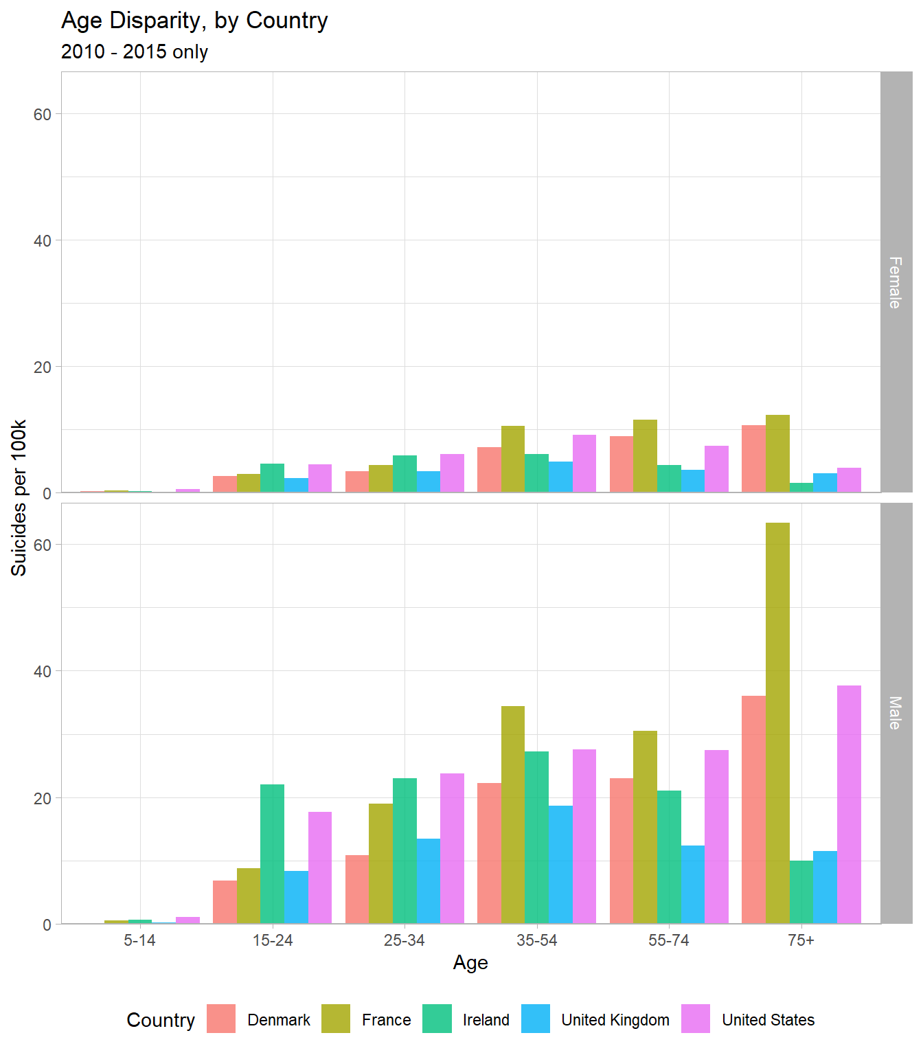
Insights
- In the US, suicide rate for men continues to increase with age, but the female rate decreases in old age
- This weird disparity is only present in the US and i’m curious as to why it occurs
- The UK has the lowest or second lowest suicide rate in every sex-age group
Young to Middle-Aged Men
There is a big concern in my country (UK) regarding mental health problems and suicide for young to middle-aged men. Here i’m going to restrict the analysis to just:
- Men
- Ages “15-24”, “25-34” & “35-54”
I’ll basically be observing whether concerning trends are present. I think having other countries here for comparison will be useful and will help provide perspective in the analysis.
Men - Ages 15-54 Combined
data_filtered %>%
  filter(age %in% c("15-24", "25-34", "35-54"), sex == "Male") %>%
  group_by(country, year) %>%
  summarize(suicide_per_100k = (sum(as.numeric(suicides_no)) / sum(as.numeric(population))) * 100000) %>%
  ggplot(aes(x = year, y = suicide_per_100k, col = country)) +
  geom_point(alpha = 0.5) +
  geom_smooth(se = F, span = 0.2) +
  scale_x_continuous(breaks = seq(1985, 2015, 5), minor_breaks = F) +
  labs(title = "UK, Ireland, US, France & Denmark",
       subtitle = "Suicides per 100k population, 1985 - 2015",
       x = "Year",
       y = "Suicides per 100k",
       col = "Country")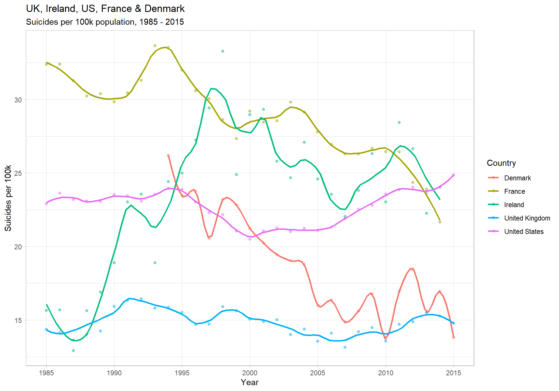
Insights
- Ireland’s trend over the 1990’s was very concerning
- It went from 14 (per 100k, per year) to 33.3 between 1988 and 1998 - an increase of 138%
- Again, the US shows the most obvious and concerning current trend
- Comparatively, for young to middle-aged men, the UK seems fairly flat across time
Men - Ages 15-24, 25-34 & 35-54
data_filtered %>%
  filter(age %in% c("15-24", "25-34", "35-54"), sex == "Male") %>%
  group_by(country, age, year) %>%
  summarize(suicide_per_100k = (sum(as.numeric(suicides_no)) / sum(as.numeric(population))) * 100000) %>%
  ggplot(aes(x = year, y = suicide_per_100k, col = country)) +
  geom_point(alpha = 0.5) +
  geom_smooth(se = F, span = 0.2) +
  facet_wrap(~ age, nrow = 3, scales = "free_y") +
  scale_x_continuous(breaks = seq(1985, 2015, 5), minor_breaks = F) +
  labs(title = "UK, Ireland, US, France & Denmark",
       subtitle = "Suicides per 100k population, 1985 - 2015",
       x = "Year",
       y = "Suicides per 100k",
       col = "Country")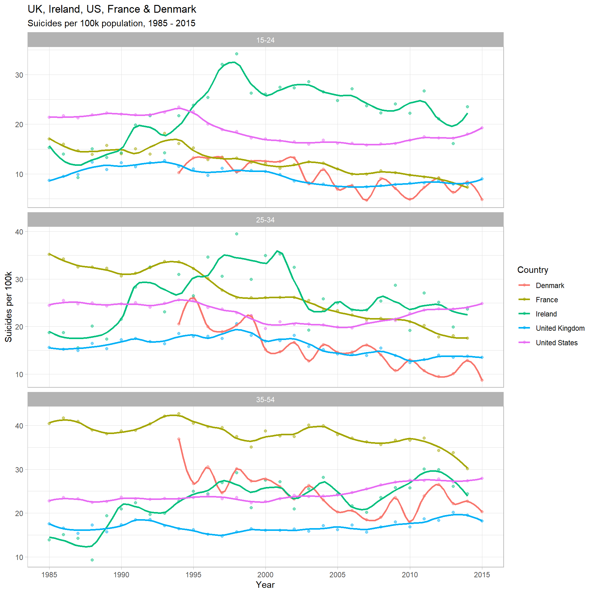
Insights
- For men in the UK, only the ‘35-54’ category seems to be increasing, with a slight increase (~10-15%) over the past decade
- UK rates for men in the ‘15-24’ and ‘25-34’ categories appear flat & slightly decreasing, respectively
- It has been quite hard to describe these UK trends, which I think is a positive thing. The comparison with other countries definitely helps with perspective
This is the end of the analysis What I have learned is the following:
- Suicide rates are decreasing globally.
- Of those countries that show clear linear trends over time, 2/3 are decreasing.
- On average, suicide rate increases with age.
- This remains true when controlling for continent in the Americas, Asia & Europe, but not for Africa & Oceania.
- There is a weak positive relationship between a countries GDP (per capita) and suicide rate.
- The highest suicide rate ever recorded in a demographic (for 1 year) is 225 (per 100k population).
- There is an overrepresentation of men in suicide deaths at every level of analysis (globally, at a continent and country level). Globally, the male rate is ~3.5x higher.
Thank you for reading,
Kind regards Per Granberg